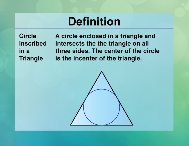
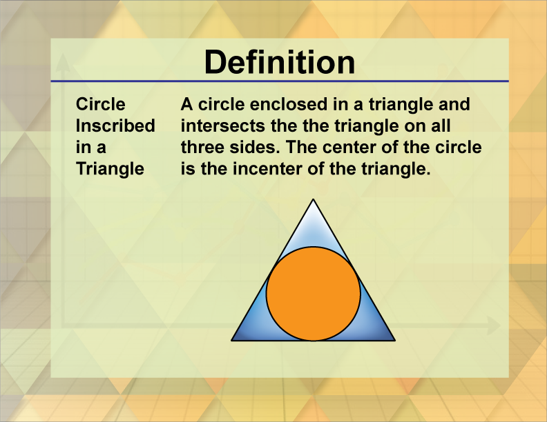
In the saturated marketplace of the 21st century, a brand’s visual identity is often the first—and sometimes only—chance to communicate its core values to a potential consumer. While many business owners focus on color palettes and typography, the underlying geometric structures of a logo often do the heavy lifting in the subconscious mind. One of the most enduring and provocative configurations in design is the “circle inside a triangle.”
To the casual observer, it might look like a simple mathematical diagram or a mystical sigil. However, in the realms of brand strategy and corporate identity, this specific combination of shapes carries profound psychological weight. By understanding the intersection of these two fundamental forms, brand architects can craft a visual narrative that speaks to stability, inclusion, and focused energy.
The Psychology of Geometric Shapes in Corporate Branding
The human brain is wired to recognize and assign meaning to patterns. This cognitive shortcut allows us to process complex information quickly. In branding, geometric semiotics—the study of signs and symbols—is used to evoke specific emotions without saying a single word. When a circle is placed inside a triangle, it creates a tension between two opposing psychological forces.
The Stability and Direction of the Triangle
In brand design, the triangle is the shape of movement and hierarchy. Depending on its orientation, it can represent different corporate philosophies. An upright triangle (resting on its base) is the ultimate symbol of stability, reminiscent of the pyramids. It suggests a brand that is grounded, powerful, and enduring.
Furthermore, the triangle acts as a directional pointer. It leads the eye toward a specific apex, symbolizing progress, peak performance, and “pointing the way” toward the future. For a brand, this communicates leadership and an aspirational quality. However, a triangle alone can feel sharp or exclusive. Its points are aggressive, which is why it often requires a counter-balance.
The Unity and Totality of the Circle
The circle is the antithesis of the triangle’s sharp angles. It represents wholeness, eternity, and community. Because a circle has no beginning and no end, it is the universal symbol for unity and protection. In branding, the use of circular motifs often suggests that a company is inclusive, customer-centric, and holistic in its approach.
When you place a circle inside a triangle, you are effectively “softening” the edges of the brand’s ambition. The triangle provides the structural integrity and the goal-oriented drive, while the circle represents the heart of the organization—the people, the community, or the central core value that remains protected within that structure.
Iconic Examples: Brands That Mastered the Circle and Triangle
To understand how this geometry translates into market dominance, we can look at several world-class brands that have utilized the circle-triangle relationship to define their corporate identity.
Google Play: Directing Digital Energy
Perhaps the most ubiquitous modern example of the triangle-and-circle motif is the Google Play logo. While the primary shape is a “play” button (a sideways triangle), the internal logic of the design often involves circular intersections and rounded vertices. The triangle represents the “start” of an action—the delivery of media—while the implied circularity within its ecosystem suggests a complete, all-encompassing universe of content. By housing the colorful segments within a triangular frame, Google communicates a brand that is both high-energy (the triangle) and diverse/inclusive (the circularity of the content wheel).
Reebok: Modernizing Heritage Through Geometry
Reebok’s “Delta” logo is another masterclass in geometric branding. The logo forms a triangle, but the negative space and the way the segments curve often evoke a sense of internal movement. The three sides represent the physical, mental, and social changes that occur when individuals push themselves. When this delta is paired with circular typography or placed within a circular badge for specific lines, it communicates a “protected” transformation. It tells the athlete: “Within this structure, you will find your wholeness.”
Integrating Sacred Geometry into Modern Personal Branding
For personal brands and small-to-medium enterprises (SMEs), using a circle inside a triangle isn’t just about looking “cool.” It is a strategic move to position oneself at the intersection of logic and creativity. This configuration is often referred to as a “squared circle” or a variation of the “Pythagorean” ideal, suggesting a brand that has found a balance between the spiritual (the circle) and the material (the triangle).
Balancing Logic and Creativity
In personal branding, the triangle often represents the “Hard Skills”—the degrees, the years of experience, and the strategic framework of the business. The circle represents the “Soft Skills”—the empathy, the intuition, and the personal connection the founder has with their audience.
A consultant who uses this geometry in their visual identity is subconsciously telling clients: “I have a rigorous, structured methodology (the triangle), but at its core, my focus is on your well-being and the human element (the circle).” This balance is essential in service-based industries where trust is the primary currency.
Creating a “Venn Diagram” of Purpose
Modern branding is moving away from flat, one-dimensional messages. Strategists now use the circle-in-triangle motif to show a “containment of purpose.” By placing the circle—symbolizing the “Why”—inside the triangle—symbolizing the “How”—the brand creates a visual manifesto. It shows that the brand’s actions (the sides of the triangle) are always guided by a central, unwavering core. This level of symbolic depth can foster much deeper brand loyalty than a standard wordmark ever could.
Design Principles for Combining Shapes in Marketing Collateral
When implementing this geometric duo into a brand’s visual identity, there are technical design principles that ensure the message isn’t lost in translation.
Proportion and the Golden Ratio
For a circle inside a triangle to feel “right” to the human eye, it must adhere to specific proportions. Using the Golden Ratio (1.618) to determine the diameter of the circle relative to the height of the triangle creates a sense of natural harmony. If the circle is too large, it overwhelms the triangle, making the brand seem “unfocused.” If it is too small, the circle looks like an afterthought, suggesting that the brand’s “core” is weak or insignificant.
Color Theory and Geometric Contrast
Color plays a vital role in how these shapes are perceived. Often, brand strategists will use a bold, solid color for the triangle to emphasize strength, while using a gradient or a softer hue for the internal circle. This creates a “glow” effect, suggesting that the brand’s inner core is a source of energy or light. Alternatively, using a “cut-out” or negative space circle inside a solid triangle can suggest transparency—an essential trait for brands in the financial or tech sectors where “seeing inside” the process is a key selling point.
The Future of Minimalist Symbology in Visual Identity
As we move further into a mobile-first world, the complexity of brand logos is decreasing. Fine details are being replaced by bold, geometric “favicons” that must be recognizable at the size of a postage stamp. The circle inside a triangle is perfectly suited for this evolution.
Scalability in the Digital Age
One of the primary reasons brand managers love geometric shapes is scalability. Whether it’s on a massive billboard in Times Square or a tiny app icon on an Apple Watch, a circle within a triangle retains its legibility. This geometric simplicity ensures that the brand’s “DNA” is communicated across all platforms without distortion. In an era where brand consistency is synonymous with brand equity, these shapes offer a future-proof solution.

Transcending Language Barriers
Finally, the power of this symbol lies in its universality. Words must be translated, but geometry is a global language. A brand looking to expand into international markets can rely on the circle-in-triangle to communicate stability and unity in Tokyo, London, or New York simultaneously. By stripping away the fluff and focusing on the core meaning of these shapes, a brand can achieve a “transcendental” status, moving beyond a mere product to become a recognizable symbol of a specific philosophy or lifestyle.
In conclusion, a circle inside a triangle is far more than a simple design choice. It is a sophisticated strategic tool that balances the aggressive drive of the triangle with the inclusive harmony of the circle. For any brand looking to project an image of “structured empathy” or “focused wholeness,” this geometric combination remains one of the most powerful assets in the brand strategist’s toolkit.
aViewFromTheCave is a participant in the Amazon Services LLC Associates Program, an affiliate advertising program designed to provide a means for sites to earn advertising fees by advertising and linking to Amazon.com. Amazon, the Amazon logo, AmazonSupply, and the AmazonSupply logo are trademarks of Amazon.com, Inc. or its affiliates. As an Amazon Associate we earn affiliate commissions from qualifying purchases.