
In the realm of visual communication, few symbols carry as much weight, history, and immediate recognition as a national flag. However, in the last decade, a striking variation has emerged in the commercial and cultural landscape: the monochromatic, all-black American flag. While its origins are often debated in historical and political contexts, its presence in modern brand strategy, corporate identity, and consumer marketing is undeniable.
To a brand strategist or a marketing executive, the black American flag is not just a piece of fabric; it is a powerful case study in “subversive branding” and the psychology of color. It represents a departure from traditional patriotism toward a niche, often “tactical” or “resilient” brand identity. Understanding what this symbol represents in a professional context requires a deep dive into how visual semiotics shape consumer perception and how brands navigate the thin line between heritage and bold reinvention.
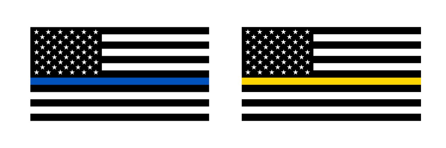
The Evolution of Visual Identity: Why Monochromatic Flags Dominate the Market
The transition from the vibrant red, white, and blue to a stark black-on-black or black-and-grey palette is a masterclass in minimalist design. In the world of branding, color is often the first thing a consumer notices, but the absence of color can be even more evocative.
Minimalist Design and the Power of Subtraction
Modern branding has leaned heavily into minimalism. By stripping away the traditional colors of the American flag, brands create a “stealth” aesthetic. This process of subtraction forces the viewer to focus on the form—the stars and stripes—rather than the sentiment usually associated with the primary colors. For companies in the tech, automotive, or high-end apparel sectors, this minimalism signals sophistication and modernity. It suggests that the brand is “American-made” but through a lens of contemporary, high-performance engineering rather than traditional nostalgia.
Psychological Impact of All-Black Color Palettes
In color psychology, black represents authority, power, elegance, and mystery. When applied to a national icon, these traits are transferred to the product or organization. A black flag does not ask for attention with bright hues; it demands respect through gravitas. Brands that utilize this iconography are often positioning themselves as “elite” or “specialized.” They aren’t catering to the mass market; they are speaking to a segment that values grit, seriousness, and a “no-nonsense” approach to business and life.
Brand Association and the “Tactical” Market Niche
Perhaps the most significant use of the black American flag in the corporate world is within the “Tactical and Outdoor” lifestyle niche. This sector has successfully co-opted the symbol to create a distinct brand language that resonates with a specific demographic: veterans, first responders, and fitness enthusiasts.
Identifying the Target Audience: Defense, Security, and Fitness
For brands like Under Armour (with its “Freedom” line), 5.11 Tactical, or various veteran-owned apparel companies, the black flag is a badge of membership. It represents a “shared struggle” or a “mission-first” mentality. In this context, the flag represents resilience. It is the “subdued” version of the flag worn on military uniforms during night operations—designed not to reflect light and compromise a position. By adopting this into their corporate identity, these brands signal to their customers that their products are built for the toughest environments and the most dedicated individuals.
Case Studies in High-Performance Brand Identity
Consider the rise of functional fitness brands like Rogue Fitness or GoRuck. Their use of monochromatic American imagery isn’t accidental. It aligns their brand with the concept of “functional excellence.” The black flag here represents a “dark mode” version of the American dream—one that is earned through sweat, discipline, and hardship. This branding strategy turns a customer into a “member of a unit,” fostering high brand loyalty that traditional “bright and cheery” marketing rarely achieves.
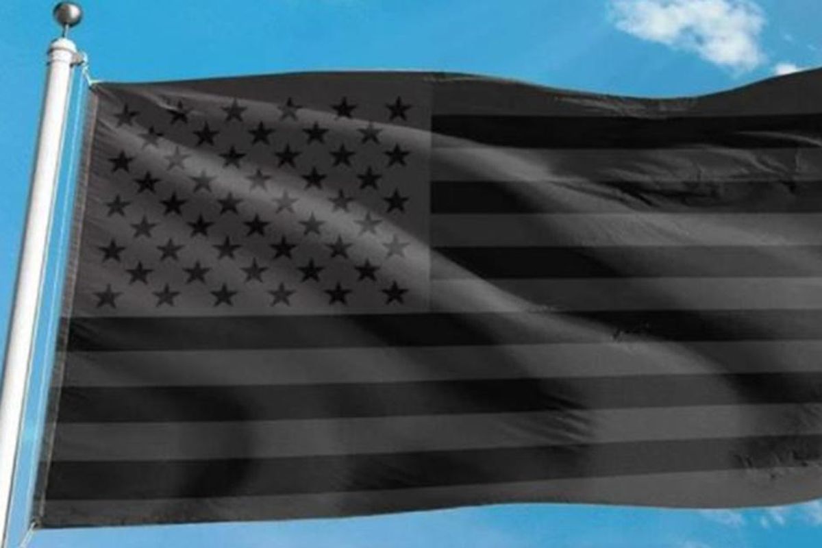
Navigating Controversy: The Symbolism of “No Quarter” in Commercial Branding
While many brands use the black flag for aesthetic or “stealth” purposes, there is a deeper, more controversial meaning that brand managers must navigate carefully: the historical “No Quarter” flag. Historically, a black flag flown in battle signified that no prisoners would be taken—essentially the opposite of the white flag of surrender.
The Risks of Reinterpreting National Symbols
When a brand integrates a symbol with such aggressive historical connotations, it takes a calculated risk. In the modern marketplace, the black American flag has occasionally been associated with “No Quarter” sentiments in political spheres. For a corporate entity, this can be a double-edged sword. While it might deepen the bond with a core, “hardcore” audience, it can alienate broader consumer bases who view the symbol as exclusionary or overly aggressive.
Successful brand strategy requires an “environmental scan.” Brands must ask: Does this symbol align with our corporate social responsibility (CSR) goals? If a brand’s identity is built on peace, inclusivity, and mainstream appeal, adopting a black flag could be a catastrophic marketing misalignment. However, for a brand built on “disruptive” energy, the edge provided by this symbol might be exactly what sets them apart from the competition.
Managing Brand Perception and Social Responsibility
The key to using powerful iconography is transparency and context. Brands that use the black flag effectively often pair it with messaging that emphasizes “Resilience” or “Protection” rather than “Aggression.” By redefining the symbol within their own brand narrative—perhaps as a symbol of the “unseen” work that goes into a product—they can mitigate the risk of negative associations. Managing this perception requires a robust PR strategy and a clear understanding of the nuances of American iconography.
Strategies for Implementing Bold Iconography in Your Brand
If your organization is considering a shift toward more “subdued” or “alternative” national symbols, the process must be strategic rather than merely aesthetic. A symbol as potent as the black American flag cannot be used “just because it looks cool.”
Aligning Visuals with Core Values
Before adopting any variation of a national symbol, a company must conduct a “Brand Value Audit.” Does your brand value tradition, or does it value rebellion? The black American flag is fundamentally a “disruptor” symbol. It takes the most traditional icon in the country and flips the color scheme. This is ideal for “Challenger Brands”—those looking to take on established industry giants by presenting a tougher, more modern alternative. If your core values include “Stability” and “Safety,” the traditional flag is a better fit. If your values are “Strength” and “Innovation,” the black flag offers a more aligned visual narrative.
Consistency Across Digital and Physical Touchpoints
A brand is only as strong as its consistency. If the black flag is part of your corporate identity, it must be integrated thoughtfully across all platforms.
- Digital Presence: In web design, this iconography often requires a “dark mode” UI/UX, using high-contrast whites and greys against deep blacks to maintain the “stealth” feel.
- Packaging: Using matte black finishes with UV-spot-treated flag icons can create a premium, tactile experience for the consumer.
- Advertising: The tone of copy must match the visual. Short, punchy, and authoritative language works best with monochromatic imagery.
Conclusion: The Symbolism of Success
In summary, the black American flag in the world of branding represents a shift toward specialization, resilience, and elite positioning. It is a symbol that tells the consumer, “This is for those who go further, work harder, and prefer the shadows of the grind to the spotlight of the stage.”
For brand strategists, the lesson is clear: symbols are fluid. While the black flag may have various historical or political interpretations, its corporate representation is defined by the brand that wears it. When used with intention, it is a powerful tool for community building and market differentiation. It proves that sometimes, to make the loudest statement, you have to strip away the color and let the strength of the form speak for itself. As the market continues to fragment into specialized niches, expect to see this “subdued” iconography continue to play a pivotal role in the visual language of American industry and commerce.
aViewFromTheCave is a participant in the Amazon Services LLC Associates Program, an affiliate advertising program designed to provide a means for sites to earn advertising fees by advertising and linking to Amazon.com. Amazon, the Amazon logo, AmazonSupply, and the AmazonSupply logo are trademarks of Amazon.com, Inc. or its affiliates. As an Amazon Associate we earn affiliate commissions from qualifying purchases.