In the landscape of modern social media, Snapchat stands out as a platform that pioneered ephemeral communication. Unlike the text-heavy interfaces of early social networks, Snapchat relies heavily on a complex, almost cryptic visual shorthand. For the uninitiated, the array of colorful icons, emojis, and symbols can feel like a foreign language. However, these symbols are not merely aesthetic choices; they are sophisticated UI/UX elements designed to communicate data-driven relationships, delivery statuses, and user engagement levels.
Understanding what these symbols mean is essential for any user looking to master the app’s ecosystem. This guide provides a deep dive into the technical and functional significance of Snapchat’s visual lexicon, categorizing them into friendship indicators, messaging statuses, and interface navigation tools.
Decoding the Friendship Emojis: The Algorithmic Social Map
Snapchat’s most famous symbols are the emojis that appear next to friends’ names in the Chat tab. These are not chosen by the users themselves; rather, they are generated by a proprietary algorithm that tracks interaction frequency and consistency. This gamification of social interaction is a hallmark of the app’s software design.
The Evolution of the Best Friend Status
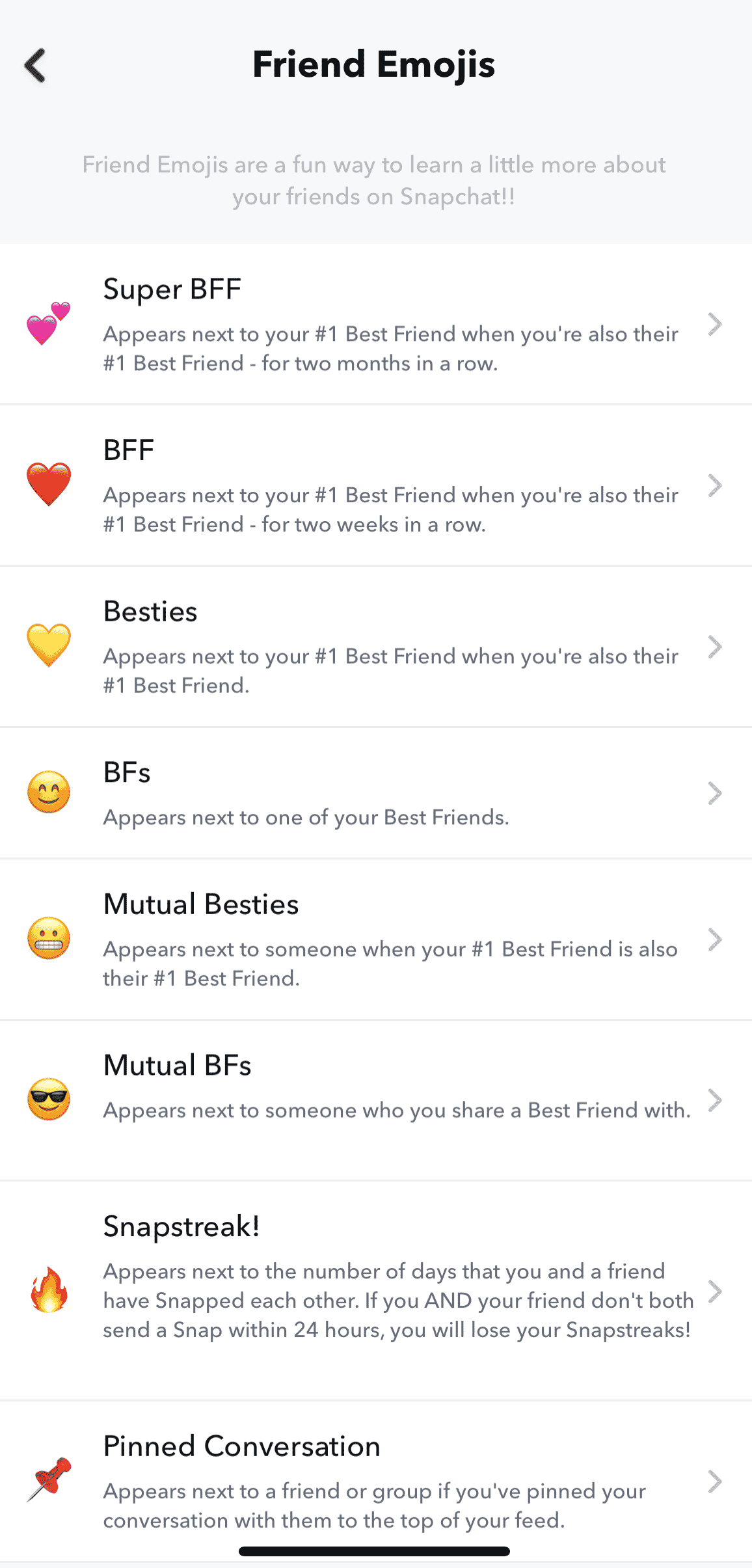
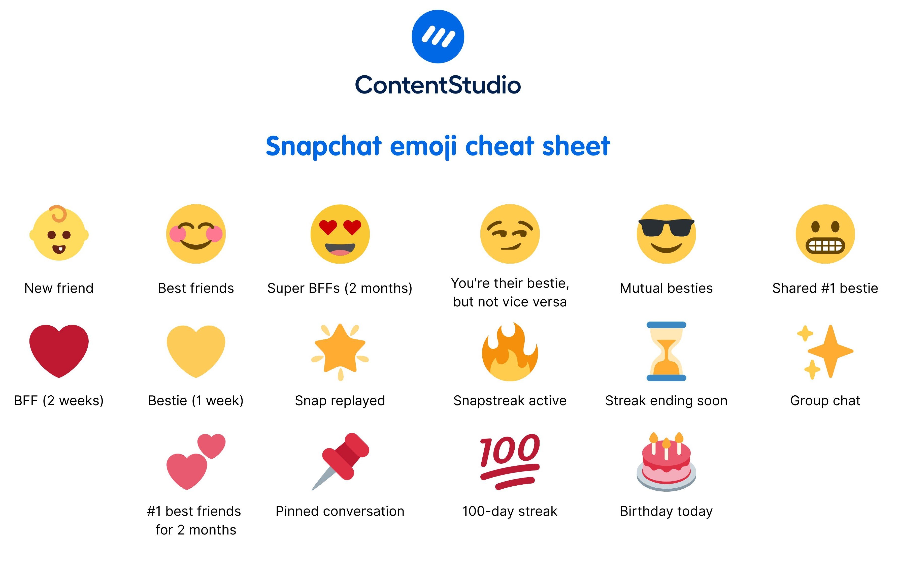
The “Best Friend” system is the core of Snapchat’s social hierarchy. A Yellow Heart indicates that you are each other’s number one best friend—the person you send the most Snaps to, who also sends the most Snaps to you. If this mutual consistency continues for two weeks, the heart turns Red. After two consecutive months of being each other’s top contact, it evolves into Pink Hearts. These symbols serve as visual benchmarks for relationship milestones within the app’s database.
The Fire Emoji and the Snapstreak Mechanism
Perhaps the most significant symbol in the “Tech-Social” sphere is the Fire (Flame) Emoji. This appears when you and a friend have snapped each other every day for at least three consecutive days. Accompanied by a number, it indicates the length of the “Snapstreak.” From a technical perspective, this is a masterclass in user retention software. It leverages behavioral psychology to ensure daily app opens. If the streak is at risk of expiring (meaning 20 hours have passed without a Snap), the Hourglass Emoji appears, acting as a countdown timer within the interface.
Mutual Friendships and Social Overlap
Other emojis provide insight into your broader social circle. The Smiling Face indicates that someone is one of your best friends, but not your number one. The Grimacing Face (teeth showing) is particularly revealing: it means your number one best friend is also their number one best friend. This transparency into the “Social Graph” is a unique feature of Snapchat’s software, allowing users to see how their digital interactions overlap with others.
Understanding Chat and Delivery Icons: The Technical Feedback Loop
The icons appearing on the main Chat screen provide real-time feedback on the status of sent and received media. These icons are color-coded and shape-coded to provide high-density information at a glance, minimizing the need for text labels.
The Color-Coding System: Media Types
The software uses a strict color palette to distinguish between different types of data packets sent through the server:
- Red: Represents Snaps sent without audio (usually photos).
- Purple: Represents Snaps sent with audio (usually videos).
- Blue: Represents text-based Chat messages.
- Turquoise: Represents 3D Snaps or specialized media content.
Sent, Delivered, and Opened Statuses
Snapchat uses arrows and squares to communicate the lifecycle of a message. A Solid Arrow means you have sent a message. Once the server confirms receipt on the other user’s device, the icon remains solid but the recipient is notified. When the recipient opens the message, the arrow becomes Hollow.
Conversely, Square Icons represent incoming messages. A Solid Square means a Snap is waiting for you to view it. Once you have viewed it, the square becomes Hollow, and a small note (e.g., “Received”) appears below the friend’s name. This clear distinction in UI states helps users track digital conversations with surgical precision.
The Replay and Screenshot Indicators
Privacy and ephemeral logic are the foundations of Snapchat’s technology. Therefore, the app includes specific symbols for actions that bypass the “disappearing” nature of the content. The Replay Symbol (a circular arrow) indicates that a user has used their once-daily replay on your Snap. The Screenshot Symbol (a two-way overlapping arrow or a stylized “starburst”) is perhaps the most critical for digital security; it notifies the sender immediately if the recipient has captured a permanent image of the ephemeral content.
Navigation and Profile Symbols: Interface and Verification
Beyond the chat screen, Snapchat utilizes a variety of symbols to manage user profiles, public content, and location-based services. These symbols help organize the massive amount of content generated by the app’s global user base.
The Bitmoji and Actionmoji Interface
Snapchat’s integration of Bitmoji (personalized avatars) transformed the profile symbol system. On the Snap Map, your avatar becomes an “Actionmoji.” Using a combination of GPS data, time of day, and even device sensors (like accelerometer data), the software changes your symbol to show you driving, sleeping, or listening to music. This is a sophisticated application of sensor-fusion technology translated into a simple visual icon.
Verification and Influence: The Star Badge
Similar to the “Blue Check” on other platforms, Snapchat utilizes a Black Star inside a Gold Circle (or sometimes a specific emoji chosen by the celebrity) to denote official, verified accounts. This is a crucial security feature to prevent impersonation of public figures. When you see this symbol next to a Story, it confirms that the content is coming from a high-profile creator or an “Official Story” account, authenticated by Snapchat’s internal security protocols.
Snap Map and Privacy Icons
When navigating the Snap Map, users may encounter the Ghost Mode icon (a ghost holding a sign). This indicates that the user has opted out of sharing their location, a vital feature for digital privacy. Additionally, the Heat Map symbols (glowing blue, orange, and red areas) represent “Points of Interest” where a high volume of Snaps are being uploaded simultaneously. This is an automated data visualization tool that identifies real-world trends in real-time.
The UX Philosophy: Why Snapchat Uses Symbols Instead of Text
From a technical and design perspective, Snapchat’s reliance on symbols is a deliberate choice that differentiates it from older platforms like Facebook or LinkedIn. This “minimalist-yet-complex” UI serves several functions within the tech ecosystem.
Efficiency in Data Consumption
On mobile devices, screen real estate is at a premium. By replacing phrases like “This person has opened your video” with a simple hollow purple arrow, the app reduces visual clutter. This allows for a faster “scan rate,” enabling users to process information about dozens of conversations in a matter of seconds.
Creating an “Insider” Experience
There is a strategic technical hurdle in Snapchat’s design. By not labeling every icon, the app creates a learning curve. This fosters a sense of community and “insider knowledge” among its primary demographic—Gen Z and Millennials. It essentially functions as a digital shibboleth; if you know what the symbols mean, you belong to the digital-native cohort.
Algorithmic Transparency through Visualization
While many social media companies keep their algorithms entirely secret, Snapchat uses symbols to provide a level of transparency. The friendship emojis are essentially a “front-end” visualization of “back-end” data. It tells the user exactly how the app perceives their social interactions, giving them a tangible look at the data points being tracked, such as frequency of contact and speed of response.

Conclusion
The symbols of Snapchat are far more than mere decorations; they are the functional gears of the platform’s user interface. From the Fire emoji’s role in gamified retention to the Hollow Arrow’s role in communication feedback, each icon serves a specific purpose in the app’s software architecture. By mastering this visual language, users can better navigate the complexities of digital communication, monitor their privacy, and understand the data-driven relationships that define the modern social media experience. As the app continues to evolve, adding new features like AI-driven chatbots and augmented reality lenses, its visual lexicon will likely expand, further blurring the line between human conversation and technical feedback.
aViewFromTheCave is a participant in the Amazon Services LLC Associates Program, an affiliate advertising program designed to provide a means for sites to earn advertising fees by advertising and linking to Amazon.com. Amazon, the Amazon logo, AmazonSupply, and the AmazonSupply logo are trademarks of Amazon.com, Inc. or its affiliates. As an Amazon Associate we earn affiliate commissions from qualifying purchases.