
The Fundamental Blend: Green and Red in Color Theory and Digital Design
The seemingly simple question of what colors green and red make unravels a fascinating interplay between physics, perception, and ultimately, strategic brand design. The answer isn’t singular; it depends entirely on the medium and the method of color mixing. Understanding this distinction is paramount for any brand aiming for visual consistency and impact across various platforms, from print materials to digital interfaces.
Additive Color Mixing: The Light Spectrum’s Yellow Outcome
In the realm of light, colors behave as an additive system. This is the principle behind television screens, computer monitors, and smartphone displays, all of which emit light. The primary colors of light are Red, Green, and Blue (RGB). When these primary light colors are combined, they create secondary colors. Specifically, when red light and green light are mixed in equal intensity, the result is yellow light. This phenomenon is a cornerstone of digital design, where vibrant yellows are formed by the illumination of red and green pixels on a screen. For brands operating heavily in the digital space, understanding that their digital yellow logo, for instance, is an offspring of red and green light is fundamental to consistent color representation. The brightness and saturation of this yellow will depend directly on the intensity of the red and green components.
Subtractive Color Mixing: The Pigment’s Path to Brown and Beyond
Conversely, when dealing with physical pigments such as paints, inks, dyes, or filters, colors operate on a subtractive system. Here, pigments absorb certain wavelengths of light and reflect others. The primary colors for subtractive mixing are Cyan, Magenta, and Yellow (CMY, or CMYK in printing, where K stands for black). While green and red are not primary colors in this system, mixing them directly as pigments yields a significantly different result than mixing light.
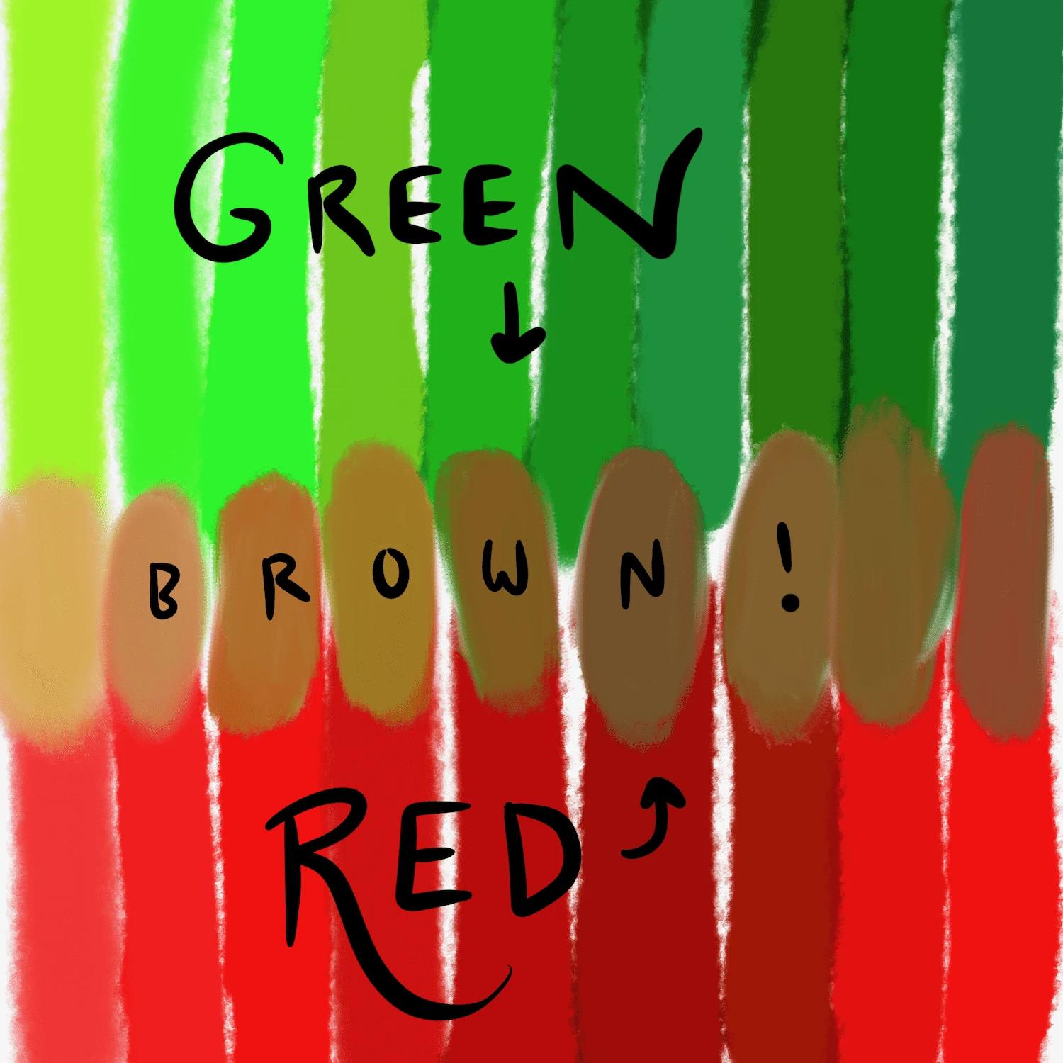
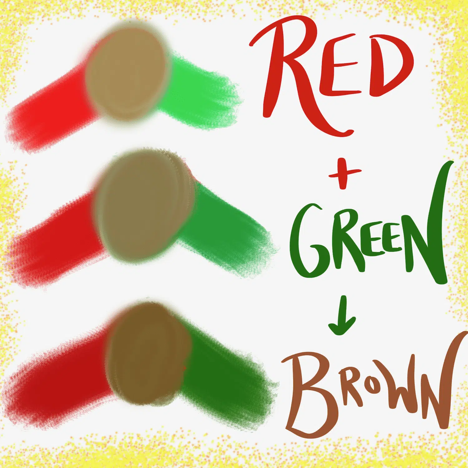
When green and red pigments are combined, they tend to create a dark, muted brown or a muddy, desaturated reddish-brown. This is because green pigment absorbs red and blue light, reflecting only green. Red pigment absorbs green and blue light, reflecting only red. When mixed, they collectively absorb a wide spectrum of light, leaving very little to be reflected, hence the dark, often brownish outcome. The specific shade of brown will vary based on the exact hues of green and red used, their proportions, and the quality of the pigments. For brands producing physical merchandise, printed advertisements, or product packaging, this principle is critical. A brand relying on a vibrant yellow created digitally from red and green light would be sorely disappointed attempting to replicate that yellow by mixing red and green paint.
Why Understanding Both is Crucial for Brand Consistency
The divergence between additive and subtractive color mixing presents a significant challenge and opportunity for brand identity. A brand’s visual assets must translate seamlessly across digital screens (additive) and printed materials (subtractive). A failure to account for this can lead to inconsistent brand perception, where a logo or color scheme appears vibrant online but dull or off-color in print. Professional brand guidelines often include specific RGB, CMYK, and Pantone (a standardized pigment matching system) values to ensure color fidelity across all mediums, directly addressing the different ways green and red (and all other colors) are perceived and created.
Psychological Resonance: The Individual Impact of Green and Red on Consumers
Beyond the technicalities of color mixing, green and red carry profound psychological weight, individually influencing consumer perception and brand messaging. Understanding these intrinsic associations is vital for strategic branding.
Green’s Message: Growth, Tranquility, and Trust
Green is universally associated with nature, growth, and renewal. In branding, it frequently evokes feelings of health, vitality, and freshness. Think of organic food brands, environmental initiatives, or pharmaceutical companies that often leverage green to communicate natural benefits, safety, and well-being. Furthermore, green is linked to financial prosperity and stability (e.g., money, “green light” for progress), making it a popular choice for banking and investment firms aiming to convey trust and security. Its calming effect can also suggest tranquility and balance, offering a sense of peace to the consumer.
Red’s Command: Urgency, Passion, and Power
Red is a color of intense emotion and high energy. It immediately grabs attention, signifying urgency, passion, love, excitement, and even danger. In branding, red is used to stimulate, alert, and encourage action. Fast-food chains often employ red to evoke hunger and speed. Retailers use it during sales to create a sense of urgency. Brands wanting to project power, confidence, and dynamism frequently incorporate red. It’s a color that demands to be seen and can elicit strong emotional responses, making it highly effective for call-to-action elements or brands seeking a bold, memorable presence.
The Duality of Perception: How Context Shapes Meaning
While green and red have general associations, their specific meaning can be heavily influenced by context, culture, and the brand’s industry. For example, red can signify love in one context but danger in another. Green can mean environmentalism or financial success. When these colors are used in conjunction, their individual psychological impacts can either be reinforced, contrasted, or subtly altered to create a new, nuanced message. A brand needs to carefully consider the entire visual language and cultural implications to ensure their green and red choices convey the intended sentiment, rather than creating confusion or unintended associations.
Strategic Integration: When Green, Red, and Their Offspring Define a Brand
Understanding how green and red combine, both scientifically and psychologically, allows brands to leverage them strategically. Whether the resulting ‘color’ is yellow (from light), brown (from pigment), or a dynamic juxtaposition, each holds unique branding potential.
Leveraging Yellow: Optimism and Clarity in Branding

When red and green light combine to make yellow, the resulting psychological associations are often of optimism, clarity, warmth, and joy. Yellow is a cheerful color that can suggest happiness, friendliness, and creativity. Brands that wish to project an approachable, innovative, or energetic image often use yellow, either as a primary color or a key accent. For digital-first brands, the inherent ‘yellow’ created by their digital reds and greens can be strategically considered. It implies vibrancy and forward-thinking, making it suitable for tech startups, creative agencies, or children’s brands.
Embracing Earth Tones: Stability and Authenticity
The brown or earthy tones produced by mixing green and red pigments carry entirely different connotations. Browns are associated with nature, warmth, comfort, and reliability. They suggest stability, authenticity, and an organic quality. Brands in agriculture, artisanal crafts, coffee, or sustainable products might intentionally lean into these natural, earthy palettes to communicate groundedness, heritage, and trustworthiness. This allows them to avoid the artificiality often associated with brighter, more saturated colors, aligning with a brand ethos of naturalness and enduring quality.
The Power of Contrast: Dynamic Energy and Call-to-Action
Beyond literal mixing, the strategic juxtaposition of green and red is a powerful branding tool. This contrast can create visual tension, excitement, and highlight key messages. The most iconic example is holiday branding, particularly Christmas, where the combination evokes festivity, warmth, and tradition. In other contexts, green (signifying “go” or “safe”) and red (signifying “stop,” “warning,” or “important”) are used in functional branding for alerts, indicators, or call-to-action buttons. A green “Buy Now” button paired with a red “Limited Stock” banner creates a dynamic message of opportunity and urgency. This direct contrast is effective for brands that need to convey clear, action-oriented messages or create a sense of immediate impact.
Real-World Branding: Iconic Uses and Common Pitfalls
Examining how successful brands employ green and red, both individually and in combination, reveals best practices and common missteps in brand design.
Brands That Master the Green-Red Harmony
Many brands strategically deploy green and red to reinforce their identity. For instance, BP (British Petroleum) notably uses a yellow, green, and white sunflower logo, where the yellow is a central element, potentially referencing the ‘yellow’ outcome of light mixing while conveying environmental aspirations (green) and energy (yellow). The festive combination of green and red is synonymous with Coca-Cola during the holiday season, temporarily shifting their iconic red to incorporate green accents that evoke warmth, tradition, and cheer. Financial institutions like Bank of America use a blue and red logo, but many other banks use green to signify growth and security, sometimes pairing it with bolder colors for dynamic effect. Food brands like Whole Foods Market leverage green for health and naturalness, while a brand like Wendy’s uses red for appetite stimulation and friendliness. The strategic use isn’t always about literal mixing, but about the carefully considered relationship between the colors.
Avoiding Brand Clashes: When Not to Mix
A critical pitfall is the indiscriminate use of green and red without considering their context or the brand’s core message. Overuse of both intense green and red can create a visually chaotic or aggressive brand identity, especially if not balanced with neutral tones. A brand aiming for sophistication and minimalism might find this combination too loud. Furthermore, mixing pigments of red and green can easily lead to undesirable muddy browns if the intent was vibrancy, creating a dull and unappealing visual. Cultural considerations are also vital; while red and green together are festive in Western cultures, their combination might carry different, potentially negative, connotations elsewhere. Brands with a global presence must navigate these nuances carefully.
Adaptability Across Mediums: Print, Digital, and Environmental Design
True mastery lies in a brand’s ability to maintain its color integrity across all touchpoints. A brand’s green, red, and any yellow or brown derived from them must look consistent on a website, in a magazine ad, on product packaging, and even as part of an experiential environmental design. This requires meticulous attention to color specifications (RGB, CMYK, Hex codes, Pantone swatches) and careful testing across different substrates and displays. A brand that invests in this consistency ensures that its carefully crafted visual message is delivered uniformly, strengthening recognition and trust regardless of how or where a consumer encounters it.
The Designer’s Palette: Crafting Meaningful Brand Experiences
Ultimately, the question of “what do the colors green and red make” is a gateway for designers to craft deliberate and impactful brand experiences. It’s about more than just pigment; it’s about psychology, strategy, and precision.
Beyond Simple Mixing: Shades, Tints, and Tones
The true artistry in branding doesn’t stop at primary color mixing. Designers leverage the entire spectrum of green and red – their shades (darker versions with black), tints (lighter versions with white), and tones (desaturated versions with gray). A deep forest green paired with a rich burgundy red evokes a different feeling than a bright lime green with a fiery scarlet. By manipulating these variations, designers can fine-tune the emotional impact, creating palettes that range from earthy and organic to luxurious and sophisticated, or playful and energetic. The ‘mix’ becomes less about literal combination and more about the harmonious interplay of specific hues from within the green and red families.
Audience and Industry Considerations
The choice and combination of green and red must always align with the target audience and the industry context. A brand targeting eco-conscious millennials might use muted, natural greens and earthy reds to convey authenticity. A brand in the gaming industry might opt for neon greens and electric reds to evoke excitement and cutting-edge technology. Financial services might use a deep, trustworthy green with a subtle, empowering red accent. Understanding the demographic’s cultural references and the industry’s visual conventions ensures that the color choices resonate effectively rather than appearing incongruous.
The Evolving Language of Color in Branding
The language of color is dynamic. Trends, cultural shifts, and technological advancements continually shape how colors are perceived and utilized in branding. As brands increasingly operate in augmented realities, virtual environments, and interactive digital spaces, the understanding of additive color mixing (green and red making yellow light) becomes even more critical for immersive experiences. For a brand to remain relevant and resonant, its visual identity, particularly its use of foundational colors like green and red, must be flexible enough to adapt while remaining true to its core essence. It’s about designing a brand that speaks powerfully, both in the present and into the future, through the eloquent language of color.
aViewFromTheCave is a participant in the Amazon Services LLC Associates Program, an affiliate advertising program designed to provide a means for sites to earn advertising fees by advertising and linking to Amazon.com. Amazon, the Amazon logo, AmazonSupply, and the AmazonSupply logo are trademarks of Amazon.com, Inc. or its affiliates. As an Amazon Associate we earn affiliate commissions from qualifying purchases.