In the intricate world of branding, every visual element carries significant weight. From logos and packaging to website design and marketing collateral, the colors chosen are not merely aesthetic decisions; they are powerful communicators of emotion, value, and personality. Among the vast spectrum of hues available, brown holds a unique and often underestimated position. It’s a color that can evoke a sense of warmth, earthiness, reliability, and organic authenticity. However, achieving the perfect shade of brown for a brand requires a nuanced understanding of color theory and how various pigments interact. This article delves into the fundamental color combinations that yield brown, exploring their implications and applications within the realm of brand strategy and design.
The Alchemy of Earth Tones: Understanding Primary and Secondary Colors
At its core, color mixing, whether in digital design or physical pigments, operates on established scientific principles. Understanding these principles is the first step in mastering the art of brand color selection. Brown is not a spectral color, meaning it doesn’t appear in the rainbow as a distinct hue. Instead, it is a composite color, a result of mixing other colors. This makes its creation a form of visual alchemy, particularly relevant when aiming for a specific brand feel.
Red, Yellow, and Blue: The Foundation of Color Mixing
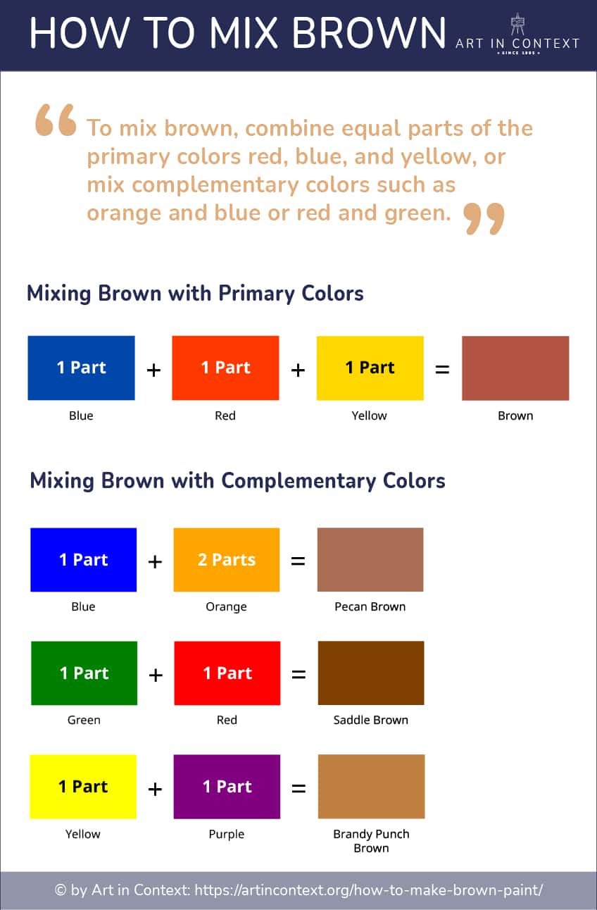
The traditional primary colors in subtractive color mixing (the kind used in printing and with physical paints) are red, yellow, and blue. These are the foundational building blocks from which a multitude of other colors can be derived. For our purposes, understanding how these three interact is crucial for generating brown.
- Red: Often associated with passion, energy, and urgency, red can introduce warmth and intensity into a brown mix.
- Yellow: Symbolizing happiness, optimism, and energy, yellow contributes to the lightness and warmth of brown.
- Blue: Representing calmness, stability, and depth, blue can darken and cool down a brown, pushing it towards more serious or sophisticated tones.
The interplay of these three primary colors is the bedrock of creating diverse browns. By altering the proportions of each, designers can create a spectrum of earthy, rich, and nuanced shades that resonate with specific brand messages. The challenge and the art lie in finding the right balance to achieve the desired psychological and aesthetic impact for a brand.
Secondary Colors: The First Step Towards Brown
Secondary colors are created by mixing two primary colors. The three secondary colors are orange (red + yellow), green (yellow + blue), and violet (blue + red). These intermediate colors play a vital role in bridging the gap to brown.
- Orange: A blend of red and yellow, orange already possesses a significant amount of warmth and is often a component in lighter, warmer browns. Think of the rich hues of terracotta or caramel.
- Green: Created by mixing yellow and blue, green can contribute to more muted, naturalistic browns. Depending on the specific green, it can add a touch of earthiness, like moss or soil tones.
- Violet: The combination of blue and red, violet, can introduce a cooler, deeper dimension to browns. This is particularly useful for creating sophisticated, dark browns with subtle undertones.
These secondary colors, by themselves, are not brown. However, they represent the initial step in the color-mixing journey that will ultimately lead to the desired earthy tones. Their inherent characteristics – warmth, coolness, brightness, or depth – will heavily influence the final brown shade.
Creating Brown: Direct Combinations and Strategic Additions
The most direct and common methods for creating brown involve specific combinations of primary and secondary colors. However, the true mastery lies in understanding how to refine these initial mixtures to suit a brand’s unique identity.
The Universal Formula: Mixing Complementary Colors
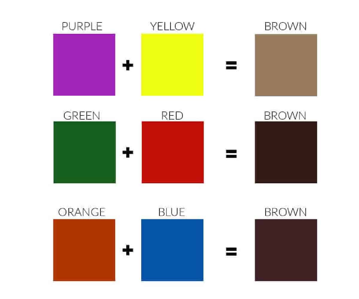
One of the most fundamental and effective ways to create brown is by mixing complementary colors. Complementary colors are pairs of colors that are opposite each other on the color wheel. When mixed together, they neutralize each other, producing a desaturated, or “broken,” color. This desaturation is precisely what gives brown its characteristic earthy and subdued quality.
- Red and Green: Mixing red and green, complementary colors, is a highly effective way to generate brown. The intensity of the red, combined with the coolness and depth of the green, creates a naturalistic brown. A vibrant red and a deep green will result in a darker, richer brown, while lighter shades of each will yield a more muted tone. This combination is excellent for brands aiming for an organic, natural, or rustic feel.
- Blue and Orange: The combination of blue and orange also produces a brown. Blue, being a cooler color, will temper the vibrancy of orange, leading to a more grounded and sophisticated brown. This pairing can create browns that feel reliable, established, and even luxurious, depending on the specific shades used. Think of the rich mahogany or deep chocolate tones.
- Yellow and Violet: While less commonly thought of as a direct path to brown, yellow and violet can also create brown tones. The challenge here is that violet can be a very strong color. A subtle yellow mixed with a muted violet can produce an interesting, almost taupe-like brown, suitable for brands seeking understated elegance.
The beauty of the complementary color method is its versatility. By adjusting the proportions of the two colors, you can shift the brown towards warmer or cooler undertones. For example, adding more red to a red-green mix will warm it up, while adding more green will cool it down.
The Power of Three: Mixing All Primary Colors
Another universally recognized method for creating brown is by mixing all three primary colors: red, yellow, and blue. When combined in roughly equal proportions, these colors neutralize each other to produce a dark brown. This is often the simplest approach for a foundational brown.
- Achieving Depth and Richness: The presence of all three primaries allows for a deep, rich brown. This method is excellent for creating a solid, dependable base color for a brand. The resulting brown can feel robust, strong, and authoritative.
- Fine-Tuning the Hue: While mixing all three primaries creates a brown, it’s rarely the perfect shade immediately. To refine the brown, one of the primary colors will typically be dominant, or a secondary color might be introduced. For instance, if the mix leans too muddy, adding a touch more red can bring warmth. If it’s too dark, a hint of yellow can lighten it.
This “all-primary” approach is a foundational technique, often serving as a starting point before further adjustments are made to achieve a specific brand aesthetic. It’s a testament to the interconnectedness of the color spectrum.
Strategic Applications of Brown in Brand Design
Understanding how to make brown is only half the battle. The true value lies in strategically deploying these earthy tones to enhance a brand’s identity and connect with its target audience. Brown can be a surprisingly versatile color in a brand’s palette, conveying a range of desirable attributes.
Conveying Authenticity and Naturalism
Brown is inherently linked to the natural world – soil, wood, leather, coffee, chocolate. This association makes it an ideal choice for brands that want to emphasize authenticity, organic origins, and environmental consciousness.
- Organic and Sustainable Brands: For companies in the food, beverage, skincare, or fashion industries that prioritize natural ingredients and sustainability, brown can immediately communicate their core values. Think of organic coffee roasters, artisanal chocolate makers, or eco-friendly clothing lines. The color brown anchors them firmly in the realm of the natural and the wholesome.
- Craftsmanship and Heritage: Brands that emphasize handmade quality, traditional techniques, or a sense of heritage can also leverage brown effectively. The color evokes a feeling of timelessness and skilled labor, suggesting products that are built to last and possess a story. This is common in brands related to woodworking, leather goods, and artisanal food production.
The specific shade of brown chosen here is critical. A light, sandy brown might suggest a more delicate, natural feel, while a deep, rich chocolate brown can convey luxury and indulgence.
Building Trust and Reliability
Beyond its natural connotations, brown also possesses a significant ability to build trust and convey reliability. Its grounding nature makes it feel stable and dependable, attributes crucial for any brand aiming to establish a long-term relationship with its customers.
- Financial Institutions and Professional Services: While often associated with warmer, more rustic aesthetics, certain shades of brown, particularly darker, desaturated tones, can lend an air of professionalism and seriousness. This makes them suitable for financial institutions, law firms, or consulting businesses that want to project stability and trustworthiness. A sophisticated, dark brown can feel as authoritative as navy blue or charcoal gray.
- Durable Goods and Industrial Brands: For brands selling products that are meant to be robust and long-lasting, brown can be a powerful choice. It suggests resilience and a no-nonsense approach, appealing to consumers who value durability and practicality. This can include brands in construction, automotive, or outdoor equipment.
In these contexts, the brown chosen is typically muted and sophisticated, avoiding overly bright or warm tones that might detract from the sense of gravitas and reliability.
Creating Warmth and Approachability
While brown can convey seriousness, its most common association is with warmth and approachability. This makes it an excellent choice for brands aiming to create a welcoming and comfortable customer experience.
- Hospitality and Food Service: Cafes, bakeries, and restaurants often employ brown in their branding to evoke feelings of comfort, coziness, and deliciousness. The color of coffee, baked goods, and warm spices makes it a natural fit. A warm, inviting brown can make customers feel instantly at ease and eager to engage with the brand.
- Lifestyle and Home Goods: Brands focused on creating a sense of home, comfort, and relaxation can benefit from brown’s inherent warmth. This includes furniture stores, home decor brands, and companies selling cozy textiles. The color promotes a feeling of sanctuary and well-being.
Here, warmer browns like caramel, tan, and reddish-browns are often favored, creating an inviting and comforting visual language for the brand.
Refining Your Brand’s Brown: Hue, Saturation, and Value
Once the fundamental color combinations are understood, the crucial next step in brand design is the precise refinement of the chosen brown. This involves manipulating its hue, saturation, and value to achieve a unique and effective brand identity. These three elements are the building blocks of any color and understanding how to adjust them for brown is key to brand differentiation.
Understanding Hue: The Dominant Color Influence
Hue refers to the pure color itself – whether the brown is primarily influenced by red, yellow, or blue. Adjusting the hue allows you to shift the brown towards specific undertones that communicate different brand messages.
- Red-Based Browns: These are warmer browns, often resembling cinnamon, terracotta, or mahogany. They evoke feelings of energy, passion, and richness. Brands aiming for a bold, inviting, or luxurious feel might lean towards these hues.
- Yellow-Based Browns: Lighter and often more optimistic, these browns can be reminiscent of sand, wheat, or light wood. They suggest warmth, naturalness, and approachability. Brands focused on organic products, lightheartedness, or natural beauty might select these.
- Blue-Based Browns: These are cooler, more muted browns, sometimes referred to as taupe or greige (gray-beige). They convey sophistication, calmness, and a sense of understated elegance. Brands in minimalist design, high-end services, or those seeking a refined aesthetic may find these hues appealing.
By carefully selecting the dominant hue, a brand can subtly guide consumer perception and emotional response.
Controlling Saturation: From Vibrant to Muted
Saturation refers to the intensity or purity of a color. For brown, adjusting saturation is about moving from a more vibrant, earthy tone to a more muted, desaturated one, or vice versa.
- High Saturation Browns: These are richer, more intense browns. They can feel more lively and grounded, often associated with natural elements like rich soil or dark wood. Brands aiming for a strong, earthy presence or a sense of deliciousness (like chocolate brands) might use higher saturation.
- Low Saturation Browns: These are muted, desaturated browns. They appear softer, more subdued, and sophisticated. Brands that want to appear calm, reliable, and understated often opt for low saturation browns. This is where shades like taupe and muted grays that lean brown come into play.
The level of saturation directly impacts how a brand is perceived. A highly saturated brown can be attention-grabbing, while a low-saturation brown encourages a more contemplative and subtle engagement.
Manipulating Value: Lightness and Darkness
Value refers to the lightness or darkness of a color. For brown, this is a critical factor in its legibility, mood, and overall impact.
- Light Browns (High Value): These can be airy, delicate, and natural, reminiscent of parchment, light wood, or straw. They can make a brand feel accessible, friendly, and clean. However, very light browns might lack the gravitas needed for certain brand messages.
- Dark Browns (Low Value): These are rich, deep, and sophisticated, evoking chocolate, coffee, or dark soil. They convey strength, stability, and a sense of luxury or gravitas. However, overly dark browns can sometimes feel heavy or somber if not balanced appropriately.
The strategic use of value is essential for creating contrast within a brand’s color palette and ensuring that the brown is both visually appealing and functionally effective across various applications, from small logos to large-scale displays. Ultimately, the perfect brown for a brand is not just about knowing how to mix colors, but about understanding the nuanced language of color and its power to shape perception and forge lasting connections.
aViewFromTheCave is a participant in the Amazon Services LLC Associates Program, an affiliate advertising program designed to provide a means for sites to earn advertising fees by advertising and linking to Amazon.com. Amazon, the Amazon logo, AmazonSupply, and the AmazonSupply logo are trademarks of Amazon.com, Inc. or its affiliates. As an Amazon Associate we earn affiliate commissions from qualifying purchases.