
Camouflage, a pattern historically rooted in military utility and concealment, has long transcended its original purpose to become a potent, versatile element in brand strategy, design, and personal expression. Far from a mere background, camo carries connotations of ruggedness, adventure, resilience, and even a certain counter-cultural chic. The strategic choice of accompanying colours can dramatically alter its perceived meaning, influencing everything from brand identity and marketing messaging to consumer perception and emotional resonance. Understanding which colours harmonise, contrast, or elevate camouflage is not just an aesthetic exercise; it’s a critical branding decision that shapes how an entity is seen and understood.
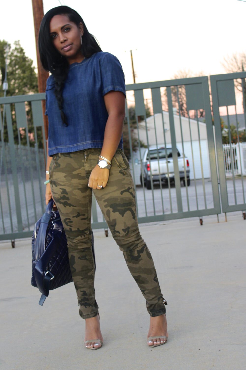
The Strategic Palette: Decoding Camouflage as a Brand Element
At its core, camouflage is a complex visual texture rather than a singular colour. Its inherent visual busy-ness demands thoughtful consideration for complementary hues. Brands leverage camo not just for its visual appeal but for the stories it tells and the emotions it evokes. Whether a traditional woodland green, a sandy desert pattern, or a futuristic digital print, each variation comes with its own set of intrinsic associations. The challenge and opportunity lie in harnessing these pre-existing perceptions and guiding them with intelligent colour pairings.
When integrating camouflage into a brand’s visual language, designers must first identify the core message they wish to convey. Is it utility and authenticity for an outdoor gear company? Is it rebellious sophistication for a fashion label? Or is it playful adventure for a children’s brand? Each objective dictates a different approach to colour pairing. The wrong colour can dilute camo’s power, create visual dissonance, or worse, send conflicting brand signals. Conversely, the right palette can amplify its strengths, refine its message, and position the brand effectively within its competitive landscape. It’s about translating the inherent qualities of camo into a coherent, compelling brand narrative, where colour acts as the primary storyteller alongside the pattern itself.
Harmonizing Hues: Classic and Contemporary Colour Pairings
The vast spectrum of colours offers endless possibilities for pairing with camouflage, each combination yielding a distinct impact on brand perception. From grounding neutrals to striking brights, the choice depends entirely on the desired brand personality and target audience.
The Power of Neutrals: Grounding Camouflage
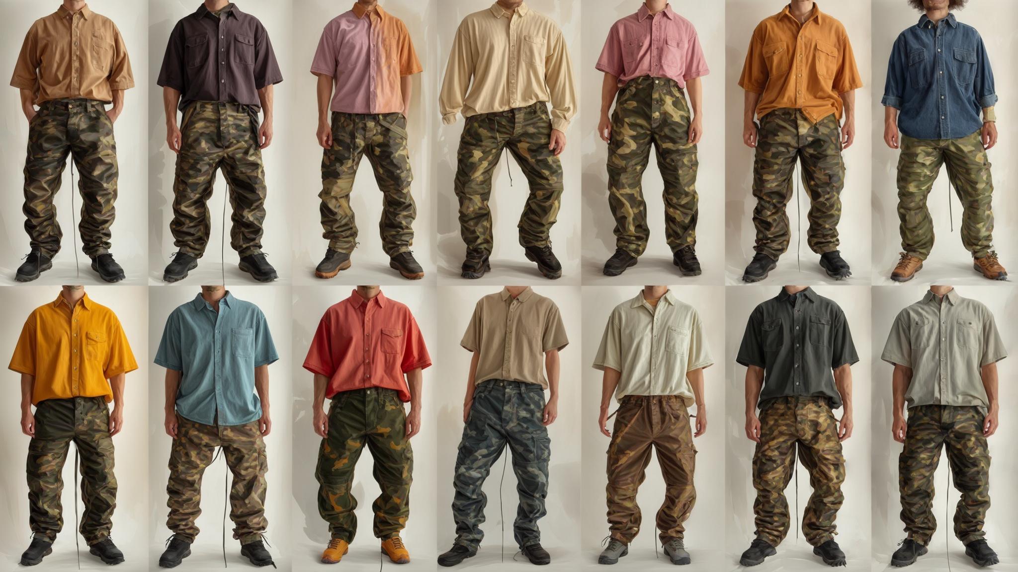
Neutrals are the safest, yet often most sophisticated, companions for camouflage. Colours like black, white, grey, and various shades of beige or stone provide a clean, uncluttered canvas that allows the complexity of camo to truly stand out without overwhelming the eye.
- Black: Paired with camo, black evokes a sense of authority, strength, and urban edge. It’s a classic combination often seen in streetwear and tactical apparel, conveying seriousness and understated power. Brands aiming for a sleek, modern, or premium feel often lean into this pairing, using black for accents, typography, or as a dominant background.
- White: White offers a stark contrast, bringing a sense of freshness, cleanliness, and modernity to camouflage. It lightens the often-heavy aesthetic of camo, making it feel more approachable and contemporary. This pairing can be particularly effective for brands looking to soften camo’s ruggedness or inject a minimalist appeal into their design.
- Grey: Grey acts as a sophisticated bridge between black and white, offering versatility. Lighter greys can mimic the effect of white, while darker charcoals provide a subtle depth similar to black. Grey makes camo feel grounded and mature, often used in professional or more refined brand contexts where the camo pattern is an accent rather than the main feature.
- Earth Tones (Beige, Olive, Khaki): These natural hues extend the inherent aesthetic of traditional camouflage, creating a cohesive, organic look. This pairing reinforces themes of nature, authenticity, and utility, making it ideal for outdoor, adventure, or heritage brands. The result is a seamless integration that feels natural and unforced.
Bold Statements: Vibrant Accents and Contrast
For brands seeking to make a more dynamic statement, introducing vibrant colours can inject energy, playfulness, or a contemporary edge into camouflage. This approach often involves using the bold colour as an accent rather than a primary pairing.
- Bright Orange/Red: These colours demand attention. When paired with camo, they create a high-contrast, high-visibility effect, often used to signify safety (e.g., hunting gear) or to inject a sporty, energetic vibe. For fashion or lifestyle brands, a pop of neon orange or electric red can transform camo from rugged to rebellious or fashion-forward. It suggests confidence and a willingness to stand out.
- Electric Blue/Teal: Cooler brights like electric blue or vibrant teal can lend a modern, tech-inspired feel to camouflage. This unexpected pairing creates an intriguing tension between organic patterns and synthetic hues, appealing to brands that want to position themselves as innovative, futuristic, or connected to digital culture. It can also evoke a sense of adventure, particularly in water sports or exploration.
- Vivid Yellow/Lime Green: These optimistic and energetic colours can inject a playful, youthful spirit into camouflage. While less common, they can be strategically used by brands targeting younger demographics or those aiming for a whimsical, adventurous appeal. The contrast is sharp and memorable, ensuring the brand captures attention.
Metallic Touches: Modernizing the Classic
The addition of metallic colours like gold, silver, or bronze introduces a layer of luxury, sophistication, or futurism to camouflage. This pairing is less about blending and more about elevating and contrasting textures.
- Gold/Bronze: Paired with traditional green camo, gold or bronze accents can signify premium quality, heritage, or a celebratory spirit. This works well for luxury brands, limited editions, or those seeking to infuse their rugged aesthetic with a touch of elegance.
- Silver/Chrome: Silver or chrome elements, particularly with urban or digital camo patterns, create a sleek, futuristic, and high-tech impression. This is often seen in modern design, automotive branding, or products aiming for a cutting-edge appeal, blending natural concealment with technological advancement.
Beyond Aesthetics: The Psychological Impact of Camo Color Combinations
The power of colour in branding extends far beyond visual appeal; it deeply influences consumer psychology, perception, and brand association. When combined with camouflage, these psychological effects are amplified, directly impacting a brand’s ability to communicate its core values and connect with its target audience.
Trust and Authority: Professional Applications
For brands operating in professional, tactical, or even corporate environments (where an element of ruggedness or resilience is valued), careful colour pairing with camo can build trust and convey authority.
- Camo with Deep Blues or Forest Greens: When traditional green or desert camo is paired with deep, solid blues or additional forest greens, it reinforces associations with nature, trustworthiness, and stability. This is often seen in branding for outdoor equipment, conservation efforts, or even government-affiliated services, where the visual language needs to convey reliability and environmental consciousness. The blues can suggest honesty and professionalism, while the greens ground the brand in authenticity.
- Camo with Muted Greys or Blacks: As discussed, black and grey impart a sense of seriousness and professionalism. In contexts where camo is used to suggest preparedness or a ‘no-nonsense’ attitude (e.g., security services, survival gear, or even certain automotive brands), these dark neutrals lend gravitas and an undeniable sense of authority. They strip away any frivolous connotations, focusing on function and resilience.
Adventure and Freedom: Lifestyle Branding
Many brands leverage camouflage to evoke feelings of adventure, freedom, and an active lifestyle. The accompanying colours play a crucial role in enhancing these emotional connections.
- Camo with Sun-kissed Oranges or Sky Blues: For brands targeting explorers, travellers, or outdoor enthusiasts, pairing camo with warm, inviting colours like oranges (reminiscent of sunsets or campfires) or bright sky blues (suggesting open spaces and clear skies) can evoke a powerful sense of wanderlust and joy. These combinations foster a feeling of optimism and exhilaration, perfectly aligning with brands promoting exploration, recreation, or travel.
- Camo with Earthy Reds or Browns: These colours deepen the connection to the natural world, reinforcing the authenticity and grounding aspects of adventure. Brands focused on rugged outdoor pursuits, traditional crafts, or sustainable living can use these pairings to communicate a deep respect for nature and a commitment to enduring quality.
Exclusivity and Edge: Fashion and Youth Markets
In fashion and youth markets, camouflage is often a statement of individuality, rebellion, or edgy sophistication. The right colour pairings can significantly enhance this perception of exclusivity and forward-thinking style.
- Camo with Metallics (Gold, Silver) or Deep Jewel Tones (Emerald, Sapphire): These combinations elevate camo from its utilitarian roots to a realm of luxury and uniqueness. A flash of gold against a dark camo print or an accessory in a deep jewel tone signals premium status and a discerning taste. This strategy is employed by high-fashion brands that want to infuse military aesthetics with opulence, appealing to consumers who seek distinctive, high-value items.
- Camo with Neons or Iridescents: For brands aiming to capture a youthful, avant-garde, or streetwear audience, neon colours or iridescent finishes can transform camo into something entirely unexpected and fresh. This bold contrast communicates a playful defiance, a trend-setting attitude, and an embrace of the unconventional. It’s about breaking norms and creating a visual language that resonates with those who value individuality and cutting-edge style.
Application Across Identities: From Corporate to Personal Branding
Understanding which colours pair effectively with camouflage is invaluable for a broad spectrum of branding applications, from designing corporate identities to crafting a compelling personal brand. The principles remain consistent: clarity of message, target audience consideration, and visual harmony.
Corporate Identity: Product Design and Marketing
For businesses, integrating camouflage and complementary colours into their corporate identity requires strategic foresight. A brand dealing in hunting equipment, for instance, might pair traditional green camo with safety orange for visibility and functionality, while a luxury fashion brand might use urban camo with sleek black or metallic accents to convey sophistication. Automotive brands could use digital camo in grey tones with silver trim to suggest advanced engineering and rugged capability. The choice influences packaging design, advertising campaigns, website aesthetics, and even retail environments. Each element contributes to a cohesive brand experience that reinforces the desired attributes, whether they are rugged durability, cutting-edge style, or adventurous spirit. Marketing materials should consistently reflect these chosen palettes to build strong, recognisable brand equity.
Personal Branding: Wardrobe, Accessories, and Online Presence
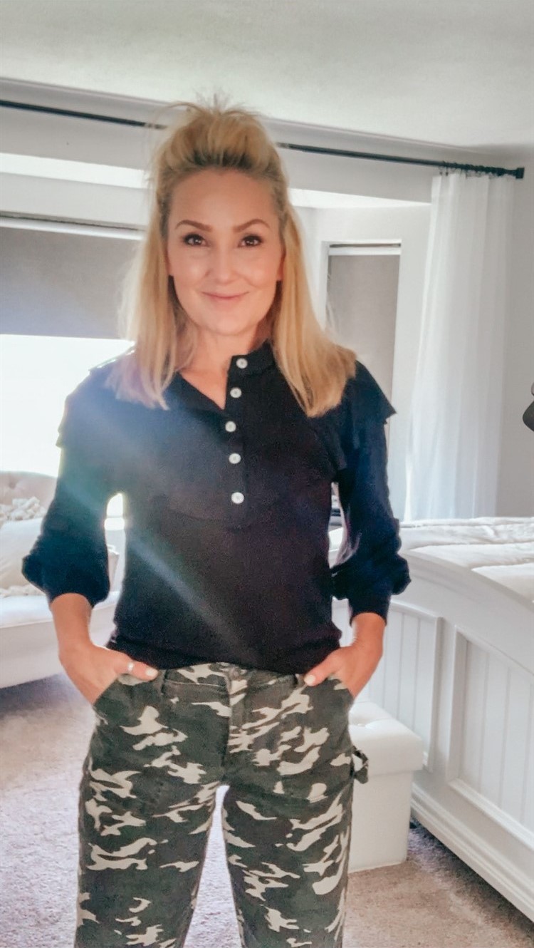
Beyond corporate entities, individuals can also leverage these colour pairing principles for personal branding. Whether curating a professional image or expressing personal style, how one incorporates camouflage and accompanying colours sends distinct signals. For someone in a creative field, pairing camo with a vibrant accent colour might communicate a unique, bold personality. In contrast, someone aiming for a more grounded, approachable personal brand might opt for camo paired with earthy neutrals. In professional settings, a subtle camo accessory paired with a classic solid colour outfit can convey an interesting blend of strength and sophistication. Even in online presence, choosing a camo-inspired background for social media profiles, juxtaposed with specific accent colours in avatars or banner designs, can strategically align one’s digital persona with desired traits like adventure, resilience, or innovative thinking. The key is intentionality: every colour choice contributes to the narrative of who you are and what you represent.
aViewFromTheCave is a participant in the Amazon Services LLC Associates Program, an affiliate advertising program designed to provide a means for sites to earn advertising fees by advertising and linking to Amazon.com. Amazon, the Amazon logo, AmazonSupply, and the AmazonSupply logo are trademarks of Amazon.com, Inc. or its affiliates. As an Amazon Associate we earn affiliate commissions from qualifying purchases.