The seemingly simple question of “What color is bisque?” belies a nuanced understanding of color perception, psychology, and, most importantly, its strategic application within the realm of branding. Bisque, a term often associated with a warm, off-white, or pale brownish-pink hue, is far more than just a shade; it’s a feeling, a texture, and a carefully chosen element in a brand’s visual identity. In the competitive landscape of modern business, understanding the subtle power of colors like bisque can be the difference between a forgettable presence and a resonant connection with a target audience. This article will explore the multifaceted nature of bisque, not just as a color, but as a potent tool in the brand strategist’s arsenal.

The Sensory and Psychological Landscape of Bisque
Bisque is not a color that shouts; it whispers. Its subtlety is its strength, drawing on associations that are deeply ingrained in human experience. To truly grasp its brand potential, we must first understand its inherent qualities and the psychological responses they evoke.
Defining the Bisque Palette: Beyond a Single Shade
The term “bisque” itself originates from the ceramic arts, referring to unglazed, fired clay. This origin imbues the color with associations of earthiness, natural materials, and a raw, yet refined, aesthetic. However, in common parlance and design applications, bisque encompasses a spectrum.
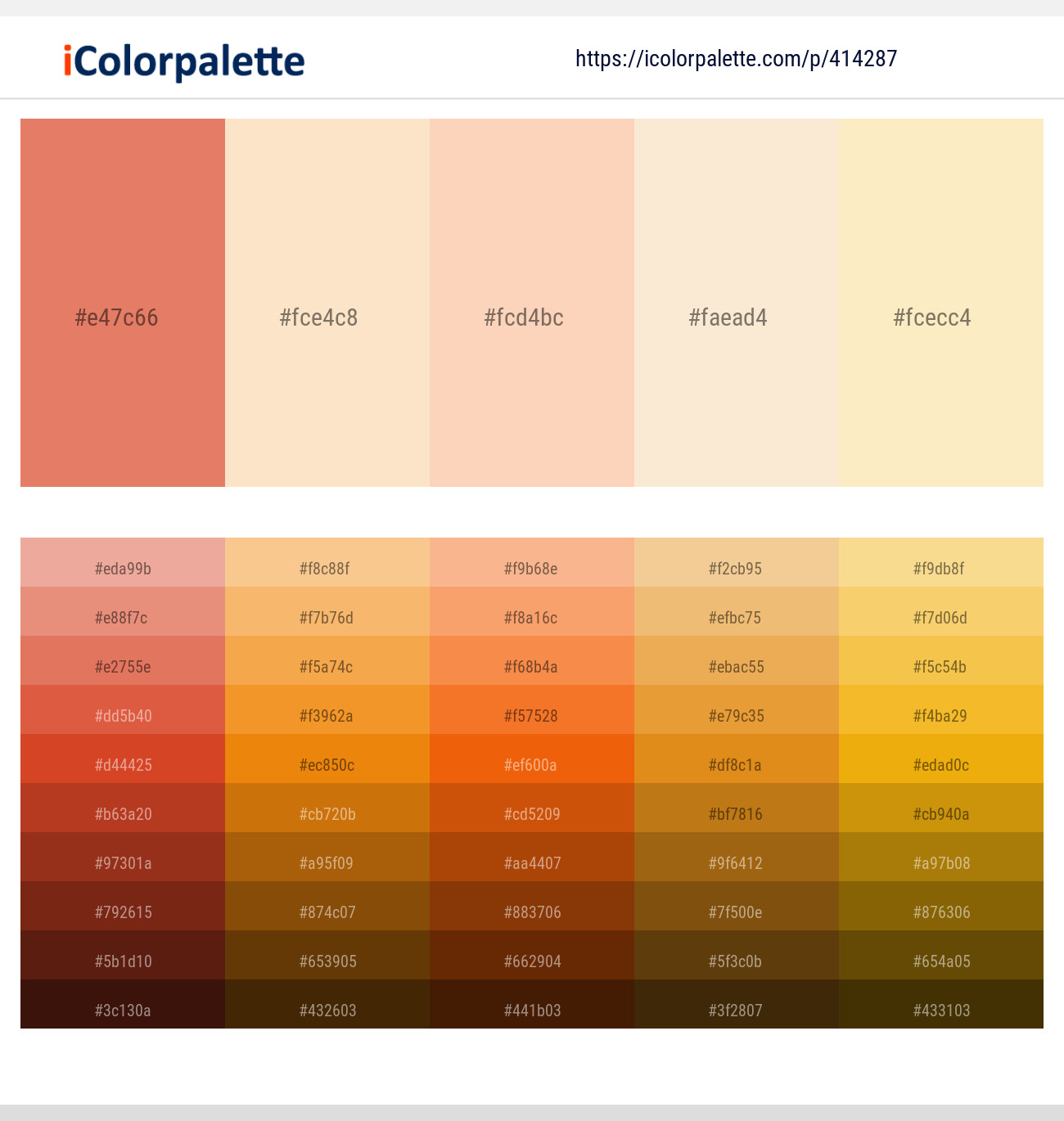
- The Core Hue: At its heart, bisque is an off-white. It’s a departure from stark, sterile whites, offering a softer, warmer alternative. Think of the delicate blush on porcelain, or the subtle undertones in fine linen. It often carries hints of beige, cream, or even a very faint, muted pink or peach. The precise shade can vary depending on lighting, context, and the specific brand’s interpretation.
- Subtle Variations and Undertones: The beauty of bisque lies in its adaptability. A bisque with stronger beige undertones might evoke feelings of comfort, tradition, and reliability. Conversely, a bisque with a more pronounced pink or peachy nuance can suggest warmth, gentleness, nurturing, and even a touch of luxury or romance. This fluidity allows brands to fine-tune the emotional resonance of their visual identity.
- Perception and Context: It’s crucial to remember that color perception is subjective and influenced by context. What appears as bisque on a screen might translate slightly differently in print. Furthermore, the colors it is paired with will significantly alter its perceived warmth or coolness. When surrounded by cool blues, bisque will appear warmer; when placed alongside vibrant reds, it might lean towards a cooler, more neutral tone.
The Emotional Resonance of Bisque: A Brand’s Emotional Currency
Colors are powerful communicators of emotion, and bisque, with its inherent softness and warmth, taps into a range of desirable brand attributes. Understanding these psychological connections is paramount for any brand aiming to evoke specific feelings in its audience.
- Comfort and Serenity: The gentle, understated nature of bisque promotes a sense of calm and relaxation. It’s a color that doesn’t demand attention but rather invites it. This makes it ideal for brands seeking to convey a sense of peace, tranquility, and an escape from the chaos of daily life.
- Elegance and Sophistication: While not overtly opulent, bisque possesses an inherent elegance. It speaks of good taste, refinement, and understated luxury. It suggests a brand that is confident in its quality and doesn’t need ostentatious displays. Think of high-end skincare, artisanal home goods, or classic fashion.
- Naturalness and Authenticity: The connection to natural materials and the earth lends bisque an aura of authenticity and genuineness. Brands that champion natural ingredients, ethical sourcing, or a connection to the environment often find bisque to be a perfect visual descriptor of their values.
- Nurturing and Care: The subtle warmth and gentle undertones of bisque can evoke feelings of care, empathy, and nurturing. This makes it a suitable choice for brands in the healthcare, wellness, or childcare sectors, where trust and a sense of well-being are paramount.
Bisque in Action: Strategic Brand Implementations
The theoretical understanding of bisque’s qualities is only the first step. Its true power lies in its strategic application across various brand touchpoints. From logos and packaging to website design and marketing collateral, bisque can be a subtle yet impactful element that shapes consumer perception.
Logo and Visual Identity Design: The First Impression
A brand’s logo is often the initial point of contact for consumers. The color choices within a logo are critical for establishing an immediate emotional connection and conveying brand personality.
- Subtle Sophistication: When used in a logo, bisque can lend an air of understated elegance and timeless appeal. It avoids the harshness of bright colors and the potential for being overlooked in favor of bolder hues. This is particularly effective for luxury brands, heritage companies, or those aiming for a sophisticated, minimalist aesthetic.
- Creating a Soft Foundation: Bisque can serve as a grounding color, providing a warm and inviting base that allows other brand elements, such as typography or accent colors, to stand out without feeling jarring. This creates a harmonious and balanced visual identity.
- Versatility in Application: Bisque logos can be remarkably versatile. They can appear subtly on dark backgrounds, offering a sophisticated contrast, or blend seamlessly with lighter backgrounds, creating a cohesive and airy feel. This adaptability ensures the logo remains effective across diverse applications, from business cards to large-scale signage.
- Examples of Strategic Use: Consider brands in the wellness sector that use bisque to evoke a sense of natural healing and calm, or artisanal food producers who employ it to suggest handcrafted quality and wholesome ingredients. The choice of bisque in these instances is not accidental; it’s a deliberate decision to communicate specific brand values.
Packaging and Product Design: The Tangible Brand Experience
For many consumers, packaging is the most direct physical manifestation of a brand. The color of a product’s packaging plays a significant role in its perceived value, quality, and appeal on the shelf.
- Elevating Perceived Value: In the realm of premium goods, especially in cosmetics, skincare, and gourmet food, bisque is often employed to signify luxury and high quality. It suggests an artisanal approach, natural ingredients, and a refined sensory experience. Brands that choose bisque for their packaging are often aiming to convey a sense of exclusivity and sophisticated indulgence.
- Communicating Naturalism and Purity: For brands focused on organic, natural, or ethically sourced products, bisque is a natural fit. It conjures images of raw materials, earthy tones, and a commitment to simple, unadulterated goodness. This resonates strongly with consumers who prioritize health, sustainability, and transparency.
- Creating a “Soft Sell”: Unlike vibrant colors that can feel aggressive or demanding, bisque offers a gentle invitation. It encourages closer inspection and a more considered interaction with the product. This “soft sell” approach can be particularly effective for products that require a degree of trust and personal connection.
- Balancing Aesthetics and Information: Bisque provides an excellent canvas for typography and other design elements. Its neutral yet warm character ensures that product information, brand names, and other visual cues are legible and aesthetically pleasing without competing with the overall mood.
Digital Presence and User Experience: The Online Realm
In the digital age, a brand’s website, social media, and app interfaces are critical touchpoints. The strategic use of color in these digital environments can profoundly influence user engagement and brand perception.
- Establishing a Welcoming Atmosphere: Websites and apps that utilize bisque as a primary or secondary color tend to feel more inviting and less overwhelming. This is especially important for platforms that offer complex information or services, as a calming color palette can reduce cognitive load and improve the overall user experience.
- Enhancing Readability and Focus: Bisque’s subtle nature makes it an excellent background color for text. It offers a softer alternative to pure white, which can sometimes be too stark for prolonged viewing. This can lead to improved readability and allow users to focus more effectively on the content.
- Conveying Trust and Professionalism: In sectors like finance, healthcare, or consulting, where trust and professionalism are paramount, bisque can be used to build credibility. It projects an image of stability, reliability, and a measured approach, which are essential qualities for these industries.
- Strategic Accentuation: While often used as a background, bisque can also serve as a sophisticated accent color. When used sparingly, it can highlight key calls to action or important information without appearing overly flashy, maintaining the brand’s overall sense of refinement.
The Psychology of Association: Bisque in Different Industries
The effectiveness of bisque as a brand color is further amplified by its inherent associations, which lend themselves particularly well to certain industries. Understanding these industry-specific connections can inform more targeted and impactful branding strategies.
Wellness and Natural Products: The Embrace of Purity
For brands in the wellness, health, and natural product sectors, bisque is a near-perfect thematic fit. Its inherent qualities align directly with the core values these brands aim to communicate.
- Evoking Natural Ingredients: Bisque is strongly associated with natural elements like unbleached cotton, linen, and the subtle tones of earth. This makes it an ideal choice for brands that emphasize organic ingredients, plant-based formulations, and a holistic approach to well-being.
- Promoting Calm and Serenity: The gentle, soothing nature of bisque contributes to an atmosphere of peace and relaxation. This is crucial for wellness brands that aim to help consumers de-stress, find balance, and nurture their physical and mental health.
- Building Trust and Authenticity: In a market often saturated with synthetic products, bisque can signal a brand’s commitment to authenticity and transparency. It suggests a straightforward, honest approach, which is highly valued by health-conscious consumers.
- A Subtle Hint of Luxury: Even within the natural product space, bisque can elevate a brand by imbuing it with a sense of understated luxury. This can differentiate a product from competitors and appeal to consumers seeking premium, natural options.
Luxury Goods and Artisanal Crafts: The Mark of Refined Taste
The world of luxury goods and artisanal crafts often relies on subtlety and understated elegance to convey quality and exclusivity. Bisque excels in this domain.
- Understated Opulence: Bisque is the color of quiet confidence. It communicates a level of sophistication that doesn’t need to be loud. For luxury brands, this translates to an appreciation for fine materials, meticulous craftsmanship, and timeless design.
- Timeless Appeal: Unlike trendy colors that can quickly feel dated, bisque possesses a timeless quality. Brands that choose bisque often aim for longevity and a classic aesthetic that transcends fleeting fashion cycles.
- Highlighting Craftsmanship: The neutral yet warm tones of bisque serve as an excellent backdrop for showcasing the intricate details of artisanal products. It allows the texture, form, and inherent beauty of the product itself to take center stage.
- Creating a Sense of Exclusivity: The subtle nature of bisque can also create an air of exclusivity. It appeals to a discerning clientele who appreciate nuanced beauty and are not swayed by ostentatious displays.
Home Décor and Interior Design: Creating Inviting Spaces
In the realm of home décor and interior design, bisque is a staple for creating warm, inviting, and sophisticated living spaces. Its application in branding within this sector is a direct reflection of these design principles.
- The Foundation of a Welcoming Home: Bisque is often used as a wall color, upholstery, or accent in home décor because it creates a sense of warmth and comfort. Brands that align with these values can leverage bisque to communicate a feeling of home, sanctuary, and personal expression.
- Versatility in Styling: Bisque is a highly versatile neutral that pairs well with a wide range of other colors and textures. This adaptability makes it an excellent choice for brands in the home sector, as it can be integrated into diverse design aesthetics, from minimalist to bohemian.
- Suggesting Quality and Durability: Similar to its application in product packaging, bisque in home décor branding can suggest quality materials and lasting appeal. Think of furniture brands or fabric manufacturers using bisque to convey the enduring beauty and craftsmanship of their offerings.
- A Touch of Refined Simplicity: For brands that champion simplicity and elegant functionality, bisque is a natural choice. It communicates a sense of order and calm, creating an aspirational yet attainable vision of an aesthetically pleasing living space.

Conclusion: The Enduring Power of Bisque in Brand Strategy
The question “What color is bisque?” is an invitation to explore a world of subtle power, nuanced emotion, and strategic branding. Far from being a simple off-white, bisque is a complex hue that, when wielded with intent, can profoundly shape consumer perception and forge deep connections with an audience. Its inherent qualities of warmth, elegance, naturalness, and serenity make it a versatile and potent tool for brands across a spectrum of industries.
From the initial logo impression to the tangible experience of packaging and the immersive journey of a digital presence, bisque offers a sophisticated and memorable pathway to communicating brand values. As brands continue to navigate an increasingly crowded marketplace, understanding and strategically employing colors like bisque will remain a critical differentiator, allowing them to resonate with their target audiences on a deeper, more emotional level, and ultimately, build a lasting and meaningful brand identity. The subtle whisper of bisque, when strategically deployed, can indeed speak volumes.
aViewFromTheCave is a participant in the Amazon Services LLC Associates Program, an affiliate advertising program designed to provide a means for sites to earn advertising fees by advertising and linking to Amazon.com. Amazon, the Amazon logo, AmazonSupply, and the AmazonSupply logo are trademarks of Amazon.com, Inc. or its affiliates. As an Amazon Associate we earn affiliate commissions from qualifying purchases.