
In the competitive landscape of visual communication, color serves as the silent ambassador of a brand. Among the vast spectrum of available hues, few carry the historical weight, psychological depth, and immediate recognition of emerald. To answer the question “what colour is a emerald” is to delve into more than just a wavelength of light or a hex code; it is an exploration of prestige, vitality, and the strategic application of one of the most evocative shades in brand design.
The Anatomy of Emerald: Defining the Hue of Luxury
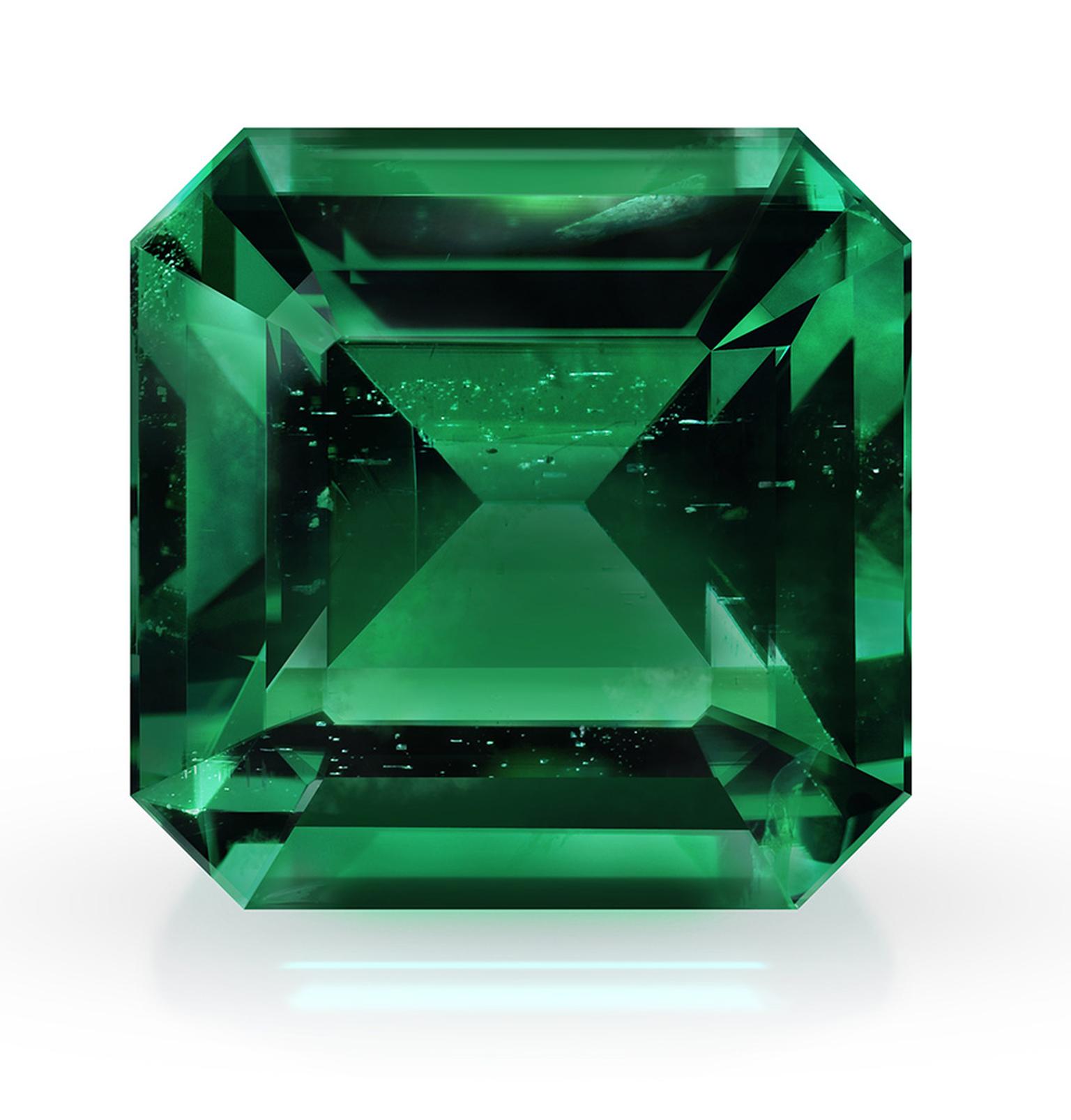
From a purely technical standpoint, emerald is a vivid, deep green with distinct blue undertones. Unlike the “grass green” associated with casual outdoor brands or the “olive green” often used in military and utilitarian contexts, emerald occupies a unique space in the color wheel. It is a saturated hue that balances the warmth of yellow-based greens with the cooling stability of blue.

The Spectrum of Green: Where Emerald Sits
In the world of branding, distinguishing between similar shades is crucial for maintaining a unique identity. Emerald is often confused with “Forest Green” or “Kelly Green,” but the differences are strategically significant. Forest green is darker and more muted, evoking traditionalism and the outdoors. Kelly green is brighter and more yellow, suggesting energy and playfulness. Emerald, however, maintains a level of saturation and depth that signals “prestige.” It is the colour of the rare, the refined, and the meticulously crafted.
Technical Standardization in Brand Design
For a brand to “own” a color, consistency across digital and physical mediums is mandatory. In the digital space, the classic emerald is often represented by Hex code #50C878. However, luxury brands often lean into slightly deeper variations, such as #046307 or #00853E.
When translating these to physical products—packaging, signage, or high-end collateral—designers rely on the Pantone Matching System (PMS). Pantone 17-5641 TCX, named “Emerald,” was famously selected as the Color of the Year in 2013, solidifying its place as a staple in modern corporate identity. For a brand manager, defining the “emerald” of their brand involves selecting a specific point on the gamut that remains legible on a smartphone screen while retaining its richness on a velvet-lined jewelry box.
The Psychology of Emerald: What the Colour Communicates
Color psychology is the backbone of brand strategy. When a consumer sees emerald, their brain processes a series of evolutionary and social cues. Understanding these responses allows brand architects to build trust and desire without saying a word.
Wealth and Financial Stability
Historically, emeralds have been synonymous with royalty and extreme wealth. In modern branding, this translates to financial stability and premium positioning. When a brand chooses emerald as its primary color, it is often making an implicit promise of value and longevity. This is why many financial institutions and high-end investment firms utilize shades of emerald; it suggests that the client’s wealth will not only be protected but will “grow” like lush vegetation.
Growth, Renewal, and Vitality
Because green is the dominant color of the natural world, emerald is inextricably linked to life and renewal. However, unlike a pale mint which might suggest new, fragile growth, emerald represents a mature, thriving ecosystem. For brands in the wellness, organic, or sustainability sectors, emerald serves as a signal of “premium health.” It moves beyond the basic “eco-friendly” look to suggest a sophisticated, high-performance approach to nature.
The Emotional Balance of Blue and Green
The “secret sauce” of emerald is its blue undertone. Green is generally perceived as calming, while blue is perceived as trustworthy and professional. By combining these, emerald provides a sense of “refreshing stability.” It is more energetic than a standard corporate navy but more serious than a bright lime. This balance is ideal for brands that want to appear innovative yet grounded.
Strategic Implementation: Incorporating Emerald into Brand Identity
Choosing a color is only the first step; the second is knowing how to deploy it within a visual hierarchy. Emerald is a high-impact color, meaning its use must be intentional and measured.
Primary vs. Accent Usage
In brand strategy, emerald can function as either a cornerstone or a highlight. When used as a primary brand color (the dominant hue in a logo or website), it creates a bold, immersive experience. It demands attention and sets a high-end tone immediately.
Conversely, using emerald as an accent color—on “Call to Action” buttons, icons, or high-end packaging details—allows a brand to inject a sense of luxury into a more neutral palette. For example, a brand with a minimalist black-and-white aesthetic can use emerald accents to signal premium features or exclusive memberships.
Color Pairings and Contrast
The effectiveness of emerald is dictated by its surroundings. To maximize its impact, brand designers often pair it with:
- Gold or Brass: This is the quintessential luxury pairing. It leans into the gemstone heritage and suggests opulence.
- Crisp White: This provides a modern, “clinical” luxury feel, often seen in high-end skincare or boutique hospitality.
- Deep Charcoal or Black: This creates a moody, sophisticated atmosphere suitable for nightlife brands or premium technology products.
- Soft Pinks or Corals: For modern, consumer-facing brands, pairing emerald with its near-complementary colors creates a vibrant, high-fashion look that appeals to younger, design-conscious demographics.
Iconic Emeralds: Lessons from Global Market Leaders
To understand how emerald functions at the highest levels of commerce, we look to the brands that have successfully integrated the shade into their corporate DNA. These case studies demonstrate that emerald is more than a choice—it is a strategic asset.
The Rolex Influence: Precision and Prestige
Perhaps no brand is more closely associated with a specific shade of green than Rolex. While their “Rolex Green” fluctuates slightly across different models and packaging eras, it consistently sits within the emerald and hunter spectrum. For Rolex, the color signifies more than just luxury; it represents the “Gold Standard” of horology. The emerald box is as much a part of the product’s value as the watch itself, illustrating how a color can become a “hallmark” of authenticity and quality.
Bottega Veneta and the “Parakeet” Shift
While Bottega Veneta popularized a much brighter “Parakeet Green,” its success highlights a broader trend: the elevation of green in the high-fashion world. Many boutique brands have followed suit by moving toward deeper, more “emerald” tones to distance themselves from the fleeting trends of fast fashion. By adopting a rich emerald, these brands signal that they are “investment pieces” rather than disposable goods.
The Digital Frontier: Emerald in UI/UX
In the tech world, emerald is increasingly used to denote “success” and “security.” FinTech apps often use emerald for “Balance” screens or “Transaction Complete” notifications. The color’s inherent link to wealth and growth makes it the perfect psychological anchor for users managing their money digitally. It provides a sense of reassurance that a “neon green” simply cannot achieve.
The Future of Emerald in Design and Marketing
As we move toward an era defined by digital sustainability and the “Quiet Luxury” movement, the role of emerald is evolving. It is no longer just a color of the past; it is a color of the future.
Sustainability and the “Green” Transition
As global brands shift toward more sustainable business models, the visual language of “green” is becoming crowded. To stand out, brands are moving away from the “recycled paper” aesthetic of light browns and muted greens toward the “lush” aesthetic of emerald. This transition suggests that being sustainable doesn’t mean sacrificing luxury or performance. It positions “Green Tech” as a premium, high-status category.
Emerald in the Metaverse and Digital Spaces
With the rise of high-fidelity digital environments, the way we perceive color is changing. Emerald, with its depth and ability to interact with virtual light sources, is a favorite for designers creating luxury digital assets. Whether it is a digital twin of a gemstone or the interface of a high-end virtual bank, emerald provides a “tactile” feel in a weightless environment.
Conclusion: The Strategic Power of a Gemstone Hue
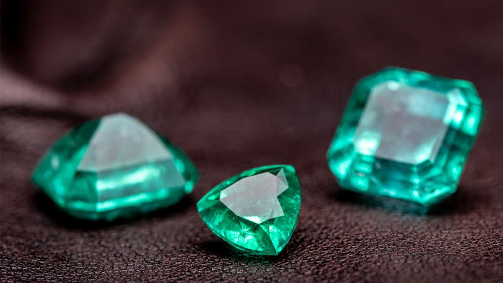
When a brand asks “what colour is a emerald,” they are really asking how to communicate value, trust, and growth through a single visual touchpoint. Emerald is not just a shade of green; it is a psychological tool that, when used correctly, elevates a brand from the mundane to the exceptional. In an increasingly noisy marketplace, the deep, resonant clarity of emerald offers a sanctuary of prestige—a visual promise that the brand is as enduring and valuable as the gemstone that shares its name.
aViewFromTheCave is a participant in the Amazon Services LLC Associates Program, an affiliate advertising program designed to provide a means for sites to earn advertising fees by advertising and linking to Amazon.com. Amazon, the Amazon logo, AmazonSupply, and the AmazonSupply logo are trademarks of Amazon.com, Inc. or its affiliates. As an Amazon Associate we earn affiliate commissions from qualifying purchases.