
In the realm of brand identity and corporate design, color is far more than an aesthetic choice; it is a psychological tool and a strategic asset. When a creative director or brand strategist asks what colors you mix to make brown, they are rarely looking for a simple primary-school answer. Instead, they are exploring the nuances of color theory, the technicalities of pigment versus light, and the emotional resonance of “earth tones” in a saturated marketplace.
Brown is a complex, composite color. In the world of branding, it represents stability, reliability, and heritage. Whether it is the deep mahogany of a luxury leather goods brand or the warm tan of an organic skincare line, understanding the technical composition of brown is essential for maintaining brand consistency across digital and physical touchpoints.
The Technical Foundation: Mixing the Perfect Corporate Brown
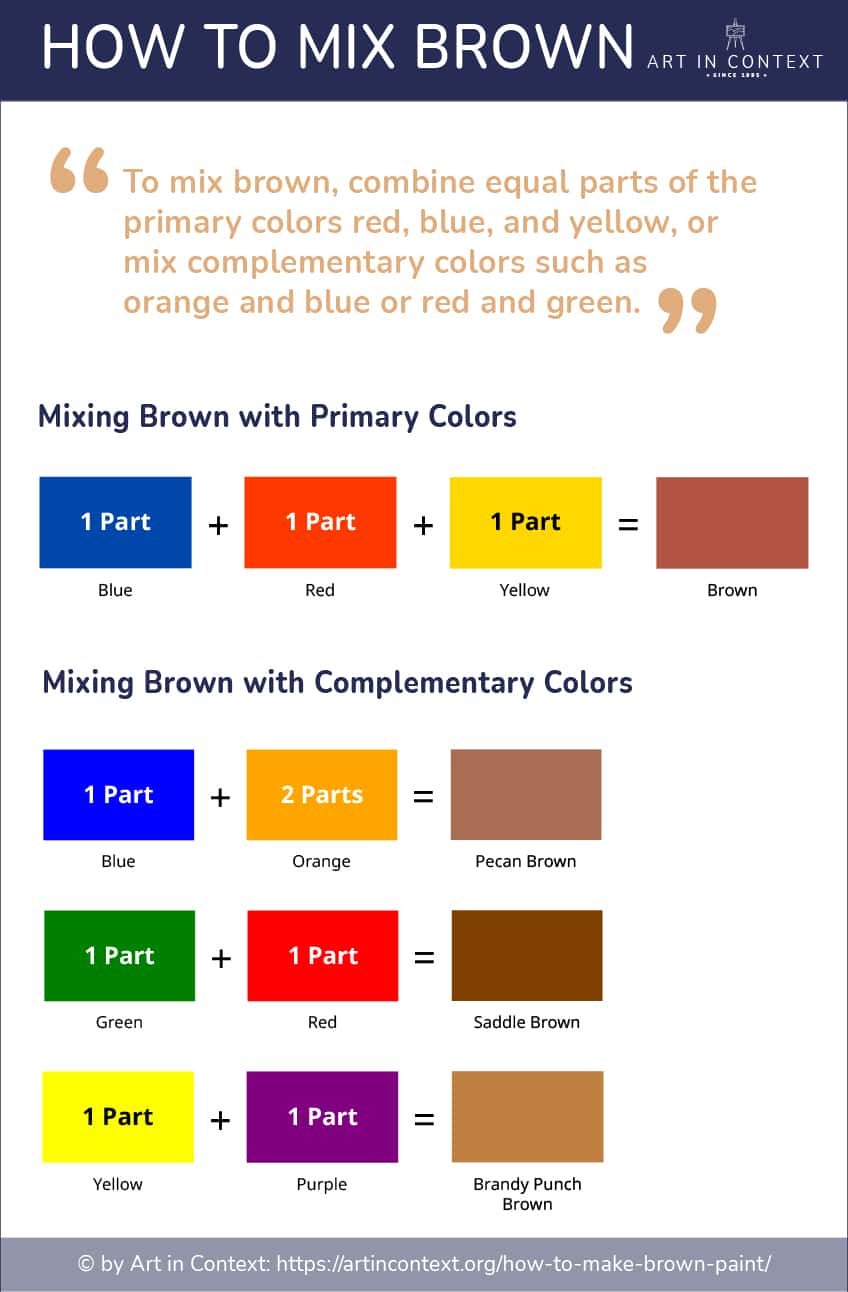
To understand how to create brown, one must first master the color wheel. Unlike primary colors, brown is created by mixing multiple hues. In a professional design context, there are three primary ways to achieve a balanced brown, each yielding a different “temperature” and emotional impact.
Using Complementary Colors
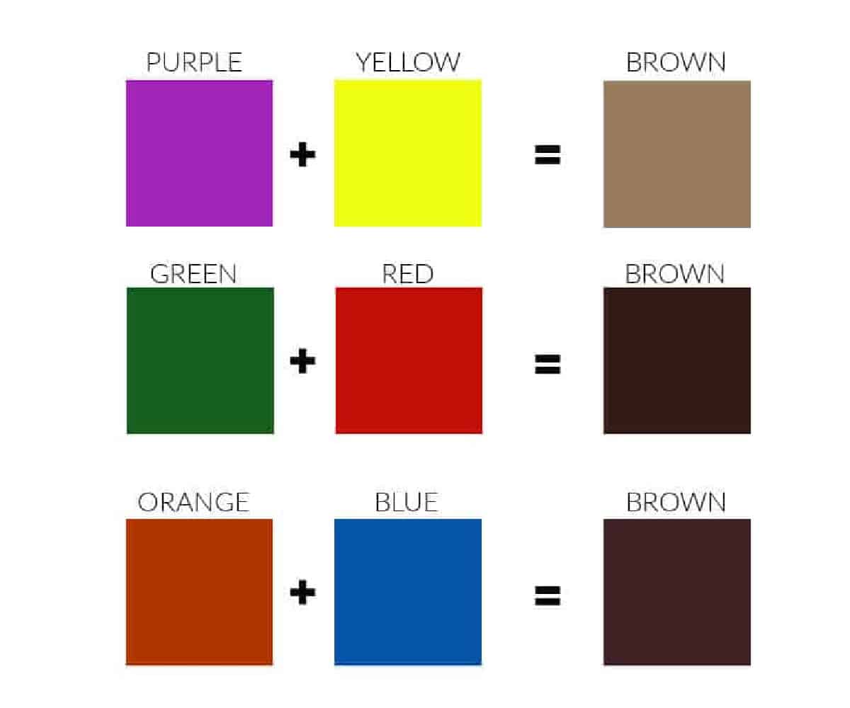
The most efficient way to mix brown is to combine two complementary colors—hues that sit opposite each other on the color wheel. When these opposites are mixed, they neutralize one another, resulting in various shades of brown.
- Blue and Orange: This combination often results in a sophisticated, cooler brown. In branding, this mix is frequently used to create “slate browns” that feel modern and corporate.
- Red and Green: Mixing these two produces a traditional, warm, and earthy brown. This is the go-to combination for brands that want to emphasize natural origins or rustic charm.
- Yellow and Purple: This mix results in a more vibrant, golden-brown. It is often used in the food and beverage industry to evoke richness and luxury, such as in premium chocolate or coffee branding.
The Primary Color Triad
Another method involves mixing all three primary colors: red, yellow, and blue. By adjusting the ratios of these three, a designer can create an infinite spectrum of browns. Increasing the blue content makes the brown cooler and more professional, while increasing the red or yellow makes it feel more inviting and energetic.
Subtractive vs. Additive Mixing
Brand strategists must distinguish between CMYK (Cyan, Magenta, Yellow, and Key/Black) used in print and RGB (Red, Green, Blue) used in digital media.
- CMYK Mixing: In print, brown is achieved by layering inks. Precise control over these percentages is vital for a “Corporate Identity Manual” to ensure that a brand’s brown doesn’t look like “mud” when printed on different paper stocks.
- RGB Mixing: On screens, brown is an “orange of low intensity.” To make brown digitally, a designer manipulates light, mixing red and green while keeping the overall brightness low.
The Psychology of Brown in Brand Strategy
Once the technical mixing is understood, the strategist must determine why a brand would choose brown over more conventional colors like blue or red. In the landscape of corporate identity, brown is often the “undiscovered” hero. It offers a sense of grounding that few other colors can provide.
Reliability and Longevity
Brown is the color of the earth and wood. It evokes feelings of permanence and history. This is why heritage brands often lean into deep, rich browns. It signals to the consumer that the brand is not a “fly-by-night” operation but an established institution. For a brand like UPS, the “Pullman Brown” is more than just a color; it is a trademarked symbol of logistical reliability and “on-time” service.
Luxury and Sophistication
In the high-end fashion and lifestyle sector, brown is used to denote quality materials like leather, suede, and mahogany. It suggests a “quiet luxury” that avoids the flashiness of gold or the starkness of black. When mixed with cream or metallic accents, brown becomes a backdrop for premium positioning. Brands like Louis Vuitton have built global empires on a foundation of specific brown hues that communicate exclusivity and artisanal craftsmanship.
Organic and Sustainable Positioning
As consumer demand for eco-friendly and sustainable products grows, brown has become the shorthand for “natural.” From recycled packaging to organic food labels, various shades of khaki, tan, and terracotta are used to signal a brand’s commitment to the environment. Mixing a brown with a slight green undertone reinforces this connection to nature, making it a powerful tool for brands in the wellness and agriculture sectors.
Strategic Application: Maintaining Brand Consistency
Knowing what colors you mix to make brown is only half the battle; the other half is ensuring that the “Brand Brown” remains identical across every medium. This is where professional brand strategy intersects with technical execution.
Developing a Signature Palette
A brand should never have just one “brown.” Instead, a comprehensive brand book will define a primary brown alongside secondary and tertiary shades. This allows for depth in design.
- Primary Brown: The core logo color.
- Secondary Tan: Used for backgrounds or secondary graphic elements to keep the design from feeling too heavy.
- Accent Colors: Often a pop of color that cuts through the neutral brown, such as a vibrant turquoise or a warm orange, to draw the eye to “Call to Action” buttons.
The Role of Pantone Systems
To avoid the variations inherent in standard CMYK printing, professional brands utilize the Pantone Matching System (PMS). By selecting a specific Pantone spot color for their brown, a brand ensures that their business cards, product packaging, and storefront signage all match perfectly. This level of consistency is what separates amateur design from professional brand identity. When a customer sees the specific shade of brown associated with a brand, the recognition should be instantaneous.
Digital Accessibility and Readability
In digital branding, using brown requires careful attention to contrast ratios. Dark brown backgrounds with white text offer high readability, but lighter tans can often fail accessibility audits if the text color isn’t dark enough. Brand designers must test their mixed browns against Web Content Accessibility Guidelines (WCAG) to ensure the brand is inclusive and functional for all users.
Case Studies: Mastery of the Neutral Palette
To see the strategic use of brown in action, one can look at several global leaders who have turned a “basic” mixed color into a powerful brand asset.
The “Big Brown” Legacy (UPS)
United Parcel Service (UPS) famously used the slogan “What can Brown do for you?” This is a masterclass in brand strategy. By leaning into a color that many considered boring, they transformed it into a symbol of efficiency and “no-nonsense” service. Their brown is a specific, proprietary mix designed to look clean even when the trucks are covered in road dust—a practical and strategic choice.
Luxury Heritage (Hermès)
While Hermès is famous for its orange boxes, the brand relies heavily on deep browns and tans for its core product lines. The interaction between the vibrant orange and the stabilizing brown creates a brand identity that is both energetic and rooted in tradition. This mix allows the brand to feel modern while constantly referencing its origins as a harness workshop.
The Coffee Culture (Nespresso and Starbucks)
For the beverage industry, the color brown is intrinsic to the product. However, the way these brands “mix” their browns is different. Starbucks uses a dark, forest green paired with wood-toned browns to create a “third place” atmosphere that feels like a cozy library. Nespresso, on the other hand, uses metallic browns and deep chocolates to position coffee as a premium, high-tech experience.

Conclusion: Beyond the Mix
Asking what colors you mix to make brown opens the door to the entire world of brand design and visual strategy. It is a reminder that every element of a brand’s visual identity is a deliberate choice. Whether you are mixing red and green or adjusting HEX codes for a mobile app, the goal is the same: to create a visual language that communicates values, builds trust, and stands the test of time. In a world of fleeting trends and neon gradients, the strategic use of brown offers a grounded, sophisticated alternative that commands respect and ensures brand longevity.
aViewFromTheCave is a participant in the Amazon Services LLC Associates Program, an affiliate advertising program designed to provide a means for sites to earn advertising fees by advertising and linking to Amazon.com. Amazon, the Amazon logo, AmazonSupply, and the AmazonSupply logo are trademarks of Amazon.com, Inc. or its affiliates. As an Amazon Associate we earn affiliate commissions from qualifying purchases.