In the intricate world of brand identity, every color choice carries significant weight, influencing perception, emotion, and ultimately, consumer connection. Tan, a color often underestimated in its strategic potential, offers a unique blend of warmth, sophistication, and versatility. Understanding how to mix the perfect shade of tan is not merely an artistic endeavor; it’s a critical skill for designers and brand strategists aiming to craft resonant visual identities. This guide delves into the essence of tan, exploring its psychological impact, the foundational color theory required for its creation, and its effective application in diverse branding contexts.

The Psychology and Strategic Use of Tan in Branding
Tan, in its myriad variations from a light, creamy beige to a deep, earthy khaki, serves as a powerful yet subtle tool in a brand’s visual lexicon. Far from being bland, tan evokes a sense of naturalness, reliability, and understated elegance, making it a compelling choice for brands seeking to communicate authenticity and timelessness.
The Warmth and Versatility of Tan
Tan is intrinsically linked to natural elements—sand, earth, wood, and skin tones—imbuing it with an inherent sense of warmth and comfort. This connection to nature allows brands to tap into a primal sense of security and groundedness. Unlike more vibrant colors that demand immediate attention, tan offers a calming presence, allowing other elements of a brand’s design to shine without being overshadowed. Its versatility is unparalleled; it can act as a sophisticated primary color, a calming background, or a subtle accent, adapting seamlessly to various brand personalities and industries. From luxury fashion houses to organic food brands, the adaptive nature of tan enables a wide spectrum of visual expressions.
Brand Associations and Messaging
The strategic application of tan can profoundly influence brand associations and messaging. Brands aiming for an organic, sustainable, or eco-friendly image often gravitate towards tan due to its earthy connotations. It suggests natural ingredients, traditional craftsmanship, and a commitment to environmental stewardship. For high-end or luxury brands, a sophisticated tan palette can convey exclusivity, quality, and timeless elegance, often paired with metallics or deep jewel tones to enhance its richness. Minimalist brands frequently utilize tan for its clean, uncluttered aesthetic, communicating simplicity, functionality, and a focus on essentials. Moreover, in personal branding or corporate identity, tan can project dependability, approachability, and a sense of trust, fostering a stable and relatable image. The specific shade of tan also dictates its message: lighter tans suggest freshness and openness, while deeper, richer tans can convey heritage and gravitas.
Understanding Color Theory: The Foundation of Mixing Tan
To master the art of mixing tan, a solid grasp of fundamental color theory is indispensable. This knowledge empowers designers to move beyond guesswork, enabling precise and intentional color creation, whether for digital interfaces or physical packaging.
Primary and Secondary Colors Revisited
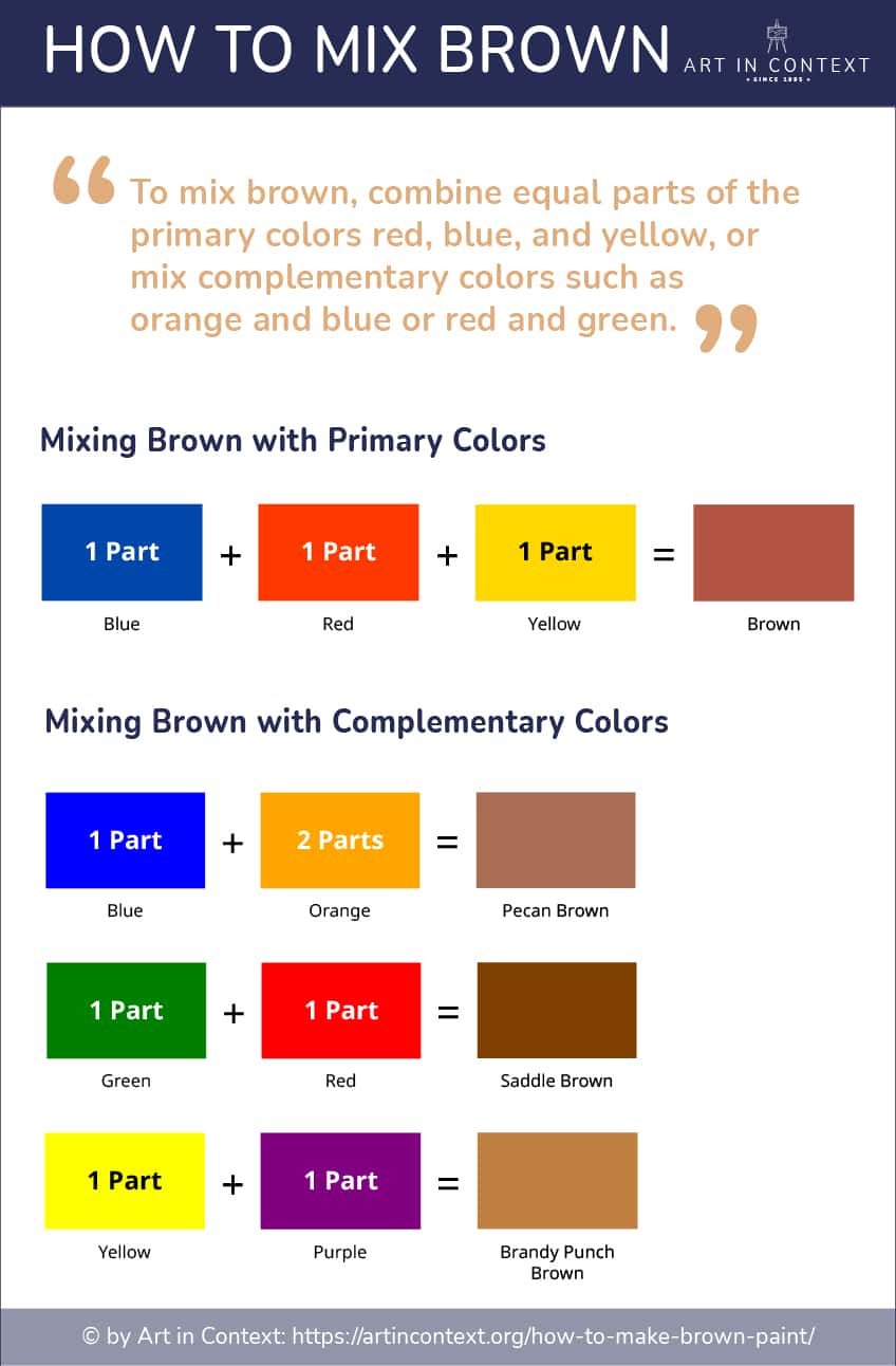
At the core of all color mixing are the primary colors: red, yellow, and blue. These are the foundational hues from which all other colors are derived. Mixing two primary colors yields a secondary color:
- Red + Yellow = Orange
- Yellow + Blue = Green
- Blue + Red = Purple
Tan, while seemingly complex, is essentially a nuanced secondary or tertiary color. It typically stems from a mixture involving orange or brown, which are themselves combinations of primary colors. Understanding this lineage is crucial for controlling the undertones and saturation of your desired tan.
The Role of Neutrals: White, Black, and Grey
Neutrals play a pivotal role in refining and creating specific shades of tan.
- White: Adding white to any color lightens it, increasing its luminosity and often softening its intensity. To create lighter shades of tan, like beige or cream, white is an essential component.
- Black: Conversely, black darkens a color, reducing its brightness and often creating deeper, more subdued tones. When aiming for deeper tans or browns, a touch of black (used sparingly to avoid dullness) can achieve significant depth.
- Grey: Grey, a mix of black and white, can desaturate a color, making it less vibrant and more muted. Incorporating grey can help achieve sophisticated, muted tans, like a stone-grey tan or a cooler, understated khaki. The precise mix of these neutrals allows for an infinite spectrum of tan variations, each with its own unique character and branding potential.
Color Models: RGB vs. CMYK in Design
The method of color mixing also depends heavily on the medium. Designers primarily work with two color models:
- RGB (Red, Green, Blue): This additive color model is used for digital displays (screens, websites, apps). Colors are created by combining light. An equal mix of red, green, and blue light at full intensity produces white. The absence of light is black. When mixing tan for digital applications, you’ll specify RGB values or hexadecimal codes (e.g., #D2B48C for traditional tan).
- CMYK (Cyan, Magenta, Yellow, Key/Black): This subtractive color model is used for print (brochures, packaging, business cards). Colors are created by inks absorbing light. Mixing 100% cyan, magenta, and yellow theoretically produces black, but in practice, a “key” black (K) ink is added for true black and richer dark tones. When specifying tan for print, you’ll use CMYK percentages. The challenge often lies in accurately translating an RGB tan to CMYK, as print colors can appear duller or shift in hue compared to their on-screen counterparts. Consistent color management and understanding the nuances of each model are vital for brand consistency across all touchpoints.
The Art and Science of Mixing Tan for Your Brand
Creating the perfect shade of tan for your brand involves a blend of artistic intuition and precise technical application. The goal is not just to make “a” tan, but “the” tan that perfectly encapsulates your brand’s essence.
Basic Recipes: Orange, Brown, and Beyond
At its simplest, tan is a desaturated, light brown or a muted orange.
- Start with Orange: Begin by mixing red and yellow to create orange. The ratio will influence the warmth of your tan—more yellow for a yellower orange, more red for a redder orange.
- Add Blue (or Black/Grey): To desaturate the orange and push it towards brown, gradually add a small amount of blue. Blue is orange’s complementary color, so adding it will neutralize the orange, turning it brownish. Be cautious, as too much blue will turn it muddy or grey. Alternatively, instead of blue, you can add a small amount of black or a neutral grey to darken and mute the orange. This method gives you more control over the warmth, as blue can sometimes make the tan cooler than desired.
- Lighten with White: Once you have a basic brown or muted orange, add white incrementally to lighten it to your desired tan shade. This step determines the luminosity and creaminess of the tan.
This fundamental process allows for a wide range of basic tan variations. The key is to add colors in very small increments, mixing thoroughly and observing the changes carefully.
Achieving Different Tan Shades: From Beige to Khaki
The beauty of tan lies in its vast spectrum of shades, each with unique brand implications:
- Beige: To achieve a classic beige, start with a light yellow-orange, then add a significant amount of white, and a tiny hint of blue or grey to mute it slightly. Beige often leans cooler than traditional tan, making it feel refined and airy.
- Khaki: Khaki typically has a greener or more olive undertone. Begin with yellow and a touch of brown, then introduce a very small amount of green or blue-green. Gradually add white to lighten to the desired khaki shade. Khaki evokes ruggedness, utility, and natural strength.
- Sandy Tan: For a warm, inviting sandy tan, lean heavily on yellow and red to create a rich orange base. Add a small amount of brown (or a tiny touch of black/blue) to deepen it, and then lighten with white. The emphasis here is on warmth and golden undertones.
- Stone Tan: A cooler, more muted tan. Mix a significant amount of grey into a brown base. Add white to lighten. This tan has a less saturated, more architectural feel, often used for minimalist or industrial brands.
Experimentation is key. Slight adjustments in the ratios of primary colors and neutrals can yield distinct results, each capable of conveying a different nuance for your brand.
Digital Tan Mixing: Hex Codes and CMYK Values
For digital branding, precise color specification is paramount for consistency.
- Hex Codes (RGB): These six-digit alphanumeric codes represent specific colors in the RGB model, vital for web design and digital assets. For instance, a classic tan might be
#D2B48C. A light beige could be#F5F5DC, and a darker khaki#C3B091. When designing digitally, you’ll input these codes directly into design software (e.g., Adobe Photoshop, Illustrator, Figma) or CSS stylesheets. - CMYK Values: For print media, you’ll need CMYK percentages. A common CMYK breakdown for a neutral tan might be C: 15%, M: 25%, Y: 40%, K: 0-5%. A warmer tan might have higher yellow and magenta values, while a cooler tan might incorporate more cyan. It’s crucial to work with a color-calibrated monitor and conduct print tests (proofs) to ensure the CMYK output accurately reflects your brand’s digital tan. Printers often have specific profiles, so communicating your CMYK values clearly with your print vendor is essential to avoid color shifts.
Implementing Tan Effectively in Your Brand’s Visual Identity
Once you’ve perfected your brand’s unique shade of tan, the next step is to integrate it thoughtfully across all visual touchpoints, ensuring it reinforces your brand messaging and enhances the overall user experience.
Tan in Logos and Wordmarks
Tan can lend a distinct character to logos and wordmarks. Used as a primary color, it projects stability and authenticity, especially when paired with clean, modern typography. For brands like artisanal food producers, handcrafted goods, or natural beauty products, a tan logo can immediately communicate organic quality and artisanal craftsmanship. It can also serve as an effective background or secondary color, allowing a bolder primary logo color to pop while grounding the overall design. When designing a logo, consider how the tan interacts with negative space and how it will appear across various mediums, from digital screens to embroidered merchandise.
Website Design and User Experience
In website design, tan offers a sophisticated alternative to stark whites or dominant darks. As a background color, particularly in lighter shades, it creates a warm, inviting, and easy-on-the-eyes experience, reducing eye strain compared to pure white. This is especially beneficial for content-heavy sites, blogs, or e-commerce platforms selling natural products. Tan can also be used for buttons, headers, or informational blocks to add subtle visual breaks without being distracting. When designing with tan, ensure sufficient contrast with text colors for readability and accessibility, particularly adhering to WCAG guidelines. Harmonize your tan with complementary colors from your brand palette to maintain a cohesive and engaging user interface.
Packaging, Print, and Physical Branding
The physical presence of a brand, from product packaging to retail interiors, offers prime opportunities for tan to shine. For packaging, tan paperboard, kraft paper, or textured materials immediately convey an eco-friendly, handcrafted, or premium feel. It suggests authenticity and often hints at a product that is natural, wholesome, or of high quality. In print collateral such as brochures, business cards, or annual reports, tan can provide an elegant and professional backdrop, making other colors and typography stand out. In retail spaces, tan walls, fixtures, or fabrics can create a calming, luxurious, and welcoming atmosphere, influencing customer mood and perception. The tactile experience of tan in physical branding reinforces its natural and grounded associations.
Harmonizing Tan with Other Brand Colors
While powerful on its own, tan truly comes alive when harmonized with a well-curated brand palette. Its neutral yet warm nature makes it an excellent companion for a diverse range of colors:
- Earthy Tones: Pair tan with deep greens (forest, olive), blues (denim, navy), and muted oranges or terracottas for a cohesive, nature-inspired palette. This combination reinforces organic and sustainable brand values.
- Sophisticated Pairings: For a luxurious feel, combine tan with metallic accents (gold, rose gold), rich jewel tones (emerald, sapphire), or deep charcoal greys. This elevates tan to a realm of understated opulence.
- Minimalist Contrasts: Tan works beautifully with crisp whites, off-whites, and stark blacks to create a clean, modern, and minimalist aesthetic. This emphasizes clarity, simplicity, and refined design.
- Vibrant Accents: To add a touch of energy without overwhelming tan’s calm demeanor, use small pops of brighter, more saturated colors like coral, teal, or a vibrant mustard yellow. These accents can draw attention to key calls to action or highlight specific elements.
By carefully considering the psychological impact, understanding the science of color mixing, and strategically applying tan across all brand touchpoints, designers and marketers can leverage this versatile hue to craft powerful, memorable, and resonant brand identities. The perfect shade of tan is not just a color; it’s a strategic communication tool that can deeply connect with your audience.
aViewFromTheCave is a participant in the Amazon Services LLC Associates Program, an affiliate advertising program designed to provide a means for sites to earn advertising fees by advertising and linking to Amazon.com. Amazon, the Amazon logo, AmazonSupply, and the AmazonSupply logo are trademarks of Amazon.com, Inc. or its affiliates. As an Amazon Associate we earn affiliate commissions from qualifying purchases.