
The creation of black, a seemingly fundamental aspect of visual design, is far more nuanced than a simple combination of pigments. For professionals working within the realm of brand identity, marketing, and design, understanding the underlying principles of color mixing, particularly concerning the achievement of true, impactful black, is crucial. It’s not just about aesthetics; it’s about perception, brand recognition, and the psychological associations that black evokes. This article delves into the science and art of color mixing to achieve the perfect black, exploring how this knowledge translates into effective branding strategies and visually compelling designs.
The Subtractive Color Model: The Foundation of Pigment Mixing
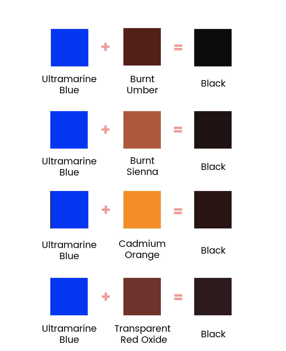
At its core, understanding how to make black with physical media lies within the subtractive color model. This model governs how pigments and dyes work, where colors are created by absorbing certain wavelengths of light and reflecting others. When we mix pigments, we are essentially adding more absorption.
Primary Colors in Subtractive Mixing
The primary colors in the subtractive model are Cyan, Magenta, and Yellow (CMY). These are the colors that cannot be created by mixing other colors. When light passes through these colored pigments, certain wavelengths are absorbed.
- Cyan: Absorbs red light, reflecting blue and green light.
- Magenta: Absorbs green light, reflecting red and blue light.
- Yellow: Absorbs blue light, reflecting red and green light.
When these three primary colors are mixed together in equal proportions, they theoretically absorb all wavelengths of visible light, resulting in the absence of reflected light and thus, black. However, in practice, achieving a true, deep black through the simple mixing of CMY pigments is often elusive due to the impurities of real-world pigments.
The Role of Black (K) in CMYK
In printing, the subtractive color model is represented by CMYK: Cyan, Magenta, Yellow, and Key (Black). While theoretically CMY can produce black, a separate black ink (K) is used for several critical reasons:
- Depth and Richness: CMY mixes often result in a muddy, brownish, or purplish black rather than a deep, true black. This is due to the imperfections of the pigments, which don’t perfectly absorb all wavelengths.
- Cost-Effectiveness: Mixing three inks to create black can be more expensive and less efficient than using a dedicated black ink.
- Sharpness and Detail: For text and fine lines, a single layer of black ink provides sharper edges and better definition than a build-up of three colored inks. This is particularly important in branding where legibility and crispness are paramount.
- Consistency: Using a single black ink ensures greater consistency in color reproduction across different print runs and materials.
Therefore, in print design, black is typically represented by the K component, and for richer, deeper blacks, designers often utilize a combination of black ink with a small percentage of CMY inks, known as a “rich black” or “super black.”
Achieving “True” Black in Digital Design vs. Print
The concept of “black” also varies significantly between digital screens and physical print. This distinction is vital for brand consistency across all touchpoints.
Black on Digital Displays (RGB)
Digital displays use the additive color model, represented by RGB: Red, Green, and Blue. In this model, black is the absence of light.
- Black in RGB: On a digital screen, true black is achieved when all pixels are turned off, emitting no light. This is represented by the RGB value (0, 0, 0).
- Screen Limitations: While digital black appears absolute, the reality is that screens emit light, and the “black” we see is the result of pixels not actively emitting light in specific areas, surrounded by other illuminated pixels. The contrast ratio of the display also plays a significant role in how deep the perceived black appears.
For branding purposes, ensuring that the designated brand black translates accurately from screen to print requires careful color management and calibration.
The Nuances of Black in Print

As discussed in the CMYK section, achieving a visually impactful black in print is a more complex endeavor than simply setting an element to black in design software.
- Rich Blacks: To create a deeper, more absorbing black on paper, designers often use a combination of CMYK values. A common “rich black” recipe is C:60%, M:40%, Y:40%, K:100%. This recipe uses the black ink for its density and sharpness, while the other CMY inks add a subtle depth and richness by filling in any imperfections in the black ink’s absorption.
- Brand-Specific Black: Some brands may opt for a slightly warmer or cooler black, achieved by adjusting the proportions of CMY in their rich black formulation. For instance, a brand aiming for a sophisticated and classic feel might lean towards a bluer black, while a brand focused on warmth and approachability might use a slightly warmer, browner black. These subtle variations are key to defining a brand’s visual personality.
- Material and Ink Interaction: The type of paper and the printing process can also influence the final appearance of black. Coated papers tend to produce sharper, deeper blacks than uncoated papers, which can absorb more ink, leading to a slightly softer appearance.
Strategic Implications of Black in Branding and Design
Black is a powerful color in the branding arsenal, evoking a range of emotions and perceptions. Understanding how to mix and utilize it strategically is a cornerstone of effective brand identity.
Psychological Associations of Black
Black is a color that carries significant weight and meaning. Its psychological impact is multifaceted and can be leveraged to communicate specific brand values.
- Sophistication and Elegance: Black is often associated with luxury, high fashion, and sophistication. Think of brands like Chanel, Dior, or Mercedes-Benz, which frequently employ black in their logos and marketing to convey an aura of exclusivity and refinement.
- Power and Authority: Its inherent depth and lack of brightness can also communicate power, strength, and authority. This is why many governmental organizations, legal firms, and financial institutions utilize black to project stability and trustworthiness.
- Mystery and Intrigue: Black can also evoke a sense of mystery, intrigue, and the unknown. This can be used by brands that want to appear enigmatic or aspirational.
- Modernity and Minimalism: In contemporary design, black is a staple of minimalist aesthetics, communicating a sense of clean lines, simplicity, and forward-thinking design.
- Formality and Seriousness: It’s a color that conveys seriousness and formality, making it suitable for occasions and brands that require a sense of gravity.
Applying Black in Brand Identity
The choice of black, and how it’s achieved, has tangible implications for a brand’s visual identity.
- Logo Design: The color of a logo is one of its most defining characteristics. A strong, well-defined black logo can be instantly recognizable and communicate core brand values. The precise shade of black used – whether a flat black, a rich black, or a slightly tinted black – contributes to the brand’s overall personality.
- Marketing Collateral: From business cards and brochures to websites and social media graphics, the consistent use of a specific brand black across all marketing materials is essential for brand recognition. This requires establishing clear brand guidelines that specify the exact CMYK and RGB values for the brand’s black.
- Website Design: On digital platforms, the choice of black impacts readability and user experience. A pure RGB (0,0,0) black can sometimes be too harsh on the eyes, especially when contrasted with bright white. Many designers opt for a slightly softened black (e.g., RGB 10, 10, 10) to improve visual comfort while still maintaining a sense of depth.
- Packaging: For physical products, the way black is rendered on packaging can significantly influence consumer perception. A premium product might use a deep, matte black to exude luxury, while a tech gadget might use a glossy black to convey modernity and sleekness.
Color Management and Brand Consistency
The bridge between digital and print, and the assurance of a consistent brand experience, lies in robust color management. Understanding how colors translate across different mediums is not just a technical requirement; it’s a strategic imperative for brand integrity.
The Importance of Color Profiles
Color profiles are essentially digital fingerprints that describe the color characteristics of a device or medium.
- ICC Profiles: International Color Consortium (ICC) profiles are used to ensure that colors are displayed and reproduced consistently across different devices, such as monitors, printers, and scanners.
- Ensuring Accurate Black: For branding, it’s crucial to have accurate color profiles for all the devices used in the design process and for the printing partners. This ensures that the intended brand black, whether it’s a standard black or a custom rich black, is consistently rendered.
Developing a Brand Color Palette
Beyond the primary brand colors, a comprehensive brand palette should include variations and supporting colors.
- Defining Brand Black: This involves specifying the precise CMYK and RGB values for the brand’s black, as well as any approved “rich black” formulations. This definition should be clearly documented in the brand guidelines.
- Secondary Blacks and Grays: Often, brands will also define a range of grays or slightly off-black tones that complement the primary black. These can be derived from the primary black by adjusting its saturation or lightness.
- Consistency Across Touchpoints: By providing clear color specifications and utilizing proper color management techniques, brands can ensure that their black appears consistently on a company website, in print advertisements, on product packaging, and on digital displays. This consistency builds trust and reinforces brand identity.
Conclusion: The Strategic Art of Black
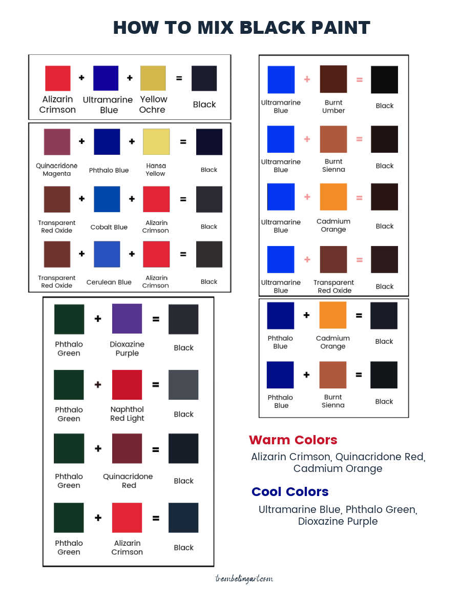
The seemingly simple question of “what colors to mix to make black” opens a gateway into the intricate world of color theory, printing technology, digital display, and, most importantly, strategic brand communication. For professionals in branding, marketing, and design, mastering the nuances of achieving and utilizing black is not merely a technical skill; it is a critical component of crafting a compelling and consistent brand identity. From the subtractive and additive color models that govern pigment and light, to the psychological impact of black, and the essential practices of color management, every decision regarding the creation and application of black contributes to how a brand is perceived. By understanding and strategically implementing the principles of black color mixing, brands can ensure their visual presence is not only aesthetically pleasing but also powerfully resonant and enduring in the minds of their audience.
aViewFromTheCave is a participant in the Amazon Services LLC Associates Program, an affiliate advertising program designed to provide a means for sites to earn advertising fees by advertising and linking to Amazon.com. Amazon, the Amazon logo, AmazonSupply, and the AmazonSupply logo are trademarks of Amazon.com, Inc. or its affiliates. As an Amazon Associate we earn affiliate commissions from qualifying purchases.