
Chocolate brown, a hue steeped in nature and indulgence, carries a profound weight in the lexicon of brand identity. Far from being a mere background color, its strategic application and thoughtful pairing can imbue a brand with specific psychological associations, elevating its perceived value, trustworthiness, and market positioning. Understanding the nuanced interplay between chocolate brown and its complementary colors is a cornerstone of effective visual branding, allowing companies to craft narratives that resonate deeply with their target audience. This exploration delves into the art and science of matching colors with chocolate brown, viewed through the critical lens of brand strategy, corporate identity, and marketing design.
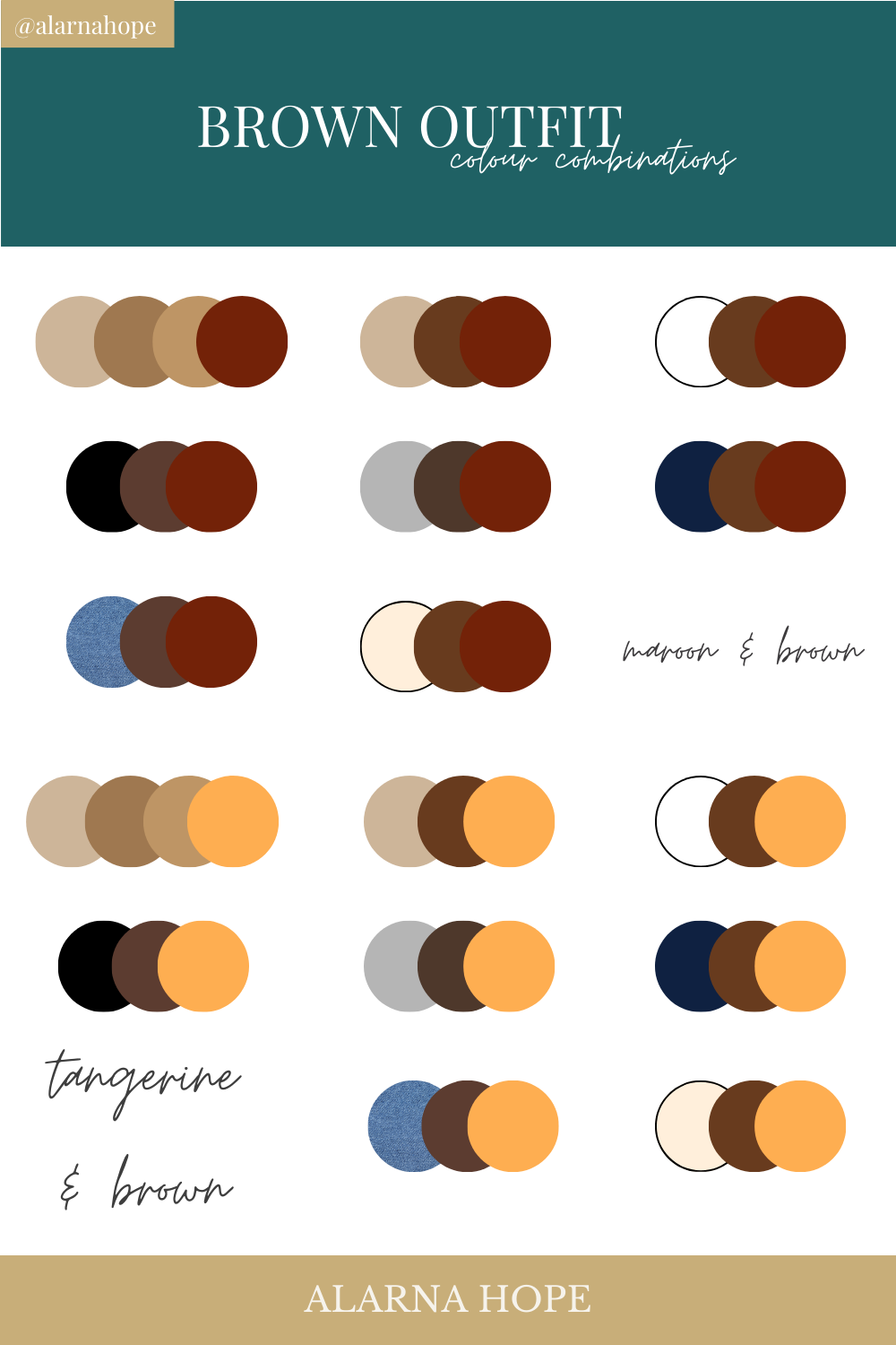
The Psychological Impact of Chocolate Brown in Branding
Before exploring specific color pairings, it is crucial to understand the inherent psychological attributes of chocolate brown itself. As a descendant of the earth, wood, and the very food it’s named after, this rich hue communicates a distinct set of values that can be strategically leveraged in brand development.
Connotations of Sophistication and Reliability
Chocolate brown projects an aura of grounded sophistication. Unlike stark black, which can sometimes appear severe or unapproachable, chocolate brown offers a softer, more organic take on elegance. It suggests stability, experience, and a quiet confidence that doesn’t need to shout for attention. For brands aiming to convey reliability and established credibility, particularly in luxury goods, professional services, or heritage brands, chocolate brown forms an excellent foundation. It implies longevity and quality, subtly communicating that the brand is well-rooted and dependable.
Evoking Warmth and Trust
Beyond sophistication, chocolate brown inherently evokes warmth and comfort. Its connection to natural elements and comforting consumables (like chocolate itself, coffee, or wood-paneled libraries) fosters a sense of security and approachability. Brands seeking to build trust and an intimate connection with their consumers can harness this warmth. This is particularly effective for food and beverage companies, hospitality brands, or businesses focused on well-being and personal comfort. The color helps create an inviting atmosphere, signaling that the brand is nurturing, authentic, and safe.
Crafting a Brand Palette: Complementary Hues for Chocolate Brown
The true power of chocolate brown in branding is unlocked when it is skillfully paired with complementary colors. These pairings are not merely aesthetic choices; they are deliberate strategic decisions that enhance brand messaging, differentiate from competitors, and shape consumer perception.
Earth Tones: Organic Harmony and Authenticity
Pairing chocolate brown with other earth tones creates a cohesive and authentic brand aesthetic. This palette speaks to sustainability, natural products, and an understated elegance.
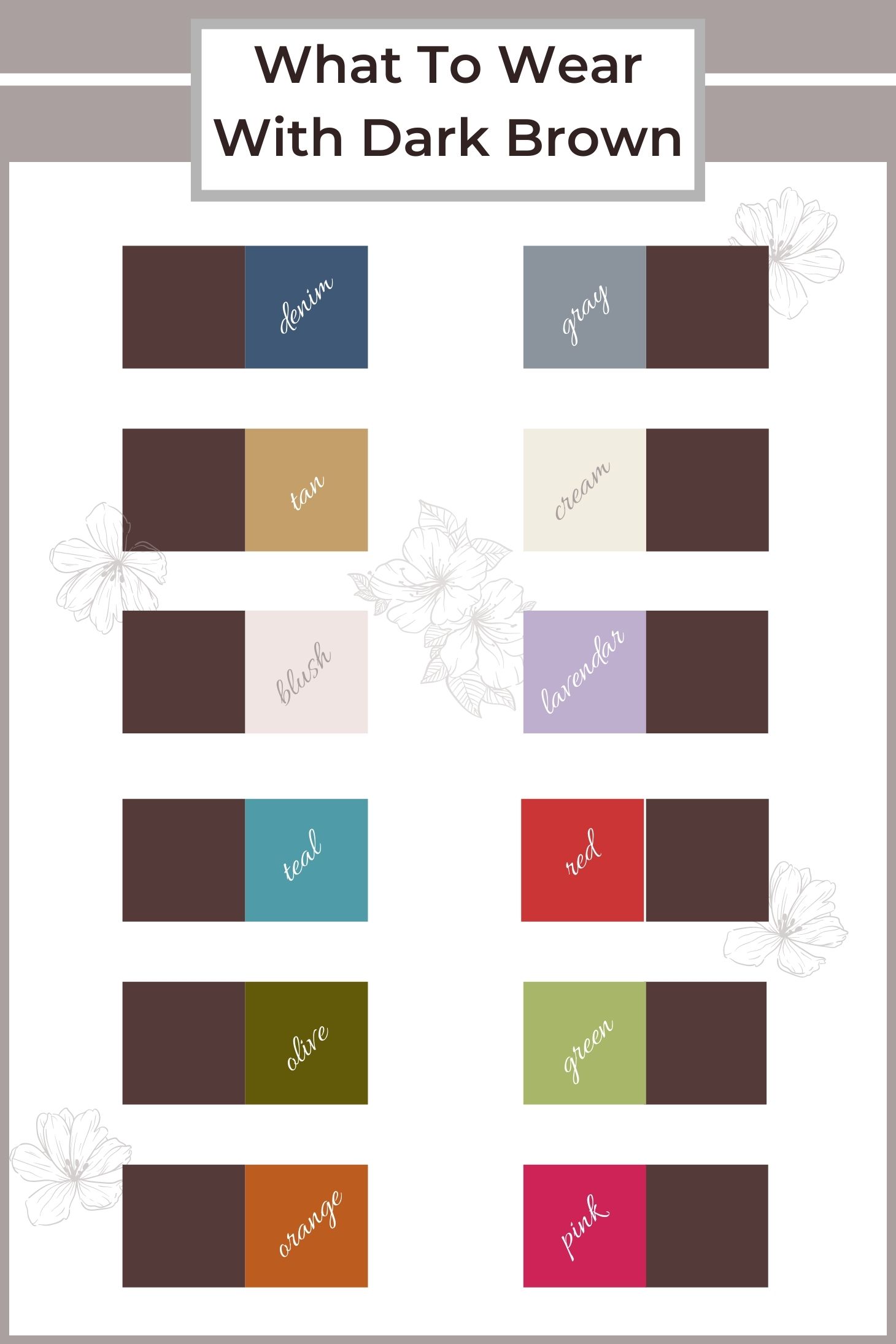
- Creams and Off-Whites: These soft neutrals provide a gentle contrast, allowing chocolate brown to feel less heavy and more inviting. Brands in organic food, sustainable fashion, or artisanal crafts often employ this combination to highlight purity, natural ingredients, and handcrafted quality. The light tones offer breathability and cleanliness against the richness of brown.
- Sage Greens and Muted Olives: Drawing inspiration directly from nature, these greens signify growth, tranquility, and environmental consciousness. When combined with chocolate brown, they create a harmonious, grounded palette perfect for eco-friendly brands, wellness products, or outdoor lifestyle companies. This combination strongly reinforces a brand’s commitment to nature and health.
- Terracotta and Burnt Orange: These warmer earth tones add a touch of rustic charm and vibrancy. They evoke a sense of heritage, craftsmanship, and a connection to cultural traditions. Brands in pottery, ethnic crafts, or authentic culinary experiences can leverage this pairing to communicate warmth, passion, and a handcrafted narrative.
Metallics: Luxe Appeal and Modern Edge
The interplay of chocolate brown with metallic accents introduces an immediate sense of luxury, modernity, and premium quality. This combination elevates the brand’s perceived value and targets a discerning audience.
- Gold: The quintessential symbol of luxury, gold against chocolate brown is a classic pairing that exudes opulence, prestige, and timeless elegance. This combination is highly effective for high-end fashion, jewelry, gourmet products, or luxury real estate brands. It communicates exclusivity and superior quality, often seen in sophisticated packaging and corporate identities.
- Copper and Rose Gold: These warmer metallics offer a contemporary twist on luxury, suggesting innovation, craftsmanship, and a subtle warmth. They imbue a brand with a modern, design-forward sensibility without losing the richness of chocolate brown. Brands in artisanal coffee, bespoke homewares, or premium tech accessories can use these tones to signal both quality and cutting-edge style.
- Bronze: Similar to gold but with a deeper, more antique feel, bronze with chocolate brown suggests heritage, durability, and established excellence. It’s often used by brands that want to convey a sense of enduring quality and traditional craftsmanship, such as watchmakers or fine spirits.
Vibrant Accents: Dynamic Contrast and Playfulness
While chocolate brown typically signals gravitas, it can also serve as an excellent anchor for more vibrant accent colors, creating a dynamic and memorable brand identity. These pairings are carefully chosen to add personality without detracting from the brown’s foundational strength.
- Turquoise and Teal: These cool, refreshing blues and greens provide a striking, unexpected contrast to the warmth of chocolate brown. They introduce an element of modernity, creativity, and sometimes playfulness. Brands in travel, creative agencies, or innovative tech solutions might use this combination to balance grounded reliability with forward-thinking design.
- Coral and Peach: Softer yet vibrant, these warm pink-orange hues inject energy, friendliness, and approachability. They can lighten the perception of a chocolate brown brand, making it feel more contemporary and less formal. This pairing is suitable for lifestyle brands, beauty products, or services that want to be seen as inviting and cheerful yet sophisticated.
- Bright Yellows (e.g., Mustard or Saffron): A touch of a sophisticated yellow can bring a burst of optimism and distinctiveness. It’s an energetic accent that can symbolize innovation or a unique perspective, making the brand stand out. This is a bold choice for brands aiming for a memorable and spirited identity within a stable framework.
Neutrals: Timeless Elegance and Versatility
Pairing chocolate brown with other neutrals offers a sophisticated and versatile palette that can adapt to various brand messages.
- Charcoal Gray and Black: These pairings create a more serious, authoritative, and minimalist aesthetic. The depth of charcoal or black against chocolate brown suggests power, executive presence, and modern professionalism. This combination is favored by high-end corporate services, automotive brands, or fashion labels seeking a sleek, no-nonsense image.
- Greige (Gray + Beige): A blend of gray and beige, greige offers a softer, more contemporary neutral alternative to pure beige. When combined with chocolate brown, it creates a very sophisticated, understated, and modern feel, perfect for minimalist brands, architectural firms, or high-end home goods.
Strategic Application Across Brand Touchpoints
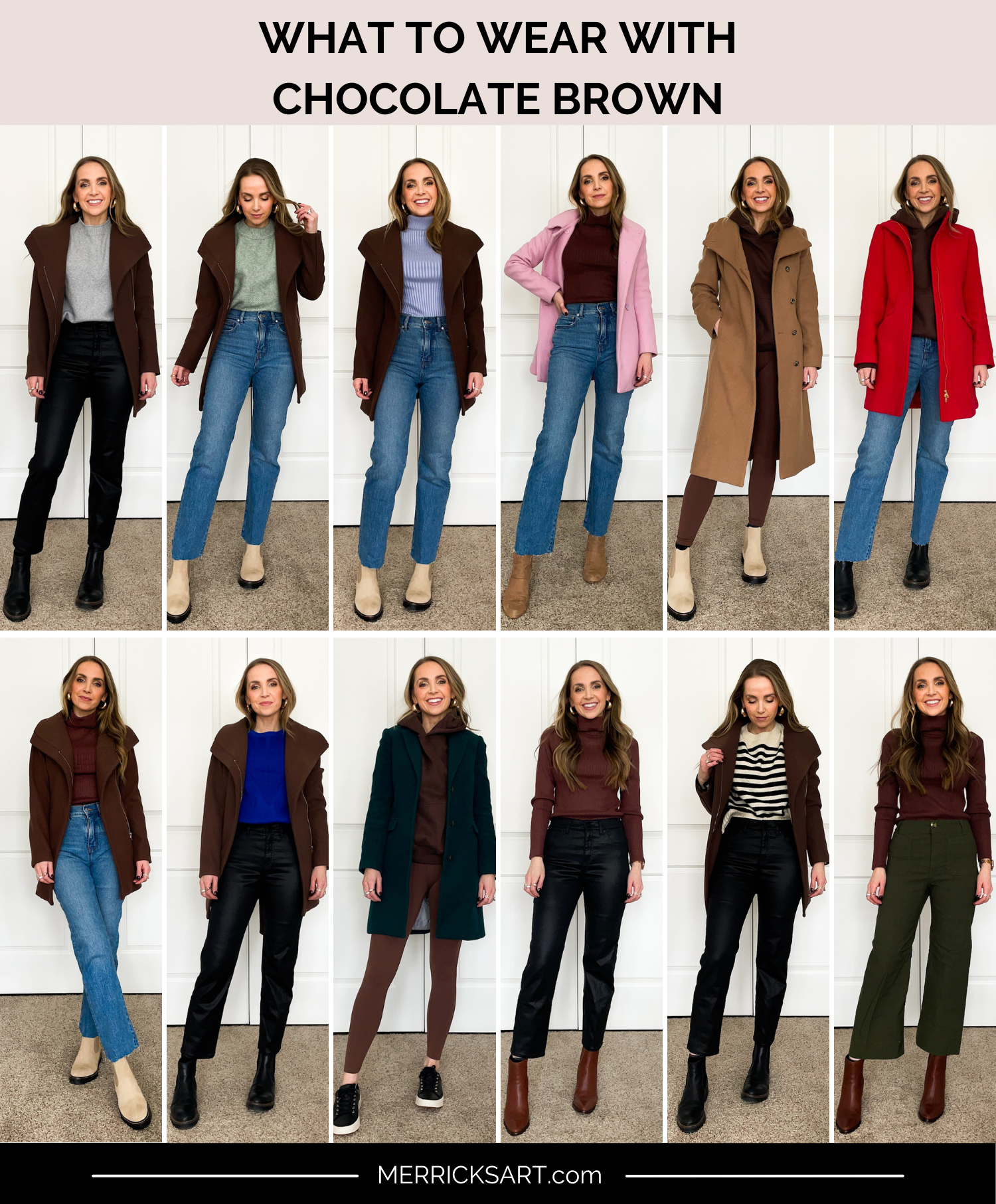
The chosen chocolate brown palette must be consistently applied across all brand touchpoints to build a coherent and impactful brand identity.
Logo Design and Corporate Identity
The logo is often the first visual encounter a consumer has with a brand. Using chocolate brown as a primary or secondary color in the logo can immediately convey its core attributes of reliability, sophistication, or warmth. Complementary colors can be used for specific elements, typography, or as an accent to add dynamism or specific sub-messaging. For instance, a luxury chocolate brand might use chocolate brown for its logomark, accented with gold for the typography to signify premium quality.
Website and Digital Marketing
A brand’s website is its digital storefront. Chocolate brown can be effectively used in backgrounds, headers, footers, or text elements to establish a consistent brand mood. When paired with lighter neutrals, it provides excellent readability and an inviting user experience. For digital marketing campaigns, the color palette ensures brand recognition across various platforms, from social media graphics to email newsletters. Careful use of accent colors can highlight calls to action or key messages, drawing the user’s eye.
Packaging and Product Design
For brands where the product is tangible, packaging is a critical communication tool. Chocolate brown packaging, especially with metallic accents, instantly suggests premium quality and often evokes a sensory experience linked to taste or texture. For sustainable brands, brown, combined with sage green or cream, reinforces natural ingredients and eco-friendly values. The color choice here directly influences purchasing decisions and shelf appeal.
Retail Environments and Brand Experiences
In physical spaces, chocolate brown can be used in interior design elements, furniture, or staff uniforms to extend the brand’s aesthetic. A coffee shop might use chocolate brown and warm wood tones to create a cozy, inviting atmosphere. A luxury boutique might combine dark brown with gold accents to cultivate an exclusive, high-end shopping experience. These environmental cues reinforce the brand promise and immerse the consumer in the brand story.
Case Studies in Effective Chocolate Brown Branding
Many successful brands implicitly or explicitly leverage chocolate brown and its pairings to their advantage, though specific public case studies often focus on broader brand overhauls rather than just color. However, we can observe archetypes:
Premium Food & Beverage Brands
Consider high-end chocolate manufacturers or gourmet coffee brands. Their packaging often features deep chocolate browns paired with opulent golds, silvers, or rich creams. This combination immediately communicates indulgence, quality ingredients, and a luxurious experience, justifying a higher price point and distinguishing them from mass-market competitors. The visual language speaks directly to sensory pleasure and exclusivity.
Sustainable Lifestyle Brands
Brands focusing on natural, organic, or eco-friendly products frequently employ palettes that include chocolate brown alongside muted greens, creams, and earthy textures. This visual strategy reinforces their commitment to nature, authenticity, and responsible consumption. The brown grounds the brand in an honest, unpretentious elegance, appealing to consumers who value sustainability and transparency.
Luxury Fashion & Home Goods
In luxury segments, chocolate brown is a staple. Fashion houses use it for leather goods, sophisticated apparel, and brand collateral, often paired with gold or deep charcoal. Home goods brands might use it for furniture, textiles, and decor, combining it with cream or greige to convey timeless elegance, comfort, and enduring quality. The color here signifies refined taste and enduring style.
Avoiding Pitfalls: When Chocolate Brown Doesn’t Fit
While versatile, chocolate brown is not a universal solution for every brand. Overuse can lead to a heavy or dated feel if not balanced with appropriate complementary colors and modern design principles. Brands aiming for a light, airy, highly youthful, or overtly futuristic image might find chocolate brown counterproductive, as it can weigh down their message. Similarly, brands in sectors like pediatric care or highly innovative tech might find its traditional connotations at odds with their desired brand perception of playfulness or cutting-edge novelty. Strategic color selection always begins with a deep understanding of the brand’s core values, target audience, and competitive landscape.
In conclusion, chocolate brown is a powerful and versatile color in the brand designer’s arsenal. When thoughtfully paired with complementary hues and strategically applied across all brand touchpoints, it can convey profound messages of sophistication, reliability, warmth, and luxury, fundamentally shaping how a brand is perceived and valued in the market. Its effective deployment is a testament to the intricate relationship between color psychology and compelling brand strategy.
aViewFromTheCave is a participant in the Amazon Services LLC Associates Program, an affiliate advertising program designed to provide a means for sites to earn advertising fees by advertising and linking to Amazon.com. Amazon, the Amazon logo, AmazonSupply, and the AmazonSupply logo are trademarks of Amazon.com, Inc. or its affiliates. As an Amazon Associate we earn affiliate commissions from qualifying purchases.