
In the competitive landscape of modern branding, color is more than a decorative choice; it is a strategic asset that communicates values, evokes emotions, and establishes market positioning. Among the spectrum of choices available to designers and brand strategists, tan—a sophisticated, versatile neutral—has emerged as a cornerstone for brands seeking to convey stability, luxury, and organic authenticity. Understanding what colors make a tan color is the first step in mastering a palette that bridges the gap between the sterile minimalism of white and the heavy presence of dark earth tones.

For a brand, “tan” is rarely a single shade. It is a family of hues ranging from sun-bleached sand to deep, buttery ochre. By mastering the color theory behind these mixtures, brand architects can create visual identities that feel grounded, timeless, and approachable.
The Science and Art of the Tan Palette in Brand Strategy
At its most fundamental level, tan is a pale version of brown. However, in professional brand design, creating a custom tan requires a nuanced understanding of primary and secondary color relationships. To arrive at the perfect tan, one must balance warmth, depth, and neutrality.
The Core Mix: Primary and Complementary Foundations
The most direct path to creating a tan color is by mixing a base of brown with varying amounts of white. To create the brown itself, designers often mix primary colors: red, yellow, and blue. When these three are combined, they create a muddy, dark neutral. By introducing white into this mixture, the color “lifts,” revealing the underlying tan.
In branding, the specific ratio of these primaries dictates the “temperature” of the tan. A tan with a higher concentration of yellow tends toward a “sand” or “straw” hue, which feels energetic and sunny. A tan with a slight lean toward red creates a “latte” or “terracotta-lite” feel, evoking warmth and comfort. Brand strategists must decide which temperature aligns best with the brand’s personality—warm for hospitality, or cool and desaturated for high-end tech or fashion.
Adjusting Tones: From Warm Sand to Sophisticated Taupe
Beyond the basic mix, professional colorists use “complementary tinting” to refine a brand’s signature tan. If a tan appears too “flat” or yellow, adding a minute amount of its complement—purple—can neutralize the hue, pushing it toward a more sophisticated taupe.
This level of precision is vital for corporate identity. A brand like Burberry doesn’t just use “any” tan; they use a specific, trademarked balance of pigments that ensures their trench coats and packaging are instantly recognizable. When developing a brand’s visual guidelines, defining the exact “recipe” of the tan ensures consistency across digital interfaces, physical packaging, and architectural environments.
The Psychology of Tan: Why Leading Brands Choose Neutrals
Why would a brand choose tan over a vibrant primary color? The answer lies in the psychological associations of the color. Tan is the color of the earth, of unbleached linen, and of aged parchment. It suggests a history, a sense of permanence, and a rejection of the “fast-fashion” mentality of brighter colors.
Evoking Reliability and Stability
In an era of digital volatility, consumers are increasingly drawn to brands that feel “real.” Tan provides a sense of ruggedness and dependability. It is the color of leather and wood, materials that age gracefully rather than breaking.
Financial institutions and heritage brands often use tan as a secondary color to soften their primary blues or blacks. It provides a human element to otherwise cold corporate structures. By utilizing tan, these brands signal that they are grounded in tradition and are reliable stewards of the consumer’s trust. It is a color that doesn’t scream for attention but commands it through quiet confidence.
The Rise of Organic and Sustainable Aesthetics
The global shift toward sustainability has propelled tan to the forefront of brand design. Because tan is the color of recycled paper, raw cotton, and natural clay, it has become the visual shorthand for “eco-friendly.”
Brands in the skincare, wellness, and organic food sectors utilize tan to communicate that their products are free from artificial dyes and harsh chemicals. When a consumer sees a tan-colored box, their brain subconsciously registers “purity” and “nature.” By mastering the specific color mixes that produce these “natural” tans—often by incorporating more grey and white to mimic the look of unrefined materials—brands can align themselves with the values of the modern, environmentally-conscious consumer.
Incorporating Tan into Your Brand’s Visual Language
Choosing the right tan is only half the battle; the other half is knowing how to deploy it within a brand’s visual ecosystem. Tan is a “team player” color—it rarely stands alone but instead acts as a canvas that allows other elements of the brand identity to shine.
Primary vs. Secondary Usage
A brand must decide if tan will be its “hero” color or a supporting actor. When used as a primary color, tan creates a brand identity that is minimalist and “quiet luxury.” This is common in the boutique hospitality and high-end fashion industries, where the goal is to create an environment of calm and exclusivity.
When used as a secondary color, tan serves as an excellent neutral alternative to grey or white. It adds warmth to a layout without the starkness of pure white. In digital design (UI/UX), tan backgrounds can reduce eye strain, making long-form content more readable and inviting than high-contrast black-on-white designs.
Modern Color Pairings: Tan and Its Companions
The versatility of tan allows it to pair beautifully with a wide range of palettes:
- Tan and Forest Green: This is the ultimate “organic” pairing, perfect for brands emphasizing outdoor lifestyles or environmental tech.
- Tan and Navy Blue: A classic, “preppy” combination that suggests authority, maritime history, and professional rigor.
- Tan and Black: This creates a high-contrast, modern aesthetic often seen in premium lifestyle brands. It mimics the look of high-end stationery or luxury leather goods.
- Tan and Soft White: The “tone-on-tone” look. This is the hallmark of modern minimalism and “clean” branding, focusing on texture and light rather than bold color shifts.
Technical Execution: Tan in Digital and Print Media
One of the greatest challenges in brand management is ensuring that the tan color mixed in the studio looks the same on a smartphone screen as it does on a printed shopping bag. Tan is notoriously difficult to replicate across different media because it is a “low chroma” color, meaning small shifts in ink or light can make it look green, pink, or muddy.
RGB vs. CMYK Considerations
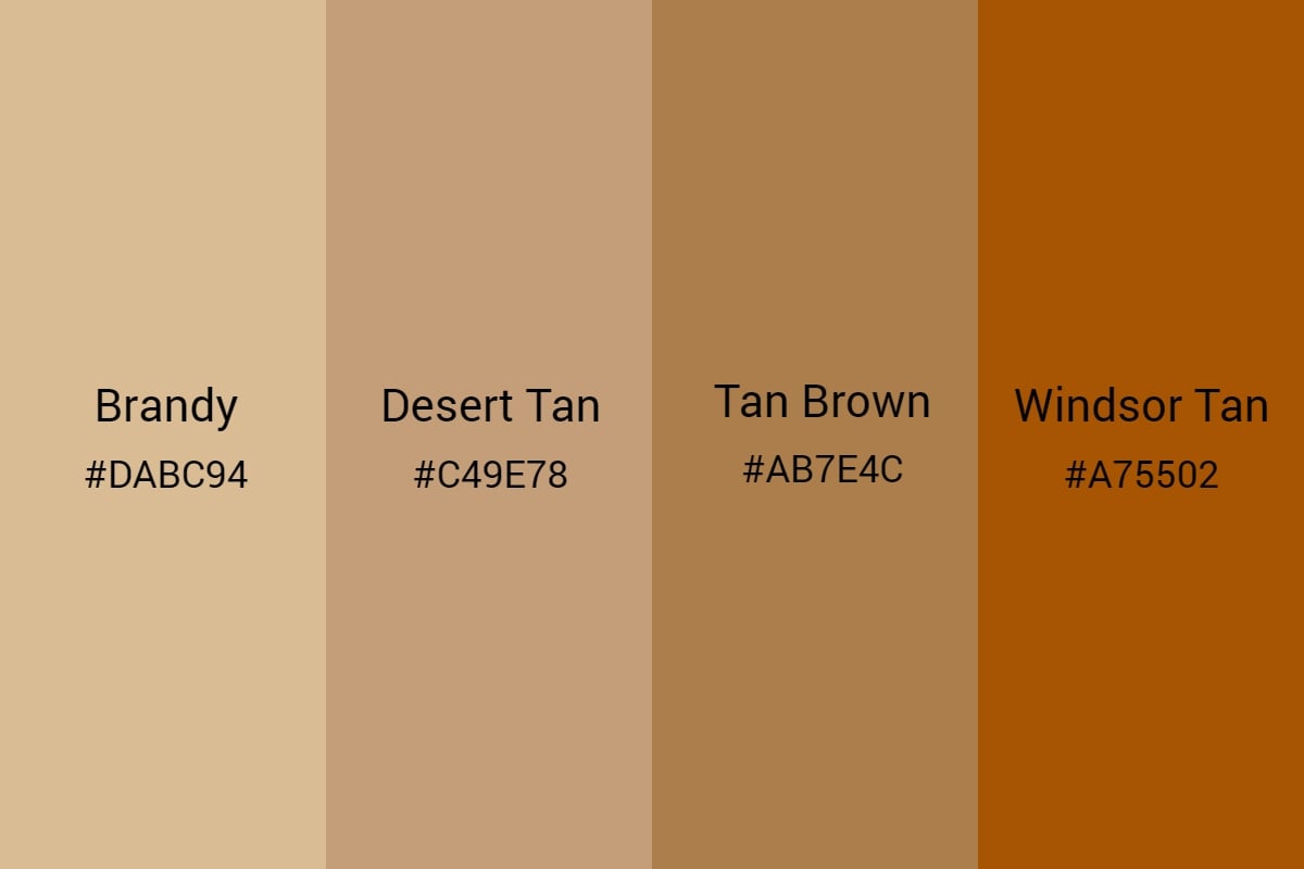
In the digital realm (RGB), tan is created by mixing high levels of red and green with a moderate amount of blue. For example, a classic tan HEX code might look like #D2B48C. On a screen, the glow of the pixels can make tan look more luminous than it actually is.
In print (CMYK), tan is achieved using a complex mix of Cyan, Magenta, Yellow, and Black. To prevent the color from looking “dirty,” printers often use a “spot color” (such as a Pantone shade) rather than a standard four-color process. Using a dedicated ink ensures that the tan remains crisp and consistent across millions of impressions. For a brand, investing in a specific Pantone tan is a mark of quality control that prevents the brand from looking “cheap” due to inconsistent printing.
Consistency Across Brand Touchpoints
A holistic brand strategy considers how tan behaves in different environments. A tan that looks beautiful on a matte paper business card might look vastly different when applied to a glossy plastic product or an embroidered logo on a canvas tote. Brand guidelines must specify the “target” tan and provide variations for different materials to ensure the brand’s visual equity remains intact regardless of the medium.

Case Studies: Brands Redefining the Power of Tan
Several world-class brands have built their entire identities around the strategic use of tan, proving that this neutral color can be a powerful engine for brand recognition.
1. UPS (United Parcel Service):
While often associated with “Brown,” the UPS palette relies heavily on tan and gold accents to provide contrast and visibility. Their use of these earthy tones is so iconic that their slogan for years was “What can Brown do for you?” By owning a color that others found “boring,” UPS built an image of utilitarian reliability and unmatched logistical power.
2. SKIMS:
Kim Kardashian’s SKIMS brand revolutionized the use of tan in the fashion and beauty industry. By creating an expansive palette of “nude” and tan shades that represent various skin tones, the brand turned a neutral color into a statement of inclusivity. Here, tan isn’t just a color; it’s a core brand value.
3. Hermès:
The luxury house Hermès is synonymous with its specific shade of orange, but its use of tan and “etoupe” (a brownish-grey tan) in its leather goods is what defines its heritage. These colors represent the brand’s origins in saddlery and high-end craftsmanship. In the world of Hermès, tan is the color of time, patience, and artisan skill.
In conclusion, understanding what colors make a tan color allows brand designers to tap into a rich psychological and aesthetic resource. By carefully mixing primaries, adjusting for temperature, and considering the technical requirements of different media, a brand can harness the power of tan to build an identity that is both contemporary and timeless. Whether it is used to signal sustainability, reliability, or luxury, tan remains one of the most potent tools in the brand strategist’s toolkit.
aViewFromTheCave is a participant in the Amazon Services LLC Associates Program, an affiliate advertising program designed to provide a means for sites to earn advertising fees by advertising and linking to Amazon.com. Amazon, the Amazon logo, AmazonSupply, and the AmazonSupply logo are trademarks of Amazon.com, Inc. or its affiliates. As an Amazon Associate we earn affiliate commissions from qualifying purchases.