
Red. It’s a color that commands attention, evokes passion, and signals urgency. In the realm of branding and design, its strategic use can be incredibly powerful, but pairing it effectively is crucial. Misjudged color combinations can dilute its impact, leading to a brand message that feels muddled or even off-putting. This article delves into the art and science of harmonizing colors with red, specifically through the lens of Brand Strategy. We will explore how different hues can amplify or complement red’s inherent characteristics, and how these choices can be leveraged to create compelling visual identities that resonate with target audiences and drive desired brand perceptions.

The Psychology of Red in Branding
Before we explore pairings, it’s vital to understand the inherent psychological associations of red. Its impact is multifaceted, capable of conveying a wide spectrum of emotions and ideas depending on the context and the colors it’s juxtaposed with.
Red’s Universal Symbolism
Across cultures, red carries significant weight. It’s often associated with:
- Energy and Excitement: Think of sports cars, high-energy beverages, or sale banners. Red is inherently stimulating.
- Passion and Love: This is a classic association, frequently used in romantic contexts.
- Courage and Strength: Red can project power and resilience, making it a choice for brands aiming for a robust image.
- Urgency and Alertness: This is why red is used for stop signs and emergency services. It demands immediate attention.
- Anger and Danger: While less desirable in most branding, this primal association is strong and can be subtly evoked.
The key for brand strategists is to harness the positive attributes of red while mitigating any unintended negative connotations. This is where strategic color pairing becomes indispensable.
Nuances of Red: From Crimson to Scarlet
It’s important to remember that “red” is not a monolithic entity. The specific shade of red used significantly influences its perception and its compatibility with other colors.
- Bright, True Reds (Scarlet, Cherry Red): These are energetic, bold, and often playful. They tend to work well with similarly vibrant colors or strong neutrals.
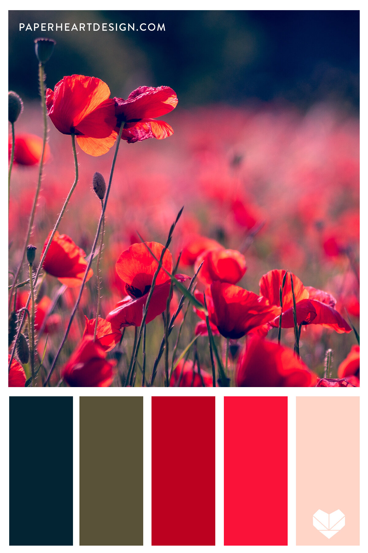
- Deep, Muted Reds (Burgundy, Crimson): These reds exude sophistication, luxury, and a sense of heritage. They pair beautifully with richer, more subdued tones.
- Orange-Reds (Vermilion): These lean towards warmth, enthusiasm, and a touch of exoticism.
- Blue-Reds (Ruby, Cardinal): These possess a cooler undertone, lending them a more refined and often regal feel.
Understanding the specific shade of red you’re working with is the first step in successful color strategy.
Harmonious Pairings for Red: Creating Brand Synergy
The colors that best complement red are often those that provide a visual counterpoint, enhance its vibrancy, or echo its intensity in a balanced way. These pairings are not merely aesthetic; they are strategic choices that shape brand perception.
The Power of Neutrals: Red’s Dependable Companions
Neutrals provide a stable foundation for red, allowing its intensity to shine without overwhelming the viewer. They offer balance and sophistication, making red feel more grounded and accessible.
1. White: The Classic Contrast
- Why it works: White is the ultimate amplifier for red. It creates a stark, clean contrast that makes red pop. This combination is often associated with purity, simplicity, and high impact.
- Brand applications: Think of iconic brands like Coca-Cola, or luxury fashion houses that use red accents against crisp white backgrounds. It’s a reliable choice for clarity and immediate recognition.
- Strategic advantage: This pairing is highly legible and creates a sense of honesty and transparency. It’s versatile, working for everything from fast food to high fashion.
2. Black: Sophistication and Boldness
- Why it works: Black and red together exude power, drama, and a touch of rebellion. Black grounds red, adding depth and a sense of premium quality. It’s a combination that signifies confidence and authority.
- Brand applications: Often seen in automotive brands, luxury goods, and brands that want to project an edgy or sophisticated image. For example, Ferrari’s classic red and black racing heritage.
- Strategic advantage: This pairing can convey a sense of luxury, mystery, or even a hint of danger, depending on the shades and proportions used. It’s potent for brands seeking to make a strong, memorable statement.
3. Grey: Modernity and Subtlety
- Why it works: Grey offers a more muted and modern counterpoint to red. Light grey can provide a softer backdrop, while charcoal grey offers a more sophisticated and serious feel. This combination is less aggressive than black and white, offering a more approachable yet still impactful presence.
- Brand applications: Increasingly popular in tech, design agencies, and lifestyle brands that aim for a contemporary and understated aesthetic. Think of minimalist websites or sleek product packaging.
- Strategic advantage: Grey softens the intensity of red, making it more palatable for brands that want to be perceived as innovative, reliable, and stylish without being overly flashy.
4. Beige and Cream: Warmth and Approachability

- Why it works: These softer neutrals add warmth and a touch of natural texture to red. They create a more inviting and organic feel, making red appear less intense and more approachable.
- Brand applications: Ideal for brands in the food and beverage, home decor, or wellness industries that want to evoke comfort, natural ingredients, or artisanal quality.
- Strategic advantage: This pairing can convey a sense of comfort, trustworthiness, and earthy sophistication, softening red’s assertive nature for a gentler brand personality.
Complementary and Analogous Colors: Dynamic Duo and Harmonious Flow
Moving beyond neutrals, we can explore how other colors interact with red to create different emotional and visual effects.
1. Blues: The Classic Complementary Balance
- Why it works: Red and blue are complementary colors on the traditional color wheel. This means they are directly opposite each other, creating a high level of contrast and visual energy when placed next to each other. The blue can cool down the intensity of red, while the red can make the blue feel more vibrant.
- Brand applications: This is a powerful combination used across many sectors. Think of athletic brands like Adidas or sports teams where red and blue are common. It can also convey trustworthiness (blue) and passion (red).
- Types of blues:
- Navy Blue: Creates a sophisticated, authoritative, and professional look, often seen in corporate branding or formal wear.
- Royal Blue: Offers a strong, vibrant contrast that’s energetic and eye-catching, suitable for dynamic brands.
- Teal/Aqua: Introduces a slightly softer, more contemporary feel, blending the intensity of red with a refreshing hue.
- Strategic advantage: The red-blue pairing is incredibly versatile, capable of conveying a wide range of messages from strong and reliable to energetic and exciting.
2. Greens: Nature, Growth, and Vitality
- Why it works: Red and green, especially when considered as a duo on the color wheel (or as a triadic harmony with blue), can create a vibrant and natural feel. Green can temper red’s intensity, suggesting growth, vitality, and harmony.
- Brand applications: This combination is frequently used in environmental organizations, health and wellness brands, and food companies. It evokes freshness, natural goodness, and a sense of well-being.
- Types of greens:
- Emerald Green: Offers a rich, luxurious contrast, evoking nature’s opulence.
- Forest Green: Creates a grounded, natural, and reliable feel.
- Lime Green: Provides a zesty, energetic pop that can make red feel more playful and modern.
- Strategic advantage: This pairing is excellent for brands wanting to communicate naturalness, sustainability, or vitality. It brings a sense of life and refreshment to the red.
3. Oranges and Yellows: Amplifying Warmth and Energy
- Why it works: These are analogous colors to red, meaning they sit next to it on the color wheel. They share a similar warm hue, creating a harmonious and energetic flow. When paired, they amplify each other’s warmth and vibrancy, creating a very lively and enthusiastic impression.
- Brand applications: Commonly found in children’s brands, food services, and brands aiming for a cheerful, optimistic, and accessible image. Think of fast-food chains or toy companies.
- Strategic advantage: This combination is inherently positive and stimulating, perfect for brands that want to convey joy, creativity, and a sense of fun. It’s a powerful tool for generating excitement and approachability.
4. Pinks and Purples: Playfulness and Luxury
- Why it works:
- Pinks: When paired with red, different shades of pink can range from playful and sweet (baby pink) to bold and luxurious (hot pink). This creates a dynamic and often feminine energy.
- Purples: Deeper purples, like amethyst or plum, create a sophisticated and often regal pairing with red, suggesting luxury, creativity, and a touch of mystery. Lighter purples can offer a more whimsical and modern feel.
- Brand applications: Pinks and reds are common in beauty, fashion, and lifestyle brands targeting a female demographic or aiming for a playful, romantic, or trendy appeal. Reds and purples are often used for premium products, creative services, or brands aiming for a unique, artistic identity.
- Strategic advantage: These pairings allow for a broad spectrum of brand personalities, from approachable and fun to sophisticated and artistic.
Strategic Application of Red Color Pairings in Branding
The choice of color pairings with red is not arbitrary; it’s a deliberate strategy to communicate specific brand values and evoke desired emotional responses from the target audience.
Achieving Brand Recognition and Memorability
Consistent and effective use of color is a cornerstone of strong brand identity. Red, with its inherent impact, can be a powerful tool for recognition when paired strategically.
- Creating a Unique Visual Language: A well-chosen color palette featuring red, used consistently across all touchpoints – from logos and websites to packaging and marketing materials – helps to build immediate brand recognition.
- Standing Out in a Crowded Market: In industries where competitors might opt for more subdued palettes, a bold and well-executed red-based branding can cut through the noise and capture attention.
- Emotional Resonance: The right color pairings can tap into the emotional drivers of consumers. For instance, a vibrant red paired with a cheerful yellow can evoke feelings of joy and excitement, making the brand more memorable and likable. Conversely, a deep crimson paired with black can convey a sense of exclusivity and prestige, attracting a different demographic.
Shaping Brand Perception and Personality
The colors a brand chooses communicate its core values and personality before any words are read. Red’s inherent boldness means its pairings are particularly critical in defining this.
- Communicating Core Values: A brand that uses red with blues and grays might be signaling reliability, innovation, and professionalism. A brand using red with oranges and yellows might be projecting energy, optimism, and fun.
- Targeting Specific Audiences: Different color combinations appeal to different demographics. For example, a bright, energetic red with playful pinks might target a younger audience, while a deep, sophisticated red with metallics might appeal to a luxury market.
- Building Trust and Credibility: While red can signal urgency, pairing it with colors that suggest stability and trustworthiness, like navy blue or a calming green, can help to build a perception of reliability and competence.
Practical Considerations for Implementation
Beyond the theoretical, successful color strategy requires practical application and thoughtful execution across all brand touchpoints.
- Accessibility and Legibility: Ensure that chosen color combinations are accessible to individuals with visual impairments. High contrast is often beneficial for readability, but it must be implemented thoughtfully to avoid sensory overload. Testing color palettes with accessibility tools is crucial.
- Cultural Nuances: While some color associations are universal, others can vary significantly across cultures. Researching the cultural implications of color pairings is vital for brands operating in global markets. Red, for example, can signify good luck and prosperity in many Asian cultures, a positive attribute to leverage.
- Digital vs. Print: Consider how colors will render across different mediums. Screen colors can appear brighter and more saturated than they do in print. Adjustments may be needed to maintain the intended brand aesthetic.
- Color Proportion and Hierarchy: The dominance of red versus its complementary color matters. A brand logo that is predominantly red with a small accent of blue will have a different impact than one that is evenly split between the two. Establishing a clear color hierarchy ensures that the desired message is communicated effectively.
In conclusion, the question of “what colors look good with red” is not just an aesthetic query; it’s a fundamental aspect of brand strategy. By understanding the psychology of red and its diverse color pairings, brands can craft compelling visual identities that resonate deeply with their audiences, foster strong recognition, and ultimately, drive business success. The strategic application of color is a powerful language, and with red, it’s a language that speaks volumes.
aViewFromTheCave is a participant in the Amazon Services LLC Associates Program, an affiliate advertising program designed to provide a means for sites to earn advertising fees by advertising and linking to Amazon.com. Amazon, the Amazon logo, AmazonSupply, and the AmazonSupply logo are trademarks of Amazon.com, Inc. or its affiliates. As an Amazon Associate we earn affiliate commissions from qualifying purchases.