In the intricate world of personal branding, every visual cue contributes to the narrative an individual presents to the world. For brunettes, understanding the strategic application of color is not merely a matter of aesthetic preference but a powerful tool for crafting a compelling and memorable personal identity. Color, in this context, transcends mere fashion; it becomes a deliberate choice in visual marketing, influencing perceptions, communicating attributes, and fostering recognition.
The Strategic Role of Color in Personal Branding
Color is one of the most immediate and impactful elements in visual communication. For brunettes, leveraging the inherent richness and versatility of their hair color provides a unique foundation for building a robust personal brand. The right color choices can enhance natural features, project desired personality traits, and ensure a cohesive visual identity that resonates with one’s professional or personal objectives.

Color Psychology and First Impressions
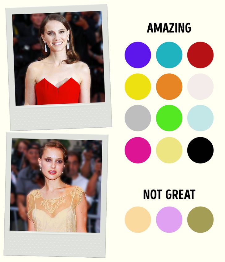
From a brand perspective, first impressions are paramount. Color psychology demonstrates that specific hues evoke predictable emotional and psychological responses. For instance, blues often convey trustworthiness and professionalism, while reds communicate power and passion. When a brunette strategically chooses colors that align with these psychological principles and their personal brand objectives, they are actively shaping how they are perceived. A deep brunette with warm undertones selecting an emerald green for a presentation, for example, not only enhances their complexion but also subtly communicates sophistication and stability, attributes highly valued in many professional contexts. This deliberate selection is a form of non-verbal marketing, allowing one to “brand” themselves before a word is even spoken.
Consistency in Visual Identity
Consistency is a cornerstone of strong branding. Just as a corporate logo or color scheme remains consistent across all platforms, a personal brand benefits immensely from a harmonious and predictable color palette. For brunettes, identifying a core set of flattering colors that complement their hair, skin, and eye tones creates a recognizable and reliable visual identity. This consistency builds trust and reinforces the desired brand message over time. Whether it’s the choice of attire for a keynote speech, the branding for a personal website, or even the subtle nuances of makeup, a consistent color narrative ensures that the brunette’s personal brand is clear, coherent, and memorable across all touchpoints. This deliberate design thinking elevates personal appearance from mere fashion to an integrated component of a comprehensive brand strategy.
Decoding Your Brunette Persona: Undertones and Depth for Brand Cohesion
To effectively harness the power of color, brunettes must first understand the unique characteristics of their own hair and complexion. This self-assessment is foundational to creating a truly effective personal brand palette, akin to a brand audit before a rebranding campaign. It ensures that chosen colors enhance rather than detract from one’s natural attributes.
Warm vs. Cool Undertones for Brunettes
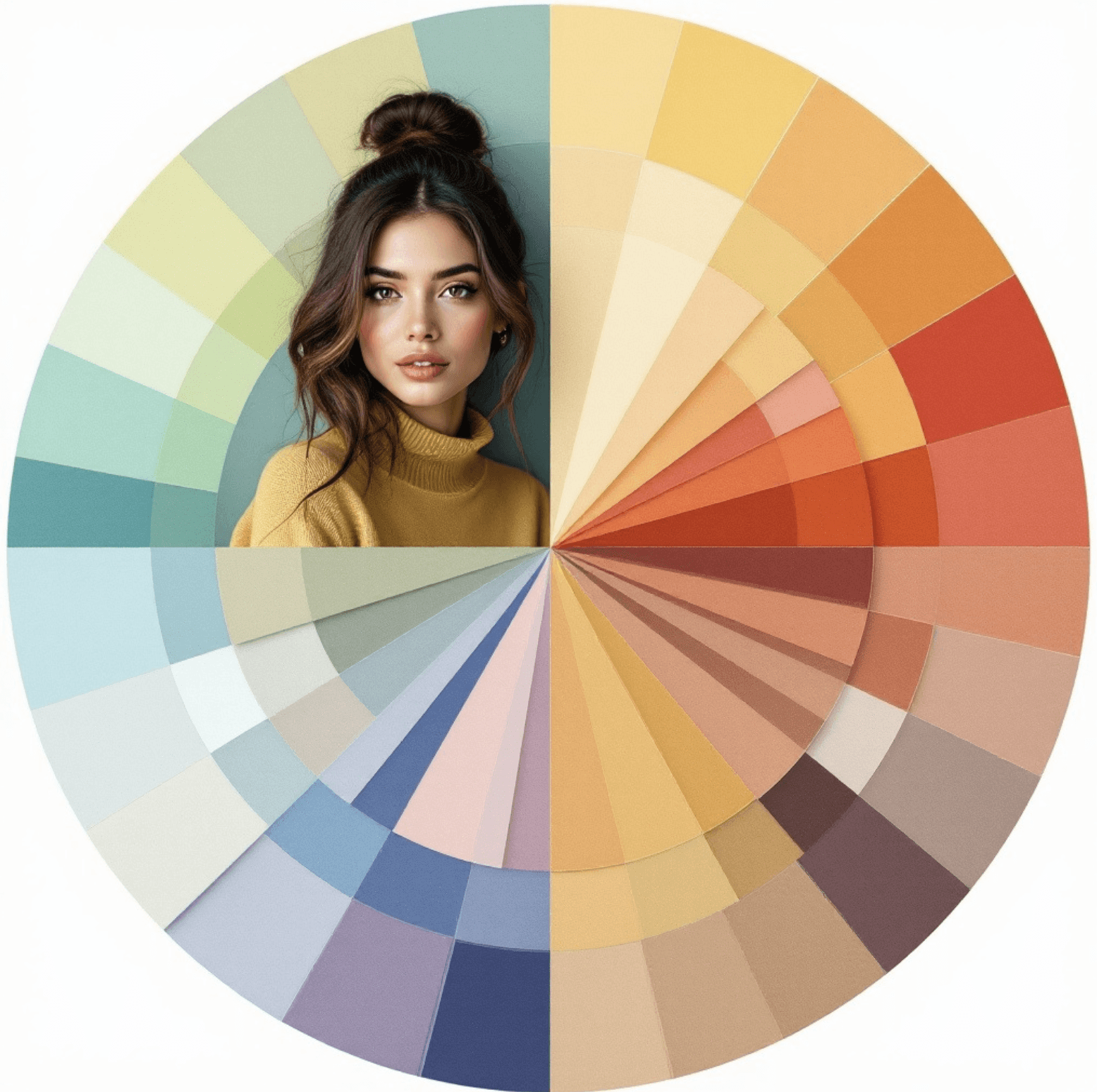
The primary determinant in selecting complementary colors is often skin undertone. Brunettes can have either warm, cool, or neutral undertones, and identifying this is crucial for selecting colors that make the skin look radiant and healthy, rather than sallow or washed out.
- Warm Undertones: Brunettes with golden, peach, or yellow undertones in their skin often have hair with golden, red, or auburn highlights. These individuals thrive in colors that mimic the warmth of the sun and earth. From a branding perspective, warm tones often communicate approachability, creativity, and groundedness.
- Cool Undertones: Brunettes with pink, blue, or olive undertones typically have hair with ash or cool brown hues. These individuals look best in colors that have a blue base, reflecting a cooler palette. For personal branding, cool tones often convey professionalism, trustworthiness, and sophisticated elegance.
- Neutral Undertones: Those with a balanced mix of warm and cool can often wear a wider range of colors, giving them flexibility in their brand expression.
A simple test to determine undertone involves examining the veins on the wrist (blue/purple for cool, green for warm) or observing how silver versus gold jewelry looks against the skin. This foundational understanding ensures that all subsequent color choices for clothing, accessories, and even digital brand assets will serve to amplify the individual’s natural radiance, making their brand presence more impactful.
The Depth of Your Brunette Shade
Beyond undertones, the depth of a brunette’s hair color – from light caramel to deep espresso – also plays a significant role in determining the most effective personal brand palette. Lighter brunettes might find that very dark, heavy colors can overwhelm their features, requiring lighter or brighter shades to maintain balance and avoid overshadowing their face. Conversely, very dark brunettes can carry intense, saturated colors with ease, using them to project authority and confidence.
- Light Brunettes (e.g., honey, caramel): These shades often benefit from medium-intensity colors that don’t create too much contrast. Think muted jewel tones, soft pastels, or richer earthy tones that enhance warmth without overpowering. Their brand might lean towards approachable elegance or creative sophistication.
- Medium Brunettes (e.g., chestnut, chocolate): This versatile range often looks good in a wide array of colors. They can experiment with both deeper and brighter shades, balancing vibrancy with depth. Their brand can be highly adaptable, moving between assertive and amicable depending on the color choice.
- Dark Brunettes (e.g., espresso, raven): The deep saturation of dark brunette hair allows for bold, highly saturated colors. Jewel tones, true reds, deep blues, and crisp whites create striking contrasts that project power, sophistication, and strong leadership qualities. Their brand often exudes confidence and gravitas.
Aligning color choices with both undertone and hair depth ensures that the visual elements of a personal brand are not only aesthetically pleasing but also strategically aligned to maximize impact and authenticity.
Curated Color Palettes for Brunettes: Building a Powerful Visual Identity
Once undertones and hair depth are understood, specific color categories can be identified as optimal for brunettes. These categories are not just about “looking good” but about strategically leveraging color to communicate specific aspects of a personal brand.
Jewel Tones: Radiance and Authority
For many brunettes, especially those with cooler undertones and deeper hair shades, jewel tones are an unparalleled choice for projecting sophistication, confidence, and gravitas. Colors like emerald green, sapphire blue, ruby red, and amethyst purple offer rich saturation that complements the depth of brunette hair.
- Brand Impact: These colors are ideal for a brand seeking to convey luxury, authority, deep intelligence, and creative power. They make a statement without being overtly loud, perfect for leadership roles, high-stakes presentations, or establishing expert credibility. An emerald green blazer, for instance, on a deep brunette can instantly elevate their presence, signaling discerning taste and unwavering assurance.
Earth Tones: Approachability and Groundedness
Brunettes with warmer undertones and lighter to medium hair shades often find their personal brand resonates beautifully with a palette of sophisticated earth tones. These include olive green, terracotta, mustard yellow, camel, and various shades of brown.
- Brand Impact: Earth tones evoke feelings of stability, authenticity, and approachability. They are excellent for brands that aim to appear trustworthy, grounded, and relatable. For consultants, educators, or individuals building community, these colors foster a sense of warmth and reliability. A camel-colored coat or an olive-green blouse can subtly communicate an inviting yet professional demeanor, reinforcing a brand built on genuine connection.
Pastels & Muted Hues: Sophistication and Softness
While often associated with lighter hair, many pastels and muted tones can look incredibly chic and refined on brunettes, particularly those with cooler undertones or a desire to project a softer, more approachable aspect of their brand. Think dusty rose, lavender, soft sky blue, or mint green.
- Brand Impact: These colors are excellent for brands that want to convey creativity, thoughtfulness, serenity, or a gentle yet impactful leadership style. They can soften a strong presence without diminishing authority. A dusty rose blouse, for example, on a cool-toned brunette can project creative elegance and empathetic leadership, a nuanced brand message that balances strength with approachability.
Neutrals with Impact: Versatility and Professionalism
Every strong personal brand needs a foundation of versatile neutrals. For brunettes, these are not just background colors but active players in their visual identity, providing balance and allowing accent colors to pop. Black, white, charcoal grey, navy blue, and specific shades of brown are key.
- Brand Impact: Neutrals are the backbone of professionalism and versatility. They convey stability, efficiency, and timeless elegance.
- Black & White: Crisp contrast, strong statements, ideal for authoritative and modern brands. Black often signifies power and sophistication; white, purity and clarity.
- Navy Blue: A universally flattering color for brunettes, projecting trustworthiness, intelligence, and reliability. It’s a softer alternative to black for many professional settings.
- Charcoal Grey: Conveys sophistication and analytical thinking, a strong choice for business-oriented brands.
- Browns: Particularly rich chocolate or deep mocha, are excellent for warm-toned brunettes, fostering warmth, reliability, and approachability.
These core palettes, when selected thoughtfully based on individual characteristics and brand objectives, form a powerful toolkit for visual communication.
Harnessing Color to Project Specific Brand Narratives
Beyond simply choosing “flattering” colors, brunettes can actively manipulate their color choices to tell a specific story about their personal brand, much like a marketing campaign tailors its message to different audiences or objectives.
Power Dressing: Commanding Presence
For brunettes aiming to project authority, confidence, and leadership, color becomes a strategic amplifier. Deep, saturated colors and strong contrasts are key.
- Color Choices: Ruby red, sapphire blue, emerald green, deep purple, and classic black. Paired with crisp whites or rich charcoals.
- Brand Narrative: “I am competent, decisive, and influential. I command respect and deliver results.” This strategy is particularly effective for those in executive roles, public speaking, or high-stakes negotiations where projecting unwavering confidence is paramount. The visual strength conveyed by these colors reinforces the individual’s inner fortitude and strategic thinking.
Approachable Professional: Building Rapport
When the brand objective is to build rapport, foster collaboration, or demonstrate empathy without sacrificing professionalism, a different color strategy is employed.
- Color Choices: Softer blues (e.g., slate, cornflower), warm browns (e.g., caramel, mocha), olive green, or muted berry tones. Neutrals like camel, grey, or cream can also serve this purpose.
- Brand Narrative: “I am knowledgeable and reliable, yet also open, collaborative, and approachable.” This palette helps brunettes connect with diverse audiences, making them seem more accessible while maintaining an air of expertise. It’s ideal for roles in HR, client relations, coaching, or creative industries where collaboration is key.
Creative & Innovative: Expressing Uniqueness
For brunettes whose personal brand centers around creativity, innovation, or a unique artistic vision, color can be used to signal originality and forward-thinking.
- Color Choices: Unexpected color combinations, vibrant accents, or rich, unconventional hues like teal, mustard yellow, or deep magenta. The key is often thoughtful juxtaposition and saturation.
- Brand Narrative: “I am imaginative, original, and bring fresh perspectives. I am not afraid to challenge the status quo and innovate.” This strategy allows the brunette to stand out in crowded fields, signaling their distinct perspective and artistic flair. It is particularly relevant for designers, artists, entrepreneurs, or thought leaders looking to differentiate themselves through unique expression.
By consciously selecting colors that align with these specific brand narratives, brunettes move beyond simple aesthetic choices to a powerful, intentional method of visual communication, reinforcing their desired identity in every interaction.
Beyond Attire: Integrating Brand Colors Across Your Visual Presence
A truly holistic personal brand extends beyond the clothes worn on any given day. For brunettes, this means integrating their identified power colors and brand palette into every aspect of their visual presence, ensuring a consistent and compelling message across all platforms. This comprehensive approach is crucial for solidifying a strong, recognizable brand identity.
Hair, Makeup, and Accessories: Subtle Reinforcement
The strategic use of color in hair, makeup, and accessories can subtly reinforce a brunette’s personal brand palette without being overtly “branded.”
- Hair Color: While the core brunette shade is foundational, subtle highlights (warm caramel for warm undertones, cool ash for cool undertones) can enhance the hair’s natural beauty and ensure it harmonizes with the chosen color palette. This is a crucial element of a cohesive visual identity.
- Makeup: The right makeup shades – eyeshadows, lipsticks, and blushes – should complement the personal brand palette. A cool-toned brunette aiming for power might choose a deep berry lip, while a warm-toned brunette aiming for approachability might opt for a peachy blush. Makeup is a powerful tool for subtly adjusting the perceived warmth or coolness of the complexion to align with chosen attire and overall brand message.
- Accessories: Jewelry, scarves, handbags, and even eyeglasses offer opportunities to inject brand colors. A pop of sapphire blue in a scarf, or an emerald green necklace, can reinforce the brand’s aesthetic even if the main outfit is a neutral. These small details contribute significantly to the overall perception of meticulousness and intentionality, hallmarks of a strong personal brand.
The Digital Brand Persona: Colors in Your Online Presence
In today’s digital age, a personal brand extends significantly into the online realm. The color choices made for a personal website, social media profiles, digital portfolios, or virtual meeting backgrounds are just as important as those in physical attire.
- Website & Social Media: The banner images, profile pictures, and overall aesthetic of online platforms should reflect the established personal brand colors. Using consistent fonts and a limited color palette (e.g., 2-3 primary brand colors plus neutrals) ensures professionalism and easy recognition. For a brunette, this means selecting background colors or accent elements that harmonise with their physical appearance, creating an integrated online and offline brand.
- Presentation Decks & Digital Materials: Any materials created for professional use – presentations, reports, e-books – should incorporate the personal brand’s color scheme. This consistent application reinforces the brand message and makes all outputs instantly recognizable as belonging to that individual.
- Virtual Backgrounds: For virtual meetings, selecting a background color or design that aligns with the personal brand’s palette can enhance professionalism and consistency, subtly communicating the desired brand attributes even in a remote setting.
By thoughtfully extending the chosen color palette across all aspects of their visual presence, brunettes can cultivate a powerful, cohesive, and memorable personal brand that resonates effectively both online and offline. This deliberate design strategy ensures that every visual element works in concert to communicate the desired message and amplify individual impact.
aViewFromTheCave is a participant in the Amazon Services LLC Associates Program, an affiliate advertising program designed to provide a means for sites to earn advertising fees by advertising and linking to Amazon.com. Amazon, the Amazon logo, AmazonSupply, and the AmazonSupply logo are trademarks of Amazon.com, Inc. or its affiliates. As an Amazon Associate we earn affiliate commissions from qualifying purchases.