
In the intricate tapestry of brand identity, color reigns supreme as a silent, yet powerfully evocative, communicator. When a brand anchors its visual identity in green and yellow, it immediately taps into a spectrum of associations ranging from nature and optimism to growth and innovation. However, the true artistry lies not just in selecting these primary hues, but in strategically complementing them with other colors to forge a coherent, impactful, and memorable brand presence. Understanding which colors harmonize or contrast effectively with green and yellow is fundamental to crafting a robust brand strategy, ensuring your message resonates precisely and profoundly with your target audience.

The Strategic Role of Color in Branding
Color is more than just an aesthetic choice; it is a critical component of brand strategy, acting as a non-verbal language that conveys emotion, meaning, and personality. For brands utilizing green and yellow, the decision about accompanying colors can significantly alter perception, influence consumer behavior, and carve out a distinct market position.
Evoking Emotion and Association
Every color carries psychological weight and cultural connotations. Green often symbolizes nature, sustainability, health, growth, and tranquility, making it a favorite for eco-conscious brands, health industries, and financial institutions aiming for stability. Yellow, on the other hand, radiates optimism, energy, cheerfulness, youth, and creativity, commonly adopted by brands seeking to project approachability, innovation, or a vibrant spirit. When these two colors are combined, they create a dynamic interplay. However, without careful selection of additional colors, the brand might inadvertently project an overly simplistic, childish, or even chaotic image. Complementary colors serve to temper, amplify, or redefine these core associations, allowing for nuanced brand messaging. A touch of deep blue might add seriousness to a green-yellow palette, while a vibrant orange could heighten its playful energy.
Building Recognition and Recall
A cohesive color palette is instrumental in building brand recognition and recall. Think of iconic brands; their colors are often as memorable as their logos. For brands utilizing green and yellow as foundational elements, the chosen secondary and accent colors contribute to the overall visual signature. Consistency across all touchpoints – from logos and websites to packaging and marketing materials – reinforces this signature, making the brand instantly identifiable. A well-constructed palette ensures that the brand doesn’t just “have” green and yellow, but “owns” a unique combination that distinguishes it from competitors. It’s about creating a visual language that speaks volumes without uttering a single word, fostering an immediate connection and facilitating easier recall in the crowded marketplace.
Decoding Green and Yellow in Brand Palettes
Before exploring complementary colors, it’s essential to understand the individual psychological impact and branding implications of green and yellow, and how they interact when paired.
The Psychology of Green
Green is overwhelmingly associated with nature, renewal, and vitality. Brands in the environmental, organic food, wellness, and outdoor industries frequently leverage green to communicate their core values. In finance, deep greens can signify wealth, stability, and trustworthiness. Lighter, brighter greens evoke freshness and growth. The versatility of green allows it to be both grounding and invigorating, depending on its shade and context.
The Psychology of Yellow
Yellow is the color of sunshine, universally linked to happiness, optimism, and energy. It demands attention and is often used to highlight important information or evoke feelings of cheerfulness and warmth. Brands targeting youth, leisure, or those wanting to project innovation and creativity often integrate yellow into their identity. However, overuse or the wrong shade can sometimes appear aggressive or denote caution. Its vibrancy requires careful balancing.
The Dynamic Duo: Green and Yellow Together
When green and yellow are paired, they naturally evoke a sense of freshness, vitality, and often, an energetic connection to nature. This combination can be incredibly powerful for brands focused on natural products, sustainability, health, or even playful, youthful ventures. The yellow provides a burst of optimism and light to green’s grounding nature. However, without careful consideration of other colors, this duo might lack sophistication or depth, potentially appearing overly casual or even garish if not balanced correctly. The addition of complementary colors can refine this dynamic, adding layers of meaning and enhancing the brand’s overall aesthetic appeal.
Complementary Colors for Green and Yellow Branding
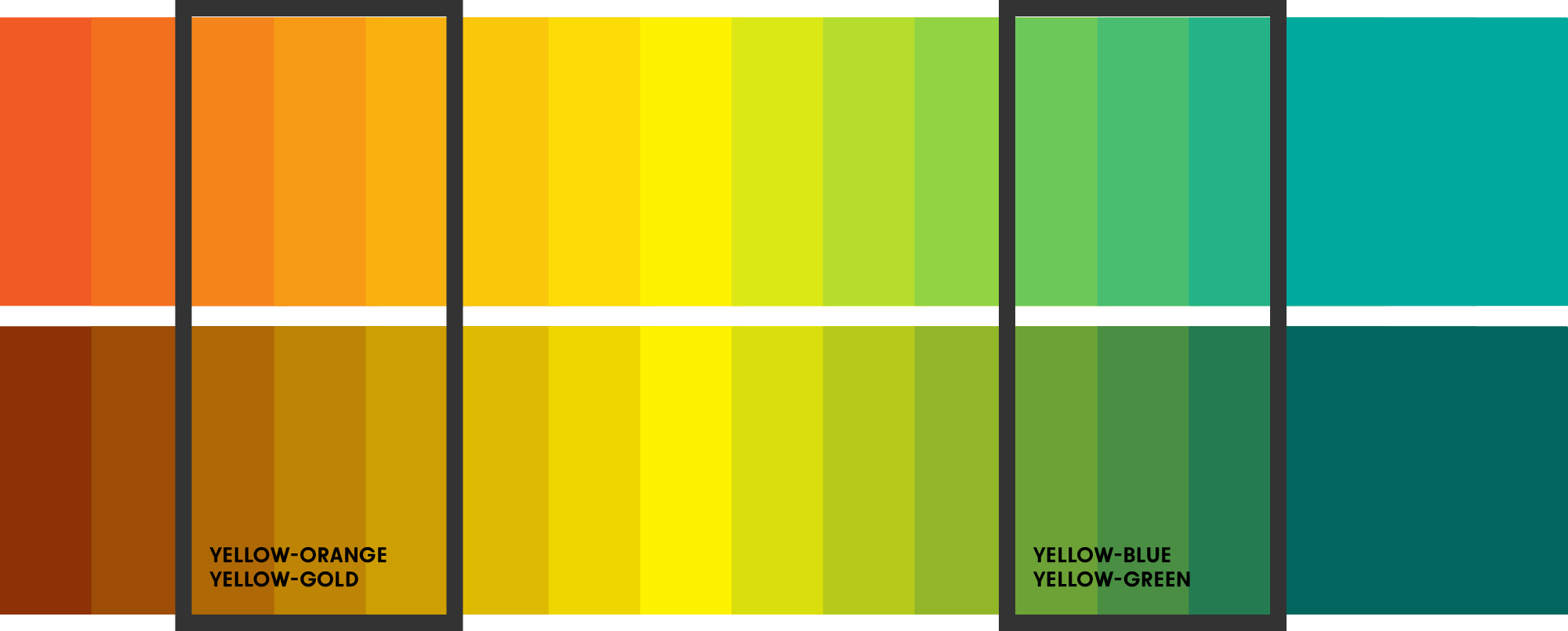
Selecting the right accompanying colors can elevate a green and yellow palette from merely pleasant to truly distinguished. These additions can provide balance, depth, contrast, or a specific emotional nuance.
Neutrals for Balance and Sophistication
Neutrals are the unsung heroes of many successful brand palettes. They provide a sophisticated backdrop that allows green and yellow to shine without overwhelming the viewer.
- White and Off-White (Cream, Ivory): These offer crispness and cleanliness, enhancing the freshness of green and the brightness of yellow. Ideal for brands aiming for minimalist aesthetics, purity, or a premium feel.
- Grey (Charcoal, Slate): A sophisticated choice that can ground the vibrancy of green and yellow. Darker greys add a sense of professionalism, stability, and modernity, making them excellent for corporate or tech brands. Lighter greys provide a soft, contemporary feel.
- Beige and Tan: These warm neutrals connect to nature and organic themes, creating a softer, more approachable look. They work well for sustainable brands, artisanal products, or those wanting to evoke a sense of natural comfort.
- Brown: Deep browns can introduce a sense of ruggedness, earthiness, and authenticity. They pair beautifully with greens and yellows, reinforcing natural or heritage themes, often seen in coffee brands, outdoor gear, or artisanal food.
Analogous Harmony
Analogous colors are those that sit next to each other on the color wheel, creating a harmonious and fluid transition.
- Teal/Aqua (Blue-Green): Situated between green and blue, teal adds a refreshing, calm, and often sophisticated dimension. It can introduce a watery element, enhancing the natural feel or adding a touch of modern elegance to a green-yellow palette, suitable for wellness or tech brands.
- Lime/Chartreuse: These are very close to yellow-green, intensifying the vibrant, energetic, and often youthful aspects of the primary duo. They can be used for playful, energetic, or innovative brands that want to push boundaries.
- Orange/Gold: Adjacent to yellow, orange brings warmth, enthusiasm, and a sense of approachability. Gold adds luxury, quality, and a premium feel. When paired with green and yellow, these can create a rich, inviting, and energetic palette, often seen in food and beverage or entertainment industries.
Contrasting Accents for Impact
Complementary colors (opposite on the color wheel) or strong contrasting hues can be used sparingly as accents to create visual interest, highlight key elements, and add depth.
- Purple/Violet: The direct complement of yellow, purple creates a striking contrast that can add a touch of luxury, creativity, or mystery. Using a deep plum or royal purple as an accent can elevate a green and yellow palette, making it feel more sophisticated and unique.
- Blue (Navy, Royal Blue): While not a direct complement to green or yellow, blue offers a strong contrast, particularly with brighter yellows. Navy blue introduces professionalism, trustworthiness, and stability, effectively grounding a vibrant green-yellow combination. It’s excellent for corporate brands or those aiming for a balanced blend of warmth and reliability.
- Magenta/Fuchsia: For brands seeking to make a bold, modern, and energetic statement, a vibrant magenta or fuchsia can act as a powerful accent. This combination is often seen in fashion, beauty, or highly creative industries that want to stand out.
Earth Tones for Natural Depth
Expanding on neutrals, a broader range of earth tones can provide a grounding and organic feel.
- Terracotta/Rust: These warm, reddish-brown tones can add a rustic, artisanal, or natural quality, evoking warmth and authenticity, particularly effective with deeper greens and golden yellows.
- Olive Green/Mustard Yellow: While not strictly complementary, using different shades of green and yellow that lean into earthier tones can create a sophisticated, muted, and very organic brand identity, ideal for heritage brands or those focused on natural craftsmanship.
Implementing Your Green and Yellow Palette
Once the perfect complementary colors are identified, consistent and strategic application across all brand touchpoints is paramount.
Brand Logo and Visual Identity
The logo is the cornerstone. Green and yellow might form the core, with an accent color used for a specific element or typeface to create emphasis. The chosen palette extends to iconography, graphic elements, and overall visual guidelines, ensuring every visual component reflects the established identity. The balance between the primary and complementary colors dictates the brand’s perceived personality—bold, subtle, serious, or playful.
Marketing Materials and Digital Presence
Whether it’s a website, social media graphics, brochures, or advertisements, the palette must be applied consistently. Web design will dictate background colors, call-to-action buttons, and typography colors. Social media templates should adhere to the palette to ensure instant brand recognition across diverse platforms. The use of complementary colors in marketing can help segment information or highlight promotions, guiding the viewer’s eye and reinforcing the brand message.

Product Packaging and Experience
For physical products, packaging is a direct interaction point. Green and yellow can dominate, while complementary colors provide crucial visual cues on labels, inserts, or secondary packaging. Think of a natural food brand using green and yellow for its core identity, augmented by an earthy brown for packaging materials to emphasize organic origins, or a vibrant teal to denote a refreshing flavor. The experience of unboxing or interacting with the product should feel like an extension of the brand’s cohesive color story.
In conclusion, green and yellow form a vibrant, versatile base for brand identity. However, their true potential is unlocked by thoughtfully integrating complementary colors. By understanding the psychological impact of each hue and strategically deploying neutrals, analogous tones, or contrasting accents, brands can craft a visual language that not only captures attention but also communicates deeply, resonates authentically, and fosters lasting recognition in the minds of their audience. The right color strategy transcends mere aesthetics, becoming a powerful engine for brand growth and engagement.
aViewFromTheCave is a participant in the Amazon Services LLC Associates Program, an affiliate advertising program designed to provide a means for sites to earn advertising fees by advertising and linking to Amazon.com. Amazon, the Amazon logo, AmazonSupply, and the AmazonSupply logo are trademarks of Amazon.com, Inc. or its affiliates. As an Amazon Associate we earn affiliate commissions from qualifying purchases.