
Camel, a hue celebrated for its inherent warmth, sophistication, and versatility, holds a powerful position in the lexicon of brand design and visual communication. Far from being a mere fashion trend, its strategic application in corporate identity, marketing materials, and digital presence can profoundly influence brand perception, evoke specific emotions, and cultivate a distinct market position. Understanding the optimal color pairings for camel is not just an exercise in aesthetics; it is a critical component of building a cohesive, impactful, and memorable brand identity.
The Enduring Appeal of Camel in Branding and Design
Camel, often described as a muted, earthy brown with yellow or red undertones, derives its name from the color of camel hair. It sits comfortably between beige and light brown, offering a rich yet understated elegance. In the realm of branding, camel functions as a sophisticated neutral, capable of anchoring a color palette or providing a warm backdrop that allows other colors to shine. Its enduring appeal lies in its perceived qualities and remarkable adaptability.
Psychological Impact of Camel
From a psychological standpoint, camel evokes feelings of reliability, comfort, and authenticity. It is often associated with natural materials, heritage, and a sense of understated luxury. For brands aiming to communicate trustworthiness, quality craftsmanship, and timelessness, camel can be an invaluable asset. It avoids the starkness of pure white or the intensity of dark browns, offering a gentle yet authoritative presence. This makes it particularly effective for high-end fashion, artisanal products, luxury services, and brands that emphasize tradition and enduring value. Its warmth can make a brand feel inviting and approachable, while its inherent sophistication elevates its perceived status.
Versatility in Visual Communication
The versatility of camel is unparalleled. It can serve as a primary brand color, a dominant background, or an accent that ties a palette together. Its ability to complement a wide spectrum of hues, from vibrant brights to muted pastels, makes it a designer’s dream. This adaptability allows brands to maintain a core identity while expressing different facets of their personality or adapting to various seasonal campaigns without losing visual cohesion. Whether a brand aims for classic elegance, contemporary chic, or rustic charm, camel provides a flexible foundation that can be styled to fit diverse brand narratives.
Classic Pairings: Timeless Elegance and Sophistication
Certain color combinations with camel have become classics, revered for their ability to convey timeless elegance and an undeniable sense of sophistication. These pairings often leverage the inherent qualities of camel to build a palette that speaks to luxury, tradition, and refined taste.
Monochromatic & Tonal Harmony
Exploring the range of camel itself offers a sophisticated monochromatic palette. By combining varying shades of camel, from lighter sand tones to deeper tan and cognac hues, brands can create depth and interest without introducing additional colors. This approach communicates a sense of focused refinement and singular identity. It’s particularly effective for brands that prioritize minimalism, understated luxury, and a strong, singular brand statement. The subtle shifts in tone provide visual texture and a sense of natural warmth that feels inherently premium.
The Power of Neutrals: White, Cream, and Black
Pairing camel with other neutrals is a fail-safe strategy for achieving classic sophistication.
- Camel and White/Cream: This combination exudes lightness, airiness, and a clean, crisp elegance. White or cream provides a fresh contrast, highlighting the warmth of camel without overwhelming it. It’s a favored palette for brands in hospitality, beauty, and luxury retail, signaling purity, comfort, and premium quality. Think of a high-end spa or a minimalist fashion label – the blend of camel and cream feels inherently serene and inviting.
- Camel and Black: For a more dramatic and formal appeal, camel paired with black offers striking contrast and undeniable authority. This combination speaks to power, sophistication, and a bold modernity. It’s often seen in high-fashion branding, corporate identities seeking gravitas, or product packaging that aims for a luxurious, impactful presence. The warmth of camel softens the starkness of black, creating a balanced yet commanding visual.
Earthy Complement: Forest Green and Deep Brown
Extending the natural theme, camel harmonizes beautifully with other earthy tones, particularly deep greens and rich browns.
- Camel and Forest Green: This pairing evokes a sense of nature, growth, and enduring stability. Forest green brings a grounding, organic feel that complements camel’s warmth, suggesting sustainability, health, and a connection to the environment. Brands in eco-conscious industries, outdoor lifestyle, or artisanal crafts can leverage this combination to communicate their values and heritage.
- Camel and Deep Brown: Pairing camel with deeper shades of brown, such as chocolate or espresso, creates a rich, layered, and profoundly grounding palette. This combination enhances the sense of tradition, craftsmanship, and warmth. It’s excellent for brands aiming to project reliability, heritage, and robust quality, such as leather goods manufacturers, artisanal food brands, or established professional services.
Contemporary Combinations: Modern Flair and Dynamic Contrast

While camel excels in classic pairings, its adaptability also allows for exciting contemporary combinations that inject modern flair, dynamic contrast, and a fresh perspective into brand identities. These pairings leverage camel as a sophisticated anchor for more vibrant or unexpected hues.
Bold Accents: Teal, Navy, and Burgundy
Introducing bolder colors with camel can create memorable and distinctive brand palettes.
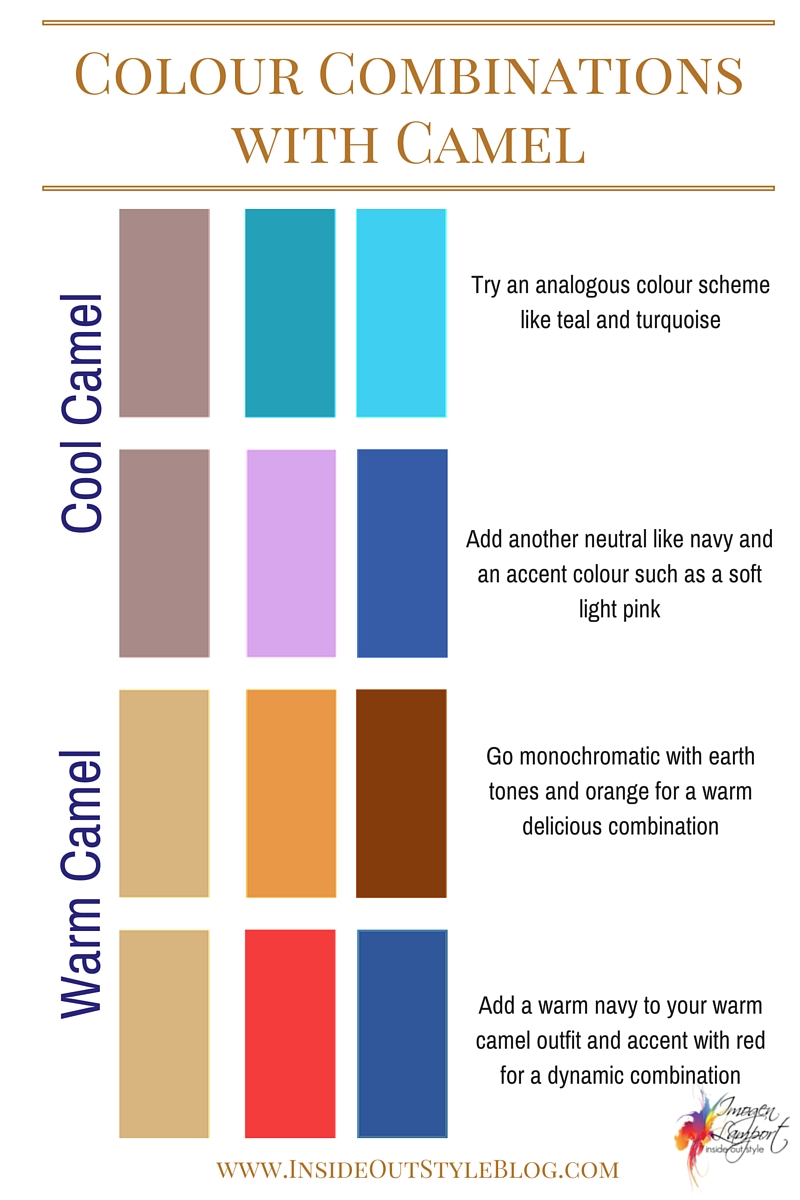
- Camel and Teal: Teal, with its blend of blue and green, offers a sophisticated yet energetic contrast to camel. This pairing can evoke a sense of creativity, innovation, and a connection to both nature and technology. It’s a strong choice for brands seeking to balance tradition with forward-thinking design, such as interior design firms, creative agencies, or premium tech accessories.
- Camel and Navy: This is a timeless power pairing that exudes trust, authority, and professionalism. Navy provides a deep, calming anchor, while camel injects warmth and approachability. It’s a go-to for corporate branding, financial institutions, and professional services that aim to convey reliability, expertise, and a polished image. The combination feels established yet refined.
- Camel and Burgundy: Burgundy, a deep, rich red, brings a sense of luxury, passion, and sophistication. Paired with camel, it creates a warm, opulent, and inviting palette. This combination is ideal for brands in the hospitality sector, high-end fashion, or luxury goods that want to communicate indulgence, elegance, and a rich experience.
Soft Statements: Blush Pink and Muted Blue
For brands seeking a softer, more approachable, or subtly luxurious feel, camel pairs beautifully with delicate, muted tones.
- Camel and Blush Pink: This combination offers a gentle, sophisticated femininity that is both warm and inviting. Blush pink softens camel’s inherent strength, creating a palette that feels nurturing, elegant, and modern. It’s perfect for beauty brands, lifestyle coaches, or brands targeting a discerning female audience who appreciate subtle luxury and a touch of romance.
- Camel and Muted Blue: Unlike the formality of navy, a muted or dusty blue brings a sense of calm, serenity, and understated sophistication. This pairing feels harmonious and balanced, evoking reliability without being overly corporate. It works well for wellness brands, sustainable products, or services that emphasize tranquility and clarity.
Metallic Touches: Gold and Silver as Enhancements
Metallic accents, particularly gold and silver, can dramatically elevate a camel-based brand palette, signifying luxury, quality, and distinction.
- Camel and Gold: Gold is the quintessential partner for camel when a brand aims for opulence, heritage, and premium status. The warm undertones of camel are perfectly complemented by the richness of gold, creating an effortlessly luxurious feel. This combination is a staple for high-end jewelry, exclusive services, and luxury packaging where perceived value is paramount.
- Camel and Silver: While gold enhances warmth, silver offers a cooler, more modern sophistication. Paired with camel, silver can give a brand a sleek, contemporary edge without losing camel’s inherent warmth. It’s suitable for tech brands with a premium feel, modern design studios, or automotive brands that want to convey innovation and cutting-edge quality.
Strategic Application: Integrating Camel into Your Brand Identity
The selection of colors is never an arbitrary choice in brand design; it is a strategic decision that directly influences brand perception, recognition, and resonance with the target audience. Integrating camel and its complementary colors requires thoughtful consideration of the brand’s core values and market positioning.
Defining Your Brand’s Personality Through Color
Every color choice contributes to the overall personality a brand projects. Camel, for example, can contribute warmth, reliability, and sophistication. When combined with other colors, this personality can be further nuanced. A brand using camel with navy might be perceived as trustworthy and traditional, while one using camel with teal could be seen as innovative and approachable. It’s crucial to align your chosen camel palette with the emotional and psychological message you intend your brand to convey. Does your brand represent stability or innovation? Luxury or accessibility? The color combinations you select will amplify these messages.
Consistency Across Touchpoints
Once a camel-based color palette is established, its consistent application across all brand touchpoints is paramount. This includes everything from the brand logo and website to marketing collateral, product packaging, uniforms, and interior design of physical spaces. Consistency builds brand recognition and reinforces the desired brand image, helping to cement its identity in the minds of consumers. Inconsistency, conversely, can dilute brand messaging and create confusion.
Adapting to Different Marketing Collateral
While consistency is key, slight adaptations of the core camel palette can be made for different types of marketing collateral or campaigns, provided they remain within the established brand guidelines. For instance, a print advertisement might use more saturated versions of the brand colors for impact, while a digital application might lean towards slightly softer hues for screen readability. The core camel and its primary pairings should always be discernible, maintaining brand recognition even when subtle variations are applied.
Avoiding Pitfalls: Ensuring Cohesion and Professionalism
While camel is versatile, its misuse can lead to a muddled or uninspired brand identity. Thoughtful application is crucial to harness its full potential.
Overwhelm and Understated Balance
The beauty of camel often lies in its understated elegance. Overloading a design with too many vibrant colors in an attempt to create contrast can overwhelm camel’s inherent warmth and lead to a cluttered appearance. The most effective use of camel typically involves a balanced approach, where it either acts as a dominant neutral supported by strategic pops of color, or as a sophisticated accent against a broader neutral or deep-toned background. The goal is to create harmony and allow each color to contribute purposefully to the overall brand message, avoiding visual noise.

Contextual Relevance
The choice of camel and its pairings must always be contextually relevant to the industry, target audience, and brand message. While camel might convey luxury for a high-end fashion brand, its use for a children’s toy company, for example, might not resonate as effectively without very specific supporting elements. Researching competitor palettes and understanding industry color norms can provide valuable insights, allowing a brand to either align with or strategically differentiate itself through its color choices. A well-considered camel palette not only looks good but also strategically communicates the brand’s essence and appeals directly to its intended market.
aViewFromTheCave is a participant in the Amazon Services LLC Associates Program, an affiliate advertising program designed to provide a means for sites to earn advertising fees by advertising and linking to Amazon.com. Amazon, the Amazon logo, AmazonSupply, and the AmazonSupply logo are trademarks of Amazon.com, Inc. or its affiliates. As an Amazon Associate we earn affiliate commissions from qualifying purchases.