Yellow, a hue that embodies optimism, energy, and attention-grabbing power, presents a unique challenge and opportunity for brands. Its inherent vibrancy can be a brand’s greatest asset or its downfall, depending on how it’s paired with other colors. In the realm of branding, color choice is not merely an aesthetic decision; it’s a strategic one, deeply intertwined with perception, recognition, and emotional resonance. Understanding how to effectively incorporate yellow into a brand’s palette can elevate its identity, enhance memorability, and foster a desired connection with its target audience. This article delves into the strategic color pairings that unlock the full potential of yellow in brand design, exploring how these combinations communicate specific messages and contribute to a holistic brand experience.

The Psychology of Yellow in Branding
Before exploring specific color pairings, it’s crucial to understand the psychological impact of yellow itself. Yellow is the most luminous color in the spectrum, naturally drawing the eye. This makes it an excellent choice for highlighting key elements, creating urgency, or simply injecting a sense of joy and positivity. However, its intensity can also be overwhelming if not managed carefully.
Optimism, Energy, and Attention
At its core, yellow is associated with happiness, warmth, and enthusiasm. Brands that want to convey these feelings often turn to yellow. Think of iconic brands like McDonald’s golden arches or IKEA’s cheerful blue and yellow emblem. These brands leverage yellow to create an immediate sense of approachability and positive association. In a crowded marketplace, yellow’s inherent attention-grabbing quality can help a brand stand out, cutting through the visual noise and ensuring it’s noticed. This is particularly valuable for calls to action, promotional materials, or any element that requires immediate engagement.
Potential Pitfalls and How to Mitigate Them
While potent, yellow carries certain risks. In its purest form, it can be perceived as cheap, garish, or even nauseating. Overuse or poor application can lead to visual fatigue or an unintended negative impression. The key to harnessing yellow’s power lies in strategic application and thoughtful pairing. This involves understanding the nuances of different yellow shades and, more importantly, the colors that temper, complement, or amplify its inherent qualities. The goal is to harness its positive attributes while mitigating its potential drawbacks, creating a balanced and impactful visual identity.
Strategic Pairings: Amplifying Yellow’s Impact
The effectiveness of yellow in branding is heavily reliant on the colors it’s paired with. These combinations can dramatically alter the perceived message and overall aesthetic of a brand. By understanding these relationships, brands can make informed decisions that align with their identity and marketing objectives.
The Power of Contrasting Colors: Blues and Greens
Perhaps the most universally appealing and versatile pairings for yellow involve blues and greens. These analogous colors, sitting next to each other on the color wheel, create a harmonious and natural feel when yellow is introduced as an accent or a primary component.
Blue: Trust, Stability, and Sophistication
When paired with yellow, blue offers a powerful contrast that speaks to reliability and professionalism while retaining a sense of optimism. A classic example is the combination of a bright, sunny yellow with a deep, authoritative navy blue. This pairing communicates trust and stability, making it ideal for financial institutions, tech companies, or businesses that want to convey competence and a forward-thinking approach. The blue anchors the vibrancy of the yellow, preventing it from becoming too overwhelming and adding a layer of gravitas. For instance, a brand using a bright yellow for its logo or calls to action against a background of a sophisticated navy blue can effectively grab attention while assuring customers of its trustworthiness. Lighter blues, like sky blue or cerulean, when combined with yellow, evoke a sense of freshness and openness, perfect for travel, wellness, or lifestyle brands.
Green: Growth, Nature, and Freshness
The combination of yellow and green is a natural winner, evoking feelings of growth, vitality, and the outdoors. This pairing is highly effective for brands in the environmental, agricultural, organic food, or health and wellness sectors. A vibrant yellow against a rich forest green or a crisp lime green can convey a sense of energy and rejuvenation. Think of the freshness of lemons on a leafy branch. This combination speaks to natural goodness and a thriving ecosystem. For brands aiming to project an image of sustainability and health, this pairing is almost a default choice. Even a muted or earthy green can work well with certain shades of yellow, creating a grounded and organic feel, suitable for artisanal products or nature-inspired businesses.
The Warm Embrace: Oranges and Reds
For brands aiming for high energy, passion, and a bold statement, pairing yellow with other warm colors like orange and red can be incredibly effective, though it requires careful execution.
Orange: Enthusiasm, Creativity, and Playfulness
Yellow and orange are closely related on the color wheel, both belonging to the warm spectrum. Their combination amplifies feelings of energy, enthusiasm, and creativity. This pairing is vibrant and dynamic, often associated with youthfulness and excitement. Brands in the entertainment, gaming, or food industries might leverage this combination to convey a sense of fun and engagement. A bright, citrusy yellow paired with a bold, fiery orange can be incredibly stimulating and memorable. However, it’s crucial to balance these energetic hues to avoid creating a visually chaotic experience. Using one color as the dominant element and the other as an accent can help maintain visual clarity and impact.
Red: Passion, Urgency, and Excitement
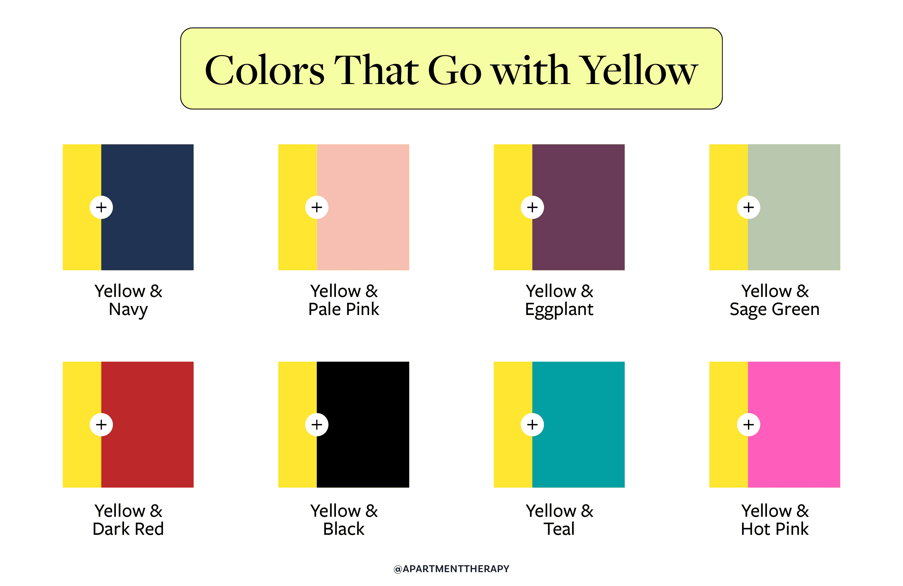
The pairing of yellow and red is one of the most potent and attention-grabbing combinations possible. Red signifies passion, excitement, and urgency, while yellow adds a layer of optimism and visibility. This duo is often used in fast-food branding (think of the classic red and yellow), sports teams, and sales promotions because it is highly effective at grabbing attention and creating a sense of immediate interest. However, due to its intensity, this combination should be used judiciously. Overdoing it can feel aggressive or overwhelming. Strategic use, perhaps a yellow accent on a red background or vice versa, can communicate dynamism and boldness without being jarring. This pairing is best suited for brands that want to make a strong, memorable impact and convey a sense of high energy and action.
Subtlety and Sophistication: Neutrals and Pastels
While bold pairings can be impactful, yellow also shines when paired with more subdued colors, allowing its inherent warmth to come to the forefront in a more sophisticated manner.
The Dependability of Neutrals: White, Black, and Gray
Neutrals provide a stable foundation that allows yellow to truly pop. They offer a sense of balance and can refine the overall perception of yellow.
White: Purity, Clarity, and Simplicity
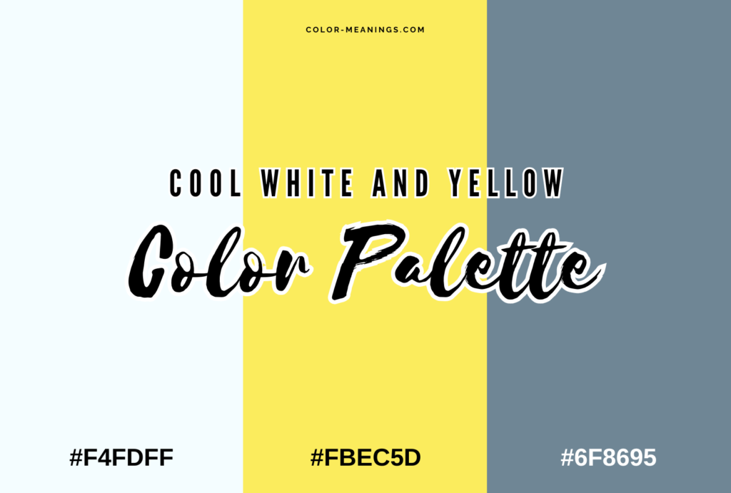
Yellow and white is a classic and incredibly effective pairing. White provides a clean, crisp backdrop that makes any shade of yellow appear brighter and more vibrant. This combination is often associated with purity, clarity, and simplicity. It’s a safe yet effective choice for a wide range of brands, from technology companies that want to appear sleek and modern to food brands that want to emphasize freshness and natural ingredients. The stark contrast ensures that the yellow element is highly visible and draws attention without being overwhelming. For instance, a white website with yellow buttons or accents creates a clean, user-friendly interface that guides the eye effectively.
Black: Elegance, Luxury, and Boldness
Pairing yellow with black creates a striking and sophisticated contrast. Black lends an air of elegance, luxury, and boldness to yellow. This combination is often used by high-end brands, fashion houses, or businesses that want to project an image of exclusivity and confidence. A rich, deep black can make a bright yellow feel even more luminous and impactful. Conversely, a softer yellow can add a touch of warmth and approachability to black. This pairing is about creating a strong, memorable statement that balances sophistication with a touch of daring. Consider a brand that uses a sharp yellow accent on a primarily black design to convey a sense of premium quality and distinctive flair.
Gray: Modernity, Balance, and Neutrality
Gray offers a more muted and sophisticated alternative to black. When paired with yellow, gray creates a modern, balanced, and approachable aesthetic. This combination is excellent for brands that want to convey a sense of professionalism and contemporary style without being overly loud. A medium to dark gray can provide a subtle yet effective contrast that allows yellow to stand out as a highlight. This pairing works well for tech companies, design studios, or brands that aim for a minimalist yet engaging presence. It allows yellow to be used as a strategic accent, drawing attention to key information or elements without dominating the overall design.
The Gentle Touch: Pastels and Muted Tones
For brands seeking a softer, more approachable, and calming impression, pairing yellow with pastels or muted tones is an excellent strategy.
Pastel Yellow with Complementary Pastels
Using lighter, softer shades of yellow, such as pastel yellow or buttercup, opens up a world of gentle and inviting color combinations. Pairing these with other pastels like baby blue, mint green, or soft pink creates an atmosphere of serenity, playfulness, and youthful charm. This palette is ideal for brands targeting a younger demographic, children’s products, or businesses that want to evoke a sense of comfort and gentleness. Think of nurseries, ice cream parlors, or artisanal bakeries. These combinations are visually pleasing, easy on the eyes, and foster a sense of calm and delight.
Muted Yellow with Earthy Tones
For a more sophisticated and organic feel, muted yellows, like mustard or ochre, pair beautifully with earthy tones such as deep browns, terracotta, or muted greens. This combination evokes a sense of naturalism, warmth, and groundedness. It’s perfect for brands in the artisanal food, craft, or eco-friendly sectors. These palettes suggest authenticity, heritage, and a connection to nature. The muted quality of both yellow and its companions creates a sophisticated and inviting atmosphere that feels both contemporary and timeless.
Implementing Yellow Strategically: Beyond Color Swatches
Choosing the right colors is only the first step. Effective brand design requires strategic implementation of these color palettes across all touchpoints.
Logo Design and Visual Identity
The logo is often the first point of contact a consumer has with a brand. When yellow is incorporated into a logo, its placement and the colors it’s paired with are critical. A yellow logo against a contrasting background can be incredibly memorable. Alternatively, a logo where yellow is an accent color can subtly convey the brand’s personality. Beyond the logo, the entire visual identity – including website design, marketing collateral, packaging, and social media graphics – must consistently reflect the chosen color palette. This consistency builds recognition and reinforces the brand’s message.
Website and Digital Presence
In the digital realm, color plays a crucial role in user experience and engagement. Yellow can be effectively used for calls-to-action buttons, banners, or important information to draw attention. However, overuse can lead to a cluttered or distracting website. Pairing yellow with white space and carefully selected secondary colors ensures that the website remains clean, navigable, and aesthetically pleasing. For example, using yellow for an “Add to Cart” button on an otherwise neutral website can significantly increase conversion rates.
Marketing and Advertising Campaigns
Color choices in marketing materials directly influence consumer perception and response. A campaign featuring a bold yellow can convey excitement and attract attention. Conversely, a more muted yellow paired with softer colors might be used for a brand aiming to evoke a sense of calm or trustworthiness. Understanding the psychological impact of color combinations allows brands to craft campaigns that resonate with their target audience and achieve specific marketing objectives, whether it’s driving sales, building brand awareness, or fostering a particular emotional connection.
In conclusion, yellow is a dynamic and powerful color that, when wielded strategically, can significantly enhance a brand’s identity and impact. By understanding the psychology of yellow and its potential color pairings, brands can move beyond mere aesthetic preference and make informed design decisions that communicate effectively, build recognition, and foster lasting connections with their audience. The art lies in balancing yellow’s inherent vibrancy with thoughtful complements, ensuring that its message of optimism, energy, and warmth is delivered with clarity and sophistication.
aViewFromTheCave is a participant in the Amazon Services LLC Associates Program, an affiliate advertising program designed to provide a means for sites to earn advertising fees by advertising and linking to Amazon.com. Amazon, the Amazon logo, AmazonSupply, and the AmazonSupply logo are trademarks of Amazon.com, Inc. or its affiliates. As an Amazon Associate we earn affiliate commissions from qualifying purchases.