
Beige, often dismissed as merely “safe” or “boring,” is in fact a highly sophisticated and versatile cornerstone in brand design and corporate identity. Far from being a neutral void, beige serves as an unparalleled canvas, offering brands a foundation of stability, warmth, and understated elegance. Its subtle complexity allows it to adapt to myriad brand personalities, from minimalist luxury to rustic authenticity, making the strategic selection of complementary colors critical for defining a brand’s visual language and emotional resonance. Understanding how to pair beige effectively can elevate a brand from forgettable to iconic, shaping perceptions and fostering deeper connections with its target audience.

The Strategic Role of Beige in Brand Identity
Choosing beige as a primary or secondary brand color is a deliberate strategic move, not a default. Its inherent qualities offer significant advantages in carving out a distinctive and impactful brand presence.
Beige as a Foundation: Stability and Sophistication
In brand architecture, beige often functions as a grounding element. Unlike stark white, which can sometimes feel cold or clinical, beige introduces an organic warmth that makes a brand feel more approachable and established. It signals reliability and permanence, attributes highly valued by consumers seeking trustworthy brands. For luxury brands, beige, particularly in its warmer, more saturated iterations like sand or fawn, evokes a sense of quiet opulence and timeless sophistication, steering clear of gaudy ostentation. It suggests a brand that is confident in its quality, requiring no loud declarations. Its ability to recede allows other brand elements—such as a distinctive logo, product imagery, or a vibrant accent color—to truly shine, creating a balanced and harmonious visual experience.
Psychological Associations of Beige in Branding
Colors carry profound psychological weight, and beige is no exception. It is frequently associated with practicality, comfort, and simplicity. Brands aiming to convey an eco-friendly, natural, or artisanal ethos often leverage beige to communicate these values without explicit messaging. For service-oriented businesses, especially in wellness, finance, or real estate, beige can instill a sense of calm, trustworthiness, and professionalism. It helps create an impression of quiet competence and reassuring stability, essential for building client confidence. Moreover, beige’s connection to natural elements—sand, earth, stone—can subtly reinforce messages of sustainability, authenticity, and a grounded approach to business.
Versatility Across Brand Personalities
One of beige’s most compelling attributes is its chameleon-like adaptability. Depending on its specific shade and the colors it’s paired with, beige can convey vastly different brand personalities:
- Minimalist & Modern: Paired with crisp whites, deep charcoals, or slate greys, beige supports a clean, uncluttered aesthetic.
- Warm & Welcoming: Combined with terracotta, rust, or olive green, it fosters an inviting, organic feel.
- Luxurious & Elegant: Accentuated by gold, emerald, or sapphire, it exudes high-end appeal.
- Playful & Youthful: Juxtaposed with bright coral, mustard yellow, or turquoise, it can appear energetic and contemporary.
This versatility makes beige an invaluable tool for designers aiming to craft nuanced brand identities that can evolve without losing their core essence.
Harmonious Pairings: Classic & Subtle Combinations
When aiming for a brand aesthetic that is calm, sophisticated, or organically inspired, pairing beige with other understated hues creates compelling harmony.
Earth Tones: Organic Appeal and Authenticity
The most natural complement to beige comes from the earth itself. Browns, deep terracottas, warm olives, and forest greens create a palette that feels grounded, authentic, and naturally derived.
- Deep Chocolate Browns: Paired with beige, brown suggests heritage, craftsmanship, and a richness that is both comforting and luxurious. Ideal for artisanal food brands, heritage fashion, or high-end furniture.
- Terracotta and Rust: These warm, reddish-browns infuse beige with a Mediterranean warmth and an artistic, handcrafted feel. Excellent for brands in pottery, sustainable home goods, or travel.
- Olive and Sage Greens: Evoke nature, growth, and tranquility. Brands focused on wellness, organic products, or sustainable practices can leverage this combination to communicate their core values visually. The pairing feels fresh yet earthy.
This family of colors reinforces beige’s organic qualities, making a brand feel approachable, honest, and connected to the natural world.
Neutrals: Understated Elegance and Minimalism
For brands that champion simplicity, clarity, and refined taste, pairing beige with other neutrals creates a sense of timeless elegance.
- Crisp Whites and Off-Whites: This combination is the epitome of clean, modern minimalism. It creates a breathable, expansive feel, often used by high-end fashion, architectural firms, or tech brands that prioritize user experience and simplicity. The warmth of beige prevents the palette from feeling too stark.
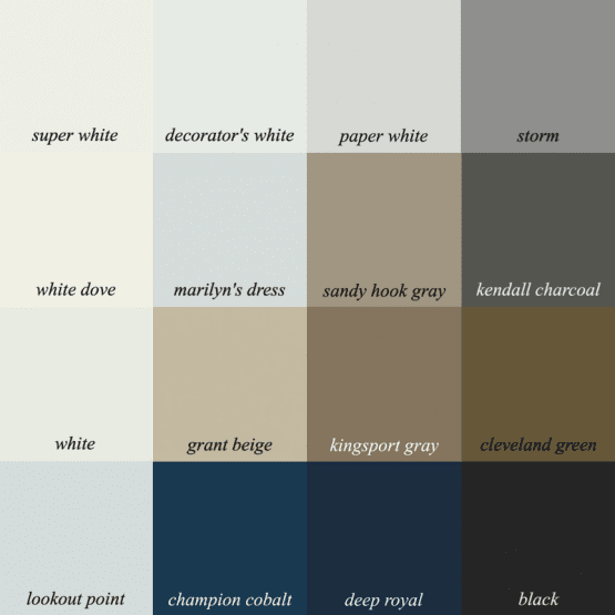
- Charcoal and Slate Greys: Introduce a sophisticated contrast. Grey adds a touch of seriousness and professionalism, grounding beige without overwhelming it. This pairing is excellent for corporate brands, consultancies, or luxury automotive, signaling reliability and gravitas.
- Black: When used as an accent with beige, black adds a dramatic flair and definitive edge. It enhances readability and creates strong visual anchors. A minimalist brand leveraging beige and black suggests confidence, power, and high-end exclusivity.
Pastels: Softness, Approachability, and Serenity
Pastel shades can soften beige, creating a palette that feels gentle, approachable, and serene.
- Blush Pink and Rose Gold: Paired with beige, these colors create a delicate, feminine, and often luxurious aesthetic. Popular with beauty brands, bespoke patisseries, or wedding planners, they convey tenderness and elegance.
- Sage Green and Muted Teal: These soft greens and blues bring a calming, refreshing quality. They work well for brands promoting mindfulness, health, or serene home environments, offering a subtle nod to nature and tranquility.
- Pale Sky Blue: Combined with beige, sky blue evokes openness, reliability, and peace. Ideal for brands in childcare, health, or personal development, suggesting trust and a light, optimistic outlook.
Dynamic Pairings: Adding Impact and Modernity
While beige excels at providing a stable foundation, it also eagerly accepts vibrant companions to inject energy, personality, and a contemporary edge into a brand’s visual identity.
Jewel Tones: Luxury, Depth, and Exclusivity
For brands aiming to convey opulence, sophistication, and a sense of premium quality, jewel tones offer a magnificent counterpoint to beige.
- Emerald Green: Paired with beige, emerald exudes richness, growth, and a connection to nature’s most luxurious facets. Ideal for high-end eco-conscious brands, jewelry, or exclusive resorts.
- Sapphire Blue: This deep, regal blue against beige communicates trust, stability, and intellectual depth. It’s often chosen by luxury financial services, premium tech, or prestigious educational institutions to convey authority and reliability.
- Amethyst Purple: A vibrant yet refined purple adds creativity, wisdom, and a touch of mystic luxury to a beige palette. Suitable for brands in wellness, artistic services, or bespoke fashion.
These combinations leverage beige’s calming presence to allow the jewel tones to make a powerful, yet not overwhelming, statement of exclusivity and high value.
Bright Accents: Energy, Youthfulness, and Differentiation
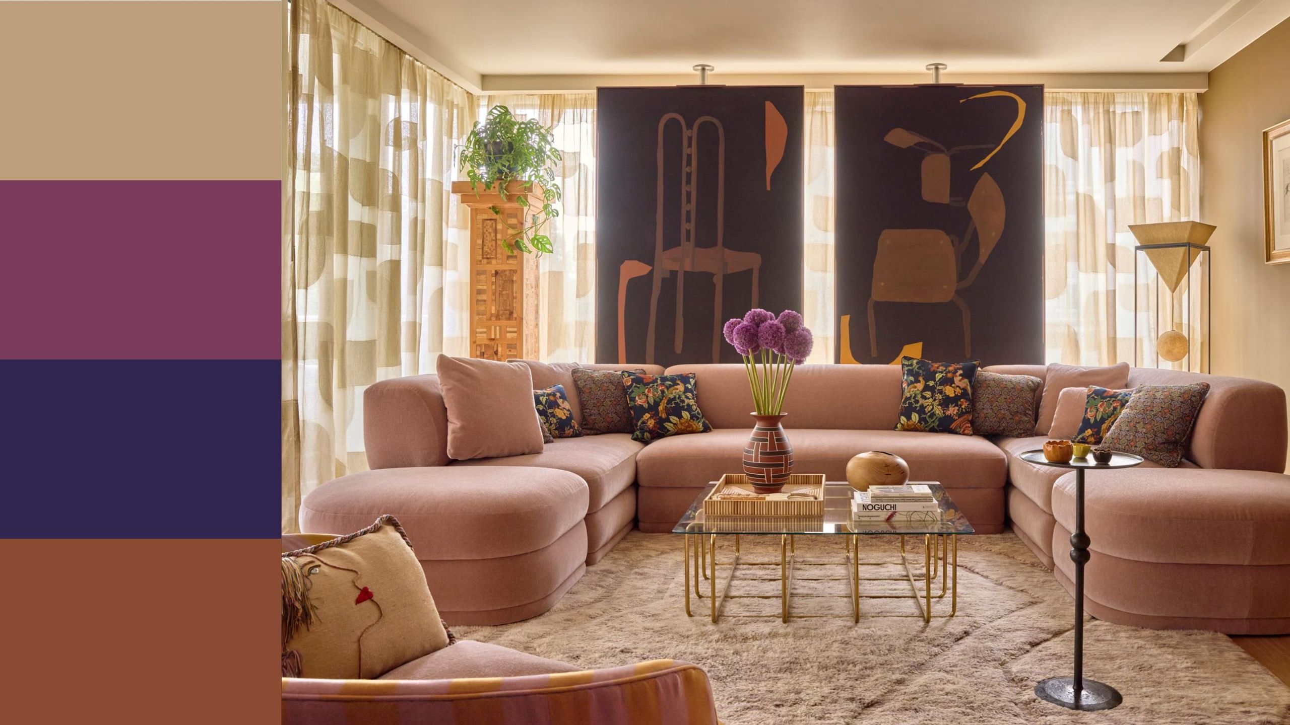
To inject vibrancy, dynamism, and a modern sensibility, strategically placed bright accents can transform a beige palette.
- Coral and Peach: These warm, energetic hues add a friendly, playful, and approachable quality to beige. They can make a brand feel youthful, innovative, and optimistic, perfect for lifestyle brands, creative agencies, or modern cafes.
- Mustard Yellow: A sophisticated yet cheerful yellow, mustard paired with beige suggests creativity, warmth, and intellectual curiosity. It’s excellent for educational platforms, design studios, or brands aiming for a retro-chic vibe.
- Turquoise and Teal: These vibrant blues and greens introduce a fresh, adventurous, and modern energy. They can evoke images of clear waters and open skies, making them suitable for travel brands, wellness products, or innovative tech companies seeking to stand out.
These bright accents are best used judiciously, perhaps in calls-to-action, small graphic elements, or key visuals, ensuring they enhance rather than detract from beige’s sophisticated base.
Metallics: Glamour, Innovation, and Premium Feel
Incorporating metallic finishes can instantly elevate a beige brand palette, adding a touch of glamour, innovation, or a distinctly premium feel.
- Gold: Paired with beige, gold is the ultimate expression of luxury, warmth, and enduring value. It’s often seen in high-end fashion, fine dining, or premium cosmetics packaging, signifying exclusivity and quality.
- Silver and Chrome: These metallics introduce a sleek, modern, and sometimes futuristic dimension. With beige, silver can make a brand feel technologically advanced, precise, and sophisticated, without being cold. Ideal for high-tech gadgets, automotive, or contemporary design firms.
- Copper and Bronze: These warmer metallics complement beige’s earthiness, adding an industrial chic, artisanal, or antique charm. They convey a sense of authenticity, craftsmanship, and warmth, perfect for craft breweries, bespoke product lines, or interior design brands.
Metallics should be used as accents, whether in logo treatments, packaging details, or digital UI elements, to provide a sophisticated sparkle without overpowering the overall aesthetic.
Applying Beige Color Palettes in Brand Design
The true power of beige and its complementary colors lies in their consistent application across all brand touchpoints.
Logo and Visual Identity: The First Impression
For a logo, beige can serve as the primary color for wordmarks or backgrounds, conveying the brand’s core values before a single word is read. Pairing it with a contrasting color for an icon or a bolder typeface establishes recognition and differentiates the brand. For instance, a beige emblem with an emerald green accent instantly signals luxury with an eco-conscious edge. The key is balance and ensuring that the selected palette reflects the brand’s essence and memorability.
Marketing Collateral: Cohesion Across Touchpoints
From business cards and brochures to annual reports, a well-chosen beige palette ensures visual cohesion. Beige provides a clean, unobtrusive background for content, allowing photography, infographics, and key messages to take center stage. Using consistent accent colors—be it a vibrant coral for calls-to-action or a deep sapphire for headers—reinforces brand recognition and guides the viewer’s eye through the material. This creates a professional and polished image across all printed and digital communications.
Digital Presence: Websites, Social Media, and UI/UX
In the digital realm, beige excels at creating a user-friendly and aesthetically pleasing experience. As a website background, it offers warmth and readability, reducing eye strain compared to stark white. Complementary colors can be strategically deployed for navigation elements, buttons, and interactive components. For social media, beige-centric templates convey a cohesive and sophisticated brand aesthetic. In UI/UX design, beige can subtly guide users, while accent colors highlight key interactions, making the interface intuitive and engaging without being overwhelming. For an e-commerce brand, a beige backdrop allows product images to truly pop, making the shopping experience feel luxurious and calming.
Product Packaging and Retail Environments
The tactile nature of beige makes it an ideal choice for product packaging, especially for brands emphasizing natural ingredients, luxury, or sustainability. A beige box with gold foil lettering, for instance, immediately communicates premium quality. In retail environments, beige walls or fixtures create a welcoming, spacious, and upscale atmosphere, allowing products to be the stars. Accent colors can then be used in signage, display elements, or staff uniforms to inject personality and guide the customer journey, ensuring a holistic brand experience from product discovery to purchase.
Considerations for Effective Color Implementation
While the aesthetic appeal of a beige palette is important, strategic implementation requires a deeper understanding of context and audience.
Target Audience and Industry Context
The most effective color choices are those that resonate deeply with the intended audience. A beige-and-pastel palette might appeal to a wellness brand’s female-dominated demographic, while a beige-and-charcoal combination would be more appropriate for a corporate consulting firm targeting executives. Researching industry norms and consumer expectations is crucial to ensure the palette feels appropriate and credible within its specific market. A fashion brand might lean into the retro-chic aspects of beige, while a tech company might highlight its minimalist, clean aesthetic.
Brand Messaging and Values Alignment
Every color within a brand’s palette should reinforce its core message and values. If a brand champions innovation, a beige base with bright, unexpected accents could convey this. If sustainability is paramount, an earthy beige paired with deep greens reinforces this commitment. The chosen colors must tell the brand’s story visually, creating an immediate, intuitive understanding of what the brand stands for and what it promises its customers.
Accessibility and Contrast Ratios
In digital and print design, accessibility is paramount. When pairing beige with other colors, designers must ensure sufficient contrast, particularly for text and essential UI elements, to meet accessibility guidelines (e.g., WCAG). This ensures that individuals with visual impairments can easily read and interact with brand materials. Tools are available to check contrast ratios, guaranteeing that the brand’s beautiful palette is also inclusive and functional for everyone.
Cultural Nuances of Color Perception
While beige is generally considered neutral and positive in Western cultures, it’s always wise to consider potential cultural connotations if a brand operates internationally. While beige typically denotes warmth and neutrality, specific shades or pairings could carry different meanings in various global markets. A thorough cultural review ensures that the chosen palette avoids unintended interpretations and resonates positively with diverse audiences.
In conclusion, beige is far more than a background color; it is a powerful strategic asset in brand design. When thoughtfully paired with harmonious or dynamic complementary colors, it can articulate a brand’s personality, convey its values, and forge strong emotional connections with its audience, transforming mere visuals into a memorable brand experience.
aViewFromTheCave is a participant in the Amazon Services LLC Associates Program, an affiliate advertising program designed to provide a means for sites to earn advertising fees by advertising and linking to Amazon.com. Amazon, the Amazon logo, AmazonSupply, and the AmazonSupply logo are trademarks of Amazon.com, Inc. or its affiliates. As an Amazon Associate we earn affiliate commissions from qualifying purchases.