
Tan, in its myriad forms ranging from creamy beige to rich camel, serves as an incredibly versatile and powerful foundational color in brand design. Far from being merely a neutral backdrop, tan imbues a brand’s visual identity with warmth, authenticity, and an understated sophistication. Understanding its inherent qualities and strategic pairings is crucial for any brand seeking to leverage its potential to convey specific messages and evoke desired emotional responses.
Tan’s Foundational Role in Brand Aesthetics
Tan’s universal appeal stems from its psychological associations with nature, comfort, reliability, and timelessness. It is the color of natural fibers, sun-baked earth, and cozy interiors, instantly evoking a sense of grounding and stability. For brands, this translates into an ability to convey trust, approachability, and an organic, unpretentious quality.
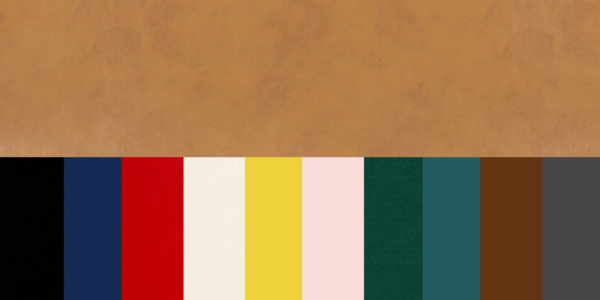
Unlike stark white or industrial grey, tan brings a softer, more inviting warmth to a palette. It can be perceived as luxurious when paired with the right accents, or as sustainable and eco-conscious when combined with earthy tones. Its chameleon-like adaptability allows it to support a wide range of brand personalities, from minimalist and modern to rustic and traditional. Brands that prioritize authenticity, heritage, comfort, or natural ingredients often find a deep resonance with tan as a primary or secondary color in their visual language. It provides a non-distracting canvas that allows other brand elements—such as a vibrant logo, intricate typography, or compelling imagery—to truly shine, all while maintaining an overarching sense of calm and coherence.
Strategic Color Pairings for Tan: Crafting Brand Narratives
The true power of tan in branding emerges when it is thoughtfully combined with complementary colors. Each pairing tells a distinct story and can dramatically alter the perception of a brand’s identity.
Eliciting Sophistication: Neutrals & Metallics
For brands aiming to exude an aura of refined elegance and understated luxury, pairing tan with a spectrum of other neutrals and metallic accents is highly effective. Think deep charcoal greys, soft ivory, crisp off-whites, and even subtle taupes. This creates a monochromatic or analogous palette that speaks volumes through its subtlety. The addition of metallic hues like brushed gold, rose gold, or polished silver can elevate this sophistication further, suggesting premium quality, exclusivity, and meticulous craftsmanship. This combination is particularly potent for luxury fashion brands, high-end interior design services, artisanal product lines, and upscale hospitality. The palette communicates a timeless aesthetic, avoiding fleeting trends in favor of enduring style and substance.
Cultivating Calm and Freshness: Blues & Greens
When a brand seeks to convey tranquility, health, sustainability, or trustworthiness, combining tan with shades of blue and green creates a harmonious and reassuring palette. Sage green, forest green, olive, or soft mint greens evoke nature, growth, and eco-consciousness, making this pairing ideal for organic food brands, wellness spas, environmental initiatives, and outdoor lifestyle companies. Blues, ranging from sky blue and dusty denim to deep navy and serene teal, add an element of trust, stability, and peacefulness. This combination is often seen in healthcare, financial services (where trust is paramount), and travel brands, creating a sense of reliability and serene escape. The earthiness of tan grounds the cooler tones, preventing them from feeling cold or impersonal, instead lending an approachable and natural feel.
Injecting Warmth and Vibrancy: Earth Tones & Jewel Tones
For brands that want to convey energy, creativity, and a touch of warmth or exoticism, tan serves as an excellent foundation for more vibrant, saturated colors. Earth tones like terracotta, rust, burnt orange, and mustard yellow can create a rich, inviting, and somewhat bohemian aesthetic. This combination speaks to handmade quality, cultural richness, and vibrant communities, fitting well with artisan crafts, cultural festivals, or unique culinary experiences. Alternatively, pairing tan with deep, rich jewel tones such as emerald green, sapphire blue, ruby red, or amethyst purple can create an opulent and dramatic statement. These combinations are perfect for brands that want to communicate luxury, exclusivity, and a celebratory mood, often seen in high-end event planning, evening wear, or premium spirits. The tan acts as a natural anchor, allowing the jewel tones to pop without overwhelming the senses, creating a balanced yet captivating visual experience.
Modern Minimalism and Bold Contrast: Black & White
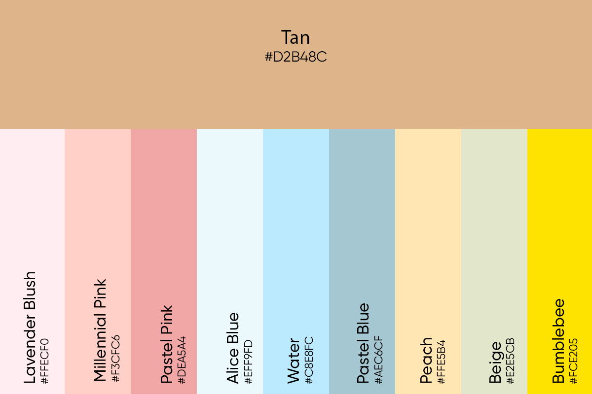
For a stark, modern, and highly impactful brand identity, tan pairs exceptionally well with the timeless contrast of black and white. Tan alongside crisp white creates a clean, minimalist, airy, and fresh aesthetic. This combination conveys clarity, efficiency, and contemporary design, appealing to tech brands, modern architecture firms, or minimalist lifestyle brands. When tan is combined with deep black, the result is dramatic, sophisticated, and powerful. This palette suggests strength, authority, and high-fashion sensibility. Often, both black and white are used alongside tan to create a dynamic balance—white for lightness and space, black for emphasis and drama, with tan providing a warm, grounding element. This versatility allows brands to create strong visual hierarchies and convey a serious yet approachable professionalism.
Applying Tan Palettes in Diverse Branding Contexts
Translating a chosen tan-based palette into tangible brand assets requires a thoughtful application across all touchpoints, ensuring consistency and maximizing impact.
Digital Presence: Websites & Social Media
In the digital realm, tan can profoundly influence user experience. A tan background on a website can feel more inviting and less sterile than stark white, creating a warm and approachable digital environment. Used in UI elements, headers, or footers, it adds a touch of organic sophistication. For social media, tan provides a cohesive visual anchor for diverse content, ensuring brand recognition even amidst varied imagery. When choosing tan shades for digital use, designers must pay close attention to accessibility and contrast ratios, ensuring that text remains legible against tan backgrounds for all users. The goal is to create a digital space that feels premium yet comfortable, sophisticated yet user-friendly.
Physical Identity: Packaging & Interiors
For physical products, tan is a natural choice for packaging, particularly for brands emphasizing sustainability, organic ingredients, or a handcrafted feel. Think kraft paper packaging, recycled materials, or natural fabric bags. Tan conveys an honest, unadorned quality that resonates with eco-conscious consumers. In retail spaces, offices, or brand showrooms, tan can create a welcoming and serene atmosphere. It’s often used on walls, furniture, or in material selections like wood, leather, or linen textiles. A tan-based interior can make a space feel more expansive and brighter while grounding it with natural warmth, fostering a sense of comfort and professionalism for clients and employees alike.
Personal Branding & Professional Presence
Beyond corporate entities, tan plays a significant role in personal branding. For professionals, incorporating tan into a wardrobe can convey approachability, reliability, and sophisticated style without being overly formal. A tan blazer, a camel-colored bag, or accessories can anchor a professional look, suggesting a grounded and competent individual. Similarly, for online portfolios, personal websites, or presentation slides, a tan-centric palette can help convey a consistent, polished, and authentic personal brand. It signals an individual who is both personable and professional, capable of conveying complex ideas in an accessible, reassuring manner.
The Psychology Behind Tan-Based Brand Palettes
Ultimately, the choice of colors to accompany tan is a strategic decision rooted in color psychology. Tan’s inherent neutrality and warmth make it an ideal canvas to amplify the psychological impact of other colors. When combined with blues, it enhances feelings of trust and stability; with greens, it reinforces naturalness and growth; with reds and oranges, it sparks energy and passion; and with metallics, it elevates perceptions of luxury and prestige. A brand’s ability to consistently deploy a tan-based palette across all touchpoints, guided by its core values and desired emotional connection, is what transforms a simple color choice into a powerful branding asset. It’s about crafting an immersive experience that resonates deeply with the target audience, building recognition, loyalty, and a distinct identity in a competitive marketplace.

Crafting Your Brand’s Tan-Centric Palette: A Strategic Approach
To effectively leverage tan in your brand identity, a structured approach is essential. Begin by defining your brand’s core values, mission, and the specific emotions you wish to evoke in your audience. Is your brand about tranquility and wellness, or cutting-edge innovation and luxury? This clarity will guide your color choices.
Next, research your target audience and your competitors. Understanding what resonates with your demographic and how you can differentiate visually is crucial. Explore various shades of tan—from pale sands to deep caramels—and experiment with different complementary colors through mood boards, digital mock-ups, and even physical samples. Pay close attention to how these colors interact, considering factors like contrast, saturation, and balance. Ensure that the chosen palette maintains accessibility and legibility across all mediums. Finally, commit to consistency. Once your tan-centric palette is established, apply it uniformly across all branding elements, from your logo and website to packaging and physical spaces. For complex branding projects, consulting with a professional brand designer can provide invaluable expertise, ensuring your chosen palette not only looks good but strategically aligns with your business objectives and resonates powerfully with your audience. The “best” colors to go with tan are ultimately those that most authentically and effectively tell your brand’s unique story.
aViewFromTheCave is a participant in the Amazon Services LLC Associates Program, an affiliate advertising program designed to provide a means for sites to earn advertising fees by advertising and linking to Amazon.com. Amazon, the Amazon logo, AmazonSupply, and the AmazonSupply logo are trademarks of Amazon.com, Inc. or its affiliates. As an Amazon Associate we earn affiliate commissions from qualifying purchases.