
Navy blue, a deep and sophisticated shade, offers a remarkable versatility that makes it a cornerstone in various aesthetic endeavors. Its inherent richness allows it to pair harmoniously with a wide spectrum of colors, creating distinct moods and conveying specific brand messages. Understanding these pairings is crucial for anyone involved in visual branding, from logo design and website aesthetics to marketing collateral and interior design for corporate spaces. This exploration delves into the most effective color combinations with navy blue, dissecting how each pairing can be leveraged to achieve specific branding objectives.
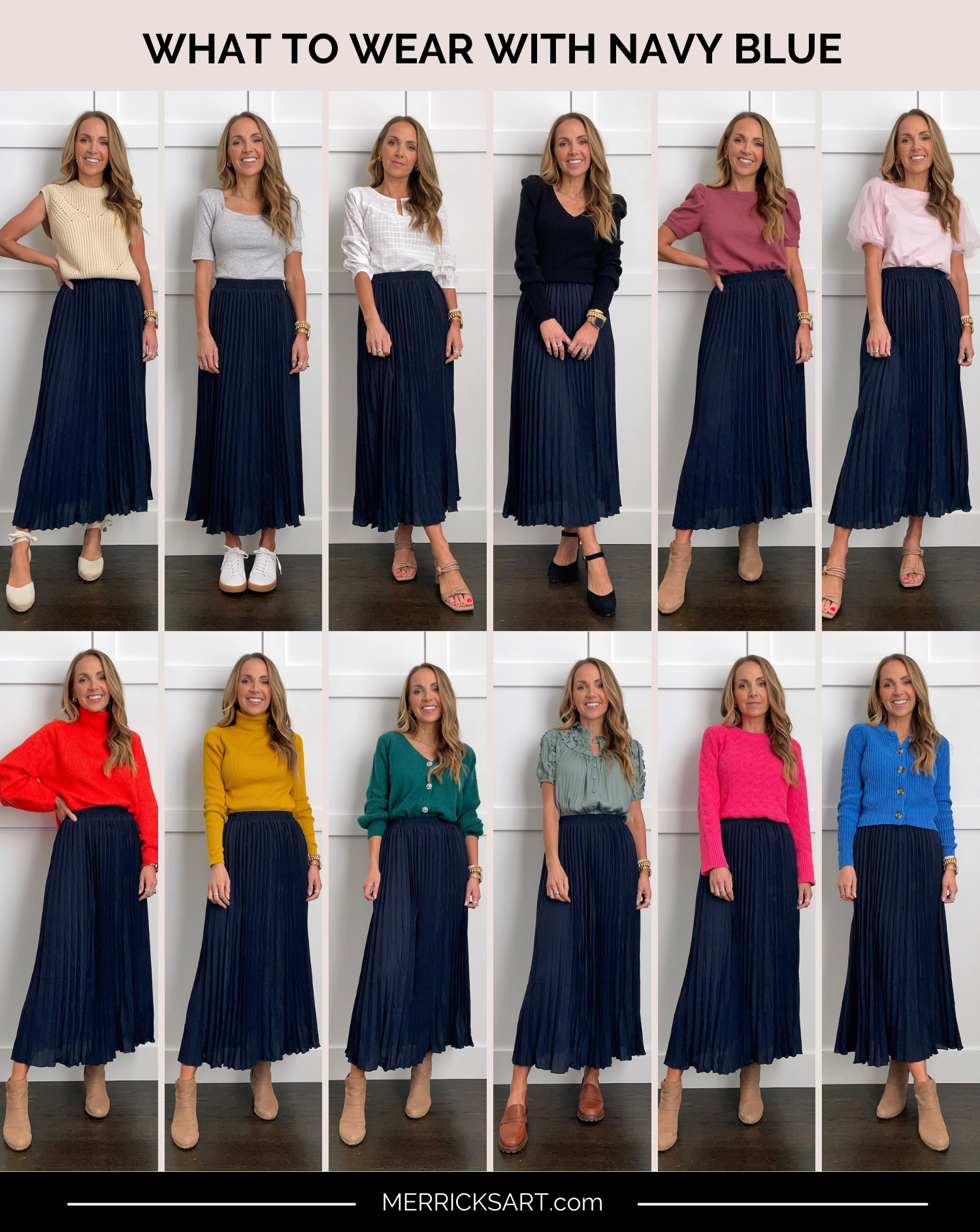
The Foundation: Understanding Navy Blue’s Brand Resonance
Before exploring complementary colors, it’s essential to grasp what navy blue inherently communicates within a brand context. Navy blue is often associated with stability, trust, authority, reliability, and professionalism. It evokes a sense of calm and sophistication, making it a preferred choice for industries that aim to build strong customer confidence, such as finance, law, technology, and luxury goods. Its depth and maturity make it a serious and dependable color, providing a solid anchor for any brand identity.
Navy Blue as a Primary Brand Color
When navy blue serves as a primary brand color, it sets a powerful tone for the entire brand identity. It suggests a company that is established, reputable, and serious about its offerings. This foundational element then influences the selection of secondary and accent colors, which are chosen to either enhance the core message of navy blue or introduce contrasting elements that add dynamism and memorability. The choice of accompanying colors will significantly determine the overall perception of the brand.
The Psychology of Color in Branding
The psychology of color is a critical component of effective branding. Navy blue, as discussed, conveys trust and professionalism. When paired with other colors, it can amplify or subtly shift these perceptions. For instance, pairing navy with a bright, energetic color might suggest innovation within a stable framework, while pairing it with a softer, more muted tone could emphasize elegance and refinement. Brands must carefully consider these psychological associations to ensure their color palette accurately reflects their values and resonates with their target audience.
Harmonious Pairings: Colors That Elevate Navy Blue
The art of color pairing lies in understanding how different hues interact with navy blue to create specific visual and emotional impacts. These combinations can range from classic and timeless to bold and contemporary, each serving a distinct purpose in the branding landscape.
Classic and Sophisticated Pairings
Certain color combinations are enduringly popular for their ability to convey a sense of established elegance and professionalism. These pairings often lend themselves to brands that prioritize tradition, quality, and trustworthiness.
Crisp White and Off-White
The pairing of navy blue with white or off-white is perhaps the most classic and universally appealing combination. White provides a clean, crisp contrast that highlights the depth of navy blue, making it appear even richer and more commanding. This duo is often seen in corporate logos, stationery, and website designs for brands that want to project purity, clarity, and a sense of effortless sophistication. It’s a timeless choice that never goes out of style and is easily adaptable across various applications. The simplicity of this pairing ensures that the brand message remains clear and uncluttered, focusing on core values of reliability and excellence.
Metallic Accents: Gold and Silver
Incorporating metallic accents like gold or silver with navy blue instantly elevates the brand’s perceived value and luxury. Gold adds a touch of opulence, warmth, and prestige, suggesting exclusivity and high quality. This combination is ideal for luxury goods, high-end services, or brands aiming to convey a sense of achievement and reward. Silver, on the other hand, offers a cooler, more modern and sleek sophistication. It can add a touch of technological advancement or contemporary elegance. Both gold and silver provide a polished finish that enhances the inherent gravitas of navy blue, creating a memorable and impactful visual identity.
Muted Neutrals: Beige, Tan, and Light Gray

For brands that seek a softer, more approachable, yet still professional aesthetic, muted neutrals like beige, tan, or light gray are excellent companions to navy blue. These colors provide a subtle warmth and earthiness, creating a grounding and approachable feel. Beige and tan can introduce an organic, natural element, suitable for brands in sectors like lifestyle, wellness, or artisanal products. Light gray offers a contemporary and minimalist feel, promoting a sense of order and understated elegance, often used by design-focused or tech-savvy brands. These combinations foster a sense of comfort and reliability without the starkness of pure white.
Bold and Energetic Pairings: Injecting Vibrancy
While navy blue often signifies seriousness, it can also be a powerful backdrop for colors that inject energy, creativity, and a sense of dynamism into a brand. These pairings are suitable for brands aiming to stand out, convey innovation, or appeal to a younger, more adventurous demographic.
Vibrant Contrasts: Coral, Teal, and Emerald Green
Introducing vibrant, saturated colors alongside navy blue creates striking visual interest and conveys a sense of boldness and excitement. Coral offers a lively and optimistic contrast, injecting warmth and playfulness. It’s a fantastic choice for brands that want to appear approachable, energetic, and creative. Teal, a rich blend of blue and green, creates a sophisticated yet invigorating pairing. It can suggest innovation, creativity, and a modern sensibility, often favored by forward-thinking companies. Emerald green, with its deep, jewel-toned vibrancy, paired with navy blue, speaks of luxury, nature, and growth. This combination can evoke a sense of lushness and prosperity, suitable for brands in fashion, lifestyle, or even environmental sectors aiming for a sophisticated appeal.
Electric Accents: Bright Yellow and Neon Hues
For brands that want to make a definitive statement and signal innovation and disruptiveness, electric accents like bright yellow or neon hues can be exceptionally effective when paired with navy blue. Bright yellow provides a cheerful, optimistic, and attention-grabbing contrast. It can symbolize creativity, intelligence, and enthusiasm. Neon colors, used sparingly as accents, inject an undeniable sense of modernity, boldness, and edge, perfect for tech startups or brands targeting a younger, trend-conscious audience. The intensity of these colors, juxtaposed with the deep stability of navy blue, creates a memorable and impactful brand image that communicates a forward-thinking and dynamic identity.
Strategic Application: Branding and Design Considerations
The effectiveness of any color pairing hinges on its strategic application within a brand’s visual identity. How these colors are used, in what proportions, and across which touchpoints significantly influences the brand’s overall perception.
Logo Design and Visual Identity
The primary color palette, often established in the logo, is the bedrock of a brand’s visual identity. When navy blue is chosen as a primary or significant secondary color, the choice of accent colors in the logo will set the tone for all subsequent branding materials. A logo featuring navy and white will project a different brand personality than one featuring navy and electric yellow. Consistency is key; the chosen palette must be applied uniformly across all visual assets, including the website, social media profiles, packaging, and marketing collateral, to build strong brand recognition and trust.
Ensuring Accessibility and Readability
Beyond aesthetic appeal, it is crucial to consider color accessibility and readability when developing a brand’s color palette. High contrast ratios are essential for text to be easily legible for all users, including those with visual impairments. Tools are available to test color contrast against accessibility guidelines (like WCAG). While bold and vibrant combinations can be exciting, brands must ensure that critical information remains readable. For instance, if using navy blue as a background, ensure text colors offer sufficient contrast. This technical consideration is as vital as the visual impact of the color pairing.
Website Design and User Experience
A website is often the first point of digital contact a customer has with a brand. The color scheme plays a pivotal role in shaping the user experience and conveying the brand’s message. Navy blue can be used as a sophisticated background, a prominent navigational element, or an accent color to highlight calls to action. Paired with white or light gray, it creates a clean and professional interface. When combined with warmer or more vibrant colors, it can add personality and engagement. The thoughtful application of navy blue and its complementary colors can guide users, enhance readability, and create an immersive brand experience that reinforces trust and professionalism.
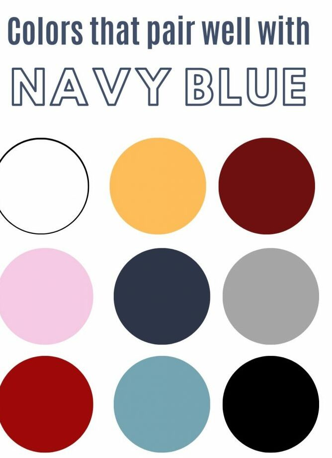
Marketing Collaterals and Brand Storytelling
From brochures and advertisements to social media graphics and presentations, marketing collaterals are powerful tools for storytelling. The color palette chosen for these materials directly influences how the brand’s narrative is perceived. Navy blue paired with soft pastels can tell a story of comfort and care. Navy blue with sharp metallics can convey a story of luxury and achievement. Using color strategically allows brands to communicate different facets of their identity and connect with audiences on an emotional level, reinforcing the brand’s core message through visual consistency and deliberate design choices.
In conclusion, the choice of colors to pair with navy blue is not merely an aesthetic decision; it is a strategic branding imperative. Each combination carries a unique psychological weight and communicates distinct brand values. By understanding the resonance of navy blue and carefully selecting complementary colors, brands can craft compelling visual identities that foster trust, convey sophistication, and resonate deeply with their target audiences, ultimately contributing to long-term brand success and recognition.
aViewFromTheCave is a participant in the Amazon Services LLC Associates Program, an affiliate advertising program designed to provide a means for sites to earn advertising fees by advertising and linking to Amazon.com. Amazon, the Amazon logo, AmazonSupply, and the AmazonSupply logo are trademarks of Amazon.com, Inc. or its affiliates. As an Amazon Associate we earn affiliate commissions from qualifying purchases.