
Purple. It’s a color that evokes royalty, luxury, creativity, spirituality, and even mystery. In the realm of branding, the strategic use of purple can be a powerful tool, capable of communicating a distinct set of values and influencing consumer perception. But beyond the abstract meaning, lies a fundamental question for any designer, marketer, or brand custodian: how do you actually create this compelling hue, and what does that process signify for your brand’s visual identity? This exploration delves into the practical and conceptual aspects of mixing colors to achieve purple, framing it through the lens of effective brand design.

The Primal Mix: Red and Blue, the Foundation of Purple
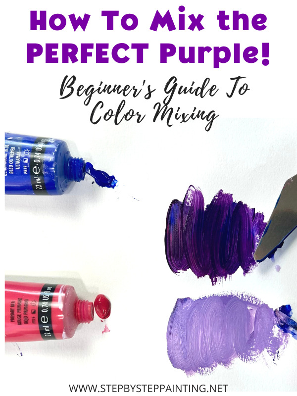
At its most elemental, the creation of purple on a physical canvas, whether paint or pigment, is a result of combining two primary colors: red and blue. This fundamental principle, learned in early art education, holds profound significance for brand development. It’s not just about achieving a specific shade; it’s about understanding the interplay of foundational elements to create something unique and impactful.
Understanding Primary and Secondary Colors in Brand Identity
In traditional color theory, red and blue are considered primary colors. This means they cannot be created by mixing other colors. Yellow is the third primary color. When we mix two primary colors, we create secondary colors. Purple, a secondary color, is born from the union of red and blue. This concept is a powerful metaphor for brand building. A strong brand is often built upon a core set of values and principles (the primaries) that, when combined and refined, create a distinct and recognizable brand identity (the secondary color).
For a brand, identifying these “primary” elements is crucial. Are they innovation and reliability? Elegance and affordability? Boldness and approachability? The successful fusion of these core attributes is what allows a brand to emerge from the noise and establish its unique position in the market. Just as a painter carefully selects the intensity and proportion of red and blue to achieve the desired shade of purple, a brand strategist must meticulously define and integrate the foundational elements of their brand.
The Pigment vs. Light Debate: Implications for Digital Branding
While the physical mixing of pigments is straightforward, the digital realm presents a different paradigm. When discussing color on screens (computers, phones, etc.), we are dealing with additive color mixing, primarily RGB (Red, Green, Blue). In this system, purple is not directly mixed from red and blue in the same way as with pigments. Instead, it is achieved by combining red and blue light at varying intensities. A specific combination of red and blue light, with little to no green light, will produce a perception of purple.
This distinction is vital for brands operating in the digital space. The “purple” on a website or in a digital advertisement will be achieved through different technical means than the purple on a printed brochure. Understanding this nuance ensures brand consistency across all platforms. A brand that relies on a specific shade of purple for recognition must ensure that its hexadecimal or RGB values are precisely translated from print to digital, and vice-versa. The technical implementation of color, though seemingly minor, can impact how readily a brand is recognized and perceived. For instance, a luxury brand aiming for a deep, regal purple will need to ensure its digital representation accurately reflects that richness, avoiding muddy or washed-out versions that could undermine its perceived value.
The Spectrum of Purple: Nuances in Shade and Their Brand Messaging
The simple act of mixing red and blue is just the beginning. The vast spectrum of purples – from delicate lavender to deep indigo – offers a nuanced palette for brands to explore. The specific shade chosen can dramatically alter the message the brand conveys.
Violet vs. Purple: Subtle Distinctions with Significant Impact
It’s important to note the subtle but important difference between violet and purple. Violet is technically a spectral color, located at the end of the visible light spectrum, with a wavelength of approximately 380-450 nanometers. Purple, on the other hand, is a color perceived by the human eye that is not a spectral color itself; it’s created by a mix of red and blue light (or pigments). In everyday language, the terms are often used interchangeably, but in design, understanding this distinction can be helpful.
For branding, the choice between a bluer-purple (closer to violet) or a redder-purple (more magenta-leaning) carries significant weight. Bluer purples often convey a sense of sophistication, calm, and depth, suitable for brands in fields like technology, high-end consulting, or spiritual wellness. Redder purples, on the other hand, can lean towards passion, creativity, and playfulness, making them ideal for brands in the arts, entertainment, or fashion industries. The precise point on the spectrum chosen is a deliberate brand decision, designed to resonate with a target audience and communicate specific emotional and psychological cues.
The Influence of Other Colors: Extending the Purple Palette
The beauty of color mixing lies in its infinite possibilities. While red and blue are the core, introducing other colors, even in small quantities, can dramatically shift the resulting purple. Adding white creates lighter shades like lavender and lilac, which often communicate softness, gentleness, and femininity. Adding black or a darker blue can deepen the hue, creating shades like plum or aubergine, which can convey richness, authority, and elegance.
For brands, this concept translates to layering meaning. A brand might use a deep purple as its primary color to convey authority, but then incorporate lighter shades of lavender in its marketing materials to add a touch of approachability or to appeal to a broader demographic. Conversely, a brand known for its playful and creative image might use a vibrant, magenta-leaning purple as its primary, but use darker, more sophisticated purples in secondary branding elements to suggest a more mature or premium offering. Each subtle variation serves a purpose, contributing to the overall narrative and perception of the brand.
Strategic Application of Purple in Branding and Marketing
The decision to incorporate purple into a brand’s visual identity is rarely arbitrary. It’s a strategic choice informed by market research, target audience analysis, and the desired brand positioning.
Psychology of Color and Purple’s Emotional Resonance
The psychological impact of purple is well-documented. Its association with royalty stems from historical periods when purple dyes were rare and incredibly expensive, making them accessible only to the elite. This historical context continues to imbue purple with a sense of luxury and prestige. Furthermore, purple is often linked to creativity and imagination, possibly due to its rarity in nature (compared to more common reds, blues, and greens). It can also evoke spirituality and introspection.
When a brand chooses purple, it is intentionally tapping into these psychological associations. A tech company might use purple to signal innovation and forward-thinking, or to convey a sense of sophisticated intelligence. A beauty brand might use purple to evoke a sense of glamour and luxury, or to highlight the creative aspect of self-expression. A non-profit organization focused on mental health might use softer purples to communicate calm, empathy, and healing. The chosen shade of purple becomes a silent communicator, whispering the brand’s core values to potential customers before they even read a single word.
Case Studies: Brands That Master the Purple Palette
Numerous successful brands have effectively leveraged the power of purple. Cadbury, for instance, is inextricably linked to its distinctive shade of purple, which has become synonymous with indulgence and quality chocolate. The color itself evokes a sense of premiumness and trust, built over decades of consistent branding.
Another notable example is Yahoo!. While its logo has evolved, its use of purple has historically conveyed a sense of exploration, discovery, and digital innovation. The vibrant, often playful, shade of purple helped position Yahoo! as a dynamic and engaging presence in the early internet landscape.
More recently, brands like Twitch have adopted shades of purple to signify creativity, community, and live interaction within the gaming and streaming world. The specific hue chosen by Twitch, a vibrant magenta-tinged purple, speaks to the energetic and passionate nature of its user base. These examples demonstrate that the effective application of purple isn’t just about picking a pretty color; it’s about aligning the color’s inherent associations with the brand’s strategic objectives and target audience.

Conclusion: Mastering the Art and Science of Purple for Brand Excellence
The question of “what colors do you mix to make the color purple” is far more than a simple query about pigment. For brand designers and marketers, it’s an entry point into understanding the intricate relationship between color, perception, and strategic communication. From the fundamental mixing of red and blue to the subtle nuances of shade and the psychological impact of different purples, each element plays a critical role in shaping a brand’s identity and its resonance with consumers.
By thoughtfully considering the foundational elements, the technical execution across platforms, the emotional connotations of various shades, and the strategic intent behind their use, brands can harness the power of purple to create compelling narratives, build strong emotional connections, and ultimately, achieve lasting success in the marketplace. The palette of purple, therefore, is not just a collection of hues; it’s a powerful language, waiting to be mastered for the benefit of your brand.
aViewFromTheCave is a participant in the Amazon Services LLC Associates Program, an affiliate advertising program designed to provide a means for sites to earn advertising fees by advertising and linking to Amazon.com. Amazon, the Amazon logo, AmazonSupply, and the AmazonSupply logo are trademarks of Amazon.com, Inc. or its affiliates. As an Amazon Associate we earn affiliate commissions from qualifying purchases.