
In the world of visual communication, color is never “just” color. It is a psychological trigger, a silent communicator of values, and a foundational pillar of brand equity. When designers and brand strategists ask, “What colors do you mix to get brown?” they are rarely looking for a simple kindergarten art lesson. Instead, they are exploring the construction of warmth, reliability, and organic sophistication within a corporate identity.
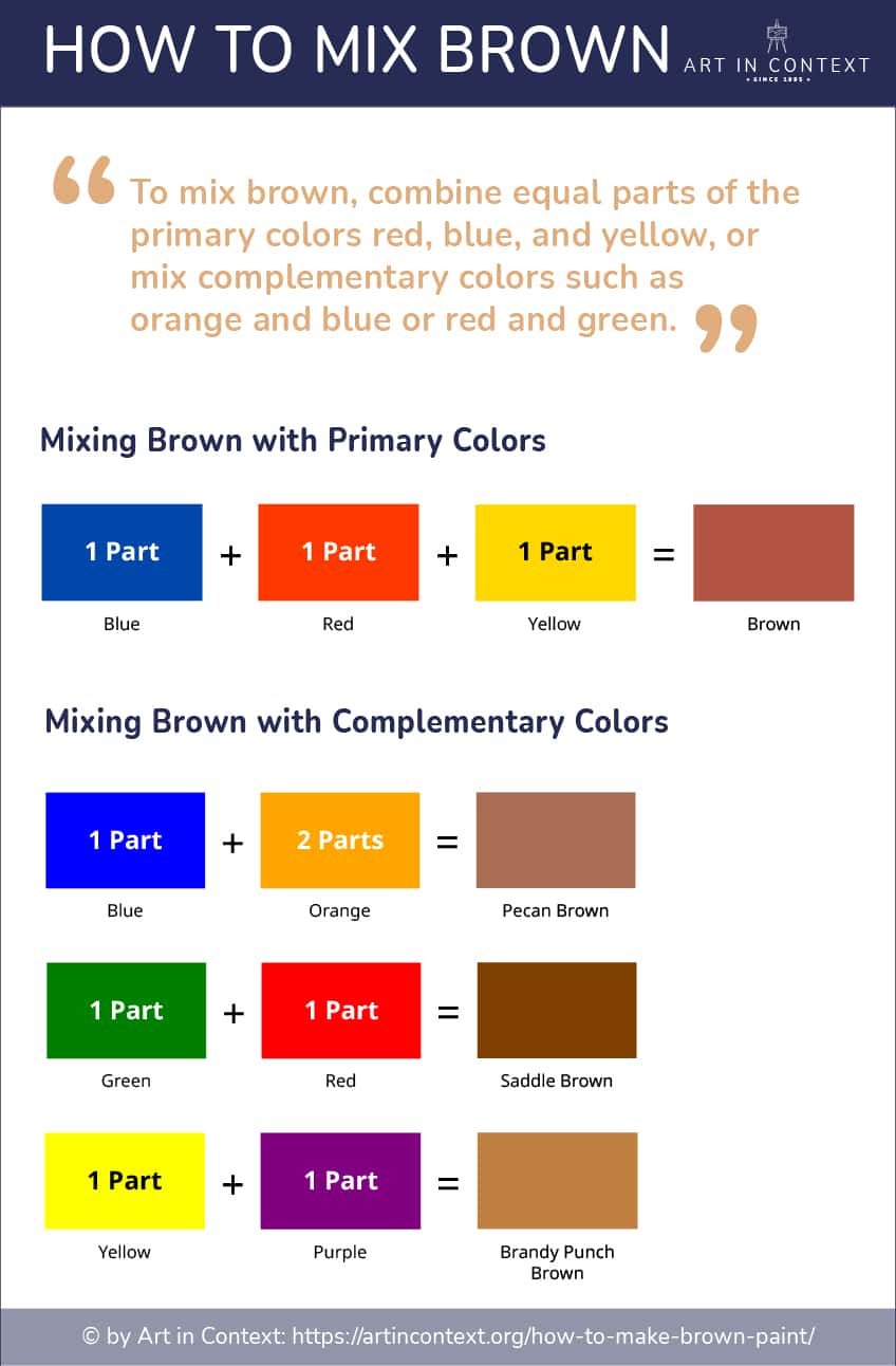
Brown is a composite color. In the traditional subtractive color model (RYB), it is created by mixing the three primary colors: red, yellow, and blue. However, for the modern brand strategist, the “mix” is much more nuanced, involving a delicate balance of secondary hues and complementary opposites to achieve a specific emotional resonance.
The Alchemy of Earth Tones: Technical Mixing in Brand Design
Understanding how to arrive at the perfect shade of brown is the first step in creating a cohesive visual identity. Unlike primary colors that stand on their own, brown is a “neutral” that requires a deep understanding of color theory to master.
Primary vs. Secondary Mixes (Digital and Print)
To create a standard brown, one must understand the relationship between complementary colors on the color wheel. In branding, these mixes are categorized into three main methods:
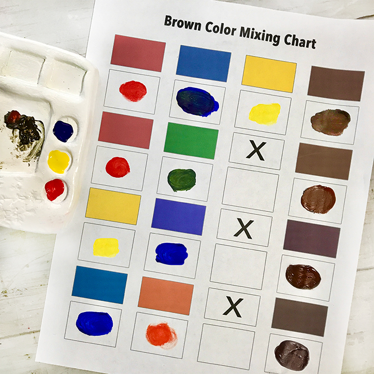
- Mixing Primary Colors: Combining Red, Yellow, and Blue in varying proportions. A higher ratio of blue results in a cooler, “espresso” brown, while more red or yellow creates “terracotta” or “tan.”
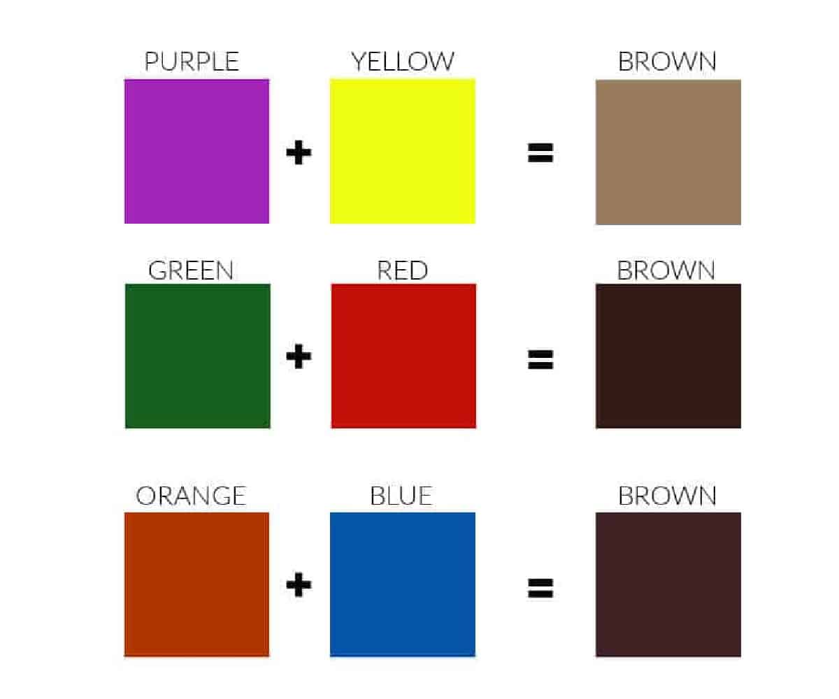
- Complementary Pairing: This is the most efficient way to achieve brown. By mixing a primary color with its opposite secondary color—Blue with Orange, Red with Green, or Yellow with Purple—designers can create a rich, neutralized brown that feels balanced.
- The Digital Transition (RGB vs. CMYK): For brands operating primarily in tech and digital spaces, brown is achieved via RGB (Red, Green, Blue) light mixing. On the other hand, for physical packaging and corporate stationery, the CMYK (Cyan, Magenta, Yellow, Key/Black) model is used. Achieving “true” brown in print requires a precise formula to ensure the color doesn’t look muddy or “flat” under different lighting conditions.
The Transition from CMYK to Pantone for Brand Consistency
For a global brand, consistency is everything. If a brand’s signature brown looks like chocolate in New York but like olive drab in London, brand equity is eroded. This is why professional brand identity systems transition from basic mixes to the Pantone Matching System (PMS). By selecting a specific Pantone shade (such as the iconic UPS Brown), a company ensures that their “mix” remains identical across every touchpoint, from digital apps to corrugated shipping boxes.
The Psychology of Brown: Why Brands Choose the “Color of Reliability”
While bright colors like red or neon green are designed to grab immediate attention, brown plays a “long game.” It is the color of the earth, wood, and stone. In brand strategy, brown is utilized to communicate a specific set of psychological traits that more “exciting” colors cannot replicate.
Evoking Trust, Stability, and Longevity
Brown is a grounding color. In an era of digital volatility and “move fast and break things” tech culture, many brands are turning toward earth tones to signal stability. It suggests that a company has deep roots and a long-term perspective. This is particularly effective for heritage brands, law firms, and high-end artisanal services. Brown doesn’t scream for attention; it commands respect through its perceived permanence.
Connection to Sustainability and the Organic Movement
The “Green Movement” has evolved. While green was once the sole signifier of eco-friendliness, brown has emerged as the color of “circularity” and “raw authenticity.” Brands that want to highlight their use of recycled materials, organic ingredients, or plastic-free packaging often lean into a “Kraft paper” brown aesthetic. This mix of colors—leaning toward the lighter, tan spectrum—communicates a “back-to-basics” philosophy that resonates with the modern, environmentally conscious consumer.
Case Studies in Brown Branding: Success Beyond the Palette
To truly understand why the “mix” of brown matters, we must look at global leaders who have successfully claimed this often-underappreciated color as their own.
UPS and “What Can Brown Do For You?”
United Parcel Service (UPS) is perhaps the most famous example of “owning” a color that most marketers would consider “unappealing.” For decades, UPS has used a dark, Pullman brown. In this context, the mix of colors serves a functional and emotional purpose. It hides dirt from long-distance shipping (functional) and exudes a sense of rugged, military-grade reliability (emotional). By leaning into the color with their “What Can Brown Do For You?” campaign, they turned a neutral hue into a powerful brand asset.
Luxury and Decadence: The Case for Confectionary and Leather Goods
In the luxury sector, the “mix” of brown shifts toward the “bittersweet chocolate” and “rich mahogany” end of the spectrum. Brands like Louis Vuitton and Hershey’s utilize brown to represent two different types of indulgence. For Louis Vuitton, the dark brown monogram represents heritage, craftsmanship, and the durability of high-end leather. For Hershey’s, the brown is a literal representation of the product, creating an immediate sensory association with sweetness and comfort. In both cases, the specific mix of warm undertones is designed to trigger a feeling of “premium quality.”
Implementing Brown into Your Visual Identity System
Integrating brown into a brand’s visual identity requires more than just picking a HEX code. It requires a strategic understanding of how brown interacts with the rest of a brand’s “ecosystem.”
Complementary Color Schemes for High Conversion
Brown is a versatile team player. To prevent a brand from looking dated or dull, designers use “high-contrast” pairings.
- Brown and Turquoise: A modern, “southwestern” tech vibe that balances warmth with digital coolness.
- Brown and Gold: The gold standard for luxury branding, conveying opulence and tradition.
- Brown and Cream: Soft, approachable, and often used in the wellness and skincare industries to denote “clean” beauty.
The strategic “mix” here isn’t just within the brown itself, but in the ratio of brown to its accent colors. A brand that uses brown as a primary background color feels “heavy” and “established,” whereas a brand using it as an accent color feels “natural” and “grounded.”
Typography and Texture: Enhancing the Earthy Palette
Because brown is so closely tied to physical materials (wood, leather, paper), the texture of the color application is just as important as the color mix. A flat, matte brown on a digital screen can feel uninspiring. However, when paired with tactile typography or a “grainy” texture in graphic assets, brown comes to life. Brand strategists often recommend using serif fonts with brown palettes to lean into the “heritage” feel, or bold, sans-serif fonts to create a “modern-industrial” aesthetic.
The Future of Color Strategy: AI and Evolving Trends
As we look toward the future of branding, the way we “mix” and apply color is being revolutionized by technology. Artificial Intelligence is now being used to analyze consumer sentiment toward specific color palettes in real-time.
AI-Driven Color Optimization
New software tools allow brand managers to input their core values—such as “trust,” “innovation,” or “sustainability”—and receive a scientifically backed color mix. These AI tools are finding that “New Brown”—a mix that incorporates more gray (taupe) or more purple (mauve-brown)—is trending in the fintech and “soft-tech” sectors. This suggests that brown is moving away from its traditional “muddy” roots and toward a more sophisticated, “neutral-luxe” category.
The Shift Toward “Digital Earthiness”
In the metaverse and high-end digital environments, color behaves differently. We are seeing a rise in “luminous browns”—colors that have the earthiness of brown but the “glow” of a digital interface. This evolution of the color mix allows brands to maintain a sense of human-centric grounding while operating in purely digital, high-tech spaces.
In conclusion, when you ask what colors mix to get brown, you are opening the door to a complex world of brand strategy. Whether it is the primary mix of Red, Yellow, and Blue, or the strategic mix of reliability, sustainability, and luxury, brown remains one of the most powerful—and underutilized—tools in the brand designer’s kit. By understanding the technical “how” and the psychological “why,” brands can use this earthy palette to build an identity that is not only visible but deeply trusted.
aViewFromTheCave is a participant in the Amazon Services LLC Associates Program, an affiliate advertising program designed to provide a means for sites to earn advertising fees by advertising and linking to Amazon.com. Amazon, the Amazon logo, AmazonSupply, and the AmazonSupply logo are trademarks of Amazon.com, Inc. or its affiliates. As an Amazon Associate we earn affiliate commissions from qualifying purchases.