In the vibrant world of branding and design, understanding how colors interact is not just an aesthetic pursuit; it’s a strategic imperative. The way colors blend, contrast, and evoke emotions directly impacts how a brand is perceived, remembered, and ultimately, how it connects with its audience. When we consider the powerful hues of orange and purple, their combination unlocks a fascinating spectrum of possibilities, influencing everything from logo design to marketing campaigns. This article delves into the synergistic relationship between orange and purple, exploring the resulting colors, the psychological impact of their interplay, and how brands can strategically leverage these combinations to achieve their objectives.
The Science and Art of Color Mixing: Orange and Purple
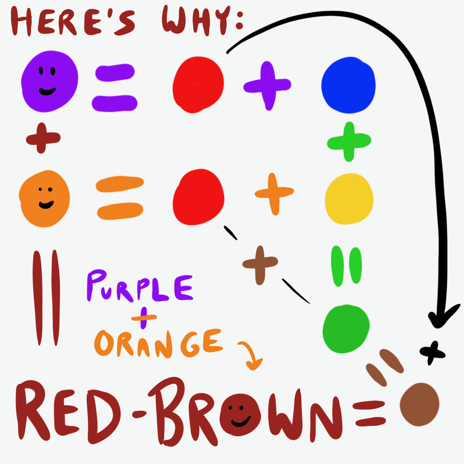
At its core, color mixing is a visual dance between primary, secondary, and tertiary colors. Orange, a warm and energetic secondary color, is born from the fusion of red and yellow. Purple, a cool and sophisticated secondary color, emerges from the union of red and blue. When these two secondary colors are brought together, the resulting hues are not a single, predictable shade but rather a nuanced exploration of their shared and distinct components.
Understanding Subtractive Color Mixing
In the context of pigments, which is most relevant for physical branding elements like print materials, signage, and product design, we employ subtractive color mixing. This system, often visualized with the CMYK (Cyan, Magenta, Yellow, Key/Black) model, operates on the principle of absorption. White light contains all colors. Pigments absorb certain wavelengths of light and reflect others. When pigments are mixed, they absorb more light, and the reflected color is what we perceive.
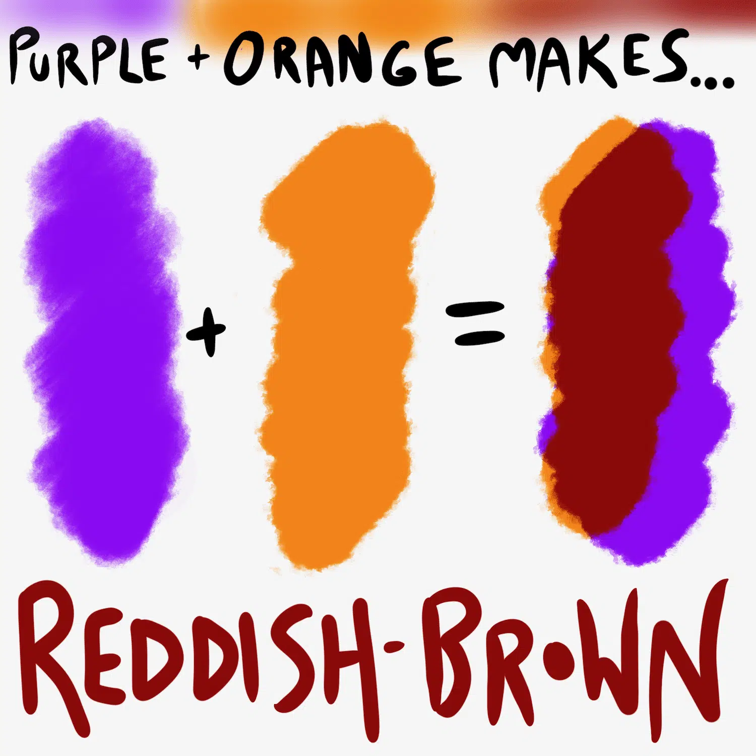
When orange and purple pigments are combined, the resulting color depends heavily on the specific shades of orange and purple used and their proportions.
- Common Resulting Hues: Generally, mixing orange and purple will produce a range of reddish-browns and muddy purples. The exact outcome can lean towards a deeper, more muted red if the orange has a strong red undertone and the purple is closer to violet. Conversely, if the orange is more yellow-based and the purple is bluer, the mixture might trend towards a browner, earthier tone.
- The Role of Dominant Pigments: The specific pigments used to create the original orange and purple are critical. If the orange is a vibrant cadmium orange and the purple is a rich ultramarine, the mixing will yield different results than if a more pastel orange is mixed with a deep amethyst purple.
The Influence of Light: Additive Color Mixing
While less directly applicable to physical color mixing in branding, understanding additive color mixing, the basis of light on screens, provides a complementary perspective. In additive mixing, colors are created by combining light sources. Red and green light combine to make yellow, blue and green to make cyan, and red and blue to make magenta. Orange is created by a combination of red and green light, and purple is created by a combination of red and blue light. When orange and purple light are combined, the dominant red component intensifies, while the green from the orange and the blue from the purple can lead to a more complex interplay, potentially creating a richer, more saturated magenta or a deep, almost blackish hue depending on the intensity and balance of the original light sources. For digital branding, this understanding is crucial for how colors appear on screens, from websites to app interfaces.
Psychological Resonance: The Emotional Language of Orange and Purple
Beyond the technical aspects of color mixing, the psychological impact of orange and purple, both individually and in combination, is a powerful tool for brands. Each color carries a distinct set of associations that can be strategically employed to shape brand perception.
Orange: Energy, Enthusiasm, and Affordability
Orange is a color of exuberance, creativity, and warmth. It’s often associated with:
- Enthusiasm and Optimism: The bright, cheerful nature of orange evokes feelings of happiness, excitement, and a can-do attitude.
- Creativity and Innovation: Its energetic character can stimulate new ideas and a sense of adventurousness, making it a popular choice for creative industries and brands aiming to position themselves as innovative.
- Affordability and Value: In many cultures, orange is linked to value and accessibility. This can make it an effective choice for brands targeting a budget-conscious audience or promoting deals and discounts.
- Warmth and Friendliness: It’s a welcoming and approachable color, fostering a sense of comfort and camaraderie.
Brands that effectively utilize orange often aim to convey a sense of fun, approachability, and dynamic action. Think of brands that encourage exploration, outdoor activities, or provide accessible services.
Purple: Royalty, Luxury, and Mystery
Purple, on the other hand, often sits at the intersection of the energetic red and the calming blue, creating a unique blend of stimulation and serenity. Its associations include:
- Royalty and Luxury: Historically, purple dye was rare and expensive, making it a symbol of wealth, power, and nobility. This association with luxury and exclusivity persists today.
- Creativity and Imagination: Similar to orange, purple can also be linked to creativity, but often with a more mystical or imaginative slant. It can evoke introspection and artistic expression.
- Wisdom and Spirituality: Purple is often connected to deeper thought, intuition, and spiritual awareness.
- Mystery and Sophistication: Its enigmatic quality can lend an air of intrigue and refined elegance to a brand.
Brands that leverage purple often seek to convey sophistication, exclusivity, and a touch of the extraordinary. This can be effective in high-end retail, wellness industries, or brands that emphasize thoughtful design and unique experiences.

Strategic Brand Applications: Orange and Purple in Action
The combined power of orange and purple in branding is not about creating a muddy, unappealing hue, but rather about using them in conjunction to create dynamic and memorable visual identities. The strategic application lies in understanding their complementary and contrasting qualities.
Creating Dynamic Contrasts and Harmonious Palettes
The key to successful orange and purple branding lies in their sophisticated use, often employing them as accent colors or in carefully balanced palettes.
- Complementary Color Harmony (Indirect): While orange and purple are not direct complements on the standard color wheel (which would be blue and orange, or yellow and purple), they share a common ancestor in red. This shared component allows for a nuanced harmony. When used together, the warmth of orange can be balanced by the coolness of purple, and vice versa.
- Example: A brand might use a deep, regal purple as its primary color and incorporate accents of a bright, energetic orange in its logo, website buttons, or marketing materials. This creates a visual pop and draws attention without overwhelming the viewer.
- Analogous Color Harmony (with Red): Often, the most effective use of orange and purple within a brand palette involves introducing red or colors adjacent to them on the color wheel. This creates a flowing, harmonious transition.
- Example: A brand could build a palette with shades of magenta (a blend of red and purple), deep oranges, and hints of red. This creates a cohesive and visually rich experience.
- Creating Depth and Interest: The interplay of warm and cool tones can add depth and visual interest. For instance, a predominantly cool purple background can be illuminated by warm orange elements, creating a captivating contrast.
Target Audiences and Brand Messaging
The choice to incorporate orange and purple into a brand’s visual identity is intrinsically linked to the target audience and the desired message.
- Youthful and Energetic Brands: Brands targeting younger demographics or those emphasizing fun and accessibility might use brighter oranges and more vibrant purples. This combination can convey playfulness, creativity, and an approachable spirit. Consider brands in the gaming, entertainment, or fast-casual dining sectors.
- Sophisticated and Premium Brands: For brands aiming for a more mature, luxurious, or exclusive positioning, deeper, more muted shades of purple and richer, burnt oranges can be employed. This evokes a sense of refined taste, quality, and discerning appeal. Luxury goods, high-end spas, or premium technology brands might lean into this combination.
- Innovative and Creative Enterprises: Brands in technology, design, or arts often utilize the unique blend of orange and purple to signify forward-thinking ideas and artistic expression. The juxtaposition can signal a brand that is both imaginative and grounded.
Case Studies in Brand Synergy
Examining real-world brands that effectively employ orange and purple can illuminate their strategic power:
- Fanta: This globally recognized beverage brand masterfully uses orange as its primary color, symbolizing refreshment, fun, and citrusy zest. While not heavily featuring purple, its marketing often incorporates complementary colors that can include violet hues in playful patterns, reinforcing its energetic and youthful brand persona. The direct association with orange is undeniable, and any subtle inclusion of purple serves to enhance its vibrancy.
- Cadbury: Known for its iconic purple packaging, Cadbury leverages the color’s association with luxury, indulgence, and quality. While its core is purple, its products and promotional materials occasionally incorporate subtle orange or red elements, particularly in advertising campaigns that emphasize fruity flavors or celebratory occasions. This creates a richer sensory experience, suggesting a blend of indulgence (purple) and vibrant taste (hints of orange/red).
- Reese’s: This popular confectionery brand is a prime example of a brand built on the combination of orange and chocolate (which, in its brown tones, can be seen as a dark, muted orange/red). While not explicitly using purple, the iconic orange wrapper is the dominant visual. The rich brown of the chocolate itself, when juxtaposed with the bright orange, creates a satisfying visual and flavor contrast that is deeply ingrained in consumer perception. If one were to imagine Reese’s with a purple element, it might signify a limited edition or a more complex flavor profile, demonstrating how the two colors could be introduced for strategic differentiation.
Beyond the Blend: Leveraging Orange and Purple in Brand Ecosystems
The impact of orange and purple in branding extends beyond simple color mixing; it encompasses their presence across various touchpoints of a brand’s ecosystem.
Digital Presence: Websites, Apps, and Social Media
In the digital realm, the precise shades and their interaction are critical for user experience and brand recall.
- Website Design: A website might use a predominantly purple color scheme for its main navigation and footer, conveying professionalism and depth. Eye-catching orange calls-to-action (buttons for “Buy Now,” “Sign Up,” or “Learn More”) can effectively guide user attention and drive conversions. The contrast makes these elements stand out, ensuring they are not overlooked.
- App Interfaces: Mobile applications can leverage this pairing to create intuitive and engaging user journeys. A purple interface can feel calming and sophisticated, while orange notifications or highlighted features can signal important updates or actions.
- Social Media Graphics: Brands can use orange and purple in their social media content to create visually striking posts that capture attention in busy feeds. This combination can be used for infographics, promotional banners, or even as background elements to highlight key messages. The vibrancy ensures the content is noticed, while the combination offers a unique aesthetic.
Physical Touchpoints: Packaging, Retail, and Merchandise
The tactile and visual experience of physical brand elements is equally important.
- Product Packaging: Eye-catching packaging is crucial for shelf appeal. A product with orange and purple packaging can stand out by offering a unique color combination that signals both excitement and a touch of premium quality. This can differentiate it from competitors using more conventional color palettes.
- Retail Environments: The interior design of a retail space can be influenced by these colors. Purple walls can create a luxurious or calming atmosphere, while orange accents on displays, signage, or fixtures can add energy and highlight specific products.
- Merchandise and Promotional Items: Branded merchandise, from t-shirts to stationery, can incorporate orange and purple in their designs. This allows consumers to engage with the brand’s visual identity in their everyday lives, fostering deeper brand connection.
Consistency is Key: Maintaining Brand Integrity
Regardless of how orange and purple are combined, consistency across all brand touchpoints is paramount. A well-defined brand guide will specify the exact hues, their usage ratios, and the emotional intent behind their application. This ensures that the brand’s message remains cohesive, whether a customer encounters it on a billboard, a website, or a product package. The strategic use of orange and purple, when executed with precision and a deep understanding of their psychological impact, can create a powerful and enduring brand identity. It’s a testament to how, in the world of design and branding, even the seemingly simple act of mixing colors can unlock profound strategic advantages.
aViewFromTheCave is a participant in the Amazon Services LLC Associates Program, an affiliate advertising program designed to provide a means for sites to earn advertising fees by advertising and linking to Amazon.com. Amazon, the Amazon logo, AmazonSupply, and the AmazonSupply logo are trademarks of Amazon.com, Inc. or its affiliates. As an Amazon Associate we earn affiliate commissions from qualifying purchases.