
In the competitive landscape of modern branding, color is far more than an aesthetic choice; it is a psychological trigger and a foundational pillar of corporate identity. Among the primary colors, yellow stands out as the most visible and luminant hue to the human eye. It radiates optimism, energy, and intellect. However, its sheer vibrancy makes it one of the most challenging colors to master within a brand palette. To use yellow effectively, a brand strategist must understand the nuances of color harmony and how specific pairings can alter the perception of a brand from “budget-friendly” to “premium” or from “playful” to “authoritative.”

Choosing the right colors to compliment yellow is a strategic exercise in balancing contrast, accessibility, and emotional resonance. Whether you are building a personal brand or refreshing a global corporate identity, the secondary and tertiary colors you pair with yellow will define your brand’s voice in a crowded marketplace.
The Psychology of Yellow in Brand Strategy
Before identifying the specific shades that compliment yellow, it is essential to understand why a brand would choose yellow as its primary “hero” color. Yellow is the color of the sun, synonymous with warmth, happiness, and mental clarity. In marketing, it is frequently used to grab attention and stimulate mental activity.
Evoking Emotion: Optimism, Clarity, and Warmth
Yellow is neurologically linked to the release of serotonin, making it the “happiest” color in the spectrum. Brands like McDonald’s, IKEA, and Nikon utilize yellow to project an image of accessibility and friendliness. In a branding context, yellow tells the consumer that the brand is approachable and energetic. When complimented correctly, this energy can be harnessed to drive conversions and foster brand loyalty.
The Risks of Yellow: Overstimulation and Caution
Despite its positive attributes, yellow can be polarizing. Excessive use of bright yellow can lead to visual fatigue or feelings of anxiety. Furthermore, yellow is internationally recognized as the color of caution (e.g., traffic signs and hazard tape). To prevent a brand from appearing “alarmist,” designers must use complimentary colors to ground the yellow and provide visual relief. The strategy lies in selecting palettes that temper yellow’s intensity while highlighting its luminosity.
Classic High-Contrast Pairings for Corporate Identity
High contrast is often the goal for brands that want to project power, visibility, and confidence. Because yellow is naturally light, pairing it with darker, more saturated tones creates a “pop” that is impossible to ignore.
Yellow and Black: The Authority of High Visibility
The pairing of yellow and black is perhaps the most striking combination in design history. From a branding perspective, this duo signifies authority, safety, and efficiency. This is why it is the standard for construction brands like Caterpillar (CAT) and logistics giants like DHL.
When yellow is complimented by black, the yellow appears brighter and more intense. For a modern brand, this pairing can feel industrial and bold. To make it work in a contemporary digital setting, designers often use “off-blacks” or deep charcoals to soften the vibration while maintaining the high-impact legibility that this duo provides.
Yellow and Blue: Trust Meets Innovation
Yellow and blue represent one of the most stable and popular pairings in corporate identity. While yellow provides the spark of innovation and energy, blue offers a foundation of trust, professional reliability, and calmness.
This combination is a staple for brands that want to appear both friendly and dependable. IKEA uses this pairing to evoke a sense of value and Swedish heritage. In the tech sector, yellow and a deep navy blue can suggest a brand that is both cutting-edge and established. The contrast between the warmth of yellow and the coolness of blue creates a balanced visual experience that appeals to a broad demographic.
Yellow and Purple: The Sophistication of Complementary Contrast
On the traditional color wheel, purple is the direct complement to yellow. This means they offer the highest level of color contrast possible. Using yellow and purple together is a bold strategic move that suggests creativity, luxury, and “thinking outside the box.”
Because they are opposites, they make each other appear more vivid. In branding, this is often used for products that want to stand out as unique or high-end. However, because both colors are visually “heavy” in terms of personality, they are often balanced with a neutral third color, like white or light gray, to ensure the brand identity remains sophisticated rather than garish.
Modern and Minimalist Palettes for Digital Branding
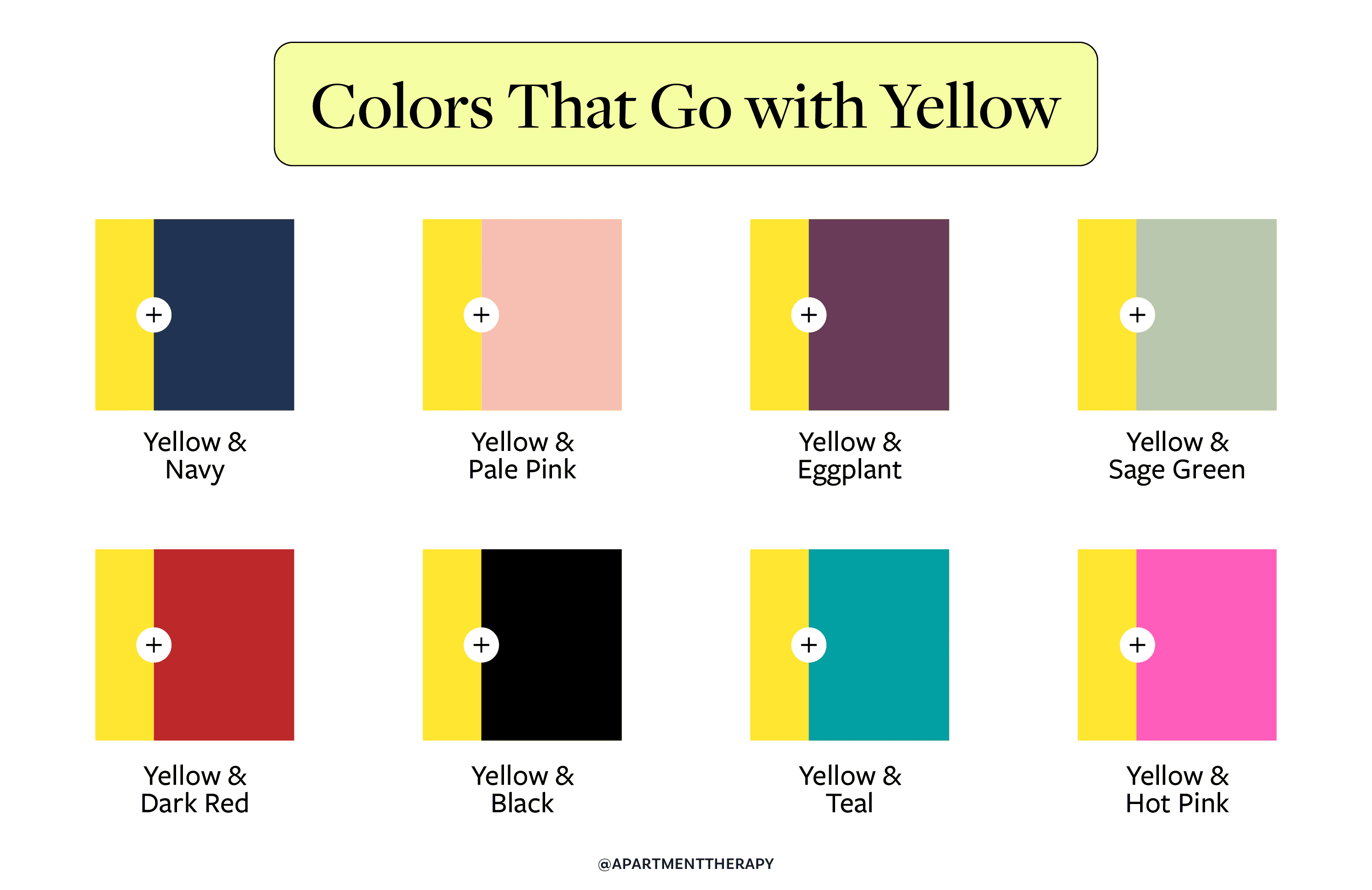
As design trends shift toward minimalism and “Flat Design,” the way we compliment yellow has evolved. Modern brands often move away from primary color clashes in favor of more nuanced, sophisticated palettes that thrive in digital environments.
Yellow and Gray: Industrial Sophistication and Balance
In 2021, Pantone famously selected “Illuminating” (a bright yellow) and “Ultimate Gray” as the Colors of the Year. This pairing has since become a hallmark of modern corporate identity. Gray provides a neutral, professional backdrop that allows yellow to serve as a strategic accent.
This palette is particularly effective for tech startups and architectural firms. It suggests a brand that is grounded in reality and structural integrity (gray) but is also forward-thinking and optimistic (yellow). It is a “serious” palette that doesn’t take itself too seriously, making it highly effective for B2B branding.
Yellow and White: Freshness and Accessibility
For brands in the wellness, food, or lifestyle sectors, yellow and white offer a clean, airy, and fresh aesthetic. This combination maximizes the “brightness” of the brand. It is a palette of transparency and honesty.
The challenge with a yellow and white palette is legibility. In web design and mobile app interfaces, white text on a yellow background (or vice versa) often fails accessibility standards (WCAG). To execute this successfully, a brand must use a darker “accent” color—such as a deep forest green or a dark slate—for typography and functional elements, using the yellow and white strictly for the brand’s visual atmosphere.
Monochromatic and Analogous Schemes for Personal Branding
When a brand wants to feel harmonious and organic rather than high-energy, it looks to colors that sit next to yellow on the color wheel. These analogous schemes are often used in personal branding to create a “vibe” or a specific mood.
Shades of Gold and Amber: Premium Positioning
By pairing a primary yellow with deeper ochres, ambers, and metallic golds, a brand creates a monochromatic depth that feels expensive and curated. This is a common strategy for luxury spirits, high-end skincare, or boutique creative agencies. Moving away from a “flat” yellow and toward a textured gold-toned palette shifts the brand’s perception from “value-oriented” to “premium.”
Yellow and Green: Growth and Vitality
Yellow and green are neighbors on the color wheel, creating a natural, harmonious transition. This pairing is synonymous with nature, growth, and environmental sustainability. For brands in the organic food space, renewable energy, or education, this combination suggests vitality and a commitment to the future. A bright “lemon” yellow paired with a “forest” green creates a mature, established look, while a “lime” green and “sunshine” yellow suggests youthful energy and disruptive innovation.
Implementing Yellow Across Brand Touchpoints
Selecting the complimentary colors is only half the battle. A brand strategist must also determine how these colors function across various mediums, from a high-resolution smartphone screen to a printed business card.
UI/UX Considerations: Accessibility and Readability
In the digital space, yellow is a powerful tool for Call to Action (CTA) buttons because it naturally draws the eye. However, because yellow is high-value (light), it often lacks the contrast necessary for text-heavy interfaces. When complimenting yellow in digital design, it is vital to ensure that the primary “action” color is paired with a high-contrast neutral for text. For example, a yellow button should almost always feature black or dark navy text to ensure readability for all users, including those with visual impairments.
Print vs. Digital: Managing Vibrancy in Physical Collateral
Yellow is notoriously difficult to replicate consistently across different media. In the digital RGB space, yellow is luminous and glowing. In the physical CMYK (print) space, it can often appear dull or “muddy” if not handled correctly.
When selecting complimentary colors for a brand that will have a significant physical presence—such as packaging or signage—it is often wise to specify a Pantone Matching System (PMS) color for the yellow. This ensures that the “sunshine” in your logo looks the same on a cardboard box as it does on a LinkedIn banner. Complimenting yellow with “spot colors” like metallic silver or matte black can also add a tactile, premium feel to printed brand assets that digital screens cannot replicate.

Strategic Conclusion
Yellow is a high-stakes color in the world of branding. It demands attention, radiates energy, and carries a heavy psychological load. By strategically choosing the colors that compliment it, a brand can control that energy and direct it toward a specific corporate goal.
Whether it is the “safe” reliability of yellow and blue, the “aggressive” visibility of yellow and black, or the “modern” balance of yellow and gray, the secondary colors in your palette serve as the stabilizers for your brand’s identity. The most successful brands do not just use yellow; they contextualize it, ensuring that its natural optimism is backed by the professional weight of a well-considered color strategy.
aViewFromTheCave is a participant in the Amazon Services LLC Associates Program, an affiliate advertising program designed to provide a means for sites to earn advertising fees by advertising and linking to Amazon.com. Amazon, the Amazon logo, AmazonSupply, and the AmazonSupply logo are trademarks of Amazon.com, Inc. or its affiliates. As an Amazon Associate we earn affiliate commissions from qualifying purchases.