
Mauve, a color of enigmatic charm and sophisticated subtlety, stands as a testament to the power of nuanced hues in design and branding. Neither a stark purple nor a simple pink, mauve occupies a unique psychological and aesthetic space, offering designers a versatile tool for conveying depth, elegance, and distinctiveness. Understanding its inherent qualities and identifying its most effective complementary colors is crucial for crafting compelling visual narratives, whether for corporate identity, product packaging, digital interfaces, or compelling marketing collateral.
This exploration delves into the art and science of pairing mauve, dissecting its psychological impact and offering strategic insights into constructing palettes that resonate with target audiences and reinforce brand messaging. From timeless neutrals to vibrant contrasts, the right color combination can elevate mauve from a mere shade to a cornerstone of a memorable design strategy.

Understanding Mauve: Its Essence and Psychology
Before venturing into complementary pairings, it is essential to grasp mauve’s intrinsic character. This understanding forms the bedrock for informed and impactful design decisions.
The Nuance of Mauve
Mauve is generally defined as a pale, grayish-purple, often imbued with hints of pink or lavender. Its precise shade can vary significantly, ranging from cooler, more muted tones closer to gray or slate to warmer variations leaning towards dusty rose or plum. This inherent variability is both its challenge and its strength. Unlike primary or secondary colors, mauve carries a sophisticated ambiguity, making it feel organic, refined, and often, quite rare. Historically, the color gained prominence in the mid-19th century with the discovery of the first synthetic aniline dye, “mauveine,” lending it an association with innovation and luxury for its initial exclusivity.
Emotional Resonance
The psychological impact of mauve is multifaceted, positioning it as a powerful tool in a designer’s arsenal.
- Sophistication and Elegance: Its muted quality and purple undertones lend it an air of refined luxury and sophistication. Brands aiming for a high-end, exclusive, or premium perception often gravitate towards mauve.
- Creativity and Uniqueness: As a less common color in mainstream branding, mauve can signal originality and a brand that dares to be different. It often resonates with creative industries, art, and fashion.
- Nostalgia and Tranquility: The grayish quality can evoke a sense of vintage charm, nostalgia, or quiet reflection. It’s often perceived as calming, gentle, and introspective, making it suitable for brands focused on wellness, comfort, or heritage.
- Femininity (Subtle): While purple and pink shades often carry feminine connotations, mauve does so with a whisper rather than a shout. It offers a mature, understated femininity that avoids overt girlishness, appealing to a broader demographic seeking elegance over overt cuteness.
Leveraging these emotional associations strategically allows brands to communicate nuanced messages and forge deeper connections with their audience.
Classic Compliments: Timeless Pairings for Mauve
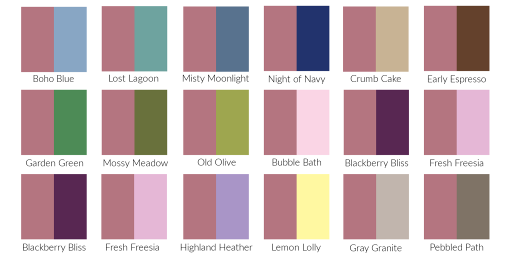
Certain color combinations with mauve have proven their enduring appeal, forming the basis for sophisticated and harmonious palettes. These pairings are often the safest yet most effective starting points for design.
Neutrals for Sophistication
Pairing mauve with neutrals is a design classic, offering balance, clarity, and an undeniable sense of elegance.
- Cream & Off-White: These warm, soft neutrals soften mauve’s cool undertones, creating a gentle, inviting, and luxurious feel. Ideal for brands in beauty, hospitality, or high-end apparel where a soft, approachable elegance is desired. Imagine mauve packaging with cream text or a cream website background with mauve accents.
- Light Gray & Charcoal: Cooler neutrals like light gray provide a modern, minimalist backdrop that allows mauve to truly pop without being overwhelming. Charcoal adds depth and seriousness, grounding mauve’s ethereal quality. This combination is excellent for corporate branding that seeks a balance between professionalism and a unique, creative edge. Think a tech brand incorporating a subtle mauve into their primarily gray interface.
- Taupe & Beige: These earthy neutrals blend seamlessly with mauve, creating a sophisticated, natural, and grounded palette. They evoke a sense of warmth and understated luxury, often seen in interior design, but equally effective in lifestyle branding, organic products, or sustainable fashion.
Analogous Harmony
Analogous colors are those situated next to each other on the color wheel, creating harmonious and serene palettes.
- Soft Pinks (Blush, Rose): Pairing mauve with lighter, dustier pinks creates a monochromatic-like harmony that is deeply feminine, romantic, and gentle. This palette is incredibly popular in beauty, bridal, and confectionery branding, conveying tenderness and delicate beauty.
- Lavender & Lilac: Leaning into mauve’s purple family, these lighter, brighter purples offer a soft transition that enhances mauve’s whimsical and creative aspects. This combination can feel dreamy, imaginative, and calming, often utilized in spas, wellness brands, or creative ventures.
- Muted Blues (Periwinkle, Slate Blue): Introducing blues adjacent to purple on the color wheel brings a calming, thoughtful dimension. Periwinkle offers a playful yet serene touch, while slate blue grounds mauve with a touch of sophistication and stability. This pairing is excellent for brands that want to convey trustworthiness with a creative twist, such as consulting firms or artisanal product lines.
Bold & Beautiful: High-Impact Color Combinations
For brands seeking to make a more dynamic statement, introducing contrasting or vibrant colors alongside mauve can create memorable and energetic palettes.

Complementary Contrasts
The most direct contrast to purple (and thus mauve) on the color wheel is yellow-green.
- Sage Green & Olive Green: These muted greens offer a sophisticated, earthy contrast to mauve. The combination feels organic, balanced, and surprisingly fresh. Sage green provides a soft, natural aesthetic, while olive green adds a deeper, more robust contrast. Brands focused on sustainability, natural products, or outdoor lifestyle can leverage this pairing for an authentic, grounded feel. This contrast is effective because it brings out the best in both colors without clashing, offering visual interest and depth.
- Mustard Yellow & Gold: While a full yellow might be too jarring, judicious use of mustard yellow or metallic gold as an accent color can inject warmth, energy, and a touch of opulence into a mauve palette. This combination is particularly striking for luxury branding, festive packaging, or high-fashion elements, where a bold statement is desired. The key is balance – using yellow or gold sparingly to highlight, rather than dominate.
Triadic and Tetradic Exploration
More complex color schemes can be generated using triadic (three colors equally spaced on the color wheel) or tetradic (four colors forming a rectangle on the color wheel) principles, though these require careful execution to maintain balance.
- Mauve, Teal, and Goldenrod (Triadic): This vibrant combination leverages mauve’s purple base, pairing it with a rich teal (a blue-green) and a warm goldenrod yellow. The result is a lively, creative, and somewhat playful palette that demands attention. It’s suitable for brands that want to convey innovation, artistic expression, or a youthful yet sophisticated energy. Achieving harmony requires careful control over saturation and the proportion of each color.
- Mauve, Pale Yellow-Green, Light Orange, Deep Blue-Green (Tetradic): A tetradic scheme offers even greater visual complexity. For mauve, this might involve pairing it with a soft chartreuse, a muted apricot orange, and a deep seafoam green. This creates a rich, multifaceted palette that can be incredibly unique and memorable for brands seeking to stand out significantly. This strategy requires advanced design skills to ensure all colors work together harmoniously without overwhelming the viewer.
Contextualizing Mauve: Application in Design
The effectiveness of any color palette, especially one featuring a nuanced shade like mauve, hinges on its application across various design contexts.
Branding & Identity
For brand identity, mauve offers distinct advantages. A mauve logo, when paired correctly, can communicate sophistication, creativity, and approachability. In packaging, mauve can denote premium quality or a gentle, natural product. On a website, it can contribute to a serene user experience or serve as an elegant accent for calls to action. The choice of complementary colors impacts the overall brand narrative – a mauve and gray palette might signal serious luxury, while mauve and sage green could suggest organic well-being.
Digital & Print Media
When designing for digital platforms, consider how mauve appears on different screens, as color calibration varies. For print, ensuring consistent color matching across different materials is vital. Mauve can be particularly effective in digital advertising to create a soft, inviting aesthetic that stands out from more common vibrant or primary colors. In print, especially on textured paper, its depth can be beautifully enhanced, conveying tangibility and quality.
Mastering Mauve: Tips for Effective Integration
Integrating mauve successfully into any design project requires more than just knowing complementary colors; it demands thoughtful application and strategic awareness.
Balance and Proportion
The 60-30-10 rule is a guiding principle in design: 60% dominant color, 30% secondary color, 10% accent color. Mauve can serve as any of these. As a dominant color, it sets a sophisticated, unique tone. As a secondary color, it adds depth and character to a neutral primary. As an accent, it provides a subtle pop of elegance or a touch of uniqueness. The proportion of mauve relative to its complementary colors dictates the overall mood and message of the design.
Texture and Materiality
The perceived color and emotional impact of mauve are heavily influenced by texture and material. A matte mauve finish on packaging feels sophisticated and soft, while a glossy mauve might appear more modern or playful. Mauve fabric, whether linen or velvet, evokes different sensations. In digital design, simulating texture or using gradients can add dimension, enhancing the color’s appeal.
Audience & Intent
Ultimately, the most effective color strategy is one that aligns with the target audience and the brand’s core intent. Is the goal to convey luxury to an affluent demographic? To appeal to a creative community? To offer comfort and tranquility? Each objective might lead to a different complementary palette for mauve. Researching audience preferences and understanding the psychological associations of chosen colors ensures the design communicates effectively and resonates deeply.
By thoughtfully considering mauve’s intrinsic qualities and strategically pairing it with appropriate complements, designers can unlock its full potential to create visually rich, emotionally resonant, and highly effective brand experiences.
aViewFromTheCave is a participant in the Amazon Services LLC Associates Program, an affiliate advertising program designed to provide a means for sites to earn advertising fees by advertising and linking to Amazon.com. Amazon, the Amazon logo, AmazonSupply, and the AmazonSupply logo are trademarks of Amazon.com, Inc. or its affiliates. As an Amazon Associate we earn affiliate commissions from qualifying purchases.