
Brown, often underestimated in the vibrant spectrum of branding colors, possesses an inherent strength and versatility that, when leveraged correctly, can convey profound messages of stability, warmth, and authenticity. For brand strategists and designers, understanding “what colors complement brown” is not merely an aesthetic exercise; it is a critical step in building a compelling corporate identity that resonates with target audiences and stands the test of time. This exploration delves into the strategic use of brown in branding, examining its psychological impact and pairing it with colors that enhance its innate qualities, ultimately shaping distinct brand personalities.
The Psychology of Brown in Branding
Before exploring complementary pairings, it’s essential to grasp the fundamental psychological associations brown carries. In the realm of branding, color is a silent communicator, and brown’s message is particularly potent.
Stability, Reliability, and Earthiness
Brown is intrinsically linked to the earth, soil, and wood, evoking feelings of grounding, steadfastness, and naturalness. Brands that wish to project an image of reliability, tradition, or environmental consciousness often find brown to be an indispensable anchor in their color palette. It signifies a no-nonsense, dependable character, suggesting integrity and a foundational strength that customers can trust. This makes it a popular choice for industries related to construction, agriculture, organic products, and financial services seeking to convey security.
Versatility and Professionalism
Despite its earthy roots, brown is surprisingly versatile. It can transition from rustic and casual to sophisticated and luxurious depending on its shade and the colors it’s paired with. Deeper, richer browns can exude professionalism and understated elegance, often seen in high-end fashion, gourmet food brands, and luxury lifestyle companies. Its ability to serve as a neutral yet impactful backdrop allows other colors in a brand’s palette to truly shine, adding depth without overwhelming the overall visual message.
Foundational Color Theory for Brand Design
Effective brand design relies heavily on color theory, which dictates how colors interact and influence perception. Understanding the principles behind complementary, analogous, and triadic schemes is crucial for selecting the right partners for brown.
Understanding Complementary, Analogous, and Triadic Schemes
A complementary color is opposite another on the color wheel, creating high contrast and visual dynamism. While brown isn’t on the traditional artist’s color wheel in the same way primary and secondary colors are, its perceived complements often derive from the colors opposite its underlying hue components (red, yellow, blue). For instance, a warmer, reddish-brown might find a striking complement in certain shades of blue.
Analogous colors are next to each other on the color wheel, offering low contrast and a harmonious, soothing feel. Pairing brown with analogous shades like deep oranges or muted yellows can create a rich, cohesive, and inviting palette.
Triadic schemes involve three colors equally spaced on the color wheel, providing a balanced and vibrant dynamic. While more complex, a triadic approach could involve brown as a neutral base, accented by two other carefully selected colors to create a distinctive brand identity. The goal is always to achieve a balance that supports the brand’s message, not just visual appeal.
The Importance of Contrast and Harmony
In branding, contrast ensures readability and visual interest, making logos and messaging stand out. Harmony ensures that all elements work together cohesively, preventing a chaotic or disjointed appearance. When pairing brown, designers must consider not just the hue, but also the saturation and lightness of the complementary color to achieve the desired balance. A light brown with a dark blue offers strong contrast, while a mid-tone brown with a muted green provides subtle harmony. Both can be effective, depending on the specific brand narrative.
Complementary Pairings: Direct Impact on Brand Perception
The true power of brown in branding emerges when it is skillfully paired with other colors. Each combination creates a unique psychological impact and brand narrative.
Brown and Blue: Trustworthy and Grounded
This classic pairing leverages the earthy stability of brown with the serene trust associated with blue. Deeper blues, such as navy or steel blue, create a sophisticated and corporate feel, ideal for financial institutions, legal firms, or technology companies aiming to convey reliability and innovation. Lighter, more vibrant blues can introduce a fresh, approachable quality, suitable for eco-conscious brands or service providers. The contrast between warm brown and cool blue offers excellent visual balance, making it a highly adaptable duo for a vast array of industries.
Brown and Green: Natural, Sustainable, and Organic
Given brown’s strong connection to the earth, pairing it with various shades of green creates an undeniably natural and organic aesthetic. This combination is a staple for brands focused on sustainability, health, wellness, and environmental initiatives. Forest greens and olive greens alongside a rich brown evoke lush landscapes and raw materials, signaling purity and an unadulterated quality. Lighter, brighter greens can add an element of growth and freshness, often seen in organic food packaging or agricultural branding. This pairing subtly communicates an adherence to natural processes and a commitment to ecological values.

Brown and Orange/Yellow: Warm, Inviting, and Approachable
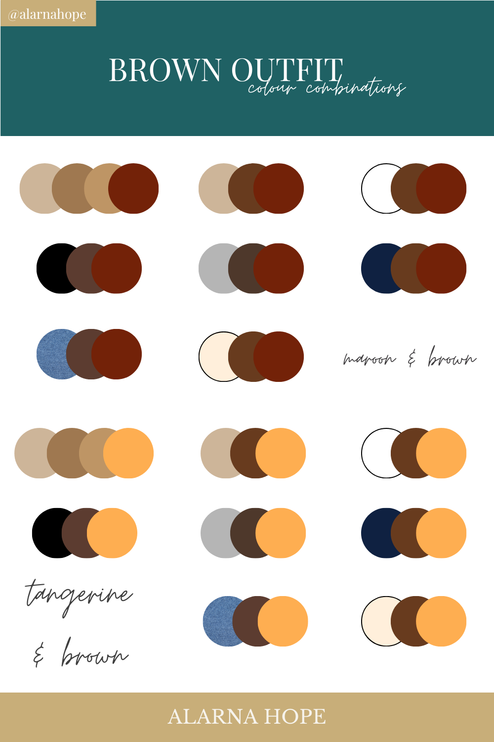
When brown is paired with warm hues like orange or yellow, the resulting palette becomes incredibly inviting and friendly. Orange, with its energy and enthusiasm, can inject vibrancy into brown’s grounded nature, making brands feel more approachable and less austere. This pairing is excellent for food and beverage companies, particularly those in the coffee, chocolate, or artisanal baked goods sectors, as it evokes warmth, comfort, and sensory pleasure. Similarly, hints of muted yellow can brighten a brown scheme, suggesting optimism and an understated cheerfulness without losing brown’s inherent professionalism. This combination is also effective for lifestyle brands or hospitality services aiming for a cozy and welcoming atmosphere.
Brown and Cream/Off-White: Elegant, Minimalist, and Sophisticated
For brands seeking an understated luxury or minimalist aesthetic, pairing brown with cream, beige, or off-white is a superb choice. This combination exudes elegance, sophistication, and a timeless quality. The light, airy quality of cream softens brown’s intensity, creating a refined look that avoids starkness. It’s often employed by high-end fashion brands, interior design firms, and luxury service providers who wish to communicate exclusivity and a discerning taste without being ostentatious. This palette champions simplicity, allowing the quality of the product or service to speak for itself, relying on subtle textural differences and refined typography.
Brown and Metallics (Gold/Copper): Premium, Luxurious, and Established
To elevate brown to the zenith of luxury, pairing it with metallic accents like gold or copper is an unparalleled strategy. Gold instantly imbues brown with a sense of prestige, wealth, and classic opulence. This combination is a go-to for luxury goods, premium spirits, high-end jewelry, and financial services targeting an affluent clientele. Copper, on the other hand, offers a warmer, more artisanal metallic sheen that can convey bespoke craftsmanship, heritage, and unique quality. Brands in specialty food, handcrafted goods, or boutique hospitality might leverage brown with copper to signify authenticity and exclusive experience. These metallic pairings allow brown to shed any perceived dullness, transforming it into a foundation for aspirational branding.
Strategic Integration: Beyond Just Two Colors
While powerful duos form the core, a comprehensive brand identity often requires a multi-tonal approach, integrating brown within a broader, sophisticated palette.
Building Multi-Tonal Brand Palettes
A successful brand palette isn’t limited to a single complementary pair. It often involves a primary brown, one or two complementary accents, and perhaps a neutral or an analogous secondary color to create depth and versatility. For instance, a brand could use a dark brown as its primary, a vibrant blue as an accent, and a light cream as a secondary neutral for backgrounds or supporting elements. This allows for flexibility across various marketing materials while maintaining a consistent brand voice. Strategic designers consider not just the colors themselves, but also their proportionate use to control the overall impression.
Considering Target Audience and Industry Context
The selection of brown’s complementary colors must always align with the target audience’s preferences and the specific industry’s conventions. A children’s brand would likely pair brown with brighter, more playful accents, while a luxury fashion house would opt for muted, sophisticated tones. Similarly, a technology brand might use brown with sleek metallics and cool blues to signify innovation and reliability, whereas an organic farm might lean towards earthy greens and warm oranges to highlight natural goodness. Understanding these nuances is paramount to creating a relevant and effective brand identity.
Application Across Brand Touchpoints (Logo, Website, Packaging)
The chosen brown-centric palette must translate seamlessly across all brand touchpoints. The logo, as the cornerstone of visual identity, sets the tone. A website design utilizes the palette for navigation, call-to-action buttons, and background elements, ensuring a cohesive user experience. Packaging applies the colors to evoke desire and communicate product values directly on the shelf. Uniforms, signage, and marketing collateral all reinforce the brand message through consistent color application, building strong recognition and emotional connection with the consumer.
Avoiding Common Pitfalls in Brown-Centric Branding
While brown offers immense potential, its misuse can lead to undesirable brand perceptions.
Over-reliance Leading to Dullness
An exclusive reliance on brown without sufficient contrast or complementary accents can lead to a brand identity that feels dull, uninspired, or even dated. The key is balance; brown should anchor the palette, not overwhelm it, allowing its complementary partners to provide necessary vibrancy and distinction.
Inappropriate Pairings That Dilute Brand Message
Pairing brown with colors that clash or carry contradictory psychological associations can confuse the brand message. For example, a rustic brown paired with jarring neon colors might send mixed signals about a brand’s authenticity or sophistication. Diluting the brand’s core values through mismatched colors can undermine trust and memorability.

Neglecting Accessibility and Readability
Finally, color choices must always consider accessibility. High contrast between text and background colors, especially for brown-on-brown or brown-on-dark colors, is crucial for readability and ensuring that the brand message is accessible to all audiences, including those with visual impairments. A beautifully designed palette loses its impact if it cannot be easily perceived and understood.
In conclusion, understanding what colors complement brown is a strategic asset for any brand aiming to build a sophisticated, trustworthy, and memorable identity. By thoughtfully integrating brown with its ideal companions—be it the steadfast blue, the natural green, the inviting orange, the elegant cream, or the luxurious metallic—brands can craft a visual language that not only stands out but deeply resonates with their target market, cementing their position in the competitive landscape.
aViewFromTheCave is a participant in the Amazon Services LLC Associates Program, an affiliate advertising program designed to provide a means for sites to earn advertising fees by advertising and linking to Amazon.com. Amazon, the Amazon logo, AmazonSupply, and the AmazonSupply logo are trademarks of Amazon.com, Inc. or its affiliates. As an Amazon Associate we earn affiliate commissions from qualifying purchases.