
In the world of visual communication, color is never “just a color.” It is a silent language that communicates values, emotions, and promises before a single word of copy is read. While many emerging brands gravitate toward the high-energy pulse of neon blues or the aggressive call-to-action of vibrant reds, there is a sophisticated, often overlooked power in the earthier spectrum. Specifically, brown—a color often misunderstood as “plain”—serves as a cornerstone for some of the world’s most resilient brands.
Understanding what colors combined make brown is not merely an exercise for an art studio; it is a fundamental requirement for brand strategists, digital designers, and corporate identity experts. To create a brown that feels “premium” rather than “muddy” requires a deep dive into color theory and an understanding of how these mixtures resonate with the human psyche.
The Science and Art of Color Mixing for Brand Palettes
Achieving the perfect brown is a masterclass in balance. In branding, the “perfect” brown can range from a deep, luxurious espresso to a warm, inviting terracotta. The technical process of arriving at these shades dictates the “temperature” of the brand’s visual identity.
The Primaries: Why Red, Yellow, and Blue Form the Foundation
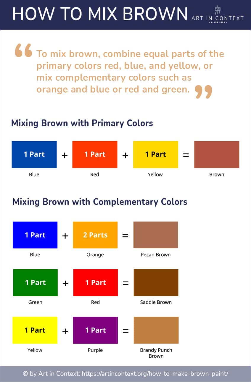
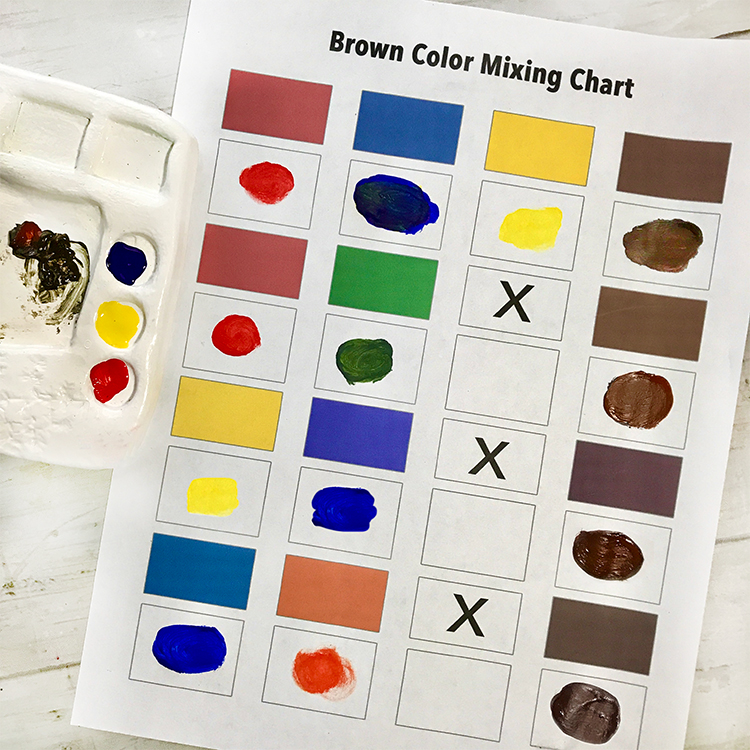
The most common way to create brown is by mixing all three primary colors: red, yellow, and blue. In the world of brand design, this is known as a tertiary mix. When these three are combined, they effectively cancel out the high-vibrancy traits of each other, resulting in a neutralized, grounded tone.
For a brand strategist, the ratio of these primaries is critical. A higher concentration of red results in a “burnt sienna” that feels warm and energetic, ideal for lifestyle or food brands. Conversely, increasing the blue content creates a cooler, darker brown that leans toward “umber,” providing a sense of stoicism and authority often used in high-end leather goods or heritage-driven corporate identities.
Complementary Pairs: Creating Depth through Opposition
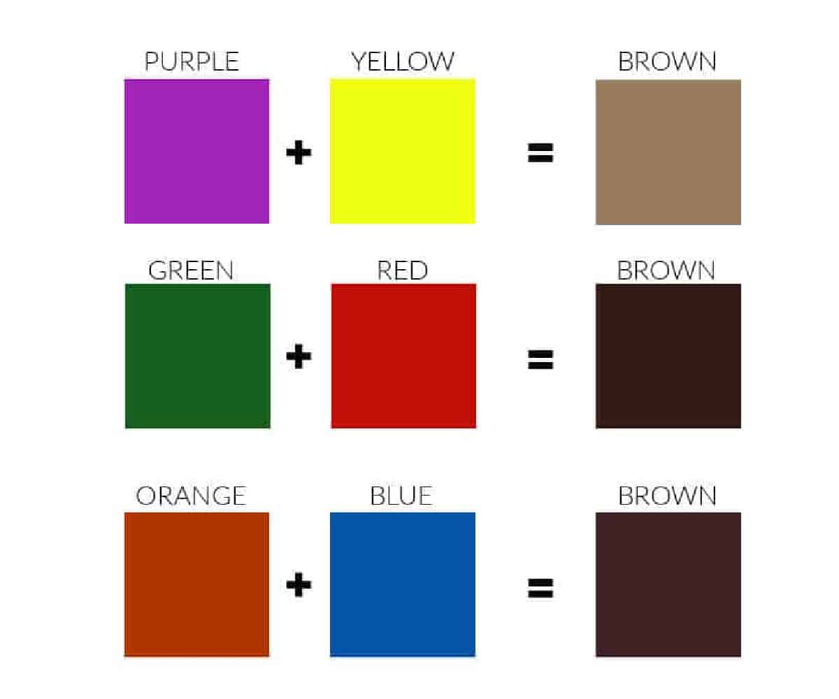
Another sophisticated method to achieve brown is by mixing complementary colors—those opposite each other on the color wheel.
-
Blue and Orange: This combination creates a rich, deep brown that feels vibrant yet stable.
-
Red and Green: This yields a forest-like, organic brown that is heavily utilized in sustainable and eco-friendly branding.
-
Yellow and Purple: This produces a bright, golden-brown that evokes feelings of antiquity and tradition.
By choosing specific complementary pairs, designers can “tint” their brown to align with a brand’s specific mission. A tech company looking to appear more “human” might use a blue-based brown to maintain a techy coolness while adding an earthy warmth.
Digital vs. Print: RGB vs. CMYK in Achieving the Perfect Brown
In modern branding, consistency across platforms is the greatest challenge. What colors make brown on a computer screen (RGB) differ significantly from what colors make brown in high-end packaging (CMYK).
-
In RGB (Red, Green, Blue): Brown is essentially a low-intensity orange. By keeping red high, green moderate, and blue low, digital designers create the “warmth” seen on high-converting websites.
-
In CMYK (Cyan, Magenta, Yellow, Black): For physical branding like business cards or luxury boxes, achieving a “true” brown requires careful calibration of the “K” (black) channel to ensure the color doesn’t look washed out under retail lighting.
The Psychology of Brown in Corporate Identity
Once the technical mixture is mastered, a brand must understand the psychological weight that brown carries. In the “Brand Strategy” niche, brown is the ultimate tool for establishing “The Grounding Effect.”
Evoking Reliability and Tradition
Brown is the color of the earth and wood. It suggests a foundation that has been in place for decades. Brands that use brown are often positioning themselves as “The Reliable Choice.” This is why financial institutions with long histories or law firms often incorporate dark wood tones and chocolate browns into their interior designs and logos. It whispers of permanence in a world of fleeting digital trends.
Earthiness and Sustainability: Connecting with Nature
As the global market shifts toward ESG (Environmental, Social, and Governance) values, brown has seen a massive resurgence. When combined with green, brown signals a “farm-to-table” or “source-to-shelf” transparency. For a brand, this specific color combination communicates that the product is organic, biodegradable, and ethically sourced. It moves the brand away from the “plastic” feel of primary colors and toward something felt and touched.
Luxury and Sophistication: From Chocolate to Leather
There is a specific “sweet spot” in brown color mixing—the rich, dark tones associated with luxury. Deep browns evoke the sensory experiences of high-end chocolate, aged spirits, and artisanal leather. For a luxury brand, brown acts as a softer, more approachable version of black. While black can feel exclusionary or cold, a deep, well-mixed brown feels inclusive yet elite.
Case Studies: Brands That Own the Brown Palette
To see the strategic application of “what colors combined make brown,” we need only look at the giants of the corporate world. These companies have turned a “neutral” color into a billion-dollar asset.
UPS and the Power of “Pullman Brown”
Perhaps no company is as synonymous with brown as UPS. Their “United Parcel Service” identity is built entirely around “Pullman Brown.” This choice was originally made to hide dirt on delivery trucks, but over a century, it has evolved into a symbol of efficiency and rugged reliability. Their famous slogan, “What can Brown do for you?” turned a technical color choice into a personified brand promise. The brown they use is heavily weighted with yellow and red, giving it a warm, “working-class” reliability.
Louis Vuitton: Redefining Luxury through Earth Tones
The LV monogram is globally recognized, and its primary color is a specific shade of muted brown. By mixing a dark umber base with golden-yellow accents, Louis Vuitton creates a visual language of “Heritage Luxury.” This brown doesn’t scream for attention; it commands it through consistency. It suggests that the brand, like the color itself, is timeless and resistant to the whims of fashion.
Hershey’s: Creating Emotional Resonance through Color
For Hershey’s, brown is not just a color; it is the product. The specific “milk chocolate” brown used in their branding is designed to trigger a physiological response. By utilizing a brown that leans heavily toward the warm end of the spectrum (high red and yellow content), the brand evokes comfort and indulgence. It is a masterclass in using color mixing to align the visual brand with the actual sensory experience of the product.
Implementing Brown into Your Brand Strategy
If you are considering integrating brown into your brand’s corporate identity, it should not be an afterthought. It requires a tactical approach to ensure it doesn’t dampen the brand’s energy.
Balancing Brown with Accent Colors
Because brown is a neutral, “grounding” color, it requires a “lifting” partner.
-
Brown and Gold: The gold standard for luxury branding.
-
Brown and Turquoise: A modern, “boho-chic” mix often used in lifestyle and travel brands.
-
Brown and Cream: Suggests minimalism, cleanliness, and high-end aesthetics (common in skincare).
The strategist must decide which “hidden” color within the brown mixture they want to highlight. If your brown has a red base, an orange accent will make the brand feel fiery and passionate.
Texture and Materiality: The Physical Application of Color
In branding, brown is unique because it is often tied to texture. A “brown” brand isn’t just a hex code; it’s a recycled paper stock, a matte finish on a box, or a grained leather texture on a product. When a brand identifies the colors that make their specific brown, they must also identify the materials that reflect those colors. A matte brown communicates “eco-friendly,” while a glossy, high-sheen brown communicates “high-tech luxury.”
Conclusion: The Strategic Necessity of Mastery
Understanding what colors combined make brown is the difference between a brand that looks amateur and one that looks established. Whether you are mixing red, yellow, and blue to create a stable foundation, or using complementary opposites to find a unique, modern hue, the goal remains the same: to communicate a brand’s essence through the subtle nuances of light and pigment.
In an era dominated by fleeting digital “pops” of color, the brands that master the earthy, reliable, and sophisticated world of brown are those that build a lasting legacy. Brown is the color of the earth, the color of history, and—when mixed with strategic intent—the color of trust. By mastering this palette, brand designers and strategists can create a visual identity that doesn’t just stand out for a moment but stands firm for a lifetime.
aViewFromTheCave is a participant in the Amazon Services LLC Associates Program, an affiliate advertising program designed to provide a means for sites to earn advertising fees by advertising and linking to Amazon.com. Amazon, the Amazon logo, AmazonSupply, and the AmazonSupply logo are trademarks of Amazon.com, Inc. or its affiliates. As an Amazon Associate we earn affiliate commissions from qualifying purchases.