
In the competitive landscape of corporate identity, color is never just a visual preference; it is a strategic tool. When we ask, “What colors combine to make yellow?” we are rarely asking a simple question about paint. In the context of brand strategy, the construction of “Yellow” is a complex blend of light physics, psychological triggers, and market positioning.
Yellow is the most visible color in the spectrum, the first hue the human eye processes, and one of the most difficult to master in a brand palette. Whether it is the “Golden Arches” of McDonald’s or the utilitarian bold of Caterpillar, the “yellow” we see is a result of specific technical and emotional combinations. This article explores how brands “mix” their identity to achieve the perfect yellow, moving from the technicalities of digital screens to the psychological architecture of global icons.
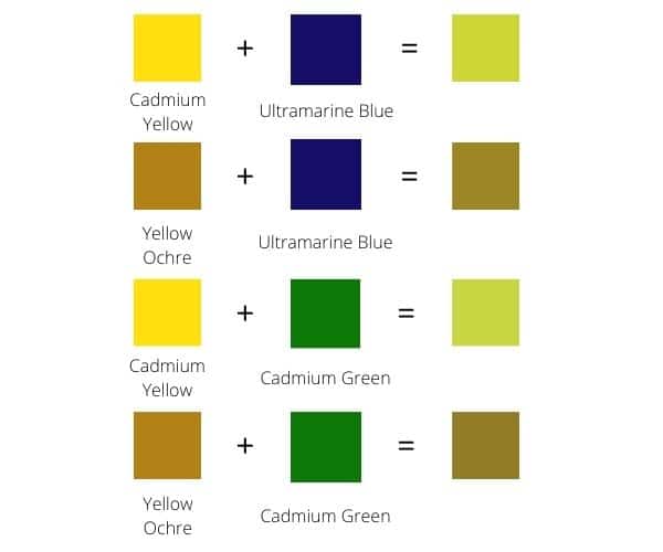
The Technical Composition: Mixing Light and Pigment for Brand Consistency
To understand how a brand “makes” yellow, one must first distinguish between the digital world and the physical world. In branding, a color must remain consistent across a smartphone screen, a printed billboard, and a physical product. This requires two entirely different “recipes” for yellow.
The Digital Formula: Red and Green Light
In the realm of digital brand strategy—Tech-heavy interfaces, apps, and websites—yellow is an additive color. Within the RGB (Red, Green, Blue) color model used by monitors and smartphone screens, yellow is not a primary color. Instead, it is created by combining equal parts of Red and Green light.
When a brand developer selects a hex code like #FFFF00, they are telling a device to fire its red and green sub-pixels at full intensity while keeping the blue sub-pixel dark. This intersection creates the perception of yellow in the human eye. For tech brands, mastering this “mix” is crucial for accessibility; the wrong balance of red and green can lead to a “muddy” yellow that fails Web Content Accessibility Guidelines (WCAG), making text unreadable and the brand appear unprofessional.
The Print Challenge: Subtractive Color and Pantone
In the physical world—packaging, signage, and corporate stationery—the “mix” changes. Printing uses the CMYK (Cyan, Magenta, Yellow, Black) model. Here, yellow is a primary color. It cannot be created by mixing other inks; rather, it is the base from which other colors are built.
However, brand strategists often rely on the Pantone Matching System (PMS) to ensure that “Yellow” looks the same in London as it does in Tokyo. Achieving a specific “Brand Yellow” often involves using “Process Yellow” or a specific spot color like Pantone 123 C (often associated with high-energy sports brands). For a brand strategist, the “colors that combine to make yellow” are less about the ink and more about the precision of the chemical formula that ensures the brand identity remains unshakeable across different mediums.
The Psychological Components: Mixing Emotion and Perception
Beyond the ink and the pixels, a brand’s “Yellow” is a mixture of psychological ingredients. A strategist does not just pick a hue; they mix emotional triggers to create a specific brand feeling.
The Brightness of Optimism and Warmth
At its core, yellow is the color of the sun. In brand psychology, yellow is “made” by combining feelings of hope, cheerfulness, and playfulness. Brands like Snapchat or Mailchimp use yellow to signal that they are approachable, friendly, and innovative. This “mix” of optimism is designed to lower the consumer’s guard and foster a sense of community. When a brand identifies as “Yellow,” they are strategically choosing to stand out against the “Corporate Blue” that dominates the financial and tech sectors, positioning themselves as the “sunny” alternative.
The Warning Sign: Capturing Immediate Attention
There is a second, sharper ingredient in the psychological mix of yellow: urgency. Because yellow has a high light-reflectance value, it is the most attention-grabbing color. It is the color of caution signs and traffic lights.
Brand strategists “mix” this sense of alertness into their identity when they want to signify speed or value. This is why “Value” brands often use a combination of yellow and black. The black provides the highest possible contrast, making the yellow pop and signaling to the consumer’s brain: “Look here immediately.” This combination is a staple in the branding of logistics companies (like DHL) and construction equipment (like JCB), where visibility is synonymous with safety and efficiency.
Strategic Case Studies: How Iconic Brands “Mixed” Their Yellow

To truly understand the application of yellow in brand strategy, we must look at the giants who have successfully claimed this slice of the color wheel. These brands didn’t just choose a color; they mixed it into their corporate DNA.
The Golden Arches: Hunger and Speed
McDonald’s is perhaps the most famous user of yellow in the world. Their strategy involves a specific mix of Yellow and Red. In color theory, this is known as the “Ketchup and Mustard” theory. Red triggers appetite and a sense of urgency, while yellow evokes friendliness and visibility. When combined, these colors create a psychological environment that encourages fast eating and high turnover. The “Yellow” here is mixed with the strategic intent of “Quick Service,” making it an indispensable part of their global corporate identity.
IKEA: Stability and Accessibility
IKEA’s use of yellow is a masterclass in national identity mixed with retail strategy. By combining the yellow and blue of the Swedish flag, they immediately communicate their heritage. However, within the store, yellow is used strategically for the “yellow bags” and “yellow shirts” of employees. Here, yellow is mixed with the concept of “Helpfulness” and “Utility.” It guides the customer through the labyrinthine showrooms, acting as a beacon of assistance in an otherwise overwhelming retail environment.
Nikon: Precision and Heritage
In the world of professional photography, Nikon uses a sophisticated yellow combined with black and white. For Nikon, the yellow isn’t about “happiness”—it’s about the “glow” of light and the precision of the lens. By mixing yellow with a stark black background, Nikon positions itself as a premium, technical brand that masters the very thing yellow represents: light. This demonstrates that “Yellow” can be professional and high-end when mixed with the right secondary brand elements.
Cultural Nuance: The Global Ingredients of Yellow
A brand strategy that works in New York may fail in Beijing if the “ingredients” of the color aren’t adjusted for cultural perception. What colors combine to make “Yellow” in the mind of a global consumer depends heavily on their geography.
Western Positivity vs. Eastern Royalty
In Western cultures, yellow is largely the color of the sun, flowers, and joy. However, in many Eastern cultures, particularly in China, yellow was historically the color of the Emperor. It represents royalty, sacredness, and power. A luxury brand moving into the Chinese market might “mix” yellow into its branding to signify “Gold” and “Exclusivity” rather than “Value” or “Cheer.” Understanding these cultural “pigments” is essential for brand managers who want to avoid the “Yellow” of cowardice (a Western trope) and instead lean into the “Yellow” of prestige.
The Evolution of “Gen Z Yellow”
In recent years, brand strategists have identified a shift in the “mix” of yellow known as “Gen Z Yellow.” This is a specific, slightly muted, buttery yellow that replaced “Millennial Pink.” It represents a mix of gender neutrality, nostalgia, and a “post-ironic” brightness. Brands targeting younger demographics—such as Bumble or Fenty Beauty—have utilized this specific shade to signal that they are modern, inclusive, and socially aware. This demonstrates that the “colors” that make a brand’s yellow are also influenced by the zeitgeist of the generation they are trying to reach.
Implementing Yellow: A Practical Guide for Brand Developers
Choosing to make Yellow your primary brand color is a bold move. It requires a careful balance of secondary colors to ensure the identity remains functional and professional.
Balancing with Neutral Foundations
Because yellow is so overwhelming, it is rarely used alone in a sophisticated brand strategy. It is almost always “mixed” with a grounding neutral. Charcoal grey, deep navy, or a crisp white are essential to prevent “visual fatigue.” A brand that is “all yellow” risks appearing amateurish or “loud.” By mixing 10% yellow with 90% neutral tones, a brand can achieve a “pop” of energy without sacrificing its corporate gravitas.
Ensuring Accessibility and Readability
One of the greatest technical challenges in branding is using yellow in digital UI (User Interface). Yellow on white is nearly invisible to those with visual impairments. Therefore, the “mix” for a digital-first brand must include a “dark mode” strategy. High-contrast borders, black typography, or a shift toward an “amber” yellow are often necessary to ensure the brand remains accessible. In this sense, the “colors that combine to make yellow” functional in tech are often the dark outlines that define its shape.
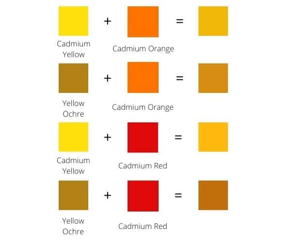
Conclusion: The Strategic Palette
What colors combine to make yellow? From a technical standpoint, it is Red and Green light or the primary pigment of the CMYK model. But from a brand strategy perspective, Yellow is a deliberate concoction of optimism, urgency, cultural heritage, and high-visibility physics.
To “make” a successful yellow brand, a strategist must mix the right amount of psychological warmth with a dash of technical precision and a solid foundation of neutral contrast. When done correctly, Yellow is not just a color; it is a beacon that signals a brand’s presence in a crowded marketplace, radiating an energy that is impossible to ignore. Whether you are building the next tech giant or a boutique personal brand, understanding the alchemy of Yellow is the key to illuminating your identity in the eyes of the consumer.
aViewFromTheCave is a participant in the Amazon Services LLC Associates Program, an affiliate advertising program designed to provide a means for sites to earn advertising fees by advertising and linking to Amazon.com. Amazon, the Amazon logo, AmazonSupply, and the AmazonSupply logo are trademarks of Amazon.com, Inc. or its affiliates. As an Amazon Associate we earn affiliate commissions from qualifying purchases.