
In the competitive landscape of modern branding, color is far more than an aesthetic choice; it is a psychological tool used to influence perception, evoke emotion, and drive consumer behavior. Among the most versatile yet frequently debated hues in the designer’s toolkit is pink. Traditionally relegated to specific niches, pink has undergone a massive cultural and commercial evolution. From the “Millennial Pink” phenomenon to the high-energy fuchsias of the tech world, understanding what colors blend with pink is essential for any brand strategist looking to build a sophisticated and memorable visual identity.
Selecting the right palette involves more than just finding colors that look “nice” together. It requires a deep dive into color theory, market positioning, and the specific message a brand intends to convey. This guide explores the strategic application of pink in brand design and identifies the most effective color pairings to elevate your corporate identity.
The Psychology of Pink in Strategic Branding
Before identifying the ideal color companions for pink, a brand strategist must understand the intrinsic psychological weight the color carries. In the context of brand strategy, pink represents a spectrum of attributes ranging from softness and nurturing to boldness and disruption.
Nurturing and Compassion
Soft, pastel pinks are often associated with empathy, care, and accessibility. These shades are frequently utilized by brands in the healthcare, wellness, and childcare sectors. When a brand aims to appear approachable and human-centric, a muted pink serves as a non-threatening invitation to the consumer.
Sophistication and Luxury
When moved toward a dustier, more “nude” or “blush” tone, pink takes on a level of sophistication comparable to champagne or ivory. This is particularly effective in high-end lifestyle branding, where the goal is to convey understated elegance rather than overt flashiness.
Energy and Innovation
On the opposite end of the spectrum, vibrant pinks—such as magenta or fuchsia—symbolize energy, creativity, and confidence. These “hot” pinks are increasingly used by disruptive brands in the tech and telecommunications industries to signal a break from tradition. Unlike the “safe” blues and greys of corporate history, these shades of pink demand attention and suggest a forward-thinking mindset.
Strategic Color Pairings: What Colors Blend with Pink?
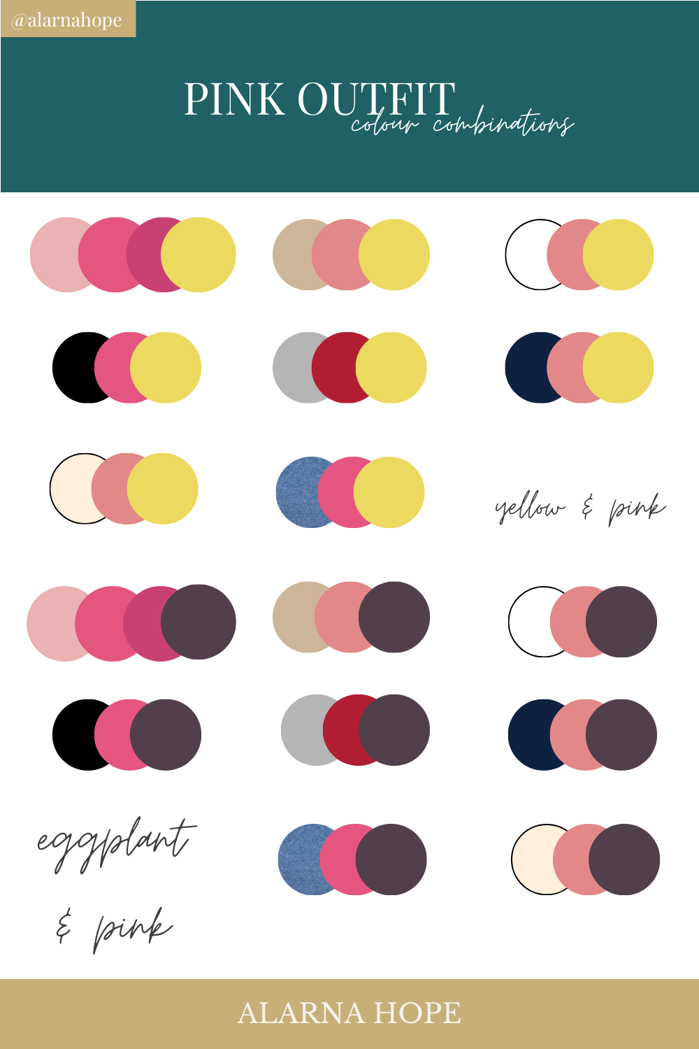
The success of a pink-centric brand identity depends heavily on its supporting palette. The colors you blend with pink will determine whether the brand feels traditional, avant-garde, or professional.
Pink and Navy Blue: The Professional Anchor
One of the most effective blends for corporate branding is pink and navy blue. Navy provides a grounded, stable, and authoritative foundation that balances the playfulness or softness of pink. This pairing is highly popular in professional services, finance, and prestige real estate. The navy blue instills trust and reliability, while a blush or coral pink adds a touch of modern personality, preventing the brand from appearing cold or unapproachable.
Pink and Forest Green: The Organic Contrast
In color theory, green is the complementary opposite of red, meaning that green tones provide a natural, high-contrast balance to pinks. A deep forest green blended with a soft rose creates a sophisticated, organic feel. This palette is frequently used by lifestyle and sustainable brands that want to emphasize a connection to nature while maintaining a chic, contemporary edge. It is a “grown-up” way to use pink that avoids any “bubblegum” connotations.
Pink, Black, and White: The Minimalist Powerhouse
For brands seeking a high-fashion or ultra-modern aesthetic, blending pink with a stark monochrome palette is a winning strategy. A bright fuchsia paired with black conveys power, luxury, and edge. Conversely, a soft pink paired with crisp white and charcoal grey suggests cleanliness and minimalist luxury. This combination is a staple in the beauty and editorial industries, where visual clarity and bold statements are paramount.
Pink and Gold: The Premium Standard
When the objective is to signify luxury and premium quality, pink and gold are a classic pairing. This blend works best when the pink is kept in the “blush” or “dusty rose” category. The gold accents—whether in physical packaging, logo embossing, or digital UI—elevate the pink, moving it away from its more casual associations and into the realm of high-end retail and boutique services.

Case Studies: Pink as a Strategic Differentiator
To understand how these blends work in the real world, we must look at major brands that have successfully integrated pink into their corporate identity to achieve specific strategic goals.
T-Mobile: The Magenta Disruptor
T-Mobile’s use of “Process Magenta” is perhaps the most famous example of pink in corporate branding. In a market dominated by the blues of AT&T and the reds of Verizon, T-Mobile chose a color that was impossible to ignore. By blending this vibrant pink with a stark white and black background, they positioned themselves as the “Un-carrier”—rebellious, energetic, and distinct. This strategic color choice helped them carve out a unique space in a saturated tech market.
Airbnb and the “Bélo”
When Airbnb rebranded, they introduced “Rausch,” a color that sits somewhere between pink and red. This color was chosen specifically because it blends the passion of red with the nurturing warmth of pink. By pairing this hue with soft greys and plenty of white space, Airbnb created a visual identity that feels globally inclusive, welcoming, and technologically sophisticated. It bridges the gap between a tech platform and a community-driven service.
Glossier: The Birth of a Movement
Glossier is the brand most responsible for the rise of “Millennial Pink.” By using a very specific shade of pale pink and blending it with minimalist black typography and dewy, natural imagery, they created a brand identity that felt relatable yet aspirational. The color became so synonymous with the brand that the packaging itself became a marketing tool, proving that the right blend of pink can drive organic brand loyalty.
Implementing Pink into Your Design System
Once the color palette is chosen, the focus shifts to implementation. Blending colors is not just about the logo; it is about how those colors interact across all brand touchpoints, from digital interfaces to physical environments.
Establishing Visual Hierarchy
When using pink, it is crucial to establish which color takes the lead. If pink is the primary brand color, the blending colors (like grey or navy) should be used for typography and structural elements to ensure readability. If pink is an accent color, it should be used strategically for “Call to Action” (CTA) buttons, notifications, or key brand highlights to draw the eye without overwhelming the viewer.
Accessibility and Contrast
In the digital space, accessibility is a non-negotiable component of brand strategy. Some shades of pink, particularly lighter pastels, can be difficult to read against white backgrounds. When blending pink with other colors for web design, ensure that the contrast ratios meet WCAG (Web Content Accessibility Guidelines) standards. For instance, pairing a dark grey text with a pink background, or vice versa, ensures that the brand remains inclusive to all users.
Materiality and Texture
In corporate identity, color is often experienced through physical materials. A color that looks great on a screen might feel different when printed on a business card or fabricated into office signage. When blending pink with metallic tones like copper or gold, consider the finish—matte pink vs. gloss pink. These textural decisions are an extension of the color strategy and can significantly alter the perceived value of the brand.

The Future of Pink: Beyond Gender and Convention
As we look toward the future of brand design, pink is shedding its historical limitations. The “gendering” of color is rapidly disappearing, allowing brands across all sectors—including Fintech, SaaS, and Automotive—to experiment with pink palettes.
The modern brand strategist views pink as a tool for inclusivity and modernism. By understanding what colors blend with pink, designers can create identities that are not only visually stunning but also psychologically resonant. Whether it’s the high-contrast “Cyberpunk” look of neon pink and teal or the grounded elegance of rose and slate, pink is a color of infinite strategic possibility.
In conclusion, pink is no longer a “niche” choice. It is a powerful, flexible, and emotionally resonant color that, when blended correctly, can define a brand’s place in the market. By moving beyond stereotypes and applying the principles of color theory and strategic positioning, you can harness the power of pink to build a brand identity that is both timeless and ahead of the curve.
aViewFromTheCave is a participant in the Amazon Services LLC Associates Program, an affiliate advertising program designed to provide a means for sites to earn advertising fees by advertising and linking to Amazon.com. Amazon, the Amazon logo, AmazonSupply, and the AmazonSupply logo are trademarks of Amazon.com, Inc. or its affiliates. As an Amazon Associate we earn affiliate commissions from qualifying purchases.