
Red brick homes possess an undeniable classic appeal, exuding warmth, history, and a grounded sense of place. The inherent character of red brick, with its varying shades and textures, presents a unique design challenge and opportunity when selecting complementary siding colors. Far from being a mere aesthetic choice, the pairing of siding with red brick is a critical element in defining a property’s visual brand, influencing its curb appeal, perceived value, and overall architectural identity. Strategic color selection can elevate a home’s design, creating harmony, contrast, or a desired emotional response, much like a well-crafted logo or corporate palette communicates a brand’s essence.
The Enduring Visual Brand of Red Brick
Red brick is more than just a building material; it’s a statement. Its robust nature and rich, earthy tones have anchored residential and commercial architecture for centuries. Understanding the intrinsic qualities of red brick is the first step in crafting an effective exterior design strategy.
Deconstructing Red Brick’s Palette
The term “red brick” itself is a simplification. The actual color spectrum can range from deep, almost purple-brown reds to vibrant oranges, muted pinks, and even variegated mixes. The age of the brick, the clay composition, the firing process, and even the mortar color significantly influence its dominant hue and undertones.
- Warm Undertones: Many red bricks lean towards orange or brown, giving them a warm, inviting character. These bricks often pair well with other warm or neutral tones that either echo or temper their intensity.
- Cooler Undertones: Some bricks, particularly older ones or those with a higher iron content, can exhibit purplish or bluish undertones. Identifying these subtle nuances is crucial, as they guide choices towards colors that either align with or skillfully contrast these cooler notes.
- Texture and Finish: Beyond color, the texture of the brick (smooth, rough, tumbled) and its finish (glazed, matte) contribute to its visual weight and light reflection. A highly textured, dark red brick might demand a lighter, simpler siding to prevent the facade from feeling overly heavy, whereas a smoother, brighter brick might accommodate more saturated siding choices.
The goal is to respect the existing visual brand of the brick while introducing siding that enhances, rather than competes with, its inherent qualities. This thoughtful integration forms a cohesive and appealing exterior narrative for the property.
Leveraging Color Theory for Exterior Branding
In design, color is a powerful communication tool. For a home’s exterior, the color palette contributes significantly to its overall “brand personality” – whether it feels welcoming, sophisticated, modern, or traditional. Applying fundamental color theory principles ensures that the siding choice harmonizes with the red brick, creating a visually impactful and memorable composition.
Harmony vs. Contrast: Strategic Aesthetic Choices
The interaction between brick and siding can follow two primary strategic paths: harmony or contrast. Both approaches have merit, depending on the desired outcome for the property’s exterior identity.
- Harmonious Blending: This approach seeks to create a seamless transition between the brick and siding. Colors chosen for harmony often share similar undertones or lie close to each other on the color wheel. For red brick, this might involve selecting siding with warm beige, cream, or soft earthy brown tones that complement the brick’s inherent warmth. The benefit is a tranquil, unified look that feels classic and understated. This strategy often projects a sense of stability and timelessness.
- Striking Contrast: Choosing contrasting colors for siding can create visual drama and define architectural features. This approach leverages the distinct differences between brick and siding to make each element stand out. For example, pairing a deep red brick with crisp white siding offers a clean, bold contrast, while a dark charcoal or slate grey can lend a sophisticated, modern edge. The key is that the contrast should feel intentional and balanced, not jarring. This strategy can project modernity, boldness, or a refreshed identity.
The Psychology of Exterior Hues
Every color carries psychological associations that subtly influence perception.
- Neutrals (White, Cream, Grey): These colors are the workhorses of exterior design. White projects cleanliness, freshness, and often a traditional or colonial aesthetic. Cream softens the contrast while maintaining brightness, offering a more inviting warmth. Various shades of grey (from light silver to deep charcoal) convey sophistication, modernity, and a grounded stability. They are versatile and allow the red brick to remain the focal point.
- Earth Tones (Green, Brown, Tan): Directly connecting the home to its natural surroundings, these colors evoke a sense of organic harmony and calm. Sage green or deep forest green can provide a beautiful, sophisticated backdrop for red brick, particularly for homes with lush landscaping. Browns and tans reinforce the brick’s warmth, creating a cozy and approachable feel.
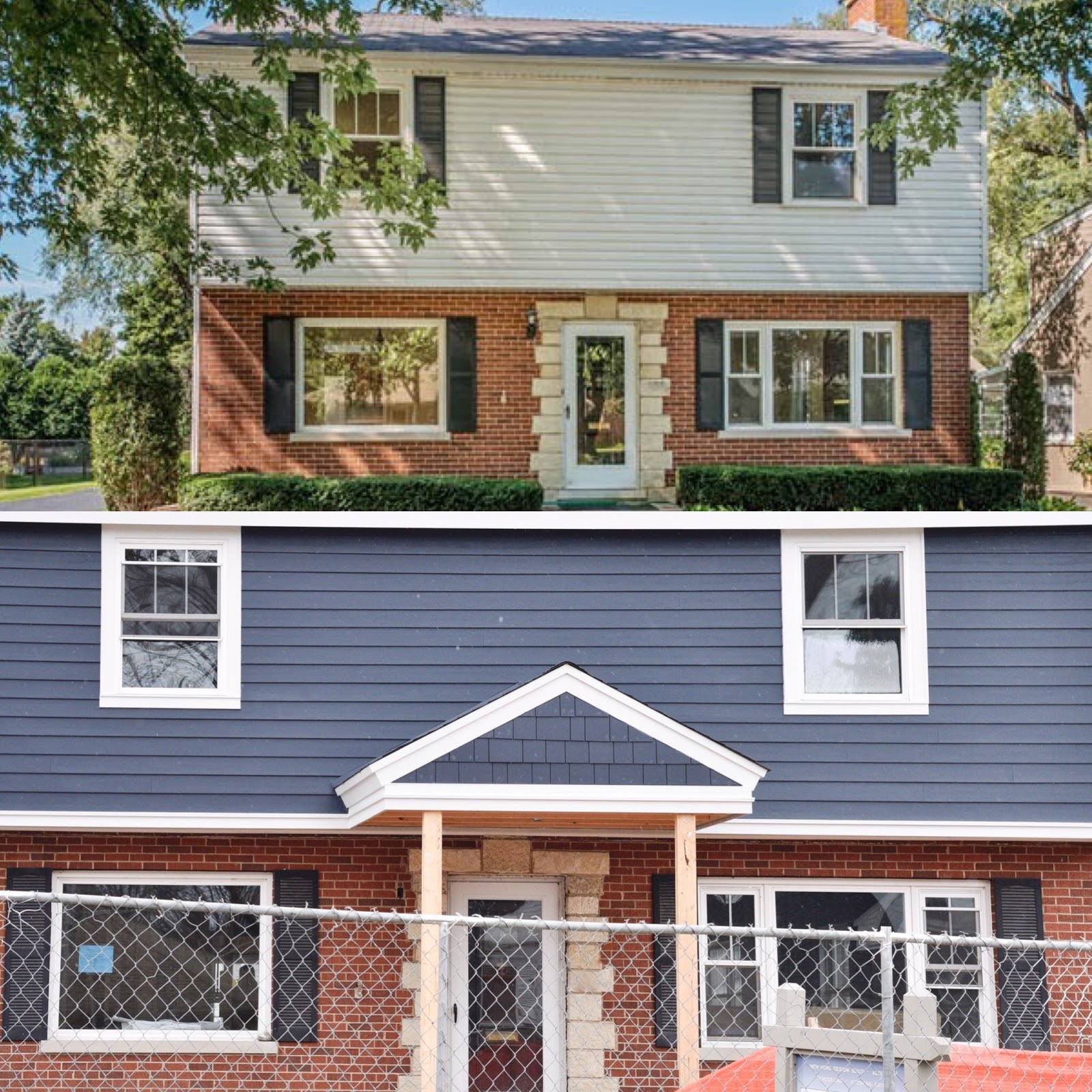
- Cool Tones (Blue): While less common, certain shades of blue can create a stunning and unexpected partnership with red brick. A muted slate blue or a deep navy can offer a sophisticated, cool contrast to the brick’s warmth, particularly effective in coastal or contemporary designs. Blue often communicates reliability and serenity.
- Dark Tones (Black, Deep Charcoal): Increasingly popular in modern design, very dark sidings create a strong, dramatic contrast with red brick. This bold choice can lend a sleek, contemporary, and grounded feel, making the red brick pop with renewed vigor. It speaks to a refined and modern brand identity.
Curated Siding Pairings for Red Brick Facades
Selecting the ideal siding color is a strategic decision that shapes a property’s visual brand. Here are some expertly curated pairings that consistently deliver impactful results with red brick.
Timeless Neutrals: The Foundation of Elegance
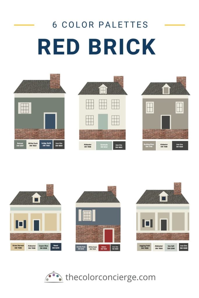
Neutral colors are the safest and often most effective choices for red brick, providing a versatile canvas that allows the brick’s character to shine.
- Crisp White: A perennial favorite, white siding offers a classic, clean contrast against red brick. It brightens the facade, creates a fresh aesthetic, and works exceptionally well with traditional architectural styles like Colonial, Georgian, or Farmhouse. The starkness of white can make the red brick appear richer and more vibrant. This combination often conveys a brand message of purity, tradition, and welcoming appeal.
- Soft Cream or Off-White: For a less stark but equally bright alternative, cream or off-white provides a warmer, softer contrast. These colors marry beautifully with bricks that have orange or pinkish undertones, creating a gentler transition and a more inviting atmosphere. It suggests a brand that is sophisticated yet approachable.
- Warm Greys (Greige/Taupe): Moving away from pure white, warm greys that lean towards beige (greige) or brown (taupe) offer a sophisticated, muted complement. These colors pick up on the earthy tones within the brick, creating a cohesive and contemporary feel without being overly bold. They are excellent for creating a modern farmhouse or transitional look, reflecting a balanced and understated brand identity.
- Cool Greys (Charcoal, Slate): For a more contemporary and dramatic effect, cool greys, especially deeper shades like charcoal or slate, provide a striking contrast. These colors allow the red brick to truly pop while grounding the overall design. This combination often feels modern, sophisticated, and urban, projecting a strong, confident brand.
Earthy Harmony: Echoing Nature’s Palette
Drawing inspiration from nature, earth tones create a harmonious and grounded aesthetic, making the home feel integrated with its surroundings.
- Sage Green: A soft, muted green like sage offers a serene and sophisticated contrast to red brick. The complementary nature of red and green (on the color wheel) ensures a visually pleasing balance without being overly vibrant. This pairing often evokes a natural, calming, and refined brand image, particularly effective for Craftsman or traditional homes.
- Deep Forest or Hunter Green: For a bolder statement, a rich, dark green can create a dramatic and elegant backdrop for red brick. This combination often feels luxurious and established, especially when paired with architectural details. It conveys a brand of tradition, depth, and organic elegance.
- Warm Browns (Chocolate, Espresso): For bricks with strong brown or orange undertones, a deep, warm brown siding can create a unified and cozy appearance. This creates a cohesive, natural look, often found in rustic or lodge-style homes, reflecting warmth, comfort, and authenticity.
Modern & Bold: Distinctive Statements
For homeowners looking to make a more distinctive architectural statement, certain darker or more unexpected colors can create a contemporary and memorable facade.
- Deep Navy Blue: A sophisticated choice, deep navy blue offers a cool, elegant contrast to the warmth of red brick. This pairing can evoke a coastal charm or a classic, preppy aesthetic, depending on the architectural style and trim. It projects a brand that is confident, unique, and subtly luxurious.
- Black: An increasingly popular choice in modern design, black siding creates the most dramatic contrast with red brick. This bold combination is sleek, contemporary, and makes the red brick utterly pop. It often signals a very modern, minimalist, or industrial aesthetic, communicating a cutting-edge and daring brand identity. When using black, balance is key; consider lighter trim or natural wood accents to soften the effect.
Practical Design Considerations for Enduring Brand Appeal
Beyond pure aesthetics, several practical factors influence the final siding choice and its long-term impact on a property’s visual brand.
Architectural Style and Period Authenticity
The architectural style of the home heavily dictates appropriate siding choices. A Victorian brick home might benefit from traditional muted greens or creams, while a mid-century ranch could carry off a bold charcoal or even a unique blue. Respecting the home’s original design language ensures period authenticity and enhances its intrinsic value, reinforcing its historical or stylistic brand. Mismatched siding can undermine the architectural integrity and create a confusing brand message.
Environmental Factors and Long-Term Maintenance
- Sunlight Exposure: Darker sidings absorb more heat, which can impact internal temperatures and potentially fade over time, especially in strong sun. Lighter colors reflect more light.
- Climate: In very cold climates, darker colors might be preferred for heat absorption, while in hot climates, lighter colors can help keep the home cooler.
- Durability and Upkeep: Siding materials vary in their maintenance requirements. Vinyl, fiber cement, and wood each have different needs regarding cleaning, painting, and repair. Choosing a durable material and color that resists fading and wear contributes to the home’s lasting curb appeal and positive brand perception without constant upkeep.

Local Regulations and Neighborhood Context
Before finalizing any exterior color scheme, it is crucial to consult local Homeowners Association (HOA) guidelines, if applicable, and municipal zoning regulations. Many communities have restrictions on exterior colors and materials to maintain neighborhood cohesion. Even without formal rules, considering the palette of surrounding homes can inform choices, allowing the property to stand out thoughtfully without clashing or appearing out of place. A home’s exterior “brand” should ideally exist in harmony with its immediate environment while still expressing individuality.
In conclusion, pairing siding with red brick is a nuanced design endeavor that extends beyond mere aesthetics. It’s about crafting a cohesive and impactful visual brand for a property. By understanding the unique qualities of red brick, applying sound color theory, exploring curated pairings, and considering practical implications, homeowners and designers can create an exterior that is not only beautiful but also strategically communicates the desired identity and enhances the home’s enduring appeal.
aViewFromTheCave is a participant in the Amazon Services LLC Associates Program, an affiliate advertising program designed to provide a means for sites to earn advertising fees by advertising and linking to Amazon.com. Amazon, the Amazon logo, AmazonSupply, and the AmazonSupply logo are trademarks of Amazon.com, Inc. or its affiliates. As an Amazon Associate we earn affiliate commissions from qualifying purchases.