
The Front Door as Your Property’s Brand Statement
Your front door is far more than a simple entry point; it is the visual cornerstone of your property’s exterior identity. In the realm of branding, every touchpoint matters, and for a home or business, the front door serves as the ultimate first impression, a non-verbal billboard communicating its essence. The color you choose for this pivotal element directly influences how your property is perceived, impacting everything from its perceived value to the emotional resonance it evokes in visitors and passersby. This is not merely a design choice; it’s a strategic branding decision that frames your personal or corporate identity for the world to see.
First Impressions and Curb Appeal: Your Property’s Visual Marketing
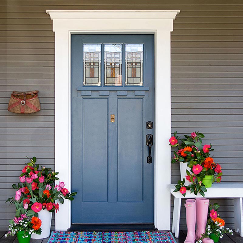
Curb appeal is the marketing bedrock of any property. It’s the immediate visual attractiveness of a house from the street, and the front door plays an outsized role in shaping this perception. A thoughtfully chosen door color can elevate the entire aesthetic, drawing the eye and suggesting a level of care and attention to detail that enhances overall desirability. Conversely, a poorly chosen or unkempt door color can detract significantly, sending unintended signals about the property’s upkeep or style. Think of it as your property’s primary visual advertisement; the color communicates professionalism, warmth, modernity, or tradition before a single step is taken inside. This initial visual impression is critical, especially in competitive markets where distinguishing your property from others is paramount.
Reflecting Your Personal or Corporate Brand Identity
Just as a company’s logo and color palette convey its mission and values, your front door color can communicate your personal brand or the corporate identity of your business. Do you wish to project warmth and hospitality? Sophistication and exclusivity? Creativity and boldness? Each color carries inherent psychological associations that can be leveraged to craft a specific message. For a residence, this choice can reflect the homeowners’ personality, lifestyle, or even aspirations. For a business, it reinforces the brand ethos, whether it’s a vibrant, innovative startup or a venerable, traditional enterprise. Understanding this interplay between color and identity is crucial for making a selection that authentically represents your brand.
Decoding Color Psychology in Exterior Design
The psychological impact of color is a powerful tool in design and branding. When applied to your front door, this understanding allows you to consciously shape the emotional and perceptual response to your property. Different hues carry distinct connotations, influencing mood, perception of space, and even guiding expectations.
Warm Tones: Inviting, Energetic, and Grounding
Colors like red, orange, and yellow fall into the warm spectrum, instantly signaling energy and enthusiasm.
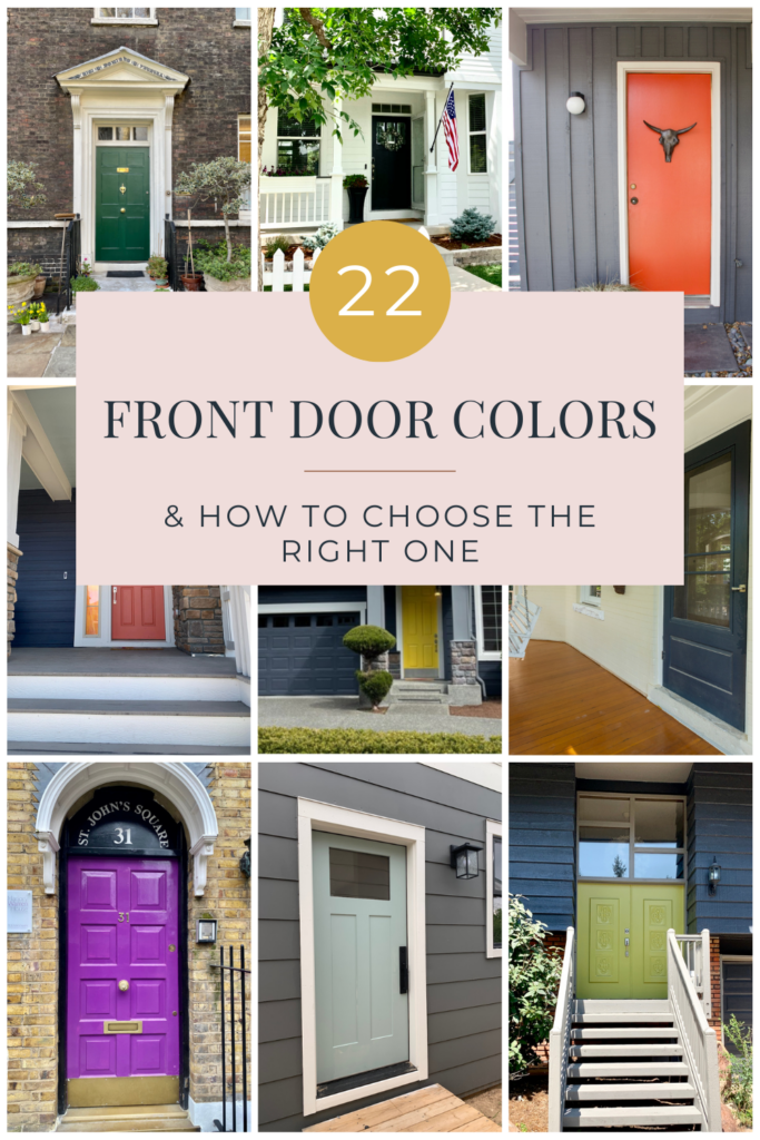
- Red: A classic choice, red is bold, passionate, and signifies strength, warmth, and hospitality. Historically, a red door meant “welcome” to weary travelers. For a modern brand, it can convey confidence, energy, and a distinctive presence. However, too bright a red might appear aggressive, while a deeper, richer red speaks to tradition and refined taste.
- Orange: Often associated with creativity, enthusiasm, and vibrancy, orange can make a youthful and approachable statement. It’s less common than red, making it a distinctive choice for a brand seeking to stand out with an innovative and friendly image.
- Yellow: Symbolizing happiness, optimism, and warmth, a yellow door can infuse your property with a cheerful and inviting energy. It suggests an open, friendly, and accessible brand. Careful consideration of the specific shade is key, as a muted yellow can be sophisticated, while a bright lemon yellow is more playful.
Cool Tones: Calm, Sophisticated, and Trustworthy
Blue, green, and purple hues evoke a sense of tranquility, stability, and sophistication.
- Blue: Synonymous with serenity, stability, and trustworthiness, blue is a popular choice for doors. A light blue can feel breezy and coastal, while a deep navy conveys elegance, authority, and professionalism—ideal for a brand aiming for gravitas and reliability. It’s a calming color that suggests dependability.
- Green: Representing nature, growth, renewal, and prosperity, green doors offer a sense of calm and balance. A soft sage green might imply natural elegance and understated luxury, while a darker forest green suggests tradition and established quality. It’s a color that resonates with brands focused on sustainability or grounded values.
- Purple: Often associated with royalty, creativity, and luxury, purple makes a sophisticated and unique statement. A deep plum can feel opulent and mysterious, while a lighter lavender offers a more whimsical, artistic flair. It’s a strong choice for a brand looking to convey exclusivity and artistic sensibility.
Neutrals: Timeless, Versatile, and Understated Elegance
Black, white, gray, and various shades of brown offer a foundation of timelessness and versatility.
- Black: The epitome of sophistication, elegance, and power. A black door projects a strong, serious, and classic brand identity. It’s often used by brands that want to convey luxury, authority, and timeless appeal. It creates a striking contrast against lighter exteriors.
- White: Clean, fresh, and classic, white doors suggest simplicity, purity, and openness. They can brighten an entryway and often complement a wide range of architectural styles. White signifies clarity and a minimalist aesthetic for a brand.
- Gray: Modern, chic, and incredibly versatile, gray offers a spectrum from light, airy tones to deep, moody charcoals. It can convey professionalism, stability, and a contemporary aesthetic. Gray allows other elements of your property’s branding to shine, acting as a sophisticated backdrop.
- Brown/Wood Tones: Earthy and grounded, brown hues or natural wood finishes evoke warmth, comfort, and authenticity. They suggest tradition, reliability, and a connection to nature. This choice often aligns with brands that emphasize craftsmanship, heritage, or an organic aesthetic.
Bold Hues: Making a Distinct and Memorable Statement
Beyond the traditional, choosing a vibrant or unexpected hue can dramatically elevate your property’s brand identity. A vivid turquoise, a fuchsia, or a lime green front door instantly communicates a bold, modern, and highly creative brand. Such choices are ideal for properties or businesses aiming to be memorable, to express a unique personality, or to signal an avant-garde approach. These colors are not for the faint of heart but, when executed thoughtfully within the overall design scheme, can create an unforgettable brand impression.
Strategic Color Selection: Beyond Personal Preference
While personal taste is a factor, strategic front door color selection involves a deeper consideration of the property’s overall brand context. It’s about how the door color integrates with and enhances the existing design elements to create a cohesive and powerful brand image.
Harmonizing with Your Property’s Architectural Style

The architectural style of your property provides a critical framework for color selection. A Victorian home might lend itself to rich, jewel tones or deep, traditional colors that complement its intricate details, reinforcing a brand of classic elegance and history. A minimalist modern dwelling, on the other hand, might benefit from a sleek black, white, or a single bold, saturated color that accentuates its clean lines and contemporary brand identity. Ranch-style homes often thrive with earthy greens, blues, or even a cheerful yellow that speaks to their relaxed, inviting nature. Understanding the inherent brand message of your architecture helps narrow down choices and ensures visual harmony.
Considering the Exterior Palette and Landscaping
The front door color rarely stands alone. It must interact harmoniously with the existing exterior palette of your home—the brick, siding, trim, roof, and even the natural hues of your landscaping. A door color should either complement these elements, creating a sense of unity and understated elegance, or provide a striking, intentional contrast that defines its role as a focal point. For instance, a property with extensive lush greenery might benefit from a color that pops against the green, like a deep red or sunny yellow, or conversely, a natural wood finish that blends seamlessly. The goal is to ensure the door contributes to a cohesive and appealing overall brand presentation, not a jarring distraction.
The Role of Lighting and Environment
The perception of color is highly dependent on light. A color swatch viewed indoors under artificial light can look dramatically different outdoors in natural sunlight, shade, or at different times of the day. The regional environment also plays a role; a vibrant, tropical hue might feel out of place in a more muted, forested setting. It’s crucial to observe how potential colors interact with the specific lighting conditions and ambient colors of your property’s location. This environmental context significantly impacts the emotional resonance and perceived sophistication of your chosen brand color.
Marketing Your Property Through Color: Enhancing Value
Beyond aesthetics, the strategic choice of a front door color can be a powerful marketing tool, especially when considering property resale or commercial visibility. It’s an investment in your property’s brand equity.
Enhancing Resale Value and Appeal
For sellers, a well-chosen front door color can significantly impact perceived value and buyer interest. Studies often show that certain door colors can fetch higher offers, acting as an implicit indicator of a well-maintained and stylish property. A fresh, appealing door color signals care and quality, making a positive first impression that can sway a buyer before they even step inside. It contributes to a professional, market-ready presentation, differentiating your property in a competitive real estate landscape and potentially reducing its time on the market.
Creating a Memorable Visual Identity
A distinct front door color helps your property stand out and become memorable. This is particularly valuable for businesses seeking to create a strong, recognizable physical presence or for residences wishing to leave a lasting impression. A unique, yet appropriate, color can become a signature element of your property’s brand, making it easier to locate, recall, and appreciate. This visual recall is a fundamental aspect of effective branding.
Standing Out (or Blending In) Strategically
The decision to make your door pop or blend harmoniously is a strategic one, tied directly to your branding goals. Do you want your property to be a distinctive landmark in the neighborhood, drawing attention with a bold statement? Or do you prefer it to exude quiet elegance, blending seamlessly with its surroundings while still communicating sophistication? Both approaches are valid branding strategies, depending on the message you aim to convey. A vibrant, contrasting door effectively “advertises” its presence, while a complementary, subdued tone subtly enhances the overall brand experience.
Practical Steps for Branding Your Entryway
Implementing your front door color strategy requires thoughtful execution.
Leveraging Digital Visualization and Design Tools
Before committing to paint, utilize online visualization tools or apps that allow you to digitally “paint” your front door. These design aids can project different colors onto a photo of your actual home, helping you see how various hues interact with your exterior. This step is invaluable for testing brand concepts and ensuring the chosen color aligns with your vision before physical application, saving time and potential costly mistakes. Many paint brands offer such tools, simplifying the branding decision process.
Testing Swatches and Observing Light
Once you’ve narrowed down your choices, purchase several small sample cans of paint. Apply large swatches directly onto the door or a sturdy board placed against it. Observe these swatches throughout the day, in varying light conditions—morning sun, afternoon shade, overcast days, and even at dusk. This real-world observation is critical, as natural light profoundly affects how a color is perceived, ensuring your final selection accurately conveys your intended brand message.
The Power of Professional Consultation
If the decision feels overwhelming, consider consulting with an exterior designer or a color consultant. These professionals specialize in visual branding for properties and can offer objective insights based on color theory, architectural context, and market trends. Their expertise can guide you towards a choice that not only looks appealing but also strategically enhances your property’s brand identity and market positioning. This investment can ensure your front door makes the most impactful statement possible.
aViewFromTheCave is a participant in the Amazon Services LLC Associates Program, an affiliate advertising program designed to provide a means for sites to earn advertising fees by advertising and linking to Amazon.com. Amazon, the Amazon logo, AmazonSupply, and the AmazonSupply logo are trademarks of Amazon.com, Inc. or its affiliates. As an Amazon Associate we earn affiliate commissions from qualifying purchases.