
In the intricate world of branding, every element, from typeface to tagline, plays a pivotal role in shaping perception. Among these, color stands as an unparalleled non-verbal communicator, capable of evoking deep-seated emotions, conveying brand values, and establishing immediate recognition. When a brand aims to position itself as innovative, imaginative, and forward-thinking, the strategic selection of color becomes paramount. The question “what color represents creativity?” is not merely an artistic inquiry but a fundamental brand strategy consideration that can define a company’s identity and resonance with its target audience.
The Psychology of Color in Branding
The human brain is wired to interpret and respond to colors in specific ways, a phenomenon deeply rooted in psychology, culture, and evolutionary experience. For brands, harnessing this innate understanding is crucial for effective communication and differentiation. A carefully chosen color palette can instantly signal a brand’s personality, its mission, and its unique approach to problem-solving, especially when creativity is a core tenet.

Emotional Associations and Brand Perception
Colors possess inherent emotional associations that transcend linguistic barriers. Red might ignite passion or urgency, while blue often conjures feelings of trust and stability. For brands championing creativity, the objective is to select colors that align with traits like innovation, imagination, originality, and out-of-the-box thinking. These emotional connections are not arbitrary; they are the result of collective human experiences and cultural conditioning. When a brand consistently uses a particular color, it reinforces these associations, building a powerful mental shortcut in the consumer’s mind. For instance, a tech startup aiming to disrupt its industry might gravitate towards vibrant, unconventional hues to signal its innovative spirit, whereas a design agency might opt for more sophisticated, nuanced palettes to convey refined artistic skill. The perception of creativity, therefore, is not solely about the output but also about the visual cues that precede and accompany it.
Cultural Nuances and Global Branding
While some color associations are universal, others are profoundly shaped by culture. What signifies creativity or innovation in one market might be perceived differently elsewhere. For example, white can symbolize purity and new beginnings in Western cultures, making it suitable for brands that emphasize a fresh, creative start. However, in some Eastern cultures, white is associated with mourning. Similarly, yellow, often linked to optimism and energy in many parts of the world, can signify cowardice in others. Brands operating on a global scale must navigate these cultural nuances with precision, ensuring their chosen colors resonate positively and convey the intended message of creativity without unintended misinterpretations. This often involves thorough market research and, at times, adapting color schemes for different regional branding efforts, all while maintaining the core creative identity.
Unpacking the Colors Most Associated with Creativity
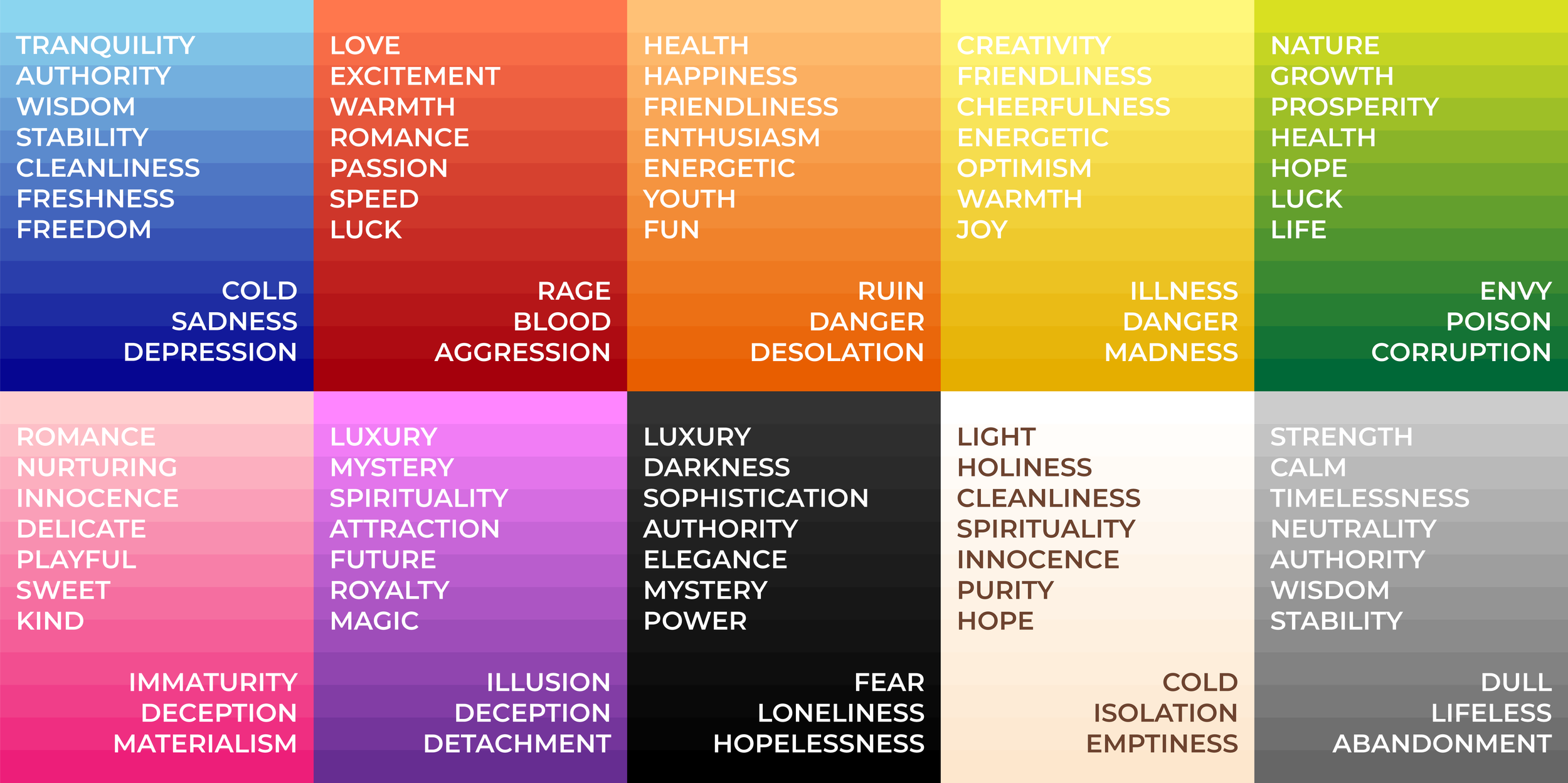
While there isn’t one single “color of creativity,” several hues consistently emerge as powerful symbols for imagination, innovation, and original thought. Each carries a unique set of psychological attributes that creative brands leverage to their advantage.
Purple: Royalty, Mystery, and Imagination
Purple is perhaps the most universally recognized color associated with creativity. Historically linked to royalty and luxury due to the expense of its dyes, purple also carries strong connotations of wisdom, mystery, and magic. These attributes naturally align with the creative process – the mystical spark of an idea, the imaginative leap, and the wisdom derived from unique perspectives. Brands that aim to project an aura of sophistication, ingenuity, and boundless imagination often embrace purple. It suggests unconventional thinking and a departure from the ordinary, making it a favorite for innovative tech companies, creative agencies, and luxury brands seeking to inspire awe and wonder.
Blue: Serenity, Trust, and Innovation
Often associated with the sky and the ocean, blue evokes feelings of calm, stability, and trust. While these might seem distant from the impulsive nature sometimes attributed to creativity, blue’s deeper psychological links make it profoundly relevant. It’s the color of intelligence, logic, and profound thought. Many creative endeavors require deep focus, strategic planning, and a calm mind to generate groundbreaking ideas. Blue, particularly in its brighter, more vibrant shades, can represent innovation, forward-thinking, and the vast potential of new ideas. Tech companies and digital platforms frequently use blue to convey both trustworthiness and their capacity for innovative solutions.
Green: Growth, Nature, and Fresh Ideas
Green is the color of nature, growth, and renewal. It inherently signifies freshness, vitality, and harmony. For brands that emphasize organic creativity, sustainable innovation, or ideas that ‘grow’ and evolve, green is an ideal choice. It suggests a fertile ground for new concepts, a natural ingenuity, and a connection to sustainable or environmentally conscious creative practices. Lighter, brighter greens can evoke a sense of playfulness and spontaneity, while deeper greens speak to established wisdom and grounded originality. Brands in fields like sustainable design, organic products, or those focused on personal development and growth often utilize green to highlight their creative, life-affirming ethos.
Yellow: Optimism, Energy, and Originality
The color of sunshine, yellow, is synonymous with happiness, optimism, and energy. It is a highly visible and stimulating color that can immediately grab attention and convey a sense of excitement and spontaneity. For brands that want to communicate bright ideas, innovation, and a vibrant, energetic approach to creativity, yellow is a powerful tool. It suggests originality, a willingness to stand out, and an optimistic outlook that fuels inventive solutions. Brands targeting younger demographics or those in fields like entertainment, children’s products, or creative services often use yellow to project an image of fun, accessibility, and playful ingenuity.
Orange: Enthusiasm, Warmth, and Spontaneity
Orange blends the energy of red with the happiness of yellow, resulting in a color that radiates warmth, enthusiasm, and creativity. It is often seen as bold, adventurous, and encouraging of social interaction. For brands seeking to convey a sense of youthful exuberance, dynamic innovation, and spontaneous creative flair, orange is an excellent choice. It encourages communication and ignites passion, making it suitable for brands that facilitate collaborative creative processes or offer products/services that spark joy and innovation. Think of brands in food, entertainment, or those promoting adventurous, creative lifestyles.
The Power of Black and White: Simplicity and Sophistication in Creative Expression
While often overlooked in discussions of vibrant creativity, black and white are fundamental to sophisticated brand identity. Black signifies power, elegance, and modernity, offering a profound depth that can underscore serious, high-calibre creativity. It provides a stark contrast that allows other colors or design elements to pop, making it an excellent backdrop for highlighting innovative work. White, on the other hand, represents purity, simplicity, and new beginnings. It provides space for ideas to breathe and develop, symbolizing clarity and the blank canvas upon which creativity unfolds. Many high-end design firms, art galleries, and minimalist brands use black and white to project an image of refined, intelligent creativity, emphasizing the concept rather than overt color.
Strategic Color Selection for Creative Brands
Choosing the right color is not merely an aesthetic decision; it’s a strategic brand move that impacts perception, recognition, and market positioning. For brands aiming to exemplify creativity, a methodical approach ensures that the chosen hues truly reflect their innovative spirit.
Defining Your Creative Brand Identity
Before selecting a color, a brand must deeply understand its unique creative identity. What kind of creativity does it embody? Is it disruptive and bold, or subtle and sophisticated? Is it playful and spontaneous, or analytical and ingenious? Answering these questions helps narrow down the vast spectrum of colors. A tech startup focused on revolutionary AI might lean towards futuristic blues or energetic oranges, while a bespoke artisan studio might prefer earthy greens or regal purples. The chosen color must resonate with the brand’s core values, its mission, and the specific type of creative problem-solving it offers.
Audience Perception and Market Differentiation
Understanding the target audience is crucial. How do they perceive different colors? What emotions do specific hues evoke in them? A creative brand targeting a youthful, energetic demographic might use bright, contrasting colors to capture attention, whereas a brand appealing to a more mature, discerning audience might opt for muted, sophisticated tones. Furthermore, strategic color selection involves analyzing competitors. To stand out in a crowded market, a creative brand might choose a color that differentiates it from its rivals, carving out a unique visual space. If all competitors use blue, opting for a vibrant yellow or a deep purple can create immediate visual distinction and reinforce a brand’s unique creative stance.
Consistency Across Brand Touchpoints
Once a color palette is chosen, consistency is key. The selected colors must be applied uniformly across all brand touchpoints – logo, website, marketing materials, social media, product packaging, and physical spaces. This consistent application reinforces brand recognition and strengthens the association of those colors with the brand’s creative identity. Inconsistent use can dilute the message and confuse the audience, weakening the brand’s overall impact. A creative brand’s commitment to its chosen colors communicates its professionalism and dedication to its aesthetic, further solidifying its image as a thoughtful and inventive entity.
Beyond Single Hues: Combining Colors for Dynamic Creativity
While individual colors hold significant power, the true artistry in branding often lies in their combination. A well-designed color palette can communicate layers of meaning, evoke complex emotions, and represent a multifaceted creative identity.
Complementary Palettes for Enhanced Impact
Complementary colors are opposite each other on the color wheel (e.g., blue and orange, red and green, yellow and purple). When used together, they create a strong contrast that is visually striking and energetic. For creative brands that want to make a bold statement, communicate dynamism, and signal a vibrant, perhaps even audacious, approach to innovation, a complementary palette can be highly effective. This combination generates a sense of excitement and can convey a brand that isn’t afraid to challenge norms and stand out.
Analogous Schemes for Harmony and Flow
Analogous colors are groups of three colors that are next to each other on the color wheel (e.g., blue, blue-green, and green). These palettes are inherently harmonious and visually pleasing, creating a sense of unity and fluidity. For creative brands that emphasize natural evolution, seamless design, or a thoughtful, integrated approach to innovation, an analogous scheme can be ideal. It suggests a sophisticated and cohesive creative process, communicating a brand that builds upon existing ideas to create something new and harmonious.
Triadic Combinations for Vibrant Energy
Triadic color schemes involve three colors evenly spaced around the color wheel (e.g., red, yellow, and blue). This combination offers high contrast and vibrancy while maintaining balance. For creative brands that want to convey an energetic, playful, and diverse approach to creativity, a triadic palette can be exceptionally engaging. It suggests a brand that is multifaceted, dynamic, and capable of generating a wide range of innovative solutions, appealing to a broad audience with its vibrant and spirited identity.

Case Studies: Brands that Master Creative Color
Consider the vibrant, multi-colored Google logo, which eschews a single dominant hue to represent the vast and diverse nature of information and innovation it processes. Its playful primary color palette signifies accessibility, creativity, and constant evolution. Similarly, Adobe, a powerhouse in creative software, often uses a rich, deep red, signifying passion, energy, and the transformative power of its tools. Yet, its broader branding incorporates diverse, often complementary colors in its product suite logos (e.g., Photoshop’s blue, Illustrator’s orange), showcasing the breadth of creative capabilities. These brands understand that color is not merely decorative but foundational to their creative identity, signaling their innovative spirit and inspiring their users.
Ultimately, the “color of creativity” is less about a single hue and more about the strategic application of color theory to communicate a brand’s unique imaginative essence. It’s about leveraging psychology, cultural context, and artistic principles to craft a visual identity that resonates deeply, inspires innovation, and clearly positions a brand as a beacon of original thought.
aViewFromTheCave is a participant in the Amazon Services LLC Associates Program, an affiliate advertising program designed to provide a means for sites to earn advertising fees by advertising and linking to Amazon.com. Amazon, the Amazon logo, AmazonSupply, and the AmazonSupply logo are trademarks of Amazon.com, Inc. or its affiliates. As an Amazon Associate we earn affiliate commissions from qualifying purchases.