
In the intricate tapestry of brand strategy, color is far more than a mere aesthetic choice; it is a potent psychological tool, a silent language that communicates values, evokes emotions, and shapes perception. When a brand aims to embody or convey the profound concept of “freedom,” its choice of color becomes a critical strategic decision, influencing everything from corporate identity to marketing campaigns. Understanding the semiotics of color, and how different hues resonate with liberation, autonomy, and opportunity, is essential for any brand seeking to establish a powerful and authentic connection with its audience.
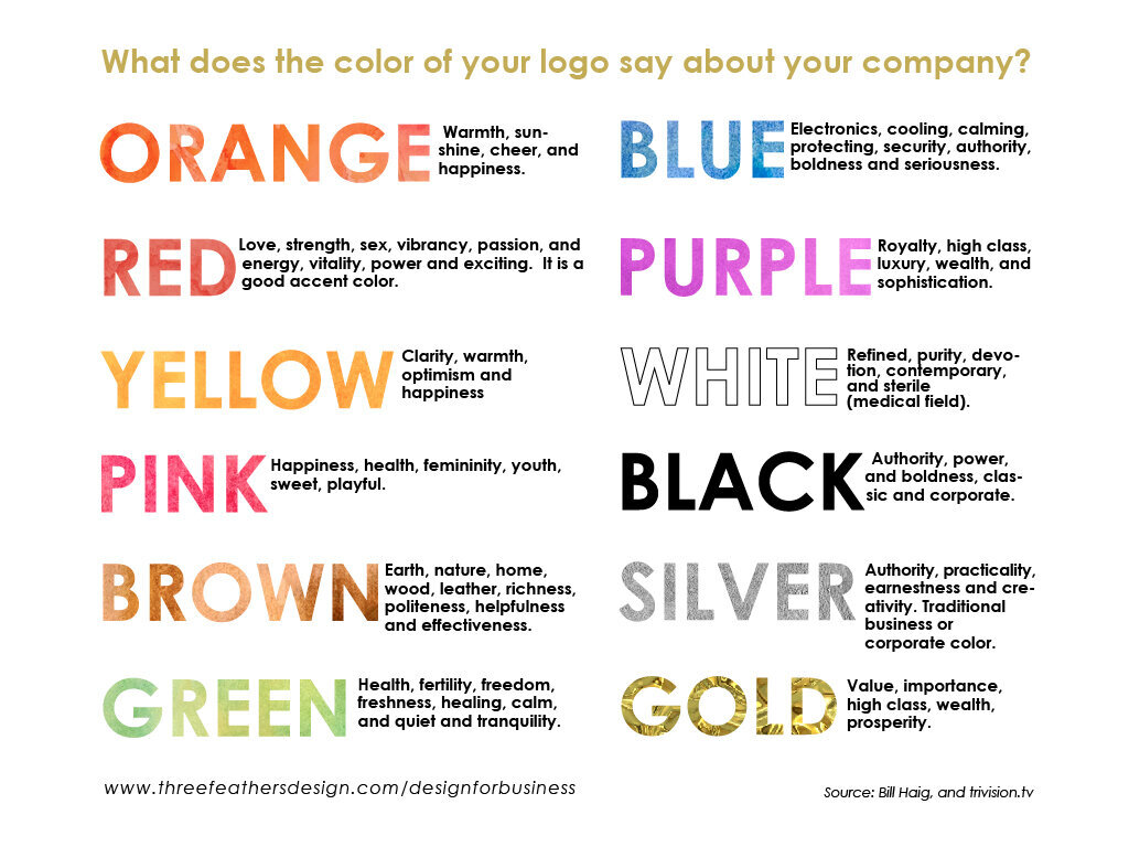
The Psychology of Color in Brand Identity
Color psychology is a well-established field that explores how different colors influence human behavior, emotions, and perceptions. For brands, this translates into a powerful framework for shaping identity and messaging. Freedom, as a concept, is multifaceted: it can mean liberation from constraints, the expansive potential of open spaces, the joy of self-expression, or the quiet confidence of independence. Each facet can be subtly, yet powerfully, suggested through specific color choices.
A brand’s palette isn’t just about making its logo recognizable; it’s about embedding its core values into the visual consciousness of its target market. When a brand identifies freedom as a key pillar, whether it’s through offering flexible services, promoting exploration, or empowering individual choice, its color scheme must reflect this ethos. The deliberate selection of colors allows a brand to bypass explicit statements and communicate its commitment to freedom directly to the subconscious mind, fostering deeper emotional resonance and loyalty.
Hues of Liberation: Crafting a Freedom-Centric Palette
While no single color universally means “freedom” across all contexts and cultures, certain hues consistently evoke feelings of openness, possibility, and independence. Brands can strategically leverage these associations to build a compelling narrative around liberation.
Blue: The Vast Expanse and Unconstrained Potential
Blue is arguably one of the strongest contenders for representing freedom. Its association with the sky and ocean immediately conjures images of vastness, boundless horizons, and uninhibited exploration. For brands, blue can signify trust, stability, and intellectual freedom – a sense of being unburdened by complexities, offering clear solutions and limitless possibilities. Tech companies often use blue to suggest innovation and forward-thinking solutions that liberate users from old limitations. Travel brands utilize it to evoke adventure and discovery. Even financial institutions employ blue to project security and the freedom from worry that comes with sound financial management, though careful consideration is needed to ensure it doesn’t just imply corporate rigidity, but rather expansive opportunity.
Different shades of blue carry distinct nuances: a light, airy sky blue might suggest youthful exuberance and boundless potential, while a deeper navy can convey a more grounded, authoritative freedom—the freedom that comes from solid foundations and reliable systems.
Green: Growth, Renewal, and Environmental Independence
Green’s intrinsic connection to nature makes it a powerful color for representing ecological freedom, sustainable living, and a return to natural order. Brands focused on organic products, renewable energy, or outdoor experiences frequently adopt green to signify a break from artificial constraints and a commitment to health and natural well-being. Beyond environmental implications, green also symbolizes growth, renewal, and prosperity—the freedom to flourish and expand.
In the context of personal development or wellness brands, green can represent liberation from internal struggles, fostering a sense of peace and natural progression. It suggests an uninhibited path forward, free from artificial obstacles, aligning with a brand promise of natural evolution and sustained well-being.
White: Purity, Clarity, and New Beginnings
White often serves as a canvas, signifying purity, simplicity, and new beginnings. For brands, white can represent the freedom from clutter, complexity, or tradition. It embodies a minimalist approach, suggesting clarity, transparency, and a clean slate. A brand using white strategically can communicate the freedom of choice, the absence of imposition, and the spaciousness for individual interpretation.
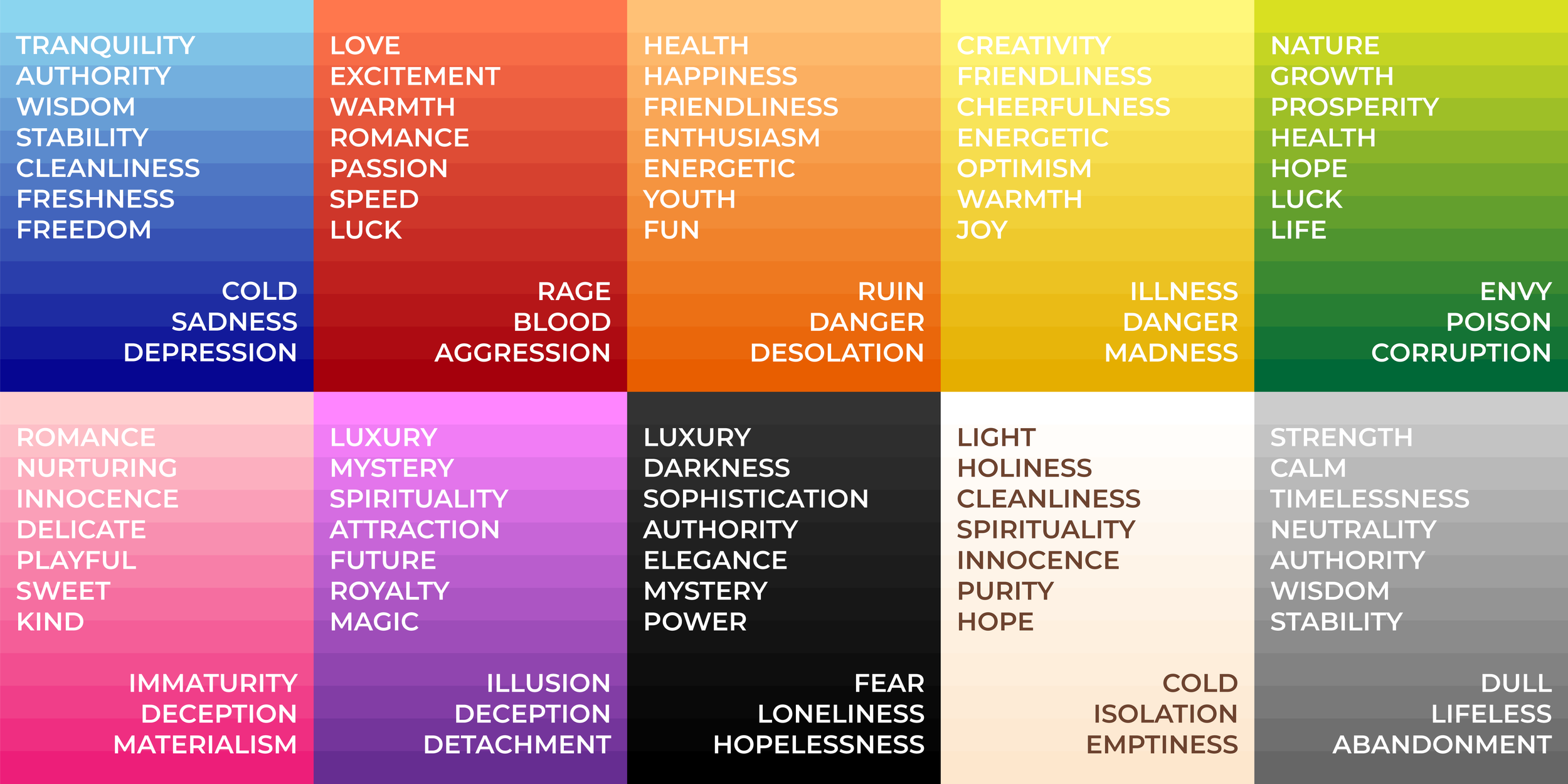
High-end brands often leverage white to project an image of sophisticated freedom – an unburdened, refined existence. It speaks to the freedom of a clear mind, unbound by the noise of the world, offering an elevated and uncomplicated experience. This can be particularly effective in industries where complexity or overwhelming choices are common, positioning the brand as a beacon of clarity and ease.
Yellow & Orange: Optimism, Adventure, and Spontaneity
Yellow, the color of sunshine, inherently radiates optimism, joy, and energy. It evokes a sense of intellectual freedom, spontaneity, and unbridled enthusiasm. Brands targeting younger demographics or those promoting creative expression, travel, or innovative solutions often integrate yellow to suggest the freedom to imagine, explore, and break conventions. It’s a call to adventure and the liberation of the spirit.
Orange shares many of yellow’s vibrant qualities but adds an element of warmth, approachability, and excitement. It embodies the freedom of adventure, innovation, and social connection. Brands that aim to be dynamic, friendly, and forward-thinking might use orange to signify a playful liberation from rigidity and a welcoming embrace of new experiences. Together, yellow and orange form a powerful duo for brands seeking to convey an energetic, uninhibited sense of freedom.
Beyond the Hue: Context, Culture, and Brand Narrative
While these color associations are generally robust, the meaning of freedom (and thus, its corresponding color) can be influenced by cultural context and specific brand narratives. What signifies liberation in one culture might have different connotations elsewhere. Therefore, a deep understanding of the target audience and their cultural backdrop is crucial.
Cultural Nuance
In some cultures, red might symbolize revolution and the fight for freedom, while in others, it might primarily signify passion or danger. Similarly, the concept of freedom itself can vary: individual autonomy versus collective liberation. A global brand must meticulously research how its chosen palette resonates with diverse audiences to avoid misinterpretations. This requires more than just picking a “free” color; it demands ethnographic research and a nuanced appreciation of global semiotics.
Brand Storytelling Through Color
Ultimately, the most effective use of color in conveying freedom comes from integrating it seamlessly into the brand’s overarching narrative. It’s not just about selecting a color, but about how that color supports the brand’s story of enabling freedom.
- A travel brand using deep blues and expansive whites tells a story of personal exploration and the freedom to discover new horizons.
- A financial tech startup might use a vibrant green, not just for money, but to symbolize growth, breaking free from traditional banking constraints, and the freedom of financial agility.
- An apparel brand advocating for body positivity might utilize a spectrum of bright, energetic colors to signify the freedom of self-expression and liberation from societal beauty standards.
The color chosen should amplify the brand’s mission, vision, and values, becoming an intuitive shortcut to understanding its commitment to freeing its audience in some meaningful way.

Sustaining Freedom in Branding: An Evolving Canvas
The perception of freedom, like all cultural concepts, can evolve. Brands must remain agile, continuously evaluating how their color palette performs and resonates with a changing audience. This doesn’t necessarily mean a complete overhaul, but perhaps subtle adjustments or the introduction of complementary hues that refresh the “freedom” narrative.
Maintaining consistency in the core freedom-evoking colors, while allowing for flexibility in secondary palettes for specific campaigns, ensures that the brand’s foundational message remains clear. This strategic discipline in color management allows a brand to continually project a sense of liberation, adapt to new interpretations of freedom, and deepen its emotional bond with consumers who value autonomy, exploration, and uninhibited potential. By treating color as an integral part of their strategic communication, brands can truly unlock the power of “what color means freedom,” transforming abstract ideas into tangible, resonant brand experiences.
aViewFromTheCave is a participant in the Amazon Services LLC Associates Program, an affiliate advertising program designed to provide a means for sites to earn advertising fees by advertising and linking to Amazon.com. Amazon, the Amazon logo, AmazonSupply, and the AmazonSupply logo are trademarks of Amazon.com, Inc. or its affiliates. As an Amazon Associate we earn affiliate commissions from qualifying purchases.