
In the competitive landscape of modern branding, color is rarely just an aesthetic choice. It is a psychological trigger, a silent communicator, and a foundational element of corporate identity. Among the vast spectrum of the visible light, few colors possess as much historical weight and strategic versatility as mauve. Often misunderstood as a mere derivative of purple or a faint echo of pink, mauve occupies a unique position in design. It is a color that represents the bridge between tradition and innovation, luxury and accessibility. For brand strategists and designers, understanding “what color mauve” truly represents—and how to deploy it effectively—is essential for crafting a narrative that resonates with a sophisticated contemporary audience.
The Evolution of Mauve: From Scientific Breakthrough to Design Staple
To understand mauve in a branding context, one must first understand its origins. Before the mid-19th century, purple dyes were prohibitively expensive, reserved for royalty and the highest echelons of the clergy. In 1856, an 18-year-old chemist named William Henry Perkin accidentally discovered the first synthetic organic dye while attempting to synthesize quinine. This substance, originally called aniline purple, was later renamed “mauveine” or “mauve.”
The Perkin Revolution: The First Synthetic Dye
Perkin’s discovery was a turning point for global industry and brand history. It was the moment that color became democratized. Suddenly, the deep, evocative tones of the purple spectrum were available to the masses. From a branding perspective, this transition is significant. Mauve became the first “mass-market” luxury color. It allowed Victorian-era brands to offer a sense of exclusivity to a wider demographic, a strategy still used by modern “masstige” (mass-prestige) brands today.
Mauve in the Victorian Era and Beyond
The late 1800s were so dominated by this shade that the period is often referred to as the “Mauve Decade.” However, like all trends, it eventually receded into the background, only to resurface periodically as a symbol of vintage elegance. Today, the resurgence of mauve in corporate identity is driven by a desire for a color that feels grounded yet imaginative. It lacks the aggressive energy of bright red or the corporate sterility of standard navy blue, offering instead a nuanced middle ground.
The Color Psychology of Mauve in Modern Branding
Every color carries a psychological profile. In brand strategy, mauve is categorized as a “muted secondary” color—a blend of the stability of blue and the passion of red, tempered by the neutrality of grey or white. This composition makes it an exceptionally complex tool for psychological positioning.
Evoking Luxury and Sophistication
Mauve is intrinsically linked to the concept of understated luxury. Unlike gold or deep royal purple, which can sometimes feel overbearing or dated, mauve suggests a contemporary, intellectual form of wealth. It is the color of high-end skincare, boutique hospitality, and artisanal products. When a brand utilizes mauve, it signals to the consumer that the brand is thoughtful, refined, and values quality over flashiness.
The Balance Between Femininity and Modernity
Historically, lighter shades of purple and pink were pigeonholed as purely feminine. Modern branding has dismantled these silos. Mauve, particularly in its desaturated or “dusty” forms, has become a gender-neutral staple. It provides a softness that appeals to emotional intelligence without the “bubblegum” connotations of bright pink. This makes it an ideal choice for brands in wellness, mental health, and modern lifestyle sectors that aim to appear inclusive and empathetic.
Creativity and Thoughtfulness
Because mauve does not occur as frequently in nature as green or blue, it retains a sense of the “extraordinary.” It is often associated with imagination, spirituality, and the subconscious. For brands in the creative industries—such as design agencies, architectural firms, or independent publishers—mauve serves as a visual shorthand for original thinking. It suggests that the brand operates on a deeper level than its competitors.
Strategic Application: How to Incorporate Mauve into Your Corporate Identity

Integrating mauve into a brand’s visual system requires a delicate touch. Because it is a “moody” color, its impact changes significantly depending on its saturation and the colors it is paired with.
Defining the Mauve Palette: Shades and Tones
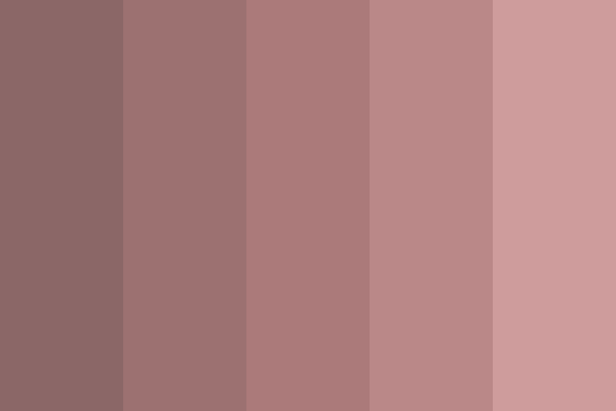
“Mauve” is not a single point on a color wheel but a range.
- Dusty Mauve: A grey-heavy shade that feels nostalgic and grounded. It is perfect for heritage brands looking to modernize.
- Bright Mauve: Closer to a pale magenta, this shade is more energetic and works well for digital-first brands targeting a younger, trend-conscious demographic.
- Deep Mauve: Leaning toward plum or eggplant, this shade conveys authority and mystery.
Color Theory: Pairing Mauve with Complementary Hues
A brand’s identity is rarely defined by a single color; it is defined by the palette.
- Mauve and Sage Green: This is a classic “earthy” pairing. It suggests organic growth, wellness, and harmony. It is frequently seen in sustainable beauty branding.
- Mauve and Gold/Copper: This combination heightens the luxury aspect. The warm metallic tones contrast with the cool undertones of the mauve to create a sense of opulence.
- Mauve and Navy Blue: A sophisticated choice for professional services. The navy provides a foundation of trust and authority, while the mauve adds a layer of approachability and modern flair.
- Mauve and Slate Grey: A minimalist, “industrial-chic” pairing often used in modern furniture design and tech hardware.
Case Studies: Successful Mauve Implementations
Consider brands like Aēsop or Glossier. While they may not use a pure mauve as their primary logo color, their secondary packaging and retail environments frequently utilize mauve tones to create a specific “vibe”—one of curated, clinical yet beautiful simplicity. In the tech space, mauve is increasingly seen in app interfaces (UI) where developers want to avoid the “Standard Blue” aesthetic that has dominated Silicon Valley for a decade. It offers a point of differentiation that feels premium and user-centric.
Digital and Physical Considerations: Mauve in UX and Packaging
The transition of a color from a screen to a physical product is where many brand identities fail. Mauve is notoriously difficult to replicate consistently across different mediums due to its complex mix of pigments.
Mauve in Digital Design: Accessibility and Engagement
In the realm of User Experience (UX) and User Interface (UI) design, mauve must be handled with technical precision. One of the primary challenges is accessibility. Pale mauve on a white background often lacks the contrast ratio required for readability under WCAG (Web Content Accessibility Guidelines).
Strategists must ensure that:
- Contrast is Maintained: Using darker mauve tones for text and lighter tones for backgrounds or decorative elements.
- Emotional Consistency: Ensuring the color doesn’t appear “washed out” on low-quality screens, which can make a brand look cheap.
- Action Signals: Mauve is excellent for “secondary” buttons—actions that are important but not the primary goal (like “Learn More” versus “Buy Now”).
Print and Tangible Branding: Tactile Sophistication
In physical branding, mauve truly shines when paired with texture. Because it is a color associated with softness and depth, using it on matte-finish paper, linen-bound books, or frosted glass bottles enhances the sensory experience. For luxury packaging, a “soft-touch” mauve box with silver foil stamping creates an immediate perception of high value before the customer even opens the product.
The Future of Mauve: Trend Forecasting in a Saturated Market
As we look toward the future of brand strategy, mauve is evolving. It is moving away from the “millennial pink” craze of the 2010s and toward something more substantial and enduring.
Sustainability and Earthy Mauves
As brands pivot toward environmental consciousness, the “new mauve” is becoming more “clay-like.” These earthy, desaturated tones link the brand to the natural world without using the obvious (and now overused) forest greens. It suggests a brand that is gentle on the planet and focused on longevity.

Mauve as the “New Neutral”
We are seeing a shift where mauve is replacing beige and grey as the preferred neutral for interior-focused and lifestyle brands. It provides more personality than a flat grey while remaining versatile enough to act as a backdrop for other brand elements. In a market saturated with “minimalist white” and “corporate blue,” mauve offers a way for brands to stand out by leaning into a color that is as intellectually stimulating as it is visually pleasing.
In conclusion, “what color mauve” represents is a strategic opportunity. For the brand builder, it is a tool to communicate complexity, luxury, and modern empathy. By understanding its historical roots, its psychological impact, and its technical requirements, a brand can leverage mauve to create a visual identity that is not only beautiful but deeply resonant with the values of the modern consumer. Mauve is not just a color; it is a statement of sophisticated intent.
aViewFromTheCave is a participant in the Amazon Services LLC Associates Program, an affiliate advertising program designed to provide a means for sites to earn advertising fees by advertising and linking to Amazon.com. Amazon, the Amazon logo, AmazonSupply, and the AmazonSupply logo are trademarks of Amazon.com, Inc. or its affiliates. As an Amazon Associate we earn affiliate commissions from qualifying purchases.