
In the competitive landscape of modern branding, color is far more than an aesthetic choice; it is a silent ambassador. Yellow, the most visible color in the spectrum, represents a unique paradox for brand strategists. It is the color of sunshine, optimism, and creativity, yet it is also the international symbol for caution and urgency. To master the use of yellow within a corporate identity or personal brand, one must understand the nuanced science of color theory and the psychological impact of pairing it with the right complementary hues.

Selecting a color to match yellow requires a deep dive into brand archetypes, target demographics, and the specific emotional response a brand aims to elicit. Whether a company is a high-energy tech startup or a heritage-rich financial institution, the secondary colors paired with yellow will dictate whether the brand feels “budget,” “innovative,” “safe,” or “premium.”
The Psychology of Yellow: Why Brands Choose the Color of Optimism
Before identifying which colors match yellow, it is essential to understand why a brand would choose yellow as its primary anchor. In the realm of brand strategy, yellow is often deployed to evoke feelings of warmth, clarity, and youthfulness. It is a “disruptor” color—one that cuts through the visual noise of a crowded marketplace.
From a psychological standpoint, yellow stimulates the logical side of the brain and mental clarity. It promotes communication and creative thought. Brands like Mailchimp, Snapchat, and IKEA utilize yellow to signal that they are approachable and user-centric. However, because yellow is so intense, it is rarely used in isolation. Without a strategic secondary color, yellow can become overwhelming or appear “cheap.” The strategic pairing of yellow with another color is what grounds the brand, providing the necessary contrast to ensure legibility and professional weight.
The Spectrum of Yellow Tints and Shades
The “match” for yellow changes depending on the specific shade. A bright, neon yellow (often associated with tech and “Gen Z” aesthetics) requires a different partner than a deep, earthy mustard or a pale, sophisticated cream.
- Canary and Lemon Yellow: High energy, best paired with deep, grounding neutrals.
- Mustard and Gold: Sophisticated and traditional, often paired with “heritage” colors like forest green or navy.
- Pastel Yellow: Soft and inviting, ideal for wellness or lifestyle brands, often matched with whites or soft greys.
The Core Pairings: Finding the Perfect Match for Brand Recognition
In professional design, the colors that match yellow are chosen based on the desired “vibe” of the brand. There are three primary directions a brand can take: high-contrast authority, modern minimalism, or creative disruption.
Yellow and Navy: The Intersection of Innovation and Authority
The combination of yellow and navy blue is one of the most successful pairings in the history of corporate identity. From a color theory perspective, yellow and blue are not direct complements (purple is the direct complement), but they create a “near-complementary” harmony that is highly pleasing to the human eye.
In this pairing, navy blue provides the “gravity.” It represents stability, trust, and professionalism. When yellow is added, it injects a sense of innovation and forward-thinking. This is why we see this pairing in brands like Walmart, Best Buy, and many aerospace or logistics firms. It tells the consumer: “We are established and reliable, but we are also fast and energetic.”
Yellow and Charcoal: Sophistication in Modern Minimalist Design
For brands aiming for a “premium” or “industrial” feel, yellow and charcoal (or deep grey) is the gold standard. This pairing moved into the mainstream spotlight when Pantone named “Illuminating” (a bright yellow) and “Ultimate Gray” as the colors of the year in 2021.
The grey acts as a modern, neutral foundation that tempers the volatility of yellow. This combination is particularly effective for personal branding, architecture firms, and high-end tech hardware. It suggests a balance between resilience (grey) and hope (yellow). When using this match, designers often use yellow as an “accent” color—for calls to action, logos, or highlighting key information—against a sea of professional grey.
Yellow and Purple: The Bold Path of Creative Disruption
On the color wheel, purple is the direct complement to yellow. This means they offer the highest possible contrast. In brand strategy, this is a high-risk, high-reward pairing. Because they are so diametrically opposed, they create a visual “vibration” that demands attention.
This pairing is often used by brands that want to appear “regal” yet “playful” or by sports franchises (like the LA Lakers) that want to project dominance and energy. In a corporate setting, a deep plum paired with a soft gold-yellow can feel incredibly luxurious and creative, setting a brand apart from the “sea of blue” seen in most B2B sectors.
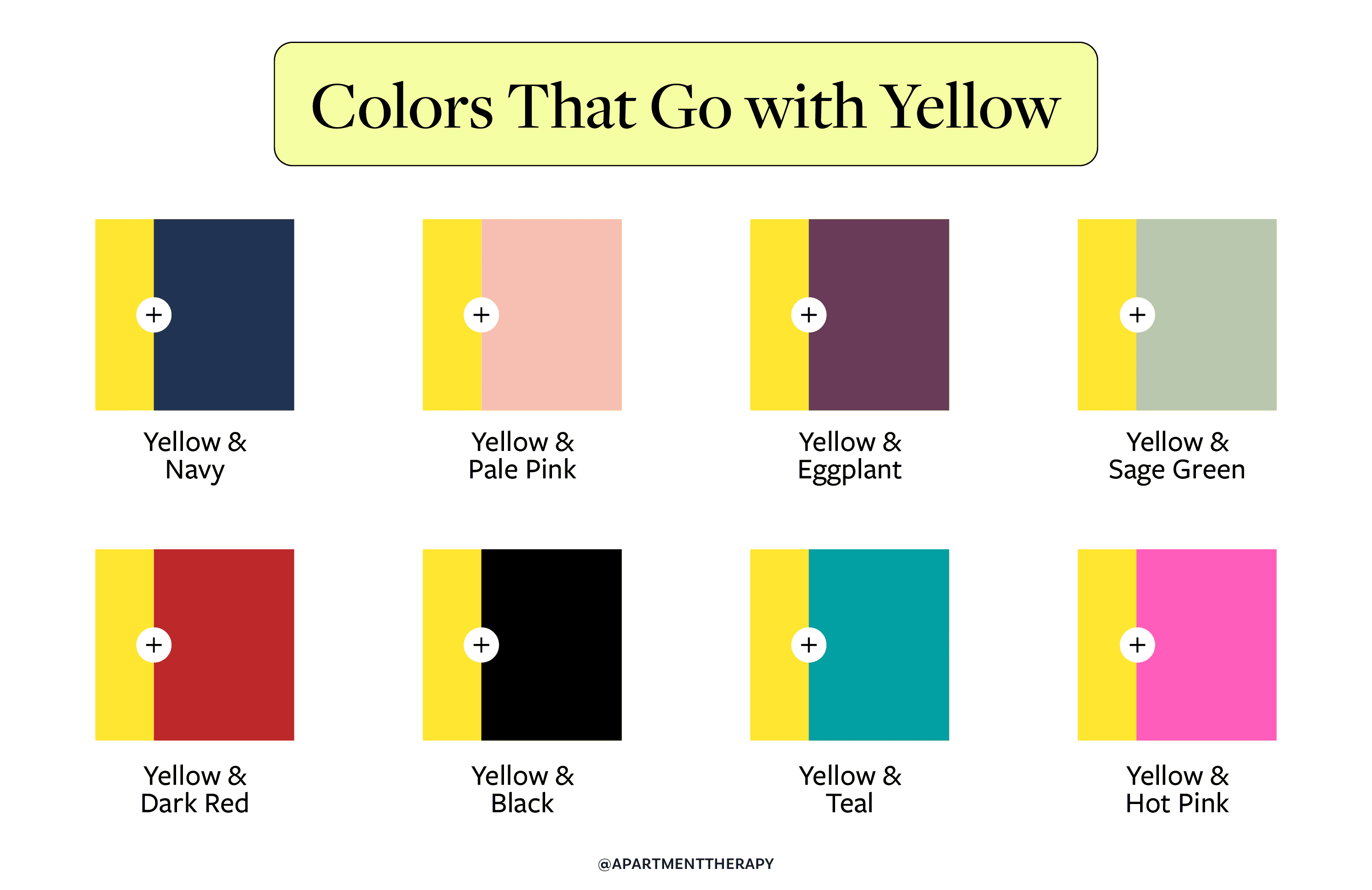
Yellow and Black: The Power of Visibility
Yellow and black is the highest-contrast combination available in the visual spectrum. It is why nature uses it for bees and humans use it for traffic signs. In branding, this match signals power, warning, and extreme visibility.
Construction brands like CAT (Caterpillar) use this to signal durability and safety. However, in the lifestyle and fashion niche, yellow and black can feel incredibly “edgy” and high-fashion. The danger of this pairing is that it can easily look like a “warning sign” if the proportions are not handled correctly. To make this pairing feel premium, it is often necessary to introduce a third “bridge” color, such as a crisp white or a metallic silver.
Scaling Yellow: Tint, Tone, and Shade in Corporate Identity
When determining what color matches yellow for a specific brand, the strategist must consider the “60-30-10 Rule” of design. This rule suggests that 60% of the brand’s visual output should be a dominant color, 30% a secondary color, and 10% an accent color.
The Role of Neutrals
Yellow rarely works as the 60% dominant color unless the brand is intentionally trying to be loud and disruptive (like Snapchat). More often, yellow serves as the 30% or 10%. In these cases, the “match” is often a neutral.
- Yellow and White: This creates a clean, airy, and optimistic feel. It is common in the beauty and healthcare industries, where “brightness” equates to “cleanliness.”
- Yellow and Forest Green: This is a “natural” pairing. It evokes growth, sunshine, and the environment. It is a favorite for organic food brands and sustainability-focused startups.
Balancing Saturation
A common mistake in brand design is matching a highly saturated yellow with a low-saturation secondary color. If you are using a “Neon Yellow,” your matching color needs to be either equally vibrant (like a bright Teal) or extremely dark (like Midnight Black) to provide the necessary anchor. A “Mustard Yellow” matches best with “muted” tones like olive green, burgundy, or burnt orange, creating a “vintage” or “artisanal” brand feel.
Yellow in the Digital Sphere: Accessibility and User Experience
In the digital age, choosing a color to match yellow isn’t just about brand strategy; it’s about User Experience (UX) and accessibility. Yellow presents a significant challenge for digital accessibility because it often lacks the contrast required for text readability against light backgrounds.
The Accessibility Challenge
According to the Web Content Accessibility Guidelines (WCAG), text must have a specific contrast ratio to be readable by individuals with visual impairments. Yellow text on a white background is almost always a failure. Therefore, if yellow is a core brand color, its “match” must be a dark, high-contrast color for digital interfaces.
Yellow as a Call to Action (CTA)
In UI/UX design, yellow is one of the most effective colors for “Buy Now” or “Sign Up” buttons. Because the eye is naturally drawn to yellow, it acts as a beacon on a webpage. To make this work, the background color (the “match”) should be a cool, receding color like dark blue, dark green, or black. This ensures the yellow element “pops” off the screen, driving conversion rates and user engagement.
Executing a Yellow Rebrand: Strategic Considerations and Pitfalls
When a brand decides to integrate yellow into its identity, it is often a signal of a “pivot.” It suggests a move toward a younger demographic, a more innovative product line, or a friendlier corporate culture. However, the execution depends entirely on the supporting palette.
Avoiding the “Fast Food” Aesthetic
Red and yellow are the classic “fast food” colors (McDonald’s, Burger King, Wendy’s). This combination is scientifically proven to stimulate appetite and suggest speed. However, unless you are in the quick-service restaurant industry, matching yellow with red can be a strategic error. It can make a professional services firm or a tech company look “cheap” or “rushed.” To avoid this, sophisticated brands will swap red for a deep terracotta or a bright orange to keep the energy without the “discount” connotations.
The Importance of Consistency
Yellow is notoriously difficult to replicate across different mediums. The yellow on a backlit smartphone screen will look different than yellow printed on a matte business card or a gloss-finish vehicle wrap. When choosing a matching color, the brand must ensure that the secondary color helps stabilize the yellow across these mediums. A dark matching color helps “define” the yellow, making discrepancies in the yellow’s shade less noticeable to the casual observer.

Conclusion: The Strategic Harmony of Yellow
In the world of branding and design, yellow is a high-octane tool that requires a steady hand. Finding the color that matches yellow is a task of balancing energy with stability. Whether it is the professional authority of Navy, the modern sophistication of Charcoal, or the natural growth of Forest Green, the “match” is what gives the yellow its context.
A successful brand doesn’t just use yellow; it frames yellow. By understanding the psychological triggers and the technical requirements of contrast and accessibility, brand strategists can leverage the power of yellow to create identities that are not only visible but also memorable, trusted, and enduring. Yellow is the spark, but the matching palette is the fuel that sustains the brand’s visual story.
aViewFromTheCave is a participant in the Amazon Services LLC Associates Program, an affiliate advertising program designed to provide a means for sites to earn advertising fees by advertising and linking to Amazon.com. Amazon, the Amazon logo, AmazonSupply, and the AmazonSupply logo are trademarks of Amazon.com, Inc. or its affiliates. As an Amazon Associate we earn affiliate commissions from qualifying purchases.