
In the competitive landscape of corporate identity, color is often the most immediate and enduring asset a brand possesses. Among the primary and secondary hues that populate our visual world, few are as complex, polarizing, or strategically potent as magenta. To the casual observer, it is a vibrant purplish-red. To the scientist, it is an “extra-spectral” color that does not exist on the visible light spectrum. But to the brand strategist, magenta is a high-octane tool for differentiation, disruption, and psychological engagement.
Understanding “what color magenta” represents in a branding context requires moving beyond simple aesthetics. It involves an analysis of how a color that doesn’t technically have a wavelength of its own has become one of the most recognizable and legally protected assets in the global marketplace.

The Science and Psychology of Magenta in Branding
To understand the branding power of magenta, one must first understand its unique physical properties. Unlike red, green, or blue, magenta cannot be found in the rainbow. It is the result of our brains perceiving the simultaneous stimulation of red and blue photoreceptors without any green. Because the brain cannot reconcile these two opposite ends of the visible spectrum, it “invents” a color to bridge the gap.
The Extra-Spectral Nature of Magenta
This biological quirk makes magenta an inherently “unnatural” yet highly stimulating color. In brand strategy, this translates to a sense of innovation and non-conformity. When a company chooses magenta, they are often signaling that they are a disruptor—a brand that exists in the space between traditional categories. Because it is a color that the brain must work to perceive, it naturally commands a higher level of cognitive attention than more common shades like corporate blue or retail red.
Emotional Triggers and Consumer Behavior
Psychologically, magenta strikes a delicate balance. It carries the passion and energy of red, softened by the introspection and quiet strength of violet. In marketing, it is frequently used to convey “universal harmony” and “emotional balance,” but it also serves as a beacon of boldness. Brands targeting a youthful, forward-thinking demographic utilize magenta to project an image of confidence and creativity. Unlike pink, which is often culturally pigeonholed into gender-specific marketing, magenta occupies a more gender-neutral, high-energy space that suggests luxury, technology, and avant-garde thinking.
The Corporate Identity Powerhouse: A Case Study in Trademarking Color
In the world of intellectual property and brand strategy, magenta is perhaps most famously associated with the telecommunications giant T-Mobile. Their use of the color is not merely a design choice; it is a masterclass in brand “ownership.”
T-Mobile and the RAL 4010 Standard
T-Mobile’s specific shade—Telemagenta (RAL 4010)—is a trademarked asset. The company has spent decades and millions of dollars ensuring that when a consumer sees that specific neon-adjacent hue, they think of wireless connectivity. This is a strategic move designed to bypass the traditional “sea of blue” favored by competitors like AT&T and the “red” of Verizon. By claiming a color that few other major corporations dared to touch, T-Mobile achieved instant visual recognition in a crowded market.
The Legal Shield: Protecting the Brand Niche
The power of this branding is so immense that Deutsche Telekom (T-Mobile’s parent company) has famously entered legal battles to protect its “ownership” of the color. Notable cases against companies like the insurance startup Lemonade or the technology firm Atea highlight a crucial lesson in brand strategy: a color can be a company’s strongest defensive moat. For Lemonade, the use of a similar pinkish-purple was seen as an infringement on the visual equity T-Mobile had built. This demonstrates that in the modern economy, the specific frequency of a color is as much a part of a brand’s value as its logo or its slogan.
Technical Implementation: Navigating the CMYK and RGB Divide
For a brand to successfully leverage magenta, it must maintain absolute consistency across a multitude of platforms. This is where the technical definition of “what color magenta” becomes a complex challenge for designers and marketing directors.

From Print to Pixel: Maintaining Consistency
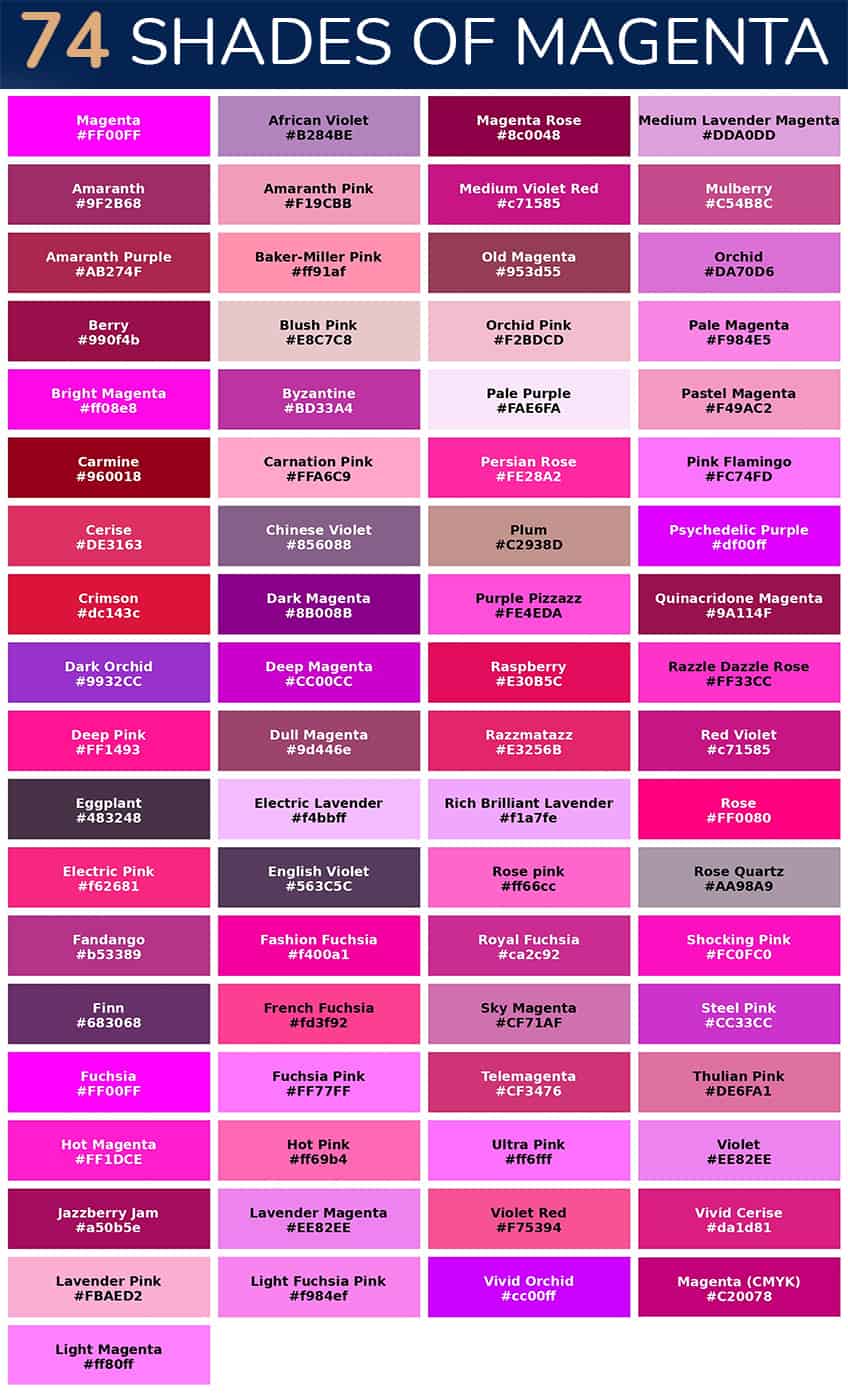
In the world of print, magenta is a foundational element—one of the four colors in the CMYK (Cyan, Magenta, Yellow, Key/Black) process. Process Magenta is a pure, bright pigment that serves as the basis for thousands of other colors. However, translating that vibrancy to a digital screen (RGB) requires precision. Digital magenta (often Hex #FF00FF) can appear overly harsh or “electric” if not calibrated correctly.
A brand strategy must define the exact hex codes, RGB values, and CMYK percentages to ensure the identity doesn’t shift from a sophisticated corporate magenta to a washed-out fuchsia. Discrepancies in color reproduction can lead to a “fragmented” brand image, which erodes consumer trust. If a customer’s mobile app looks different from the physical packaging they receive in the mail, the psychological link to the brand’s identity is weakened.
The Pantone Factor
Many high-end brands rely on the Pantone Matching System (PMS) to standardize their magenta. Pantone colors like “Rhodamine Red” or “Process Magenta” offer a universal language for manufacturers and printers. Using a “spot color” ensures that the magenta is printed as a single, solid ink rather than a mix of dots, resulting in a depth and saturation that is impossible to achieve with standard four-color processing. For a brand, this investment in technical precision is a signal of quality and attention to detail.
Strategic Integration: How to Use Magenta in Marketing Collateral
Magenta is a “loud” color. If used incorrectly, it can overwhelm the consumer and lead to visual fatigue. If used strategically, it can guide the user’s eye and create a memorable brand experience.
Building Contrast and Visual Hierarchy
In digital interface design (UI) and user experience (UX), magenta is an exceptional choice for calls-to-action (CTAs). Because it stands out so vividly against white, black, or grey backgrounds, a magenta “Sign Up” or “Buy Now” button can significantly increase conversion rates. It provides a natural focal point without the aggressive “stop” connotations associated with the color red.
Strategically, magenta works best when paired with a more subdued secondary palette. Dark teals, deep navy blues, or charcoal greys provide the necessary contrast to let magenta “pop.” This creates a visual hierarchy where the most important information—the brand’s core message or the primary action—is highlighted by the most vibrant color in the palette.
Accessibility and Inclusive Design
Modern brand strategy must also account for accessibility (WCAG standards). Magenta, particularly when used for text, requires careful consideration of contrast ratios. A “pure” magenta on a white background may fail readability tests for users with visual impairments. Savvy brands adjust their magenta shades—darkening them slightly for text or using them as decorative accents—to ensure their identity remains inclusive. This move from “pure color” to “functional color” is a hallmark of a mature brand strategy.
The Future of Magenta in Digital-First Brand Experiences
As we move further into the era of high-definition displays, augmented reality (AR), and the metaverse, the role of magenta is evolving. In digital spaces, colors are not limited by the physical properties of ink and paper. We are seeing a rise in “neo-magenta”—shades that incorporate glows, gradients, and translucency.
The Color of Innovation
In the tech sector, magenta is increasingly used to represent AI, fintech, and biotechnologies. It feels “high-tech” because it is a color that feels digitally native. As brands seek to position themselves as part of the “next generation,” magenta offers a bridge between the physical and the virtual. It is a color that looks as good on a glowing smartphone screen as it does on a billboard.
The Evolution of Brand Identity
The question “what color magenta” is no longer just about a point on a color wheel. It is about a brand’s willingness to be seen. In an age of “bland-ing”—where many tech and luxury brands are moving toward minimalist, monochromatic identities—choosing magenta is a defiant act of personality. It suggests a brand that is not afraid to take up space, a brand that values creativity over conformity, and a brand that understands the deep-seated psychological impact of visual stimulation.
Ultimately, magenta is the color of the modern strategic edge. It is a color that demands attention, requires technical mastery to execute, and offers a unique opportunity for legal and visual “ownership” in a crowded global economy. For the brand that gets it right, magenta is not just a color—it is a signature of success.
aViewFromTheCave is a participant in the Amazon Services LLC Associates Program, an affiliate advertising program designed to provide a means for sites to earn advertising fees by advertising and linking to Amazon.com. Amazon, the Amazon logo, AmazonSupply, and the AmazonSupply logo are trademarks of Amazon.com, Inc. or its affiliates. As an Amazon Associate we earn affiliate commissions from qualifying purchases.