
Winnie the Pooh, the honey-loving bear from the Hundred Acre Wood, is an instantly recognizable character. His gentle demeanor, his slightly-too-tight red t-shirt, and his ever-present quest for honey are etched in the minds of generations. But beyond the surface-level familiarity, the choice of Pooh’s color—a warm, inviting yellow—is a deliberate and powerful element of his enduring brand identity. This article will delve into the strategic significance of Winnie the Pooh’s chromatic composition, examining how his signature yellow, coupled with other key visual cues, contributes to his global appeal and marketing success. We will explore the psychology behind color choices in branding, analyze the evolution of Pooh’s visual representation, and consider how his consistent color palette reinforces his core brand attributes.

The Psychology of Yellow: Embracing Warmth and Optimism
The choice of yellow for Winnie the Pooh is far from accidental. Yellow is a color steeped in symbolism, often associated with happiness, cheerfulness, and optimism. In the realm of color psychology, yellow is known to stimulate mental activity, promote creativity, and evoke feelings of joy and enthusiasm. For a character designed to appeal primarily to children and to foster a sense of comforting familiarity, these associations are paramount.
Evoking Childhood Innocence and Joy
Yellow is frequently linked to sunlight, a universal symbol of warmth, life, and positivity. For children, the bright, energetic nature of yellow can translate directly into feelings of playfulness and excitement. Winnie the Pooh’s yellow hue instantly communicates a sense of innocent joy, making him approachable and non-threatening. This is crucial for a character intended to be a comforting presence in children’s lives, a companion for bedtime stories and imaginative adventures. The visual warmth of his fur creates an immediate emotional connection, drawing young audiences in with its inherent friendliness.
The Nuance of “Pooh Yellow”
It’s important to note that “Pooh yellow” isn’t just any shade of yellow. It’s a specific, mellow, and slightly desaturated tone that avoids being overly garish or overwhelming. This particular shade contributes to Pooh’s gentle disposition. Brighter, more vibrant yellows might feel too energetic or even aggressive, whereas Pooh’s signature hue strikes a perfect balance. It’s a color that suggests comfort, a soft glow, akin to the warm light of a comforting lamp or a gentle dawn. This subtlety is a testament to the nuanced understanding of color that informed the character’s original design and has been meticulously maintained through decades of brand evolution. This specific shade fosters a sense of calm and contentment, aligning perfectly with Pooh’s laid-back personality.
Differentiating from Other Characters
In the landscape of children’s literature and animation, color plays a significant role in character differentiation. Pooh’s yellow distinguishes him from other iconic characters who might be associated with different colors (e.g., Mickey Mouse with red and black, Donald Duck with blue). This distinctiveness is vital for brand recognition. When a child sees a yellow bear, the immediate association, due to consistent branding, is Winnie the Pooh. This visual shorthand is incredibly powerful in building a unique and memorable brand identity.
The Red T-Shirt: A Bold Contrast and Iconic Statement
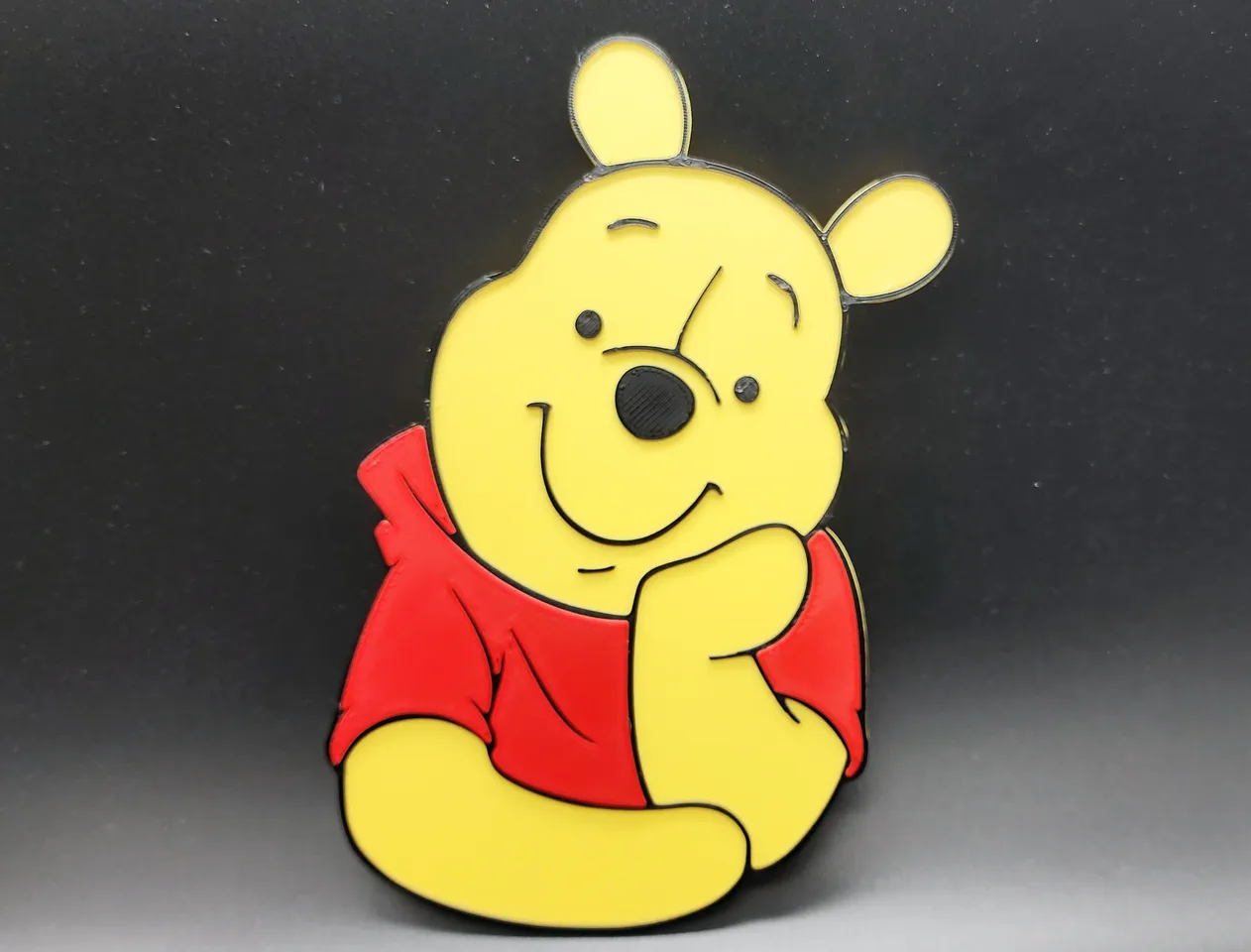
While yellow forms the foundation of Winnie the Pooh’s visual identity, his iconic red t-shirt acts as a powerful counterpoint, adding another layer of strategic branding and visual impact. This seemingly simple piece of clothing is as much a part of Pooh as his love for honey.
Creating a Memorable Silhouette and Focal Point
The red t-shirt serves as a highly effective focal point against his yellow fur. Red is a color that commands attention, stimulating excitement and energy. In a character design, this contrast helps to define Pooh’s silhouette and make him instantly recognizable, even from a distance or in busy visual environments. The boldness of the red against the softness of the yellow creates a visually appealing and memorable image that sticks in the mind. This contrast is a fundamental principle in graphic design, ensuring that the key elements of a brand are easily discernible and impactful.
Symbolism of Red: Action and Affection
Red is also a color associated with strong emotions, including love, passion, and courage. While Pooh is not typically characterized by overt displays of courage (beyond his occasional adventures), the red t-shirt can subtly allude to his big heart and his deep affection for his friends in the Hundred Acre Wood. It adds a layer of subtle dynamism to his otherwise placid yellow persona, suggesting a capacity for action when his friends are in need or when honey is involved. This duality – the calm, comforting yellow and the slightly more energetic red – creates a well-rounded and engaging character.
Evolution and Consistency of the Red T-Shirt
The red t-shirt has been a consistent element of Winnie the Pooh’s design since his earliest appearances. This unwavering consistency is a cornerstone of strong brand identity. By maintaining this key visual element across various adaptations, merchandise, and media, The Walt Disney Company has reinforced Pooh’s iconic status. Children grow up recognizing this specific garment as an intrinsic part of Pooh, contributing to a sense of enduring familiarity and trust in the brand. The absence of variations in this core element ensures that the brand message remains clear and uncluttered.
The Hundred Acre Wood Palette: Reinforcing the Brand’s Core Values
Beyond Winnie the Pooh himself, the surrounding environment of the Hundred Acre Wood also contributes to the overall brand aesthetic and reinforces Pooh’s core values of warmth, simplicity, and gentle escapism. The color palette of these illustrations is carefully curated to create a harmonious and inviting world.
Earth Tones and Naturalism
The Hundred Acre Wood is characterized by a palette rich in earth tones: greens of the trees and grass, browns of the soil and tree trunks, and the soft blues and greys of the sky. This reliance on natural colors grounds the stories in a sense of reality, albeit a whimsical one. It evokes a feeling of being outdoors, in a safe and natural environment, which is central to Pooh’s appeal. These colors are generally perceived as calming and grounding, further contributing to the comforting aura of the brand.
The Subtlety of Supporting Characters’ Colors
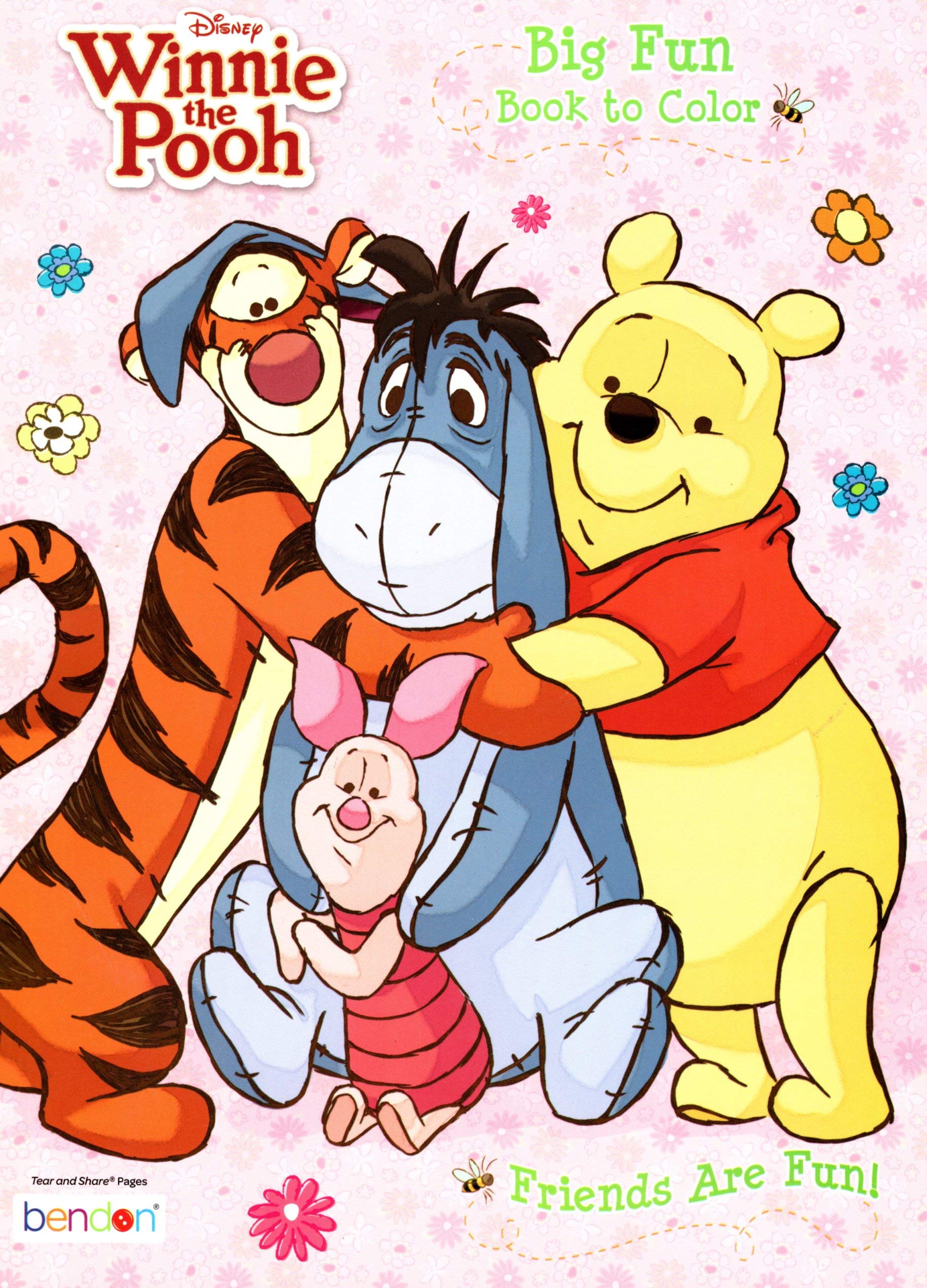
While Pooh is yellow and his shirt is red, the other characters in the Hundred Acre Wood often feature more muted or secondary colors. Piglet, for instance, is often depicted in soft pinks, Tigger in oranges and blacks, and Eeyore in blues and greys. These color choices help to differentiate the characters while still maintaining a cohesive visual language for the world. The overall effect is a tapestry of gentle, complementary colors that create a visually pleasing and immersive experience, without any single element being overpowering. This balanced approach ensures that the focus remains on the narrative and the characters’ interactions, rather than on a riot of clashing hues.
Creating a Nostalgic and Timeless Appeal
The naturalistic and gentle color palette of the Hundred Acre Wood contributes significantly to the timeless and nostalgic appeal of Winnie the Pooh. These are colors that evoke childhood memories for adults and create a sense of wonder for younger generations. The deliberate avoidance of overly modern or trend-driven color schemes ensures that Pooh’s world remains a sanctuary of comfort and familiarity, transcending fleeting trends. This strategic use of color psychology in environmental design is a crucial element in building a lasting and beloved brand.
Conclusion: A Masterclass in Color Branding
The color of Winnie the Pooh, from his warm yellow fur to his iconic red t-shirt, and the earthy palette of his home, is a masterclass in brand identity and color psychology. These deliberate choices work in synergy to create a character and a world that are instantly recognizable, deeply beloved, and enduringly appealing. The yellow evokes joy and innocence, the red adds a touch of warmth and distinctiveness, and the Hundred Acre Wood’s palette provides a comforting and natural backdrop.
In an era where brands constantly strive to capture attention and forge emotional connections, the enduring success of Winnie the Pooh serves as a powerful reminder of the fundamental impact of thoughtful design. The seemingly simple decision of “what color is Winnie the Pooh” is, in fact, a complex and highly effective branding strategy that has cemented his status as one of the most iconic and cherished characters in global popular culture. The consistent and strategic application of color has played an instrumental role in shaping perceptions, fostering affection, and ensuring that the magic of the Hundred Acre Wood continues to enchant audiences, generation after generation. It is a testament to the power of visual cues to communicate complex emotional narratives and build a brand that resonates on a deeply personal level.
aViewFromTheCave is a participant in the Amazon Services LLC Associates Program, an affiliate advertising program designed to provide a means for sites to earn advertising fees by advertising and linking to Amazon.com. Amazon, the Amazon logo, AmazonSupply, and the AmazonSupply logo are trademarks of Amazon.com, Inc. or its affiliates. As an Amazon Associate we earn affiliate commissions from qualifying purchases.