
When you unlock your smartphone, you are greeted by a mosaic of icons, each competing for a millisecond of your attention. Before you read a single label or recognize a logo’s shape, your brain processes one thing above all else: color. We often ask, “What color is this app?” not just to identify it on a crowded home screen, but because that specific hue dictates our emotional relationship with the software. In the world of brand strategy and corporate identity, the selection of an app’s primary color is rarely an aesthetic whim. It is a calculated psychological maneuver designed to foster trust, trigger urgency, or establish a sense of premium exclusivity.

The Psychology of Hues: Why We Click on Certain Colors
The digital landscape is dominated by a specific spectrum of colors, each serving as a non-verbal cue to the user about what to expect from the experience. Color psychology is the cornerstone of brand identity, acting as a shorthand for a company’s values and mission.
The Reign of Blue: Trust and Dependability
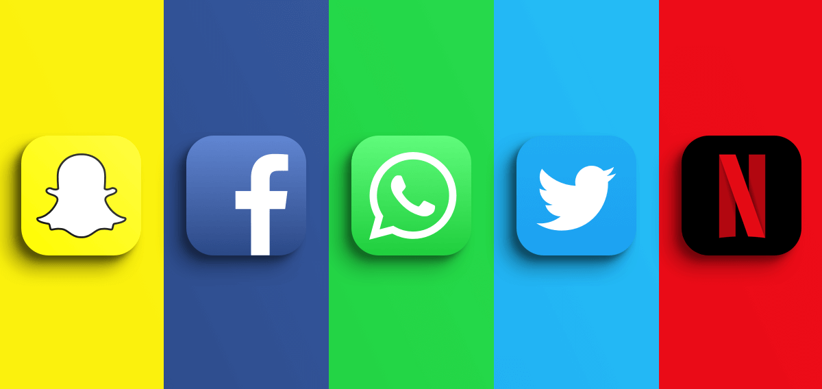
If you look at the most successful apps of the last decade—Facebook, LinkedIn, Twitter (in its original form), and PayPal—you will notice a recurring theme: blue. In branding, blue is the universal symbol of stability, intelligence, and safety. For platforms that handle personal data, professional networking, or financial transactions, blue serves to lower the user’s heart rate and instill a sense of reliability. It is a “productive” color that doesn’t overwhelm the senses, making it ideal for apps intended for long-term daily use.
The Energy of Red and Orange: Urgency and Appetite
Conversely, apps like Netflix, Airbnb, and various food delivery services lean heavily into reds and oranges. Red is known to increase heart rate and create a sense of urgency or excitement. In the context of entertainment, it signals passion and high energy. For delivery apps, red and orange are psychologically linked to appetite stimulation. These colors are designed to grab attention immediately, making them perfect for “impulse” or “high-engagement” platforms where the goal is to get the user to act quickly.
Green: Growth, Finance, and Sustainability
Green has undergone a transition in the digital space. While it was once strictly associated with nature, it has become the primary color for the “FinTech” revolution. Apps like Robinhood, Mint, and various banking platforms use green to symbolize growth, prosperity, and a “go” signal. It provides a calming effect while simultaneously suggesting that the user is making a productive, wealth-building choice.
Building the Palette: Brand Consistency Across Platforms
A brand is more than just a single color; it is a cohesive visual language. When a company defines its identity, it creates a “design system” that dictates how colors interact across mobile interfaces, web browsers, and physical marketing materials.
The Power of the Signature Shade
True brand mastery occurs when a company owns a specific shade so completely that the color alone evokes the brand name. Think of the specific “Tiffany Blue” or “Post-it Yellow.” In the app world, Spotify has achieved this with its “Spotify Green.” By utilizing a very specific, high-vibrancy neon green, the app stands out against the dark interfaces of its competitors. This signature shade becomes a visual anchor, ensuring that even if a user sees a notification icon in their peripheral vision, they know exactly which app is speaking to them.
Accessibility and the Ethics of Color
Strategic branding must also account for accessibility. The Web Content Accessibility Guidelines (WCAG) provide standards for color contrast to ensure that users with visual impairments can navigate an app effectively. A professional brand strategy doesn’t just pick a “pretty” color; it picks a palette that maintains its integrity and readability for everyone. This includes choosing secondary colors that provide enough contrast against the primary brand color to ensure buttons and text are legible. Failure to do so doesn’t just hurt the user experience; it dilutes the brand’s perceived professionalism.
Dark Mode: The Brand Identity Shift
The rise of “Dark Mode” has forced brand strategists to rethink corporate identity. A color that looks vibrant on a white background might become muddy or jarring on a dark gray or black background. Modern branding requires a “bipolar” palette—colors that are tested for their psychological impact in both light and dark environments. This shift has led to the rise of “Electric” or “Neon” variants of brand colors, which maintain their “glow” and recognizability regardless of the user’s system settings.
Case Studies in Chromatic Success

Examining how major players have navigated color changes provides a blueprint for how branding evolves with technology and user expectations.
The Instagram Gradient: From Brown to Technicolor
One of the most famous examples of color strategy is Instagram’s 2016 rebranding. The original icon was a literal, skeuomorphic brown camera. It represented “retro” photography. As the app evolved into a broader creative platform, it shifted to a vibrant purple-to-yellow gradient. Initially met with backlash, the move was a masterclass in brand evolution. The gradient reflected a more diverse, high-energy user base and ensured the app was the most colorful, unmissable icon on any home screen.
Slack: Managing a Multi-Color Identity
Slack faced a unique challenge. Their original logo used eleven different colors, which often looked messy on different backgrounds. Their rebranding simplified the palette to four primary colors (blue, green, yellow, and red) but utilized them in a way that maintained the “playful” and “collaborative” nature of the brand. By refining their colors, Slack moved from a “startup” aesthetic to a “corporate essential” aesthetic without losing its soul.
The Minimalism of Premium Brands
High-end or “lifestyle” apps often move toward a monochromatic palette. Uber, for example, utilizes a stark black-and-white identity. This removes the “noise” of color and replaces it with a sense of luxury, sophistication, and utility. When a brand reaches a certain level of ubiquity, it can afford to shed the “loudness” of bright colors in favor of a minimalist identity that suggests it is a fundamental utility, like water or electricity.
Color and User Behavior: Conversion Through Contrast
In marketing and design, the “Isolation Effect” (also known as the Von Restorff effect) suggests that when multiple similar objects are present, the one that differs from the rest is most likely to be remembered and acted upon. Brand strategists use this to drive user behavior within the app.
The “Action” Color
Every well-designed app has a “Call to Action” (CTA) color. This is often a complementary color to the primary brand hue. If an app is predominantly blue, the “Sign Up” or “Buy Now” button might be orange. This creates “visual friction” that draws the eye. A brand’s identity isn’t just the color of the icon; it’s the strategic use of contrast to guide the user’s journey from curiosity to conversion.
Cultural Variations in Color Meaning
Global brands must be wary of the “Western” bias in color psychology. While green represents “go” and “wealth” in the United States, in some Eastern cultures, white is the color of mourning rather than “cleanliness.” A truly sophisticated brand strategy involves “color localization”—adjusting the saturation or even the primary palette of an app to resonate with the cultural expectations of a specific geographic market.
The Future of Digital Brand Identity
As we move toward more immersive technologies, the question “What color is this app?” will become even more complex.
Dynamic Branding and Material You
With the introduction of systems like Google’s “Material You,” the OS can now extract colors from a user’s wallpaper and apply them to app icons and interfaces. This presents a challenge for brands: how do you maintain a corporate identity when the user can change your app’s color? The answer lies in “structural branding”—focusing on the unique shapes, motions, and typography of a brand so that the identity remains recognizable even if the color shifts.
The Rise of “Glassmorphism” and Texture
Color is no longer just a flat hex code. Modern branding involves transparency, blur, and depth (often called “Glassmorphism”). Brands are now defined by how their colors “feel” and react to touch. The “color” of an app is becoming a multi-layered experience where light and shadow play as much of a role as the hue itself.
In conclusion, the color of an app is its first and most important handshake with the user. It is a silent ambassador that communicates the brand’s intent, industry, and personality in the blink of an eye. Whether it is the calming blue of a social network or the aggressive red of a flash sale, color is the invisible thread that connects a digital product to the human psyche. When a brand gets its color right, it doesn’t just sit on a home screen; it lives in the user’s mind.
aViewFromTheCave is a participant in the Amazon Services LLC Associates Program, an affiliate advertising program designed to provide a means for sites to earn advertising fees by advertising and linking to Amazon.com. Amazon, the Amazon logo, AmazonSupply, and the AmazonSupply logo are trademarks of Amazon.com, Inc. or its affiliates. As an Amazon Associate we earn affiliate commissions from qualifying purchases.