
In the world of corporate identity and sports marketing, few questions spark as much passion and technical debate as the specific shade associated with a legendary franchise. When people ask, “What color is the Eagles?” they are rarely looking for a simple answer like “green.” Instead, they are inquiring about a complex brand ecosystem that has navigated decades of aesthetic evolution, fan psychology, and market positioning. For the Philadelphia Eagles, their color isn’t just a visual choice; it is a multi-million dollar asset that defines their brand equity.
The transition from the classic “Kelly Green” to the modern “Midnight Green” represents one of the most successful, albeit controversial, rebranding case studies in professional sports. This visual shift was not merely an aesthetic preference but a calculated strategic move designed to modernize the franchise, differentiate it from competitors, and align with a new era of professional football.
The Evolution of Midnight Green: Defining a Modern Corporate Identity
The story of the Eagles’ color palette is essentially a story of brand modernization. For much of the 20th century, the team was synonymous with Kelly Green—a bright, vibrant shade that captured the energy of the early NFL. However, as the league transitioned into a global entertainment powerhouse in the 1990s, the need for a more sophisticated and commercially versatile identity became apparent.
The Shift from Kelly Green to Midnight Green
In 1996, under the ownership of Jeffrey Lurie, the Eagles underwent a radical rebranding. The shift to Midnight Green was intended to signal a departure from the past and the beginning of a new, professionalized era for the team. Midnight Green was darker, more aggressive, and carried a sense of “prestige” that the flatter Kelly Green lacked. From a brand strategy perspective, this was a move to create a unique visual “moat.” While many teams used shades of green, none occupied the specific dark, metallic space that Midnight Green inhabitant.
Strategic Differentiation in a Crowded Market
In branding, differentiation is the key to survival. If your brand looks like everyone else’s, you become a commodity. By adopting a custom shade that leaned into teal and forest undertones, the Eagles carved out a distinct visual niche. This allowed the franchise to own a specific part of the color spectrum in the consumer’s mind. When a fan sees that specific dark teal-green, they don’t think of the New York Jets or the Green Bay Packers; they think specifically of Philadelphia. This is the ultimate goal of any corporate identity: immediate, non-verbal brand recognition.
Technical Specifications: The Hex and Pantone of Winning
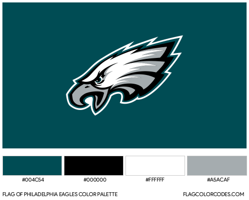
To maintain brand integrity, the Eagles must ensure that their color is consistent across all platforms—from the paint on the stadium seats to the pixels on a smartphone screen. Midnight Green is often associated with Pantone Matching System (PMS) 316 C. In the digital space, the Hex code is approximately #004C54. Maintaining this consistency is a massive logistical undertaking. For instance, when the NFL switched apparel providers to Nike, the team famously faced challenges in replicating the exact luster of Midnight Green on the new “Elite 51” jersey fabric, leading to a temporary brand crisis where the jerseys on the field didn’t perfectly match the official brand guides. This highlights the technical rigor required to maintain a professional brand identity.
The Psychology of Color in Sports Branding
Colors evoke emotions, and in the high-stakes world of sports, emotion is the primary driver of consumer behavior. The choice of green was never accidental; it was a reflection of the team’s environment and the psychological profile they wanted to project to their rivals and their supporters.
Why Green? Symbolism and Regional Connection
Green is traditionally associated with growth, renewal, and endurance. For a city like Philadelphia, with its deep historical roots and “blue-collar” work ethic, the color green serves as a grounded, resilient anchor. However, by deepening that green into a “Midnight” hue, the brand managers added layers of sophistication and “edge.” It moved the brand from “traditional and friendly” to “modern and formidable.”
Perception of Performance and Authority
Darker colors are often perceived as more authoritative and serious. In the context of a contact sport, a darker palette can influence how a team is perceived by both fans and opponents. Midnight Green, paired with silver and black accents, creates a visual profile of strength. This psychological positioning is vital for a brand that wants to be seen as a perennial contender. The color palette communicates that the organization is focused, disciplined, and elite.
Establishing Emotional Resonance with the Fan Base
A brand is more than a logo; it is the emotional connection a customer has with a product. For Eagles fans, the color green is a tribal signifier. Wearing the color is an act of identity. The specific shade of green becomes a shorthand for community belonging. When the brand remains consistent over decades, that color starts to trigger nostalgia and deep-seated loyalty, making the “product” (the team) much more resistant to market fluctuations (losing seasons).
Nostalgia as a Marketing Tool: The Return of Kelly Green
One of the most fascinating aspects of the Eagles’ brand strategy is how they manage their heritage. While Midnight Green is the primary identity, the franchise has mastered the art of “nostalgia marketing” by periodically reintroducing Kelly Green.
The Economics of the “Throwback” Jersey
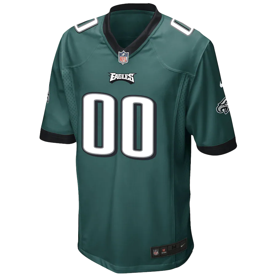
In 2023, the Eagles officially brought back Kelly Green as an alternate uniform, sparking a frenzy that saw merchandise sales shatter records. This is a classic brand strategy: using a legacy asset to create a high-demand, limited-time offering. By keeping Kelly Green as a “special edition” rather than the daily identity, the organization maximizes its value. They aren’t just selling a jersey; they are selling a connection to a specific era of the customer’s life.
Rebranding vs. Brand Refresh: Finding the Balance
Many companies struggle with whether to modernize or stay traditional. The Eagles have successfully navigated this by having a “dual-brand” strategy. Midnight Green represents the current and future business, while Kelly Green serves as the “heritage brand.” This allows the franchise to appeal to younger demographics who grew up with the modern look while maintaining a deep emotional bridge to older fans who remember the legends of the 1980s and 90s.
Case Study: 2023’s Multi-Million Dollar Merchandise Surge
The launch of the Kelly Green alternate line serves as a masterclass in product lifecycle management. The Eagles used social media teasers, high-production-value video content, and “lifestyle” photography to frame the old color in a modern context. The result was a cross-generational retail success. It proved that a brand’s history is often its most valuable intellectual property, provided it is packaged with modern marketing precision.
Maintaining Brand Consistency Across Digital and Physical Touchpoints
For a brand as large as the Philadelphia Eagles, the “color” must be managed with extreme care across various media. A brand that looks different on television than it does on a retail shelf is a brand that is losing its authority.
The Challenges of Color Reproduction in Different Media
The Eagles’ Midnight Green is a particularly difficult color to replicate because of its “sparkle” or metallic finish on helmets. In the world of design, this is known as a “spot color” challenge. When the brand is printed on cardboard packaging, it looks different than when it is embroidered on a polyester cap or displayed on an OLED screen. Professional brand managers use strict Style Guides to ensure that the “visual soul” of the Eagles remains intact regardless of the medium.
Cross-Platform Brand Cohesion
In the digital age, the Eagles are a media company as much as a football team. Their app, website, and social media channels use the Midnight Green palette to create a seamless user experience. This cohesion builds trust. When a user navigates from an Instagram post to the official shop, the consistent use of color reinforces that they are in a secure, official environment. This is a fundamental principle of digital brand strategy: consistency equals credibility.
Logo Evolution: Keeping the Brand Timeless
The color is the foundation, but the logo is the face. The Eagles’ logo—an aggressive, forward-leaning eagle head—was designed to complement the Midnight Green palette. By using white, silver, and black as secondary colors, the brand achieves high contrast, which is essential for visibility on TV and digital icons. The design ensures that even at small sizes, such as a favicon or a mobile notification, the brand is unmistakable.
Lessons for Modern Brand Managers
The Philadelphia Eagles’ approach to color offers several vital takeaways for any business looking to establish a dominant brand presence.
Owning a Color in Your Industry
Can your customers identify your brand if your logo is removed, simply by looking at your color palette? Companies like Tiffany & Co. (Tiffany Blue) or UPS (Brown) have achieved this. The Eagles have achieved this with Midnight Green. For brand managers, the lesson is to choose a color that isn’t just “pretty,” but one that is ownable and distinct within your competitive landscape.
Listening to Your Core Demographic
The return of Kelly Green wasn’t just a whim; it was a response to years of data and fan sentiment analysis. Successful brands listen to their community. They understand when the market is craving nostalgia and when it is ready for innovation. The Eagles didn’t replace their modern identity; they supplemented it, showing that brand strategy is not a zero-sum game.
Future-Proofing the Visual Identity
As we move further into a digital-first world, colors need to be “screen-ready.” The deep saturation of Midnight Green thrives in high-definition environments. When selecting a brand color today, companies must consider how that color will behave in augmented reality, virtual reality, and varying screen brightness settings. The Eagles have built a visual identity that is as effective in a physical stadium as it is in a digital metaverse.
In conclusion, “What color is the Eagles?” is a question with a multi-faceted answer. It is a specific technical shade (PMS 316 C), a strategic choice for differentiation, a psychological tool for authority, and a high-value asset for nostalgia marketing. By meticulously managing their color story, the Philadelphia Eagles have built one of the most recognizable and financially successful brands in global sports. Their journey highlights that in branding, color is never just a coat of paint—it is the very fabric of the brand’s identity.
aViewFromTheCave is a participant in the Amazon Services LLC Associates Program, an affiliate advertising program designed to provide a means for sites to earn advertising fees by advertising and linking to Amazon.com. Amazon, the Amazon logo, AmazonSupply, and the AmazonSupply logo are trademarks of Amazon.com, Inc. or its affiliates. As an Amazon Associate we earn affiliate commissions from qualifying purchases.