When a brand designer asks, “What color is straw?” they aren’t looking for a simple botanical description. They are inquiring about a specific psychological territory within the visual spectrum. In the world of brand strategy and corporate identity, the color straw—a muted, pale yellow-beige that sits comfortably between ivory and gold—has emerged as a powerful tool for companies looking to communicate authenticity, sustainability, and understated luxury.
While vibrant neons and bold primaries often dominate the tech and fast-food landscapes, the rise of the “straw” palette signals a shift toward a more human-centric, grounded approach to marketing. Understanding how to leverage this specific hue requires a deep dive into color psychology, material design, and the evolving expectations of the modern consumer.
Defining the Hue: The Science and Psychology of Straw in Brand Identity
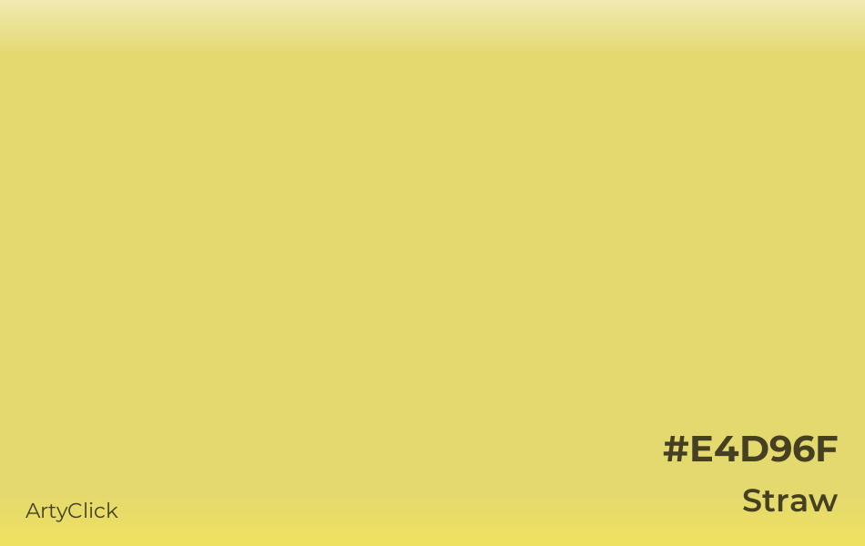
In technical terms, straw is a desaturated yellow. On the HEX scale, it often hovers around #E4D96F or #F5E6AD, depending on whether the brand leans toward its sun-bleached roots or its richer, more golden undertones. Unlike pure yellow, which can trigger anxiety or signify “caution,” straw carries the warmth of the sun without the jarring intensity.
Beyond Yellow: The Subtle Spectrum of Straw
In branding, the distinction between “Yellow” and “Straw” is the difference between a discount sticker and a bespoke linen suit. Straw incorporates significant white and grey undertones, which softens the visual impact. This makes it an ideal “neutral” that offers more personality than a standard beige but less aggression than a lemon yellow. For a brand strategist, this color represents a “bridge” hue—one that connects the reliability of earth tones with the optimism of bright colors.
Psychological Triggers: Reliability, Warmth, and Organic Trust
Color psychology suggests that straw-like tones evoke feelings of harvest, maturity, and the natural cycle of growth. For a brand, this translates to “reliability.” It suggests that the company is not a “flash in the pan” but something grown over time. It creates an immediate sense of organic trust. When a consumer sees a brand utilizing straw tones, their subconscious registers “natural,” “unprocessed,” and “transparent.”
Implementing Straw in Visual Strategy
Integrating straw into a brand’s visual identity is more complex than simply swapping out a background color. It requires a sophisticated understanding of contrast and “materiality”—how the color appears across different mediums, from a high-resolution smartphone screen to a recycled cardboard shipping box.
Hex Codes and Complementary Palettes
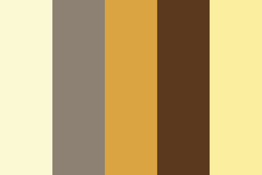
A brand’s digital presence relies on how straw interacts with secondary colors. To maintain a professional and premium feel, straw is rarely paired with other bright colors. Instead, top-tier brand strategies often pair it with:
- Deep Forest Greens: To emphasize an ecological or outdoor focus.
- Charcoal or Slate: To provide a modern, “tech-meets-tradition” contrast.
- Terracotta: To lean into a Mediterranean or artisanal aesthetic.
The strategic goal is to use straw as the “breath” in the design—the negative space that allows the primary brand assets to feel intentional rather than cluttered.
Materiality and Texture: From Digital to Physical
One of the unique advantages of the straw color in branding is its inherent link to texture. In the physical world, straw is tactile. When a brand adopts this color, it often carries over into the choice of materials: uncoated paper stocks, linen-bound notebooks, or matte-finish packaging. This consistency between the digital color and the physical touchpoint reinforces the brand’s identity as “authentic.” For personal branding or high-end corporate identity, this tactile association is a shortcut to being perceived as “premium.”
Industry Case Studies: Where Straw Commands Authority
While any brand can use the color, certain industries have mastered the “straw” aesthetic to redefine their market positioning. By moving away from industry-standard colors, these brands use straw to signal that they are doing things differently.
Sustainable Tech and Eco-Conscious Ventures
The “Green Revolution” in branding is actually becoming quite “Straw-colored.” Many sustainable tech startups are moving away from literal green—which can sometimes feel like “greenwashing”—and toward straw and sand tones. This shift signals a focus on the raw materials and the “circular economy.” By using straw, these brands highlight their commitment to the earth without relying on clichés. It suggests a “cradle-to-grave” philosophy where the product is part of a natural cycle.
High-End Minimalist Lifestyle Brands
In the sectors of skincare, interior design, and “slow fashion,” straw is used to communicate “Quiet Luxury.” Brands like Aesop or various high-end Japanese minimalist labels utilize these muted yellow-beiges to create a sense of calm. In a crowded marketplace where every brand is shouting for attention with high-contrast visuals, the “straw” aesthetic acts as a visual “hush.” It invites the consumer to lean in, suggesting that the quality of the product speaks for itself and doesn’t need flashy colors to justify its price point.
The Competitive Advantage of Understated Branding
Choosing a color like straw is a strategic move that acknowledges the current state of “attention fatigue.” Consumers are bombarded with high-saturation advertisements. A brand that chooses a more muted, natural palette is positioning itself as a sanctuary.
Cutting Through the Neon Noise
In digital marketing, there is a phenomenon known as “banner blindness.” Users have become trained to ignore high-intensity colors that look like traditional advertisements. Straw, because it feels like a “natural” or “editorial” color, often escapes this filter. It feels more like content and less like a sales pitch. This makes it an incredibly effective tool for content-led brand strategies and personal brands that want to build a community based on shared values rather than impulse buys.
Longevity vs. Trends: The Timelessness of Earth Tones
Brand strategy is an investment in the future. While “Color of the Year” trends come and go, earth-derived tones like straw are historically resilient. They do not “date” a brand the way that 90s neons or 2010s “Millennial Pink” did. By anchoring a corporate identity in a color that has existed in the human visual vocabulary since the dawn of agriculture, a brand builds an image of permanence. This is particularly vital for financial services or heritage brands that need to communicate that they will be around for decades to come.
Best Practices for Integrating Straw into Your Brand Palette
For brands looking to pivot toward this sophisticated neutral, there are several technical and strategic considerations to ensure the transition is successful and doesn’t result in a “washed out” appearance.
Accessibility and Contrast Ratios
One of the primary challenges of using a pale color like straw is maintaining web accessibility (WCAG) standards. Straw backgrounds require very dark typography—black, deep navy, or dark espresso—to remain readable for users with visual impairments. A brand strategy must include a “High Contrast” version of the palette to ensure the digital experience is inclusive. Failing to do so can alienate a significant portion of the audience and damage the brand’s reputation for social responsibility.
Future-Proofing Your Visual Identity
When adopting straw into a brand hierarchy, it is essential to define its role clearly. Is it a primary color, or a secondary “accent” neutral? For most successful brands, straw works best as a “Foundation Color.” It should be the canvas upon which more assertive brand elements sit.
To future-proof the identity, designers should create a “Straw Scale”—a range of tints and shades of the color. This allows for flexibility across different media. For example, a very light, almost-cream straw might be used for website backgrounds, while a deeper, more saturated “Golden Straw” could be used for call-to-action buttons or iconography.

Conclusion: The Strategic Power of the “Straw” Palette
The answer to “What color is straw?” is far more than a hex code or a reference to dried grain. In the context of modern brand strategy, it is a deliberate choice to embrace subtlety, authenticity, and endurance. By moving away from the loud, synthetic colors of the past decade, brands are using the straw palette to reconnect with a consumer base that values transparency and natural quality.
Whether you are building a personal brand, launching a sustainable startup, or refreshing a corporate identity, the use of straw-derived tones offers a path to a more sophisticated and grounded visual presence. In an era of digital noise, the most resonant brands are often the ones that have the courage to be quiet. Straw isn’t just a color; it’s a statement of confidence.
aViewFromTheCave is a participant in the Amazon Services LLC Associates Program, an affiliate advertising program designed to provide a means for sites to earn advertising fees by advertising and linking to Amazon.com. Amazon, the Amazon logo, AmazonSupply, and the AmazonSupply logo are trademarks of Amazon.com, Inc. or its affiliates. As an Amazon Associate we earn affiliate commissions from qualifying purchases.