
In the competitive landscape of modern branding, color is rarely a matter of mere aesthetics. It is a psychological tool, a silent communicator, and a foundational pillar of corporate identity. When we ask, “what color is sky blue,” we are not just inquiring about a wavelength of light or a meteorological phenomenon. From a branding perspective, we are investigating a specific emotional frequency that communicates openness, reliability, and infinite possibility.
Sky blue—often categorized technically as cerulean, azure, or light cyan—occupies a unique space in the visual lexicon. It is the color of the horizon, a shade that suggests both the stability of the atmosphere and the boundless potential of the future. For brand strategists and designers, mastering this specific hue is essential for building trust in an increasingly cluttered digital marketplace.

The Psychology of Sky Blue: Why Brands Lean into the Infinite
The human brain processes color before it processes language or even shapes. Sky blue triggers an immediate physiological response that is distinct from its darker cousins like navy or royal blue. While deep blues suggest authority and tradition, sky blue suggests transparency and innovation.
Evoking Trust and Reliability
In brand psychology, blue is the universal color of trust. However, sky blue specifically removes the “stiffness” associated with corporate navy. It creates an atmosphere of friendliness and approachability. This is why many financial technology (FinTech) startups and communication platforms move away from the “old guard” dark blues toward lighter, sky-centric shades. It signals to the consumer that the brand is modern, transparent, and easy to interact with.
The Association with Freedom and Clarity
Sky blue is inherently linked to the concept of “blue-sky thinking”—a term used in business to describe creative, unconstrained brainstorming. When a brand adopts this palette, it subconsciously informs the audience that the company is a pioneer. It suggests a lack of boundaries and a commitment to clear, uncomplicated solutions. For service-based brands, this clarity is a vital asset; it reassures the client that the complexity of their problems will be met with a refreshing, simplified experience.
The Technical Anatomy: Defining the “Sky Blue” Specification
To a consumer, sky blue is a feeling. To a brand manager, sky blue is a precise set of coordinates. Maintaining brand consistency across different mediums—from mobile apps to physical billboards—requires a rigorous understanding of the technical specifications of the color.
From HEX to Pantone: Standardizing the Horizon
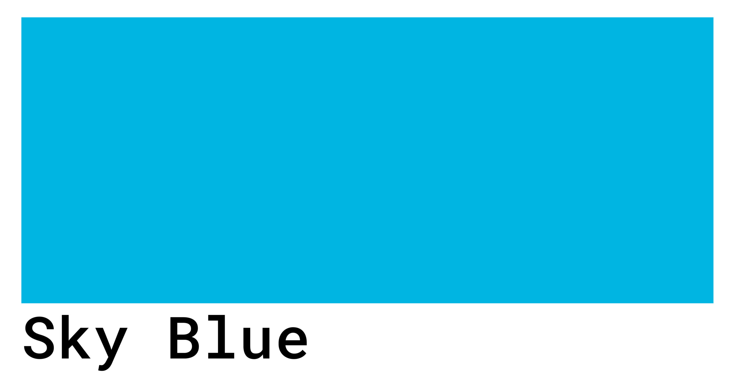
While “sky blue” is a broad term, the branding industry often looks to specific standards to ensure the identity remains intact across various touchpoints. The most common digital representation is HEX #87CEEB, but in the world of professional design, the nuances are much finer.
- Pantone 2905 C: Often used for a soft, professional sky blue that maintains its integrity in print.
- Cerulean (Pantone 15-4020): Famously named the first-ever “Color of the Year” by Pantone in 2000, specifically because it represented the inner peace and spiritual fulfillment sought at the dawn of a new millennium.
Using these specific codes allows a brand to achieve “Visual Equity.” When a customer sees that specific shade of sky blue, they should immediately associate it with the brand, regardless of whether they are looking at a business card or a high-definition digital display.
Digital Accessibility and Visual Hierarchy
In modern UI/UX design, the “color” of sky blue must also be evaluated for its functionality. Because sky blue is a lighter value, it often presents challenges with contrast ratios. Professional brand strategies must balance the aesthetic appeal of a light sky blue with the necessity of Web Content Accessibility Guidelines (WCAG). This often involves pairing sky blue with high-contrast secondary colors—such as deep charcoals or vibrant whites—to ensure that the brand remains inclusive and legible for all users.
Case Studies: Brands That Own the Horizon
Several of the world’s most recognizable brands have staked their claim on the sky blue territory, using the color to differentiate themselves in crowded markets.
The Social Media Giants
For years, the platform formerly known as Twitter utilized a signature sky blue (often called “Twitter Blue”). This choice was intentional; it reflected the concept of a “bird” in the open sky, symbolizing the free flow of information and real-time conversation. The lightness of the blue encouraged long-term engagement by reducing visual fatigue, a common issue with darker or more aggressive colors like red or neon green.
Communication and Connectivity
Skype is another quintessential example of sky blue branding. By utilizing a soft, rounded aesthetic paired with a bright sky blue, Skype positioned itself as a friendly bridge between people. In an era when video calling felt like complex science fiction, the color palette made the technology feel as natural and effortless as looking out a window.
The SaaS and Cloud Revolution
The rise of “Cloud Computing” naturally led to a surge in sky blue branding. Companies like Salesforce, Dropbox, and various Google Cloud services utilize these hues to reinforce the literal and metaphorical “cloud” where data lives. The color reassures users that their data is not trapped in a dark, cold server room, but is instead floating in a light, accessible, and limitless environment.
Strategic Implementation: Building a Palette Around Sky Blue
A brand cannot exist on sky blue alone. To create a sophisticated corporate identity, the “sky” must be grounded by a strategic secondary palette.
Complementary and Analogous Schemes
- The Professional Contrast: Pairing sky blue with navy or midnight blue creates a monochromatic hierarchy. The light blue provides the “innovation,” while the dark blue provides the “authority.”
- The Modern Energy: Pairing sky blue with a vibrant orange (its direct complement on the color wheel) creates a high-energy, modern look often used in sports branding or creative agencies. It balances the calm of the blue with the excitement of the orange.
- The Minimalist Approach: Using sky blue with varying shades of white and light gray is the hallmark of modern “Clean Tech” and wellness brands. It emphasizes purity, hygiene, and simplicity.
Cultural Nuances and Global Interpretation
While sky blue is generally viewed positively in Western markets, a global brand strategy must consider regional interpretations. In many Eastern cultures, light blues are associated with immortality and spirituality. In some Middle Eastern cultures, blue is seen as a protective color. A brand that understands these nuances can leverage “sky blue” not just as a design choice, but as a cultural bridge that resonates with local values.
The Future of Blue in a Saturated Market
As we look toward the future of brand strategy, the definition of “what color is sky blue” continues to evolve with technology. With the advent of OLED screens and high-dynamic-range (HDR) displays, brands are now able to utilize “vibrant sky blues” that were previously impossible to render accurately.
The Shift Toward “Electric” Sky Blue
We are seeing a trend where brands are moving away from muted, “dusty” sky blues toward more “electric” and saturated versions of the hue. This is a response to the “Attention Economy.” In a social media feed, a more luminous sky blue pops against the standard white or dark modes of various apps, capturing the user’s eye and conveying a sense of high-energy innovation.

Sustainability and the “Green-Blue” Intersection
As corporate social responsibility (CSR) becomes a central part of branding, we are seeing sky blue merge with seafoam greens. This “aquatic” sky blue signals a brand’s commitment to environmentalism and the protection of our natural resources—the sky and the sea. This shift shows that color is a fluid language, capable of evolving to meet the ethical demands of the modern consumer.
In conclusion, sky blue is far more than a simple optical effect caused by Rayleigh scattering. In the world of brand strategy, it is a deliberate choice that communicates trust, clarity, and a forward-thinking mindset. Whether it is standardizing a HEX code for global consistency or selecting a palette that triggers a specific emotional response, the “color of the sky” remains one of the most powerful tools in a brand’s arsenal. By claiming a piece of the horizon, a brand tells the world that its vision is clear, its platform is reliable, and its possibilities are limitless.
aViewFromTheCave is a participant in the Amazon Services LLC Associates Program, an affiliate advertising program designed to provide a means for sites to earn advertising fees by advertising and linking to Amazon.com. Amazon, the Amazon logo, AmazonSupply, and the AmazonSupply logo are trademarks of Amazon.com, Inc. or its affiliates. As an Amazon Associate we earn affiliate commissions from qualifying purchases.