
The seemingly simple question, “what color is rum,” opens a fascinating portal into the intricate world of brand strategy, product design, and consumer perception within the spirits industry. While the immediate answer might range from crystal clear to deep mahogany, the true insight lies in understanding that a rum’s color is rarely an accident of nature; it is, more often than not, a deliberate, strategic choice by brands to communicate heritage, quality, flavor profile, and intended use. For any brand, particularly in a competitive market like spirits, leveraging every sensory input—visual, olfactory, gustatory—is paramount to carving out a distinct identity and connecting with target consumers.
The Spectrum of Rum: A Strategic Palate
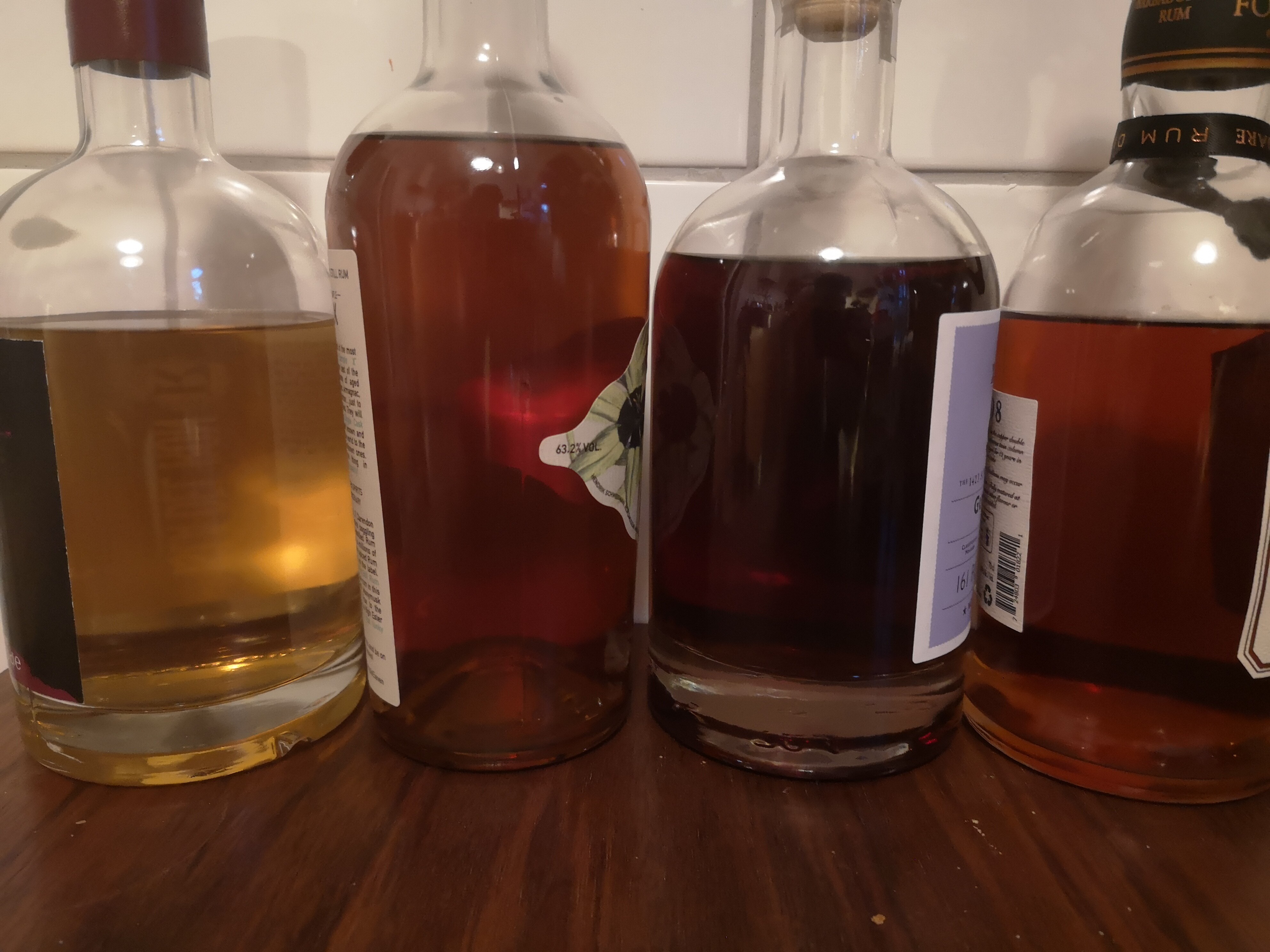
Rum’s color spectrum is wide and varied, encompassing everything from translucent white to rich amber, deep gold, and opaque dark brown. This visual diversity stems primarily from the production process, specifically aging and filtration, and critically, the brand’s decision to employ these processes in specific ways. From a branding perspective, each shade represents a distinct opportunity to position the product within the market, dictating its perceived value, versatility, and even the occasions for which it is deemed most suitable.
White Rum: The Canvas of Mixology
Often clear and unaged, or charcoal-filtered to remove color acquired during minimal aging, white rum (also known as light or silver rum) projects an image of purity, versatility, and modernity. Brands strategically market white rum as the quintessential mixer, the foundational spirit for classic cocktails like mojitos, daiquiris, and piña coladas. Its lack of color allows it to seamlessly integrate into mixed drinks without altering their visual appeal, making it a favorite among bartenders and consumers seeking unadulterated cocktail experiences.
From a brand strategy perspective, clear rum’s transparency is its strength. Brands emphasize its crispness, smoothness, and the ability to let other flavors shine. Marketing campaigns for white rums frequently highlight vibrant, refreshing imagery, often featuring tropical settings and social gatherings, reinforcing its role as a key ingredient in celebratory moments. The branding often leans towards clean labels, minimalist designs, and an emphasis on the “spirit” of the cocktail rather than solely the rum itself, positioning it as an enabler of enjoyable experiences.
Gold Rum: The Bridge of Flavor
Gold rum, also known as amber rum, typically acquires its hue from aging in oak barrels, which imparts color, flavor, and smoothness. Some brands may also add caramel coloring to achieve a consistent or desired shade, a practice that, while common, requires careful brand messaging regarding authenticity and process transparency. This category occupies a crucial middle ground, offering more character and depth than white rum without the heavy complexity of darker varieties.
For brands, gold rum represents an opportunity to convey warmth, mellowness, and a subtle sophistication. It’s often positioned as a stepping stone for those moving beyond white rum cocktails, offering a fuller body that can be enjoyed neat, on the rocks, or in more complex cocktails that benefit from its added dimension. Marketing for gold rums frequently uses imagery of golden sunsets, aged wood, and a sense of relaxed indulgence, appealing to consumers seeking a rum that offers both mixability and a discernible taste profile. The branding tends to strike a balance between approachability and a hint of refined elegance, suggesting a product with a bit more story and depth.
Dark Rum: The Emblem of Heritage and Complexity
Dark rums, encompassing brown, black, and spiced varieties, derive their deep colors from extended aging in heavily charred oak barrels, or through the addition of molasses or caramel for both color and flavor. This category is rich in history and often carries an aura of tradition, complexity, and premium quality.
Brands leveraging dark rum often focus on heritage, craftsmanship, and a narrative of time-honored distillation. The deep color visually communicates richness and intensity, suggesting a more robust flavor profile suitable for sipping neat or in spirit-forward cocktails. Marketing campaigns for dark rums frequently feature imagery of ancient distilleries, skilled artisans, and sophisticated settings, appealing to connoisseurs and those who appreciate a rum with a profound depth of character. The branding associated with dark rums typically employs darker labels, ornate bottle designs, and sophisticated typography, all reinforcing a premium, often masculine, and authoritative presence.
Furthermore, spiced rums, which fall under the dark rum umbrella, use their color and flavor additions to carve out a distinct niche. Brands like Captain Morgan have built empires by emphasizing adventure, boldness, and a unique flavor profile, using the dark, rich color as a visual cue for the intensity and warmth within.
Color as a Core Branding Element: Shaping Perception and Expectation
The color of rum is far more than an aesthetic attribute; it is a fundamental component of its brand identity, meticulously managed to influence consumer psychology, perceived quality, and market positioning. In a crowded marketplace, visual cues like color are immediate communicators of a brand’s essence and promise.

Perceived Quality and Value
There’s a strong psychological association between darker colors and perceived age, depth, and premium quality, especially in spirits. A rich, amber hue in a dark rum can instantly suggest prolonged aging and complex flavor development, allowing brands to justify higher price points and position their product as a luxury item. Conversely, the clarity of white rum, while implying purity, aligns with its role as a versatile mixer, often at a more accessible price point. Brands expertly manipulate these perceptions to align with their desired market segment, using color as a non-verbal cue for value and craftsmanship.
Flavor Expectations
Color also primes consumers for certain flavor expectations. A clear rum implies a lighter, crisper taste, free from heavy barrel notes. A golden rum suggests warmth, vanilla, and subtle spice. A deep, dark rum prepares the palate for notes of molasses, caramel, oak, and perhaps dried fruit or robust spices. When a brand’s marketing consistently pairs a specific color with a particular flavor profile, it builds a cohesive sensory experience that reinforces brand recognition and loyalty. Discrepancies between expected color and actual taste can lead to consumer confusion or disappointment, highlighting the critical role of color consistency in brand messaging.
Target Audience and Usage Occasions
Brand strategists use rum color to segment their target audience and suggest appropriate usage. White rums are positioned for younger, more dynamic consumers focused on social mixing. Gold rums target those exploring more nuanced flavors but still value versatility. Dark rums appeal to mature, discerning drinkers who prioritize sipping and contemplation. Each color cues specific consumption rituals and social contexts, directly influencing how a brand’s product is integrated into a consumer’s lifestyle.
Design, Packaging, and the Visual Narrative of Rum
The bottle, label, and overall packaging design must seamlessly integrate with the rum’s color to tell a coherent brand story. This synergy is crucial for creating a memorable and compelling brand identity on the retail shelf.
Labeling and Typography
Brands carefully select label colors, finishes, and typography to complement the rum’s hue. For white rums, labels often feature bright colors, minimalist graphics, and modern fonts that reflect their fresh and contemporary image. Gold rums might use warmer tones, perhaps with a touch of metallic sheen, to convey richness and understated elegance. Dark rums typically employ deep, often ornate labels, perhaps with embossed textures and classic serifs, to underscore their heritage and premium status. The interplay between the liquid’s color and the packaging design creates a holistic visual narrative that reinforces the brand’s core message.
Bottle Shape and Material
The physical vessel itself plays a role. Clear glass bottles are standard, allowing the rum’s color to be the star. However, brands sometimes use tinted glass (e.g., green or brown) for certain dark rums to enhance a rustic or historic feel, even if it slightly obscures the exact shade. The shape of the bottle—whether sleek and modern for a white rum or stout and robust for a dark, aged variety—further communicates brand character and strengthens the visual identity.
The Evolution of Rum Color: Authenticity vs. Innovation in Branding
As consumer preferences evolve, so too do branding strategies around rum color. There’s a growing demand for transparency and authenticity, leading some brands to shy away from excessive caramel coloring and instead emphasize natural aging processes as the sole source of their rum’s hue. This commitment to natural color becomes a powerful brand narrative, appealing to consumers who value clean ingredients and traditional craftsmanship.
Conversely, the rise of craft distilleries and experimental rums is challenging traditional color expectations. Some brands are playing with unique barrel finishes (e.g., wine casks) that impart unusual colors and flavors, pushing the boundaries of what consumers expect from rum. In these cases, the brand’s innovation and storytelling around the unique process become paramount, allowing the color to be a consequence of artistry rather than a purely strategic choice for market positioning.
Ultimately, the question “what color is rum” is a gateway to understanding the deep strategic thought behind every successful rum brand. From the initial decision to age or filter, to the meticulous design of packaging and marketing campaigns, color serves as a silent but potent communicator of identity, quality, and promise. It is a testament to the power of visual branding, transforming a simple characteristic into a compelling narrative that resonates with consumers worldwide.
aViewFromTheCave is a participant in the Amazon Services LLC Associates Program, an affiliate advertising program designed to provide a means for sites to earn advertising fees by advertising and linking to Amazon.com. Amazon, the Amazon logo, AmazonSupply, and the AmazonSupply logo are trademarks of Amazon.com, Inc. or its affiliates. As an Amazon Associate we earn affiliate commissions from qualifying purchases.