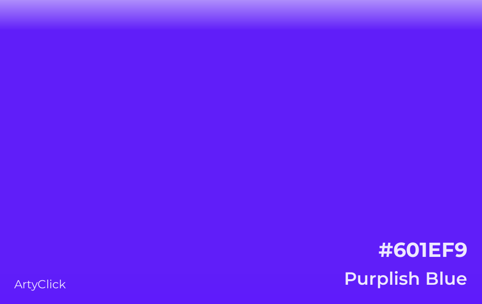
In the world of visual communication, color is rarely just a decorative choice. It is a psychological lever, a silent communicator, and a foundational pillar of brand equity. When we ask, “What color is purplish blue?” we are not merely identifying a coordinate on a color wheel; we are exploring a specific chromatic territory often referred to as Indigo, Violet-Blue, or the modern digital “Blurple.”
This unique intersection of the spectrum—where the unwavering stability of blue meets the creative luxury of purple—has become one of the most powerful tools in modern brand strategy. For organizations looking to differentiate themselves in saturated markets, understanding the nuance of purplish blue is essential for building a corporate identity that resonates with contemporary audiences.
Decoding the Science and Psychology of Purplish Blue
To understand purplish blue as a branding asset, we must first define its physical and emotional parameters. It sits between 435 and 450 nanometers on the visible light spectrum. In traditional color theory, it is a tertiary color, but in the psychological landscape of marketing, it represents a “bridge” between two distinct emotional states.
The Visual Spectrum and Color Theory
Purplish blue, or violet-blue, is categorized by its high energy and short wavelength. In the RGB (Red, Green, Blue) model used for digital screens, it is achieved by maximizing the blue channel while introducing a calculated percentage of red. In the world of print (CMYK), achieving a true purplish blue is notoriously difficult, often requiring a “spot color” like Pantone 2726 C to maintain its vibrancy. This technical complexity adds an inherent sense of “quality” and “deliberate design” to any brand that utilizes it effectively.
Emotional Resonance: Stability Meets Luxury
Blue is the color of the sky and the sea; it symbolizes trust, loyalty, and intelligence. Purple, historically the most expensive pigment to produce, symbolizes royalty, mystery, and innovation. When a brand adopts a purplish blue hue, it harvests the “Trust” of blue and the “Excellence” of purple. It suggests an organization that is as reliable as a legacy bank but as forward-thinking as a Silicon Valley startup. This makes it an ideal choice for brands that want to appear established yet disruptive.
Gender Neutrality and Modern Appeal
Historically, blue and purple have been subject to rigid gender marketing. However, the hybrid purplish blue escapes these tropes. It is perceived as modern, inclusive, and sophisticated. It lacks the “corporate coldness” of navy blue and avoids the “whimsical” associations of bright violet. This neutrality is a strategic advantage for global brands aiming to appeal to a diverse, Gen-Z and Millennial demographic that values fluidity and subverting traditional norms.
Implementing Purplish Blue in Corporate Identity
Choosing a color is the first step; implementing it across a cohesive brand ecosystem is where the real strategy begins. Purplish blue has become the “it” color for the digital-first era, specifically within the tech, fintech, and lifestyle sectors.
Case Study: The Tech Giant “Blurple”
One of the most famous applications of purplish blue is by the communication platform Discord. Their signature color, which they officially dubbed “Blurple,” was designed to stand out against the dark modes of gaming interfaces. In their recent rebranding, they adjusted the saturation of this purplish blue to make it more vibrant and accessible. By claiming a custom name for their color, Discord moved beyond simple aesthetics into “ownable” brand assets, ensuring that whenever a user sees that specific shade, they think of the platform.
FinTech and the Evolution of Trust
Traditional banking has long been dominated by “Banker Blue”—a conservative, dark navy. New-age fintech companies like Nubank and various crypto-exchanges have shifted the palette toward purplish blue. This shift signals a departure from the “old guard.” It tells the consumer: “We provide the security of a bank, but our technology is faster and more intuitive.” By moving just a few degrees toward the purple end of the spectrum, these brands visually distance themselves from legacy competitors while maintaining an aura of financial security.
Luxury and Exclusivity in Packaging
In the luxury sector, purplish blue is often used to denote “prestige.” Brands like Roku or high-end cosmetics use deep indigo shades to create a sense of depth and quality. Because purplish blue is a “receding” color (it appears further away to the human eye), it creates a sense of space and elegance on retail shelves. When paired with metallic foils or minimalist typography, it communicates a premium price point without the need for loud, aggressive marketing tactics.

Brand Strategy: Why Choose Purplish Blue Over Pure Blue?
In a “Blue Ocean” strategy, companies seek to create uncontested market space. Ironically, the literal “blue ocean” of branding is overcrowded. From Facebook to Ford, blue is the most common corporate color. Choosing a purplish blue is a calculated move to stand out while staying within the “safety” of the blue family.
Standing Out in a Saturated Market
If you look at an app drawer on a smartphone, you will likely see a sea of sky-blue and royal-blue icons. A purplish-blue icon immediately breaks the visual monotony. It creates a “pattern interrupt.” This micro-differentiation is crucial for brand recall. In a split-second decision-making environment, a color that is “blue but different” can be the deciding factor in user engagement.
Versatility Across Digital and Print Media
A significant challenge in brand strategy is maintaining consistency across different mediums. Purplish blue is particularly effective in digital environments because it pairs exceptionally well with “Dark Mode” UI. Unlike pure purple, which can lose its vibrancy on OLED screens, or pure blue, which can feel flat, purplish blue maintains its luminosity. Strategically, this allows a brand to look just as premium on a high-end smartphone as it does on a physical billboard.
Creating a Global Brand Language
Color meanings vary by culture, but purplish blue is one of the few colors with a globally positive or neutral connotation. In Western cultures, it leans toward wisdom; in Eastern cultures, it often represents immortality or high status. By adopting this hue, a brand minimizes the risk of cultural faux pas, making it a “safe” yet “bold” choice for companies with international ambitions.
Design Guidelines for Working with Violet-Blue Hues
To effectively leverage purplish blue, a brand must follow strict design guidelines to ensure the color remains an asset rather than a liability. Because this color is so sensitive to light and context, precision is mandatory.
Choosing the Right Hex Codes and Pantones
When defining a brand’s primary palette, designers should look for “Deep Periwinkle” or “Electric Indigo.”
- For Digital: Hex codes like #5865F2 (Discord Blurple) or #4B0082 (Indigo) are popular starting points.
- For Print: Utilizing Pantone 2736 C or 2728 C ensures the “purplish” element doesn’t turn into a muddy grey when printed on matte paper.
Complementary Color Palettes for High Impact
Purplish blue is most effective when paired with high-contrast accents.
- Monochromatic: Using lighter lavender shades creates a sophisticated, calming brand feel.
- Complimentary: Pairing it with a muted “Cyber Yellow” or “Coral” creates a high-energy, “pop” aesthetic common in creative industries.
- Analogous: Mixing it with deep teals or soft violets creates a harmonious, professional look suitable for healthcare or consultancy brands.
Accessibility and Readability in User Experience
From a UX (User Experience) perspective, purplish blue offers excellent contrast ratios for white text, which is vital for ADA compliance and general readability. However, designers must be careful not to use it as a background for black text, as the low light-reflectance of the color can cause eye strain. A professional brand guide will always specify the “Minimum Contrast Ratio” for its primary purplish blue to ensure the brand remains accessible to all users.

Conclusion: The Future of the Purplish Blue Aesthetic
As we move deeper into an era defined by AI, virtual reality, and digital-first interactions, the colors we choose to represent our brands must evolve. Purplish blue is more than just a trend; it is the color of the “digital twilight”—the space where technology and human creativity meet.
By answering the question “What color is purplish blue?” through the lens of brand strategy, we see a hue that offers the perfect balance of authority and innovation. It is a color that commands respect while inviting curiosity. For the modern brand, adopting this sophisticated palette is a clear signal of maturity, technical prowess, and a deep understanding of the psychological nuances that drive consumer behavior in the 21st century. Whether it is called Indigo, Blurple, or Violet-Blue, this color remains a cornerstone of strategic design for those who wish to lead the market rather than follow it.
aViewFromTheCave is a participant in the Amazon Services LLC Associates Program, an affiliate advertising program designed to provide a means for sites to earn advertising fees by advertising and linking to Amazon.com. Amazon, the Amazon logo, AmazonSupply, and the AmazonSupply logo are trademarks of Amazon.com, Inc. or its affiliates. As an Amazon Associate we earn affiliate commissions from qualifying purchases.