
In the world of professional brand strategy, color is never a mere aesthetic choice. It is a psychological trigger, a silent communicator of values, and a powerful driver of consumer behavior. When we ask, “What color is October?” we are not simply inquiring about the changing leaves or the onset of autumn. We are examining how brands leverage a specific visual vocabulary to navigate the transition from the high-energy vibrancy of summer to the high-stakes commercial urgency of the fourth quarter.
October represents a pivotal moment in the branding lifecycle. It is a month of duality—balancing the grounded, earthy reliability of harvest themes with the high-contrast, energetic signals of seasonal events. For a brand, mastering the “color” of October means understanding how to pivot visual identities to resonate with a consumer base that is shifting from an outward-looking, social summer mindset to an inward-looking, comfort-seeking, and celebratory psychological state.

The Psychology of Autumnal Tones in Brand Strategy
The primary palette of October is dominated by a specific spectrum: burnt oranges, deep russets, golden yellows, and forest greens. While these colors occur naturally in the environment, their use in corporate identity and marketing materials is deeply rooted in evolutionary and color psychology.
The Transition from Summer Vibrancy to Harvest Warmth
During the summer months, brands often utilize high-saturation primary colors—bright blues, neon pinks, and vivid yellows—to mirror the energy of outdoor activities and social expansion. As October arrives, a strategic shift occurs toward desaturated and earthy tones. This transition signals “maturation.” In branding, these colors evoke feelings of harvest and abundance. For a consumer, this translates to a sense of reward and fulfillment.
A brand that successfully adopts these warmer tones in its October collateral creates an immediate sense of approachability and comfort. This is particularly effective for lifestyle brands, food and beverage companies, and home-goods retailers. By aligning their visual palette with the natural seasonal cycle, they tap into the “cozy economy,” where consumers are more likely to spend on products that promise comfort, security, and a sense of “home.”
Evoking Trust and Stability through Earth Tones
Beyond the superficial association with autumn leaves, the browns and deep oranges of October serve a structural purpose in brand strategy. Brown, often a difficult color to master in modern digital branding, represents stability, reliability, and organic roots. In an era of rapid digital transformation, the use of these “grounded” colors in October provides a psychological anchor.
When a brand integrates deep amber or sienna into its visual identity during this period, it communicates a message of heritage and longevity. It suggests that the brand is not a fleeting trend but a permanent fixture in the customer’s life. This is a critical move as companies prepare for the year-end rush; establishing trust in October ensures that the brand remains the top choice when the high-intensity purchasing window of November and December opens.
Visual Identity and the “Scarcity” Factor
October branding is unique because it is inherently ephemeral. The visual language used during this month is often tied to “limited-time offers” and seasonal exclusivity. This creates a powerful psychological mechanism: the scarcity factor.
Why Limited-Time Aesthetics Drive Consumer Action
The “October aesthetic”—often characterized by high-contrast palettes and rustic textures—acts as a visual shorthand for urgency. Consumers have been conditioned to recognize that when a brand’s website or packaging shifts to autumnal hues, the associated products or deals are temporary.
This visual pivot allows brands to experiment with their identity without a permanent overhaul. By adopting a “seasonal brand kit,” a company can refresh its look, re-engage stagnant audiences, and drive short-term sales through the “Fear Of Missing Out” (FOMO). The color October, in this context, is the color of a ticking clock. It signals the last chance for “fall flavors” or “autumn collections” before the market is saturated with the red and green of the winter holiday season.
Case Study: The Pumpkin Spice Phenomenon as a Visual Prompt
While many view the “pumpkin spice” trend through the lens of flavor, it is arguably the greatest branding triumph of the 21st century. The success of this trend is driven by a specific visual identity: a recognizable shade of orange-gold that has become synonymous with October.
Brands across every industry—from automotive to tech—have learned to mimic this palette to capture the same emotional resonance. The color acts as a cultural touchstone. When a consumer sees that specific October orange, their brain pre-processes feelings of nostalgia, warmth, and seasonal indulgence. For a brand strategist, this means that the “color” of October is not just a hue; it is a multi-sensory brand experience that can be leveraged to increase perceived value and emotional connection.
Beyond Orange: The Multifaceted Meanings of the October Spectrum
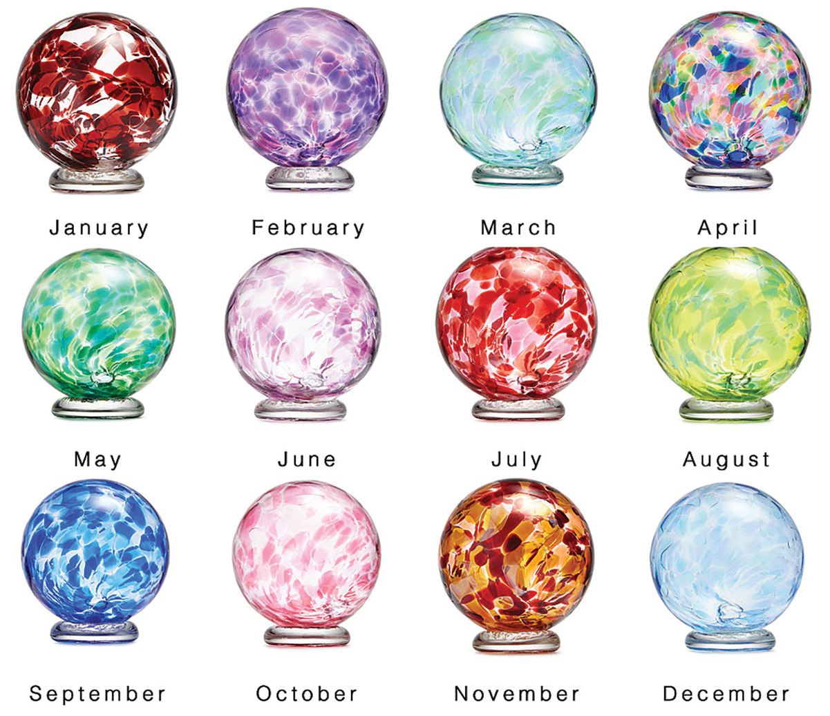
While orange and brown are the traditional protagonists of October branding, the month also hosts significant shifts in corporate identity that utilize a completely different part of the spectrum. To truly understand what color October is, one must look at the strategic use of pink and the encroaching influence of luxury blacks.
The “Pink October” Impact: Corporate Social Responsibility and Brand Alignment
October is internationally recognized as Breast Cancer Awareness Month, and for many brands, the color of October is strictly pink. This is a profound example of “cause branding.” When a corporation adopts pink in its logo or marketing materials during October, it is signaling its values and commitment to social responsibility.
However, the strategy here is delicate. Authenticity is paramount. Brands that simply “pink-wash” their identity without substantive action risk alienating savvy consumers. For a brand strategist, Pink October represents a time to align the company’s visual identity with a global movement, humanizing the brand and building equity through shared social goals. The color pink in October transforms the brand from a profit-seeking entity into a participant in a larger human story.
Black and Gold: Leveraging Luxury in Pre-Holiday Marketing
As October progresses toward its end, we see the introduction of “midnight” palettes—deep blacks, charcoal greys, and metallic golds. This shift serves two purposes. First, it acknowledges the festive, “spooky” elements of Halloween, which allows brands to play with high-contrast, edgy visual identities that wouldn’t work during the rest of the year.
Second, it sets the stage for the luxury and premium positioning required for the winter gift-giving season. Black and gold are the colors of prestige and exclusivity. By introducing these tones in late October, brands begin to “elevate” their status in the consumer’s mind. They are moving away from the “cozy” earthiness of early autumn and toward the “glamour” of the year-end celebrations. This transition is essential for high-end retailers and tech brands looking to position themselves as premium holiday gifts.
Implementing a Seasonal Pivot in Digital and Personal Branding
For brand managers and individual creators, knowing what color October is remains only half the battle. The real challenge lies in the implementation of these seasonal shifts across digital platforms without diluting core brand recognition.
Dynamic Logo Adjustments and Social Media Cohesion
A successful October brand strategy involves subtle, rather than jarring, changes. This might include adding a seasonal accent color to a website’s call-to-action buttons or updating social media templates to include autumnal textures like wood grain or matte finishes.
The goal is “cohesion.” A brand’s Instagram feed in October should feel like a curated experience that reflects the current cultural mood. This creates a sense of “nowness.” Brands that remain static in their visual identity throughout the year risk appearing out of touch or automated. By injecting the colors of October into their digital presence, they demonstrate that there is a human element behind the brand—one that is experiencing the same change in seasons as the audience.
Content Strategy: Matching the Tone to the Palette
The visual colors of October must be matched by a shift in brand voice. If the color of the month is “warm and grounded,” the copy must follow suit. This is the time for brands to use language that emphasizes community, reflection, and preparation.
A tech company, for example, might shift its visual palette to deep blues and oranges while pivoting its content to focus on “security for the season ahead” or “tools for a productive autumn.” This alignment between visual cues and messaging is what creates a truly immersive brand experience. When the “look” and the “feel” match, consumer trust is strengthened.
Future-Proofing the Seasonal Aesthetic
As we look toward the future of branding, the “color of October” is being influenced by data-driven insights and AI-augmented design. Brand strategists are no longer guessing which shades will resonate; they are using sentiment analysis to determine the exact hex codes that evoke the desired emotional response in specific demographics.
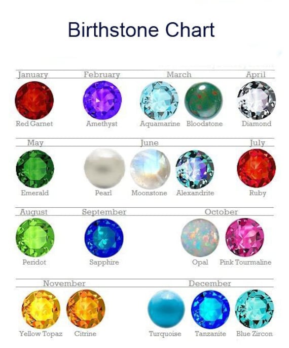
Data-Driven Color Selection for Q4 Success
In the modern market, the choice between a burnt orange and a muted terracotta is backed by performance data. Companies are A/B testing seasonal landing pages to see which “October color” yields higher conversion rates. Interestingly, data often shows that “unexpected” autumnal colors—such as a deep plum or a dusty teal—can sometimes outperform traditional oranges by standing out in a crowded, homogeneous market.
This evolution suggests that while the essence of October remains rooted in warmth and transition, the strategic application of its colors is becoming more sophisticated. The brand strategist of today asks not just “What color is October?” but “Which specific shade of October will drive the most engagement for my target audience this year?”
Ultimately, October is a month of strategic transformation. It is the bridge between the vibrant activity of the past and the commercial intensity of the future. By mastering the autumnal palette, brands can anchor themselves in the hearts and minds of consumers, providing a sense of stability, warmth, and excitement during one of the most important months of the fiscal year. Whether it is the grounded reliability of harvest brown, the urgent energy of pumpkin orange, or the purposeful advocacy of awareness pink, the color of October is the color of connection.
aViewFromTheCave is a participant in the Amazon Services LLC Associates Program, an affiliate advertising program designed to provide a means for sites to earn advertising fees by advertising and linking to Amazon.com. Amazon, the Amazon logo, AmazonSupply, and the AmazonSupply logo are trademarks of Amazon.com, Inc. or its affiliates. As an Amazon Associate we earn affiliate commissions from qualifying purchases.