
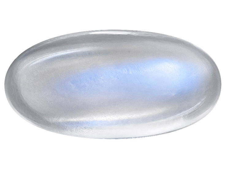
In the landscape of modern brand strategy and visual identity, the question “What color is moonstone?” transcends simple mineralogy. For designers, creative directors, and brand strategists, moonstone represents a sophisticated spectrum of light, a psychological anchor, and a versatile tool for high-end positioning. While a geologist might describe it as a sodium potassium aluminum silicate, a brand architect sees it as a fluid palette of iridescent whites, soft blues, and ethereal grays that signal luxury, innovation, and trust.
Understanding the “color” of moonstone requires looking beyond a single hex code. It is an optical phenomenon known as adularescence—the way light scatters across the internal structures of a stone. In branding, this translates to a multi-dimensional color system that moves and breathes. This article explores how this unique palette is leveraged in corporate identity, the psychology behind its use, and why it has become the hallmark of the “quiet luxury” movement in the digital age.

The Visual Language of Moonstone in Brand Identity
When a brand adopts a moonstone-inspired palette, it is rarely committing to a flat, static color. Instead, it is embracing a gradient-centric design philosophy. The base of the moonstone palette is typically a high-value, low-saturation gray or a “near-white.” However, what defines it are the secondary undertones: pearlescent blues, muted violets, and silver highlights.
The Shift Toward Desaturated Luster
In the early 2010s, branding was dominated by “flat design” and high-contrast, “electric” primary colors (think of the bold blues and reds of early app icons). As the market reached saturation with these aggressive tones, high-end brands began retreating into more nuanced territory. Moonstone emerged as the perfect middle ground. It offers more depth than a sterile clinical white, yet remains more approachable than a cold, industrial slate.
From a technical standpoint, the moonstone palette often oscillates between Hex codes like #F4F7F9 (a misty, breathable white) and #BCD4E6 (a soft, atmospheric blue). By utilizing these shades, brands create a sense of “luminosity from within.” This is particularly effective for premium skincare, high-tech hardware, and fintech platforms that want to appear “weightless” and sophisticated.
Materiality and Physical Branding
For physical products, the color of moonstone is achieved through finishes rather than pigments. In corporate identity packaging, this involves the use of holographic foils, matte lamination with spot-UV, and metallic inks. When a consumer holds a moonstone-inspired package, the color shifts as they move it—this interaction creates a tactile engagement that a standard matte black or glossy red cannot replicate. It signals that the brand is multi-faceted and worth a closer look.
Psychological Impact and Consumer Perception
The choice of color in branding is never purely aesthetic; it is a psychological maneuver designed to bypass logic and trigger an emotional response. Moonstone occupies a unique psychological space because it blends the reliability of blue with the purity of white and the wisdom of silver.
Trust Through Serenity
In sectors such as wealth management or digital security, the color of moonstone is used to project calm. Unlike bright “safety” yellows or aggressive “urgent” reds, the moonstone palette suggests that the brand is in control. It communicates a lack of friction. When a user opens a financial app and sees a moonstone-tinted dashboard, the psychological suggestion is one of clarity and transparency. It feels “clean” but not “empty.”
The Aura of Innovation
There is an inherent “futurism” associated with the moonstone spectrum. It evokes images of clean labs, space-age materials, and celestial bodies. For tech startups, using moonstone-inspired gradients signals that they are at the “leading edge.” It suggests a brand that is forward-thinking and visionary. This “ethereal” quality helps a brand stand out in a sea of “corporate blue,” offering something that feels more human, more organic, and yet more advanced.
Mystery and Exclusivity
Because moonstone is naturally rare and visually complex, its color palette carries a subtext of exclusivity. In the “Brand Niche,” we call this “The Lure of the Rare.” By avoiding standard primary colors, a brand signals that it is not for everyone. It targets a sophisticated consumer who appreciates subtlety over shouting. It is the visual equivalent of a whisper in a room full of people screaming for attention.
Implementing Moonstone in Modern Design Systems

Integrating a moonstone palette into a brand’s design system requires a delicate touch. Because the color is so dependent on light and gradient, it can easily get lost or appear “muddy” if not executed with precision.
UI/UX and Digital Surfaces
In digital design, the moonstone palette is often used to create a “glassmorphism” effect. This involves using semi-transparent layers, background blurs, and subtle inner shadows to mimic the look of etched glass or moonstone gems.
- Accessibility: One challenge with the moonstone palette is maintaining a high enough contrast ratio for accessibility. Designers must be careful to use dark, “obsidian” grays or deep “midnight” blues for typography to ensure readability against the light, shimmering backgrounds.
- Motion Design: Moonstone colors truly come alive in motion. Subtle “shimmer” animations on buttons or loading states can replicate the adularescence of the stone, providing a high-end feel to the user interface.
Typography and Hierarchy
When the primary brand color is as soft as moonstone, typography must provide the structural “weight.” Modern brands often pair the moonstone palette with bold, high-contrast serifs or ultra-clean geometric sans-serifs. The color of the type is rarely true black; instead, it is a “soft charcoal” or a “deep navy” that complements the cool undertones of the moonstone. This creates a hierarchy where the color provides the atmosphere, while the typography provides the authority.
The Role of Secondary Accents
A moonstone brand identity often requires “anchor colors” to prevent it from floating away into total abstraction. These are typically chosen from the opposite side of the color wheel to provide a pop of energy. A muted “sunset orange” or a “soft gold” can act as a perfect foil to the cool moonstone base, representing the sun hitting the moon. These accents are used sparingly for Calls to Action (CTAs) or signature brand elements.
Case Studies: Brands That Own the Ethereal Palette
Several industry leaders have successfully occupied the “moonstone” space, using it to define their market position and differentiate themselves from competitors.
The Tech Giant’s Minimalist Evolution
Consider a leading smartphone manufacturer that moves away from pure silver toward a “pearl” or “starlight” finish. This isn’t just a hardware choice; it is a brand statement. By shifting the color towards a moonstone-like iridescence, they soften the coldness of the technology. The device becomes less of a tool and more of a lifestyle accessory. It feels more personal, more premium, and more timeless.
The Wellness and Beauty Sector
In the prestige beauty market, brands have moved away from the “pharmacy white” of the 1990s. Today, top-tier skincare brands use moonstone palettes to signify “luminous skin.” The packaging itself mimics the glow that the product promises to deliver. This creates a visual promise—a “halo effect”—where the consumer associates the shimmering, healthy look of the bottle with the expected results on their own face.
Fintech and the New Guard
Traditional banks are often associated with “Navy Blue” and “Deep Green”—colors of old-world stability. New fintech “neobanks,” however, frequently adopt moonstone-adjacent palettes. By using soft, glowing grays and iridescent highlights, they signal that they are a “lighter,” faster, and more transparent alternative to the heavy, opaque institutions of the past.
Strategic Integration: Moving Beyond the Hex Code
To truly master the color of moonstone in brand strategy, one must understand that it is a philosophy of light and space. It is not enough to simply pick a color; a brand must embody the qualities that the color represents.
Consistency Across Touchpoints
A moonstone strategy fails if it is only present on the website. It must carry through to the environmental design (lighting in retail spaces), the social media aesthetic (using filters that enhance cool tones and soft highlights), and even the brand’s voice. A “moonstone” brand speaks with clarity, elegance, and a touch of mystery. It does not use “salesy” language or loud, cluttered layouts.
The Future of Moonstone in Design
As we move further into an era of VR and AR (the Metaverse), the moonstone palette is likely to become even more prominent. In 3D digital environments, the way light interacts with surfaces is the primary way we perceive quality. The “shimmer” and “glow” of moonstone are perfectly suited for these virtual spaces, where static colors often feel dead or artificial.
Conclusion: The Timelessness of Luster
In the end, what color is moonstone? It is the color of transition, of light through a veil, and of sophisticated balance. For a brand, it is a strategic choice to be perceived as both grounded and visionary. It is a commitment to quality that doesn’t need to shout to be heard. By mastering this elusive palette, brands can create a visual identity that is as enduring and captivating as the gemstone itself, ensuring they remain relevant in an ever-shifting market landscape.
aViewFromTheCave is a participant in the Amazon Services LLC Associates Program, an affiliate advertising program designed to provide a means for sites to earn advertising fees by advertising and linking to Amazon.com. Amazon, the Amazon logo, AmazonSupply, and the AmazonSupply logo are trademarks of Amazon.com, Inc. or its affiliates. As an Amazon Associate we earn affiliate commissions from qualifying purchases.