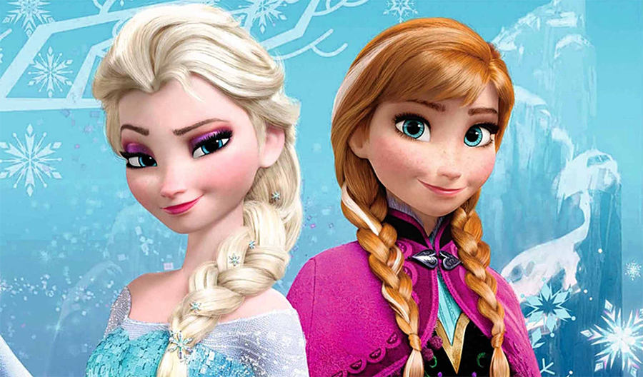
In the landscape of modern media, few visual assets are as instantly recognizable or as financially potent as the specific shade of Elsa’s hair from Disney’s Frozen franchise. To a casual viewer, the answer to the question “what color is Elsa’s hair?” might seem straightforward: it is platinum blonde, or perhaps a snowy white. However, from the perspective of brand strategy and corporate identity, that specific hue is a calculated masterpiece of visual marketing.
Elsa’s hair color is not merely an aesthetic choice; it is a core component of a multi-billion dollar brand identity. It represents a departure from traditional character palettes and serves as a linchpin for global merchandising, consumer recognition, and the psychological positioning of the Frozen brand. By analyzing the strategic intent behind this color choice, we can uncover how Disney utilizes visual design to dominate the global marketplace.

The Psychology of Platinum: Why Elsa’s Hair Color is a Masterclass in Visual Branding
Color psychology is a fundamental pillar of brand strategy. When Disney’s design team moved away from the traditional “honey blonde” of the Cinderella era or the “sun-kissed” tones of Rapunzel, they were making a deliberate move to differentiate Elsa within a crowded marketplace. The transition to a nearly-white, platinum blonde serves several strategic functions.
Transcending Traditional Character Design
Historically, Disney princesses utilized primary colors and warm tones to convey relatability and warmth. Elsa, however, was designed to be an “outsider” hero—a character defined by her power, her isolation, and eventually, her self-actualization. The choice of platinum hair serves as a visual shorthand for these traits. In branding, white and silver-toned blondes suggest sophistication, modernity, and a touch of the ethereal. By choosing this specific palette, the brand moved Elsa away from the “girl next door” archetype and positioned her as a “regal force of nature.” This distinction is vital for brand positioning, as it allowed Elsa to occupy a unique niche that appeals to a broader demographic, including older children and adults who gravitate toward more “chic” or high-fashion aesthetics.
The Power of the “Ice Queen” Aesthetic in Market Differentiation
In a saturated market, differentiation is the key to longevity. Elsa’s hair color works in tandem with her “ice blue” dress to create a cohesive brand package. This palette—cool, crisp, and high-contrast—functions as a visual trademark. When a consumer sees that specific combination of platinum and cerulean, their brain immediately registers “Frozen,” even in the absence of a logo. This is the pinnacle of brand identity: when a color palette alone can trigger brand recall. For Disney, this color strategy ensured that Frozen stood out against the warmer, more organic palettes of preceding films like Brave or Tangled, carving out a distinct visual “territory” in the consumer’s mind.
Consistency is King: How Disney Manages Global Brand Identity Across Mediums
A brand is only as strong as its consistency. For a global entity like Disney, ensuring that “Elsa’s hair color” looks exactly the same on a cinematic screen in Tokyo as it does on a cereal box in London is a monumental logistical challenge. This falls under the discipline of corporate identity management.
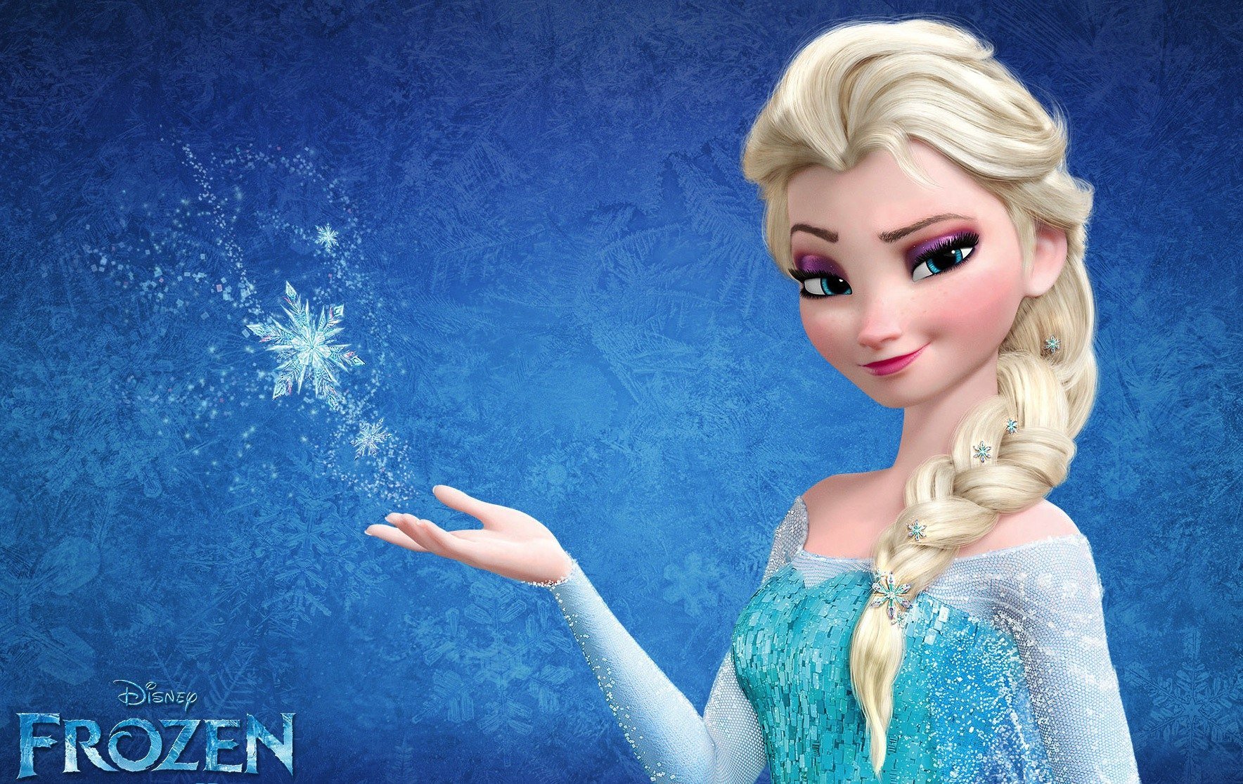
The “Ice Blonde” HEX Code: Maintaining Integrity from Screen to Theme Park
To maintain the integrity of the Elsa brand, Disney utilizes strict style guides. These guides define the exact color values for Elsa’s hair across various mediums. In digital animation, this involves complex lighting shaders that account for how “ice blonde” reacts to different environments. In the world of physical branding—print, textiles, and plastics—this requires precise Pantone matching. If the hair color on a doll shifts too far toward yellow, the brand loses its “icy” premium feel and begins to look like a generic toy. By maintaining a rigorous standard for this specific shade, Disney reinforces the brand’s premium status, ensuring that every touchpoint with the consumer feels authentic to the original intellectual property.
Visual Continuity as a Trust Signal for Consumers
Consistency in branding builds trust. When parents purchase Elsa-themed products, they are looking for a specific “promise” of quality and character accuracy. The hair color is often the first thing a child notices. If the color is off, the “magic” of the brand is broken. This is why brand managers obsess over the “whiteness” of Elsa’s hair in her transformed state. It is a visual signal of her “Let It Go” moment—a pivotal brand beat. By ensuring visual continuity from the movie to the theme park character performers to the digital avatars in video games, Disney creates a seamless brand universe that encourages long-term consumer loyalty.
From Screen to Shelf: The Impact of Color Selection on Merchandising and Retail Success
The question “what color is Elsa’s hair?” has massive implications for the manufacturing and retail sectors. Color choice is a driving factor in supply chain management and retail visibility. Elsa’s hair color was designed with the “shelf” in mind just as much as the “screen.”
The “Toy-Friendly” Palette: Designing for the Manufacturing Process
From a design perspective, Elsa’s platinum hair provides a high-contrast background for her facial features, which is essential for toy manufacturing. High-contrast designs translate better to small-scale plastic molding and painted details. Furthermore, the “cool” palette of Elsa’s hair and wardrobe allows for the use of iridescent and glitter-infused materials in merchandise. These materials have a high “perceived value” among the target demographic of young children. The branding strategy here is brilliant: by choosing a hair color that mimics ice and snow, Disney unlocked an entire category of “sparkle” and “shimmer” product finishes that have driven billions of dollars in sales.
Leveraging Visual Cues to Dominate the Global Licensing Market
Licensing is where the Frozen brand truly shows its financial might. When third-party manufacturers (from apparel companies to stationery brands) license the Elsa character, they are essentially buying the rights to use her specific visual identity. The platinum hair is a “distinctive asset” that makes licensing easy. It is easy to replicate across different materials while remaining recognizable. Because the color is so specific—a “cool” white-blonde rather than a “warm” yellow-blonde—it prevents “brand bleed,” where the character might be confused with other blonde characters in the market. This clarity of identity makes the Frozen license one of the most valuable assets in the Disney portfolio.
Rebranding the Heroine: How Elsa Shifted the Disney Corporate Identity
Elsa’s design, centered around her unique hair color, represented a pivotal shift in how Disney approaches its corporate identity for female leads. This was a strategic “rebranding” of the Disney Princess line to reflect modern sensibilities.
Breaking the “Golden Age” Blonde Trope
For decades, the “Disney Blonde” was a very specific, golden-yellow shade. This was a legacy of the 1930s-1950s animation style. By introducing a platinum-haired lead, Disney signaled a move toward a more contemporary, “high-fantasy” aesthetic. This shift allowed the brand to pivot away from traditional fairy tale tropes and toward a more “superhero-adjacent” identity. Elsa isn’t just a princess; she is a queen with elemental powers. Her hair color—cold, powerful, and stark—reflects this “power branding.” This has allowed Disney to market Frozen not just as a “princess movie,” but as an epic fantasy franchise, significantly expanding its market reach.
Future-Proofing Brand Assets through Distinctive Visual Markers
In the digital age, brand assets must be “thumb-stopping.” On social media and digital storefronts, a character must be identifiable in a fraction of a second. Elsa’s hair, often styled in a thick, voluminous braid of that specific icy hue, is a “shape and color” combination that functions like a logo. Even a silhouette of Elsa’s hair is enough to communicate the brand. This level of distinctive visual marking is the goal of every major corporate identity project. By creating a character whose primary identifier is a unique color-and-shape combination, Disney has future-proofed the brand, ensuring it remains effective in everything from low-resolution mobile icons to high-definition 8K displays.
Conclusion: The Strategic Value of a Single Shade
In conclusion, when we ask “what color is Elsa’s hair?”, we are not just discussing a detail of character design; we are discussing a multi-faceted branding strategy. The platinum-white hue of Elsa’s hair is a deliberate choice that serves to differentiate the brand, maintain global consistency, drive merchandise sales, and modernize Disney’s corporate identity.
It is a reminder that in the world of global brands, no detail is accidental. Every pixel and every pigment is a strategic asset designed to evoke emotion, trigger recognition, and ultimately, build a lasting legacy. Elsa’s hair is the “gold standard” of visual branding—ironically, by being the most iconic “non-gold” blonde in cinematic history. Through this specific color choice, Disney didn’t just create a character; they created a visual icon that continues to define the pinnacle of brand strategy in the entertainment industry.
aViewFromTheCave is a participant in the Amazon Services LLC Associates Program, an affiliate advertising program designed to provide a means for sites to earn advertising fees by advertising and linking to Amazon.com. Amazon, the Amazon logo, AmazonSupply, and the AmazonSupply logo are trademarks of Amazon.com, Inc. or its affiliates. As an Amazon Associate we earn affiliate commissions from qualifying purchases.