
Dusty blue is more than just a shade; it’s a sophisticated hue that has carved out a significant niche in branding, design, and marketing strategies. While seemingly straightforward, its elusive nature and inherent elegance make it a powerful tool for brands seeking to convey specific messages and establish a distinct corporate identity. Understanding what dusty blue truly is, from a brand perspective, involves delving into its precise characteristics, psychological impact, and strategic applications across various industries.
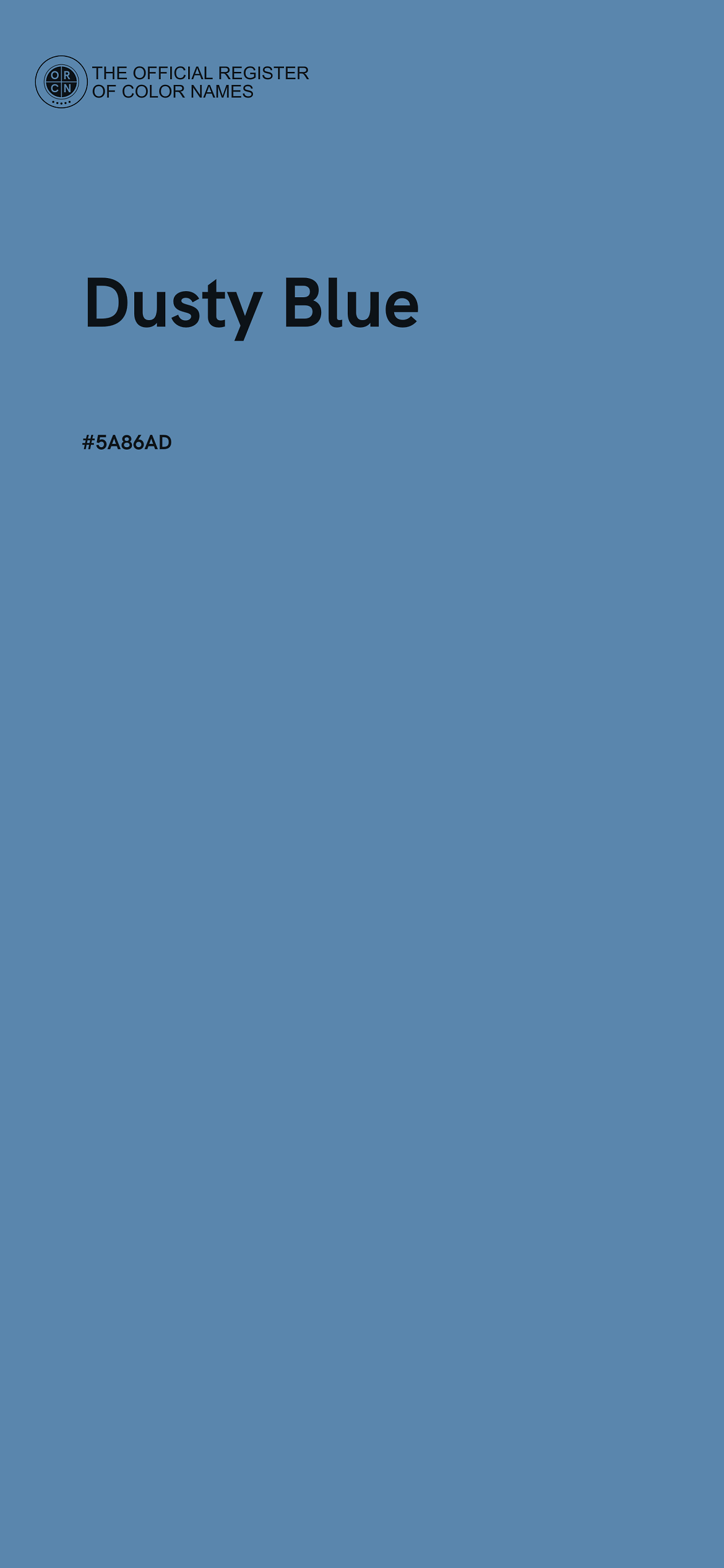
At its core, dusty blue can be described as a muted, desaturated shade of blue, often infused with hints of grey or even a subtle touch of purple. Unlike vibrant or primary blues, dusty blue carries an understated quality, a softness that evokes a sense of calm, nostalgia, and understated luxury. It’s a color that speaks volumes without shouting, making it an invaluable asset for brands aiming for subtlety, timelessness, and broad appeal. Its exact hexadecimal or RGB values can vary, demonstrating its versatility, but its defining characteristic remains its subdued, almost hazy finish, reminiscent of a clear blue sky seen through a fine mist or a well-loved pair of denim jeans.

Defining Dusty Blue in the Brand Landscape
The perception and application of dusty blue within brand strategy hinge on a nuanced understanding of its visual components and the psychological associations it naturally triggers. For designers and marketers, pinning down “what color is dusty blue” means understanding its spectrum and its inherent emotional resonance.
The Nuance of the Shade
Dusty blue sits on a spectrum, not as a single, fixed point. It can lean cooler with more grey, or slightly warmer with hints of periwinkle. This flexibility is a significant advantage for brands. A brand looking to convey robust professionalism might opt for a dustier, greyer blue, while a more ethereal or creative brand might choose a lighter, airier variant. The “dusty” component implies a softened, somewhat aged quality, which can translate into perceived authenticity and an established presence, even for nascent brands. This aged quality distinguishes it from bolder blues, which might connote modernity or aggression. In the context of corporate identity, this subtlety allows for broader acceptance and less visual fatigue compared to more intense colors.
Psychological Associations for Brands
Colors are potent psychological triggers, and dusty blue is particularly adept at eliciting specific emotional responses. For brands, these associations are critical for shaping consumer perception and fostering loyalty.
- Calm and Serenity: The muted nature of dusty blue has an inherent calming effect. It’s reminiscent of tranquil skies or peaceful waters, fostering a sense of peace and relaxation. Brands in wellness, hospitality, or even finance can leverage this to create an environment of trust and low stress.
- Trust and Reliability: Blue, in general, is strongly associated with trust and dependability. Dusty blue retains these qualities but tempers them with a touch of approachability. It suggests a steady, unwavering presence without being overly rigid or corporate. This makes it ideal for professional services, technology companies, and any brand that needs to project stability.
- Sophistication and Elegance: The subdued tone of dusty blue imparts an air of sophistication. It feels premium and thoughtful without being ostentatious. This makes it a favored choice for luxury brands, high-end fashion, interior design, and brands that pride themselves on quality and refined taste.
- Nostalgia and Authenticity: The “dusty” aspect can evoke a sense of history, authenticity, and comfort. It doesn’t scream “new and flashy” but rather “tried and true.” Brands looking to connect with consumers on a deeper, more emotional level, perhaps through a story of heritage or craftsmanship, find dusty blue to be an excellent ally.
Strategic Application in Corporate Identity and Marketing
Deploying dusty blue effectively requires strategic forethought, considering its versatility across various brand touchpoints and its synergy with other colors. Its power lies not just in its individual hue but in how it interacts within a larger brand system.
Evoking Trust and Serenity
In corporate identity, dusty blue excels at building a foundation of trust. Financial institutions, healthcare providers, and technology firms often gravitate towards blue palettes because of its inherent reliability. Dusty blue refines this by adding a layer of approachability and calm. A logo rendered in dusty blue, or a website featuring it as a primary background, immediately conveys a sense of stability and reassurance. This is crucial for brands where consumer confidence is paramount. The lack of harshness in dusty blue means it’s less likely to overwhelm or create visual fatigue, making it suitable for long-term brand engagement through extensive content or user interfaces.
Versatility Across Industries
The adaptability of dusty blue allows it to transcend industry boundaries, albeit with slightly different interpretations and pairings.
- Fashion & Apparel: Signifies timeless elegance, comfort, and understated luxury. Often paired with neutrals like cream, grey, or even subtle metallics.
- Home & Interior Design: Creates serene, sophisticated, and inviting spaces. Works well with natural textures, wood, and warm whites.
- Technology & SaaS: Conveys innovation, reliability, and user-friendliness without being cold or overly sterile. Often paired with clean whites, brighter accent colors for calls to action, or deep charcoals.
- Wellness & Lifestyle: Promotes tranquility, health, and mindful living. Complements earthy tones, soft greens, and natural textures.
- Luxury & Premium Brands: Imparts exclusivity, quality, and refined taste. Often contrasted with gold, silver, or deep jewel tones.
This broad applicability demonstrates dusty blue’s strength as a primary or secondary brand color. It provides a stable base that can be accessorized and accented to fit a particular brand’s specific tone and market.
Pairing Dusty Blue for Brand Impact
No color exists in isolation within a brand’s palette. The strength of dusty blue is often amplified by its complementary and contrasting colors.
- With Neutrals (Cream, Beige, Grey, White): Creates a sophisticated, clean, and classic look. This pairing is excellent for luxury, professional services, and brands emphasizing minimalism and elegance. It allows dusty blue to be the primary calming agent.
- With Earth Tones (Terracotta, Olive Green, Rust): Evokes a natural, organic, and grounded feel. Ideal for eco-conscious brands, lifestyle products, or those emphasizing warmth and authenticity.
- With Metallics (Gold, Silver, Copper): Instantly elevates the brand to a premium or luxury status. Gold adds warmth and opulence, while silver enhances coolness and modernity. Perfect for high-end products, jewelry, or aspirational brands.
- With Soft Pinks or Corals: Introduces a touch of warmth and gentle contrast, creating a harmonious and approachable aesthetic. Popular in feminine branding, beauty, and lifestyle sectors.
- With Deep Navy or Charcoal: Adds depth and gravitas, reinforcing professionalism and stability. This creates a more traditional, corporate feel without being overly stark.
The judicious selection of complementary colors allows brands to fine-tune the emotional impact of dusty blue, steering it towards quiet professionalism, serene luxury, or comforting authenticity.
Design Considerations for a Dusty Blue Palette
Implementing dusty blue effectively across all brand touchpoints requires careful attention to design principles, ensuring consistency and impact regardless of the medium.
Digital vs. Print Representation
The challenge with any nuanced color like dusty blue lies in its accurate reproduction across different media. Digital screens (RGB) can render colors differently than print (CMYK), and environmental factors like screen calibration or paper stock can alter perception. For brands, this means establishing precise color codes (Hex, RGB, CMYK, Pantone) and ensuring strict adherence. A dusty blue that appears calming and sophisticated on a website might look flat or dull when printed on a business card if not managed correctly. Designers must calibrate carefully and conduct thorough proofing to maintain brand integrity across all visual assets, from digital ads to physical packaging.
Accessibility and Inclusivity
When using dusty blue, particularly as a background or text color, accessibility must be a primary concern. Its muted nature means it can sometimes lack sufficient contrast with lighter text or background elements, making it difficult for individuals with visual impairments to read. Brands committed to inclusivity must ensure that dusty blue, when used for text or interactive elements, meets WCAG (Web Content Accessibility Guidelines) contrast ratio standards. This might involve using a darker shade of dusty blue for text on a light background, or pairing it with a sufficiently contrasting accent color. Accessibility isn’t just a compliance issue; it’s a fundamental aspect of effective brand communication.
Maintaining Brand Consistency
Consistency is the cornerstone of strong branding, and dusty blue is no exception. Once a specific shade of dusty blue is chosen for a brand, it must be applied uniformly across all assets: logo, website, social media, marketing collateral, product packaging, and physical spaces. Any deviation can dilute brand recognition and confuse consumers. Brand style guides are essential documents that specify the exact color values, approved pairings, and usage rules for dusty blue. This ensures that whether a customer encounters the brand online, in print, or in person, the visual experience is cohesive, reinforcing the brand’s intended message and aesthetic.

The Timeless Appeal of Dusty Blue
Dusty blue is not merely a fleeting trend; its enduring popularity in branding and design speaks to its inherent versatility and profound psychological impact. While some colors ebb and flow with fashion cycles, dusty blue possesses a timeless quality that allows brands to maintain relevance and sophistication over the long term.
Brands that successfully incorporate dusty blue often become synonymous with its attributes: quiet strength, dependable quality, and refined taste. Think of brands that exude a calm elegance, a classic appeal, or a subtle luxury – many will have a variant of dusty blue woven into their visual identity. Its ability to be both classic and contemporary, traditional yet fresh, positions it as a strategic choice for brands aiming for longevity and a resonant connection with their audience. By understanding “what color is dusty blue” in its deepest sense – as a powerful psychological tool and a versatile design element – brands can harness its potential to build identities that are not only beautiful but also deeply effective and enduring.
aViewFromTheCave is a participant in the Amazon Services LLC Associates Program, an affiliate advertising program designed to provide a means for sites to earn advertising fees by advertising and linking to Amazon.com. Amazon, the Amazon logo, AmazonSupply, and the AmazonSupply logo are trademarks of Amazon.com, Inc. or its affiliates. As an Amazon Associate we earn affiliate commissions from qualifying purchases.