In the intricate world of brand strategy, color is more than a visual choice; it is a profound psychological tool, an emotional conduit, and a cornerstone of identity. When we ask “what color is dusk?”, we aren’t merely seeking a single hex code or a simple pigment name. Instead, we are delving into a complex spectrum of emotional states, atmospheric qualities, and sensory experiences that, when harnessed effectively, can define a brand’s essence and resonate deeply with its audience. Dusk, the ethereal period between daylight and night, offers a rich, mutable palette that embodies transition, calm, mystery, and reflection—powerful attributes for any brand looking to cultivate a distinct emotional connection.
Beyond a Single Hue: The Spectrum of Brand Emotion at Twilight
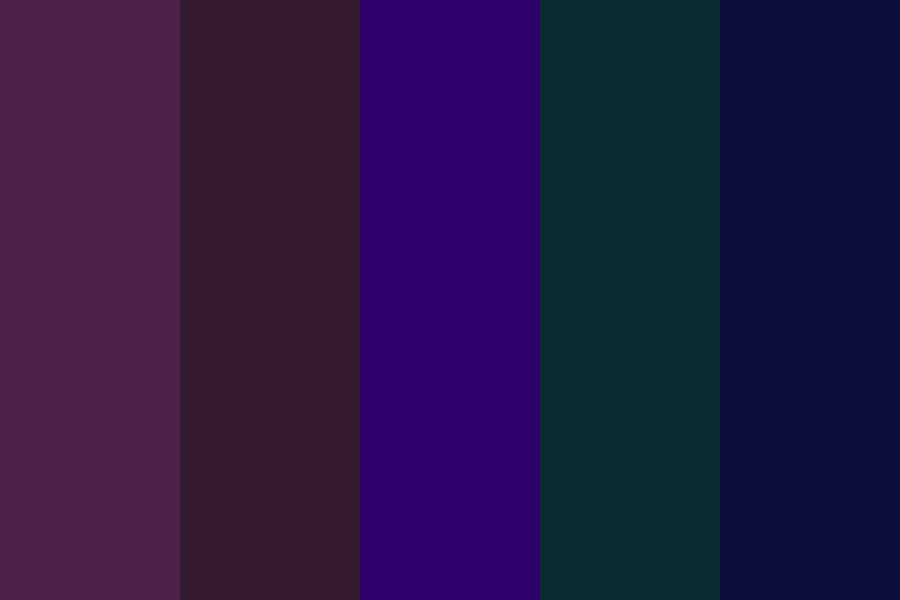
Dusk is not a monochromatic moment but a dynamic symphony of light and shadow, constantly shifting. From the last fiery streaks of orange and red kissing the horizon to the deep indigos and velvety purples that bleed into the sky, it represents a profound shift. For brand strategists, understanding this variability is crucial. A brand inspired by dusk isn’t limited to a single “dusk color” but rather embraces an entire mood board, reflecting the nuanced emotions it evokes.
The Psychological Impact of Dusk Colors
Colors, particularly those found during transitional periods like dusk, carry significant psychological weight.
- Deep Blues and Indigos: These hues often convey trust, stability, sophistication, and calm. Brands aiming for a sense of reliability, luxury, or a contemplative, serene experience often lean into these cooler tones. They can suggest depth, wisdom, and a premium quality.
- Velvet Purples and Magentas: Associated with creativity, imagination, luxury, and spirituality, purples at dusk can lend an air of mysticism and elegance. They appeal to target audiences seeking unique, innovative, or indulgent experiences.
- Warm Oranges, Pinks, and Soft Reds: While often more present at sunset, the lingering warmth of these colors can signify comfort, ambition, enthusiasm, and a welcoming feel. Brands looking to evoke a sense of community, warmth, or subtle energy might incorporate these softer, fading warm tones.
- Muted Grays and Silvers: These represent sophistication, neutrality, and modernism. As light fades, the subtle interplay of gray tones can provide a sophisticated backdrop, allowing brighter brand colors to pop or contributing to an overall understated elegance.
The strategic selection of these colors allows brands to communicate their core values and personality without uttering a single word. It’s an unspoken dialogue that forms the bedrock of brand perception.
Evoking Mood and Atmosphere in Branding
A brand’s atmosphere is as vital as its product or service. Dusk-inspired palettes excel at creating a specific mood, fostering an emotional environment for the consumer.
- Serenity and Calm: Brands in wellness, luxury travel, or personal development might use soft, cool dusk colors to suggest tranquility and introspection.
- Mystery and Intrigue: Entertainment brands, premium fragrances, or exclusive services can leverage darker, richer dusk tones like deep purples and blues to create an aura of exclusivity and allure.
- Sophistication and Elegance: Fashion houses, high-end automotive brands, or fine dining establishments often employ muted, refined dusk palettes to convey timeless elegance and luxury.
The goal is to transport the audience, to immerse them in the brand’s intended experience through visual language alone. Dusk offers a naturally inspiring canvas for this kind of evocative branding.
Crafting Brand Identity with the Dusk Palette
Building a brand identity around the concept of dusk requires more than simply picking a few pretty colors. It demands a holistic approach, where every visual element, from the logo to the website UI, contributes to a cohesive, resonant narrative.
Strategic Color Selection: More Than Just Aesthetics
The initial selection of a dusk-inspired color palette must be deeply rooted in brand strategy.
- Brand Archetype Alignment: Does the brand embody the caregiver, the explorer, the creator, or the sage? Dusk colors can be tailored to reinforce these archetypes. A “sage” brand might lean into deep blues for wisdom, while an “explorer” might use the transition from warm to cool to symbolize journey.
- Target Audience Appeal: Understanding the demographic, psychographic, and cultural nuances of the target audience is paramount. Certain dusk hues might resonate more strongly with particular groups.
- Competitive Differentiation: Analyzing competitors’ color schemes helps identify opportunities for distinctiveness. If competitors are all bright and bold, a sophisticated, serene dusk palette can carve out a unique niche.
- Versatility and Adaptability: A good dusk palette should be versatile enough to work across various mediums—digital, print, physical spaces—while maintaining its integrity and impact. Consideration must be given to how colors appear under different lighting conditions or on various screen types.
A robust brand style guide will detail the primary, secondary, and accent colors, their usage, and the emotional rationale behind their selection, ensuring consistency and strategic application.
From Logo to UI: Consistent Application

Once the palette is defined, its consistent application across all touchpoints is critical for reinforcing the brand’s identity.
- Logo Design: A logo using dusk colors can immediately communicate the brand’s essence. A deep indigo for a financial institution might signify trustworthiness, while a gradient from soft orange to purple for a creative agency could represent innovation and transformation.
- Website and App User Interface (UI): Digital platforms offer an ideal canvas for the subtle transitions and depths of a dusk palette. Backgrounds that gently shift color, gradients that mimic the horizon, and interactive elements that highlight contrasting dusk tones can create an immersive, engaging user experience. Dark mode interfaces, in particular, lend themselves beautifully to dusk-inspired aesthetics, reducing eye strain while enhancing perceived sophistication.
- Marketing Materials: Brochures, advertisements, social media graphics, and email campaigns should all consistently deploy the chosen dusk palette. This ensures brand recognition and reinforces the desired emotional connection with every piece of communication.
- Physical Spaces and Packaging: For brick-and-mortar brands or products, the physical environment and packaging are extensions of the brand. Interior design utilizing dusk tones can create a calming or luxurious atmosphere, while product packaging can leverage these colors to convey premium quality, ethical sourcing, or a sense of peace.
Consistency builds recognition, trust, and a strong mental association between the brand and the feelings evoked by its color choices.
Case Studies in Dusk-Inspired Branding
While few brands explicitly state “we are a dusk brand,” many implicitly adopt and master its principles, leveraging its unique emotional resonance.
Brands Utilizing Deep Blues and Purples
Consider brands like Headspace (meditation and mindfulness app) or certain luxury automotive marques. Headspace uses a distinct, calming deep blue often paired with soft pastels, evoking a sense of tranquility and mental clarity akin to the peaceful twilight hours. Luxury car brands frequently employ deep, rich blues and purples in their advertising and vehicle finishes to communicate sophistication, advanced technology, and an understated opulence, aligning with the serene and dignified aspect of dusk. Similarly, some high-end financial institutions or cybersecurity firms might use dark blue primary colors to project trust, security, and stability, drawing parallels to the reliability and profound depth of the night sky before complete darkness.
Embracing Warm Oranges and Soft Pinks
Brands that focus on comfort, self-care, or gentle transformation often incorporate the warmer, softer end of the dusk spectrum. Think of certain eco-friendly product lines that use faded orange and rose tones to suggest natural ingredients, warmth, and a gentle touch. Even some personal care brands might use these softer hues in their packaging to convey nurturing and a sense of calm rejuvenation, mirroring the gentle fade of the sun and the soft glow that precedes night. These colors resonate with feelings of warmth, authenticity, and a welcoming transition.
The Power of Contrast: Light Against Shadow
One of the most compelling aspects of dusk is the dramatic interplay between fading light and encroaching shadow. Brands like Spotify (though their brand green is iconic, their UI often plays with dark backgrounds and contrasting bright elements) or luxury fashion brands frequently employ this contrast. They might use a dark, almost black background (representing the depths of dusk) to make a single, luminous object or a vibrant accent color pop. This creates a sense of drama, focus, and exclusivity, highlighting what is essential while shrouding the rest in sophisticated mystery. This contrast mirrors the subtle dance of light and shadow that defines the magic of twilight, drawing attention to moments of beauty and clarity amidst the fading light.
The Future of Brand Storytelling: Capturing Transitional Moments
As consumer preferences shift towards authenticity and emotional connection, the ability of brands to tell compelling stories through evocative visual language becomes increasingly important. Dusk, with its inherent narrative of transition, change, and introspection, offers a potent framework for future brand development.
Digital Experiences and Dynamic Color Schemes
The evolution of digital platforms allows for increasingly dynamic and interactive brand experiences. Imagine websites or apps that subtly shift their color palette throughout the day, mirroring the actual time and light conditions, culminating in a rich, immersive dusk experience as evening approaches. This personalization and responsiveness can forge a deeper, more organic connection with users, making the brand feel alive and attuned to their world. Augmented reality (AR) and virtual reality (VR) will further amplify these possibilities, allowing brands to construct entire virtual environments bathed in the atmospheric beauty of dusk.

Authenticity Through Natural Inspiration
In an increasingly saturated market, authenticity is a key differentiator. Brands that draw inspiration from natural phenomena like dusk tap into universal human experiences and emotions. This natural connection can help a brand feel more grounded, genuine, and relatable. By understanding and articulating “what color is dusk” in their specific brand context, companies can move beyond mere aesthetics to create identities that are not only visually appealing but also deeply meaningful, resonant, and enduring. The colors of dusk offer a timeless wellspring for brands seeking to evoke sophisticated emotion, build trust, and craft an unforgettable identity that lingers long after the day fades.
aViewFromTheCave is a participant in the Amazon Services LLC Associates Program, an affiliate advertising program designed to provide a means for sites to earn advertising fees by advertising and linking to Amazon.com. Amazon, the Amazon logo, AmazonSupply, and the AmazonSupply logo are trademarks of Amazon.com, Inc. or its affiliates. As an Amazon Associate we earn affiliate commissions from qualifying purchases.