
At first glance, the question “what color is Dr Pepper can?” might seem trivial, a simple query about a packaging detail. However, within the realm of brand strategy, corporate identity, and consumer psychology, this seemingly straightforward question unlocks a profound discussion about the power of visual identity. The color of a product’s packaging is far more than an aesthetic choice; it is a critical component of brand recognition, differentiation, and emotional connection. For an iconic brand like Dr Pepper, its distinctive can color plays an indispensable role in its enduring legacy and market positioning, subtly communicating its unique heritage, flavor profile, and brand personality to millions worldwide.
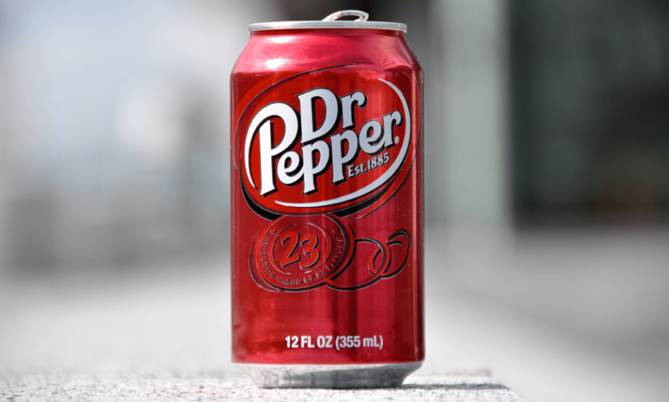
Dr Pepper, a beverage with a rich history dating back to 1885, has cultivated a fiercely loyal fan base, not just for its unique “23 flavors” taste, but also for its instantly recognizable visual presence. While the precise shade might invite casual debate – is it red, burgundy, or maroon? – the strategic intent behind its selection is unequivocally clear: to stand apart, communicate a distinct identity, and embed itself firmly in the consumer’s mind. Exploring the color of the Dr Pepper can, therefore, becomes an insightful case study into the deliberate craftsmanship of a successful brand’s visual language.
The Iconic Hue: Deconstructing Dr Pepper’s Visual Identity
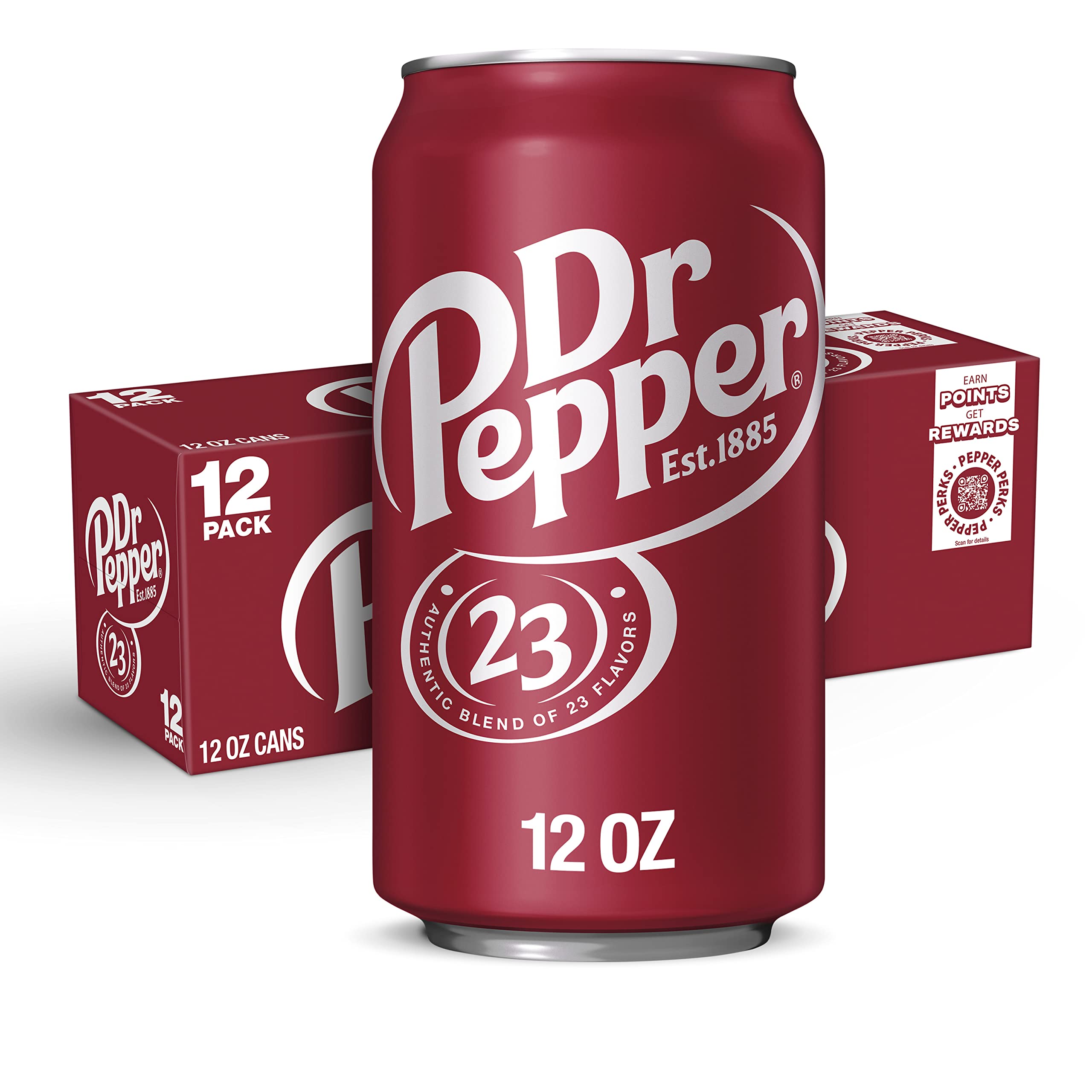
The Dr Pepper can’s primary color is a rich, deep red, often described as maroon or burgundy. This isn’t just any red; it’s a shade meticulously chosen to evoke specific feelings and associations, setting the brand apart from its carbonated beverage competitors. In a market dominated by Coca-Cola’s vibrant red and Pepsi’s bold blue, Dr Pepper’s choice of a darker, more sophisticated hue is a deliberate act of brand differentiation, signaling its unique position and flavor profile.
More Than Just Red: A Deep Dive into Maroon
The distinction between a bright, primary red and Dr Pepper’s signature maroon is crucial for understanding its brand strategy. Bright reds are often associated with energy, passion, and urgency – think of Coca-Cola’s dynamic identity. Maroon, on the other hand, carries connotations of richness, sophistication, tradition, and even a certain gravitas. It’s a color often found in luxury goods, academic regalia, and historical institutions, lending an air of established quality and timelessness. For Dr Pepper, a brand that prides itself on its unique, complex flavor profile derived from “23 flavors,” maroon beautifully encapsulates this complexity and heritage. It suggests a beverage that is more nuanced than a simple soft drink, inviting consumers to experience a depth of taste that mirrors the depth of its visual identity. This strategic color choice helps Dr Pepper cultivate an image that is both classic and distinctly individual, appealing to consumers who appreciate authenticity and a departure from the mainstream.
Complementary Colors and Elements
While maroon is the dominant force, the Dr Pepper can’s visual identity is a masterclass in how complementary elements enhance and reinforce the core color message. The most prominent contrasting element is the silver or white lettering used for the “Dr Pepper” logo and other text. This bright, clean contrast against the deep maroon ensures readability and adds a touch of modern clarity to the classic base. The distinct, stylized font of the logo itself, with its slightly curved and robust characters, further contributes to the brand’s unique personality.
Beyond the primary logo, elements like the “EST. 1885” mark and the iconic “23 flavors” badge are often rendered in similar contrasting colors, typically white or a light cream, providing additional textual information without overwhelming the primary visual. These elements are not mere additions; they are integral parts of the corporate identity, working in concert with the maroon to tell a complete brand story. The consistent application of these complementary colors and design motifs across all packaging and marketing materials creates a unified and instantly recognizable visual language, reinforcing the brand’s promise of a unique and cherished experience.
The Psychology of Color in Branding: Why Maroon Matters
The selection of maroon for the Dr Pepper can is not arbitrary; it’s a carefully considered strategic decision rooted in the psychology of color, designed to evoke specific emotional responses and reinforce core brand values. In the competitive beverage market, where shelf appeal can significantly influence purchasing decisions, every visual cue must work hard to communicate the brand’s essence.
Evoking Heritage and Tradition
Dr Pepper’s history dates back to 1885, making it one of the oldest soft drink brands in America. The color maroon inherently carries connotations of heritage, tradition, and established legacy. It’s a hue often associated with age-old institutions, vintage aesthetics, and a sense of enduring quality. By choosing this sophisticated shade, Dr Pepper subtly communicates its deep roots and long-standing presence in the market. This psychological connection helps to position the brand as trustworthy, authentic, and a classic choice that has stood the test of time. For consumers, this translates into a feeling of reliability and a sense of connection to a brand with a story, distinguishing it from newer, more fleeting trends. The maroon is a visual anchor to its past, assuring consumers of its consistent quality and unique identity across generations.
Differentiation in a Crowded Market
One of the most critical functions of brand color is differentiation. In the carbonated soft drink aisle, the visual landscape is dominated by the bright red of Coca-Cola and the electric blue of Pepsi. Had Dr Pepper chosen a similar vibrant red, it would risk being lost in the visual noise or perceived as a mere imitation. By opting for maroon, Dr Pepper intentionally carves out a unique visual niche. This distinct color choice signals to consumers that Dr Pepper is not just another cola; it’s something different, something with its own distinct character and taste profile. This visual separation is vital for a brand that prides itself on its unique “23 flavors” blend. The maroon acts as a visual shorthand for its individuality, immediately distinguishing it from direct competitors and reinforcing its “original” and “one-of-a-kind” brand messaging. This strategic avoidance of direct color competition ensures that Dr Pepper occupies its own identifiable space in the consumer’s mind and on the store shelf.
Communicating Flavor and Experience
Colors are often subconsciously linked to sensory experiences, including taste. The richness and depth of maroon can subtly communicate the complex and multi-layered flavor profile of Dr Pepper. Unlike the crisp, refreshing feel often associated with lighter colors or the intense sweetness linked to brighter reds, maroon suggests a more intricate, perhaps even slightly spiced or cherry-like taste experience. It implies a beverage that is satisfying, comforting, and full-bodied – characteristics often attributed to Dr Pepper’s distinctive blend. The color can prime consumer expectations, setting the stage for the unique taste journey that follows. It suggests a more mature and sophisticated palate experience, resonating with those who seek a beverage that offers more than just generic sweetness. Thus, the maroon can is not just packaging; it’s an integral part of the sensory marketing, inviting consumers to anticipate the distinctive taste that awaits within.
Consistency is Key: Dr Pepper’s Brand Uniformity Across Touchpoints
In the complex world of modern branding, consistency is paramount. A brand’s visual identity, especially its core color, must be uniformly applied across every conceivable touchpoint to build strong recognition and trust. Dr Pepper’s commitment to its signature maroon hue is a testament to this principle, ensuring that its brand identity remains unmistakable whether seen on a supermarket shelf, a billboard, or a digital advertisement.
Packaging Evolution vs. Core Identity
While product packaging often undergoes periodic refreshes to stay relevant and modern, the core identity – particularly the primary brand color – typically remains sacrosanct for established brands. Dr Pepper has indeed seen its can designs evolve over the decades, incorporating contemporary graphic trends, launching limited edition cans, or subtly tweaking its logo presentation. However, throughout these evolutions, the foundational maroon color has remained steadfast. This unwavering commitment ensures that despite minor design changes, the essence of the Dr Pepper brand is instantly recognizable. Consumers don’t have to re-learn who Dr Pepper is with each packaging update; the maroon provides an immediate visual anchor, reinforcing brand loyalty and ensuring continuity. This balance between contemporary design and unchanging core identity is a hallmark of successful, enduring brands.
Beyond the Can: Extending the Brand Palette
The influence of the Dr Pepper maroon extends far beyond just its cans. It is a dominant feature across all brand touchpoints, creating a cohesive and immersive brand experience. Bottles, whether glass or plastic, prominently feature the maroon in their labels. Advertising campaigns, both print and digital, heavily leverage the color in their visual schemes, ensuring that every interaction reinforces the brand’s distinct identity. Merchandise, from t-shirts to collectible items, consistently uses the maroon, turning brand enthusiasts into walking advertisements. Even in digital spaces, such as the official Dr Pepper website and social media profiles, the maroon color palette is strategically employed to maintain visual consistency. This ubiquitous application of the core color helps to build a powerful brand ecosystem, where every encounter with Dr Pepper, regardless of the medium, strengthens its overall corporate identity and recall.
The Power of Visual Mnemonics
A brand’s color acts as a potent visual mnemonic – a memory aid that allows consumers to quickly identify and recall the brand. For Dr Pepper, the maroon color is an incredibly effective mnemonic device. In a crowded store aisle, amidst hundreds of different products, a consumer can spot the distinctive maroon can almost instantly, even from a distance or with a fleeting glance. This rapid recognition is invaluable, reducing cognitive load for the consumer and streamlining the purchasing process. It’s a non-verbal cue that bypasses language and directly taps into visual memory, making Dr Pepper a familiar and comforting presence. This immediate identification capability, driven largely by its consistent color application, contributes significantly to impulse purchases and reinforces brand loyalty, turning the simple act of choosing a beverage into a confirmation of a trusted relationship.
The Strategic Impact: How Color Drives Brand Loyalty and Market Position
The color of the Dr Pepper can is not merely a design detail; it is a profound strategic asset that has been meticulously managed over decades to cultivate brand loyalty, solidify market position, and communicate deep brand equity. It exemplifies how thoughtful color selection can transcend aesthetics to become a powerful business driver.
Cultivating a Dedicated Fan Base
Dr Pepper enjoys a unique status as a “cult classic” beverage, with a fan base that often expresses a profound loyalty and affection for the brand. The distinctive maroon color contributes significantly to this phenomenon by reinforcing the brand’s unique personality. It sets Dr Pepper apart as an individualist, a brand that doesn’t conform to the usual bright red or blue norms of its competitors. This appeal to individuality resonates deeply with consumers who also see themselves as unique, forging a strong emotional connection. The color becomes a symbol for their choice to be different, to appreciate the unconventional, and to align with a brand that celebrates its own distinctiveness. This sense of shared identity, underscored by the can’s unmistakable color, transforms casual drinkers into devoted advocates, driving repeat purchases and passionate word-of-mouth marketing.
A Testament to Enduring Brand Equity
The maroon color of the Dr Pepper can is more than just paint; it is a tangible representation of the brand’s immense equity built over more than a century. This equity is the sum total of consumer perceptions, experiences, and associations with Dr Pepper. The color itself has become synonymous with the brand’s promise of unique flavor, heritage, and quality. When consumers see that maroon, they immediately access a wealth of positive brand associations, accumulated through countless advertisements, consumption experiences, and shared cultural moments. This instant recall and positive association translate into significant brand value, making the color a vital, non-depreciating asset for the company. It’s a globally recognized beacon that transcends linguistic and cultural barriers, instantly conveying the Dr Pepper identity to a diverse international audience.

Lessons for Modern Branding
Dr Pepper’s strategic use of its can color offers invaluable lessons for contemporary brands. First, it underscores the importance of differentiation through unique visual elements. In a saturated market, blending in is a death sentence; standing out, even with a nuanced color choice, can be a powerful competitive advantage. Second, it highlights the critical role of consistency. Unwavering adherence to a core visual identity across all touchpoints builds unwavering brand recognition and trust. Third, it demonstrates the power of color psychology in communicating subtle yet powerful messages about heritage, quality, and personality. Modern brands should invest in understanding what colors truly convey to their target audience, rather than simply following trends. Finally, Dr Pepper exemplifies that a brand’s visual identity, especially its dominant color, is not merely a marketing expense but a fundamental and enduring strategic asset that drives consumer connection, loyalty, and long-term business success.
In conclusion, the answer to “what color is Dr Pepper can?” is not just “maroon” or “dark red.” It is a testament to the meticulous craftsmanship of branding, a deliberate strategic choice that underpins Dr Pepper’s corporate identity. This distinctive hue evokes heritage, differentiates the brand in a crowded market, subtly communicates its complex flavor, and fosters a deep sense of loyalty among its dedicated consumers. The Dr Pepper can’s color is a masterclass in effective brand strategy, proving that in the world of marketing and design, every shade tells a story, and some stories, like Dr Pepper’s, are truly iconic.
aViewFromTheCave is a participant in the Amazon Services LLC Associates Program, an affiliate advertising program designed to provide a means for sites to earn advertising fees by advertising and linking to Amazon.com. Amazon, the Amazon logo, AmazonSupply, and the AmazonSupply logo are trademarks of Amazon.com, Inc. or its affiliates. As an Amazon Associate we earn affiliate commissions from qualifying purchases.